In the 17th century of England, people started to import tea leaf from India. In order to get the best quality of goods, they established British East India Company and supplied premium tea leaf to clients. The John Tea Company is inspired by this history and persist in providing good tea to their customers.
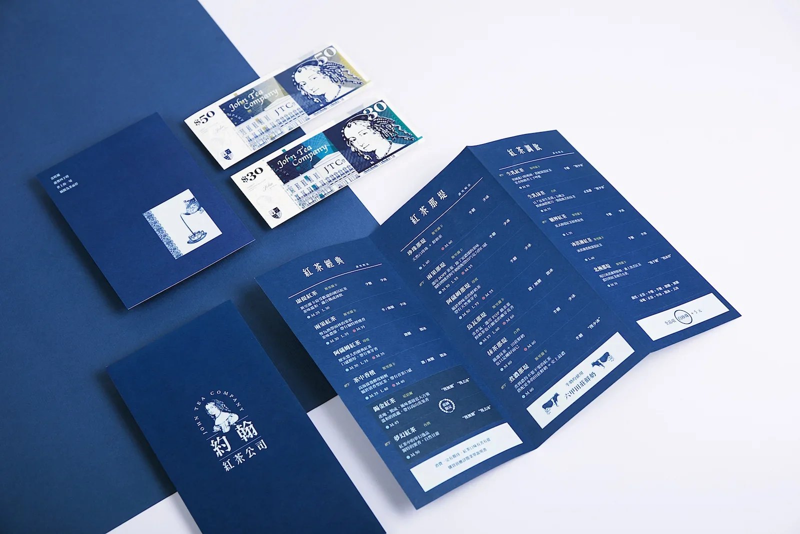
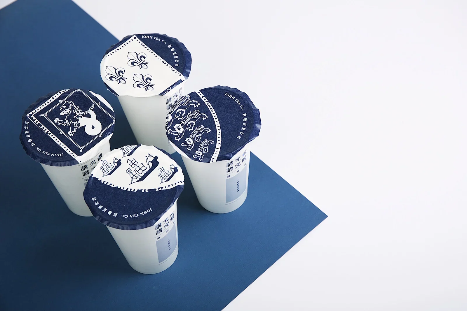
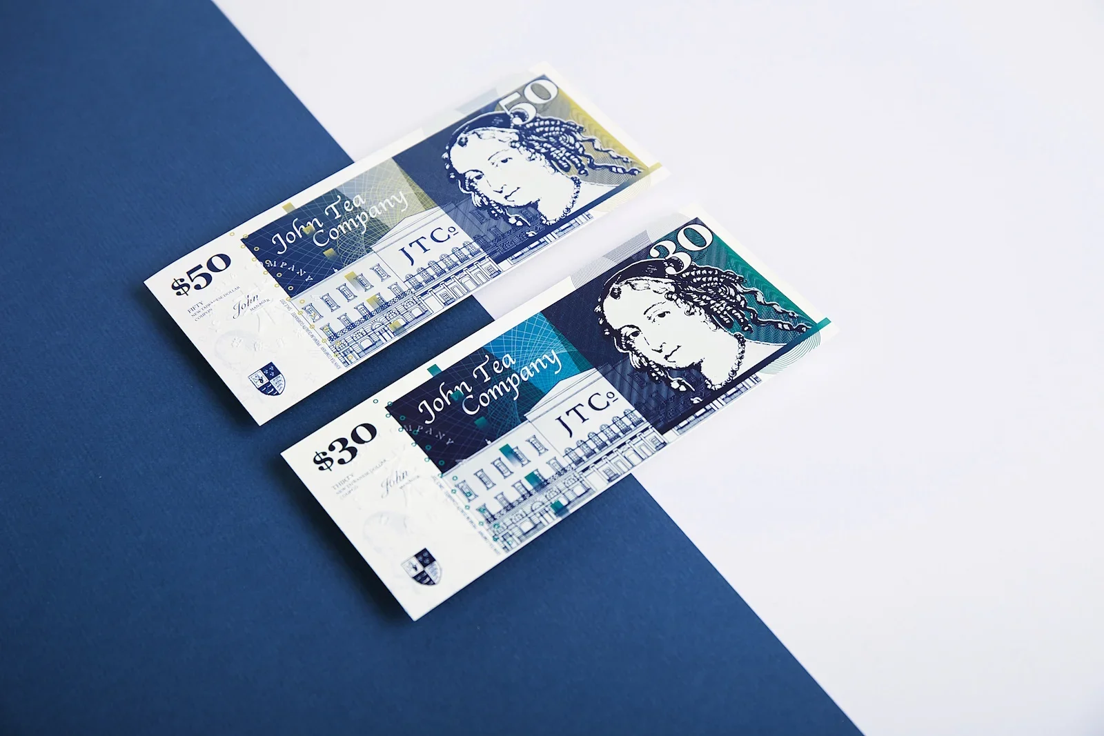
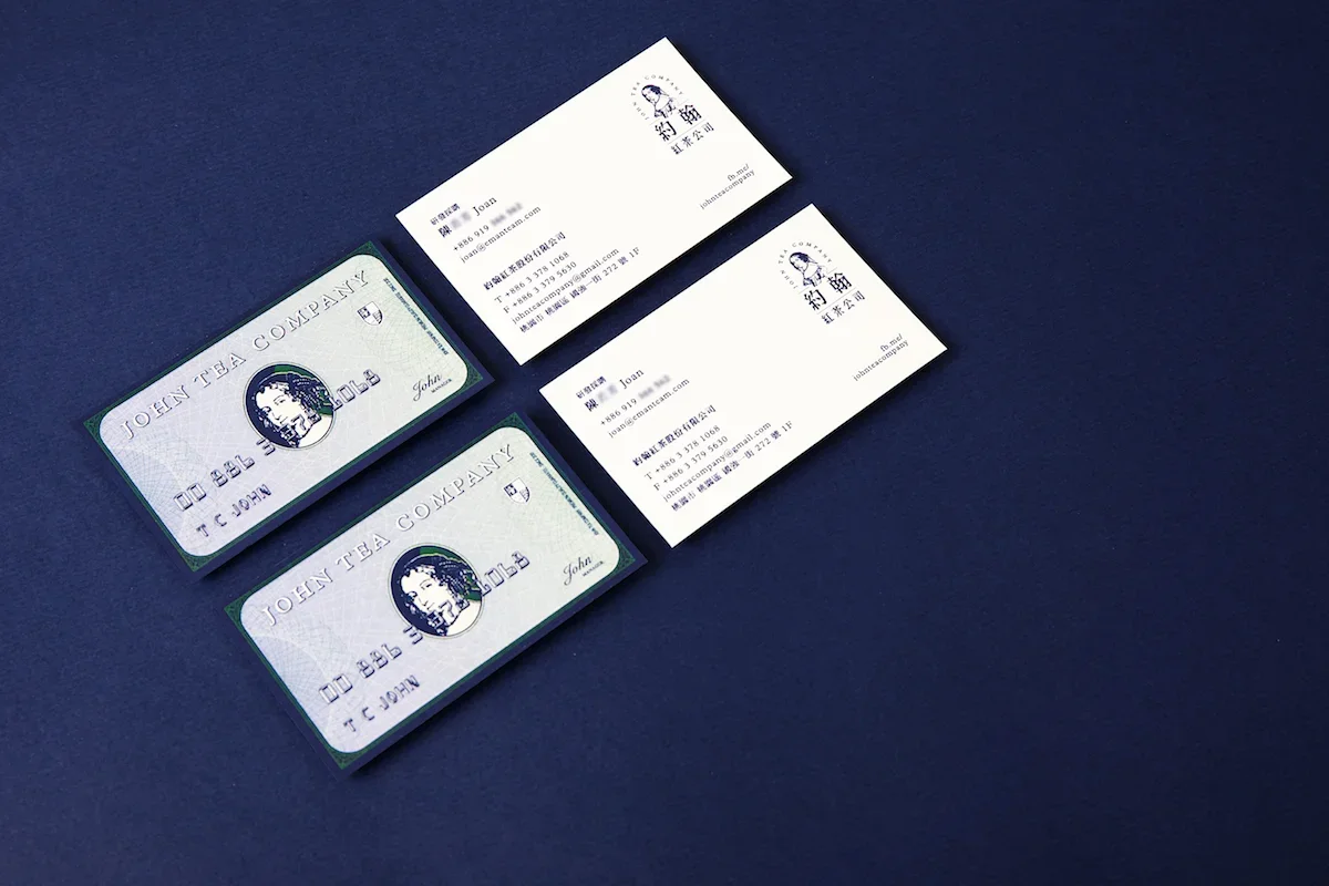
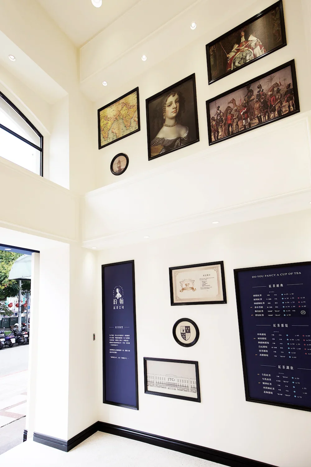
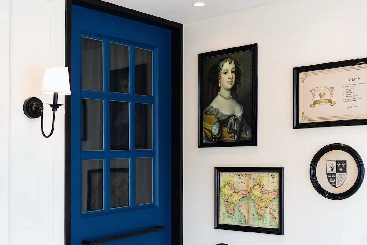
The Brand Design of The John Tea Company, we re-illustrated Catherine of Braganza, who brought tea culture from Portugal to England, as the icon of the brand. And at the same time we use different kind of portraits, paintings and navy colour to represent British culture. Furthermore, we borrow some British elements to extend this kind of impression. For instant, the film on the cup was inspired by the royal shield is built by 6 Penny coins, the coupon is designed like British Notes, and the outdoor poster presents the image of how tea leaf was been imported.
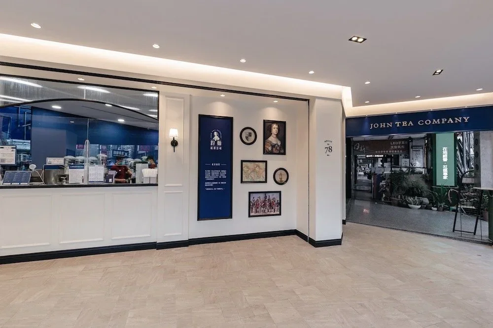
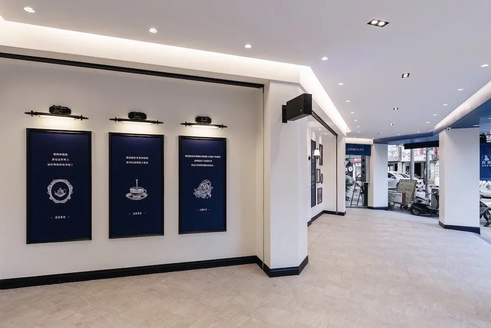
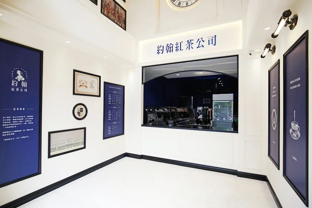
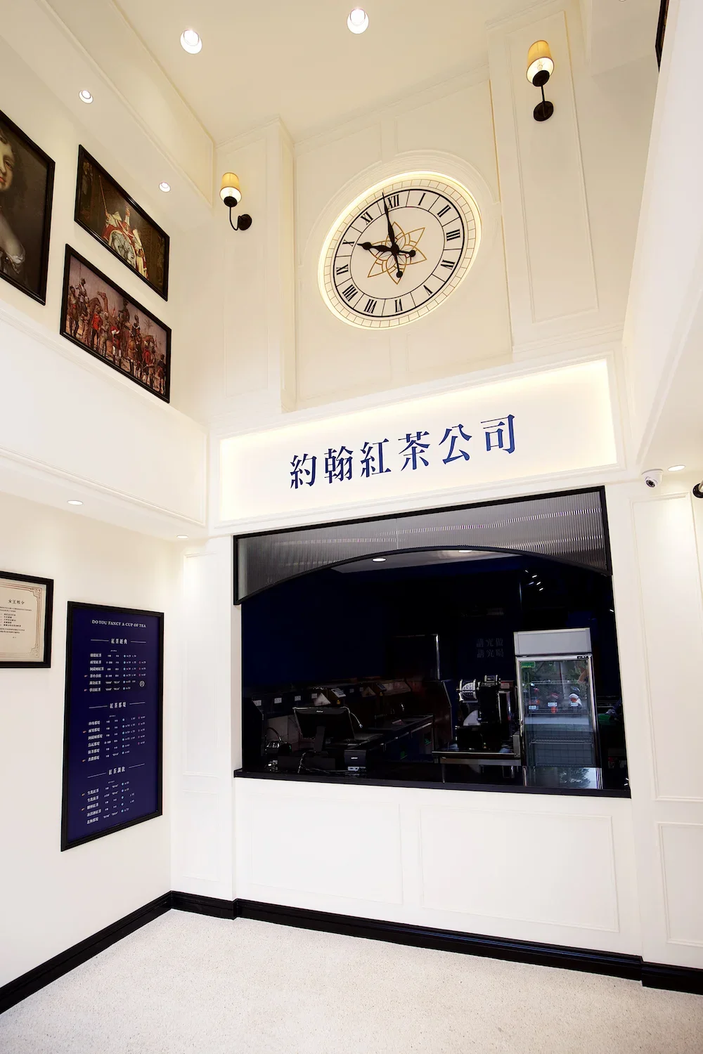
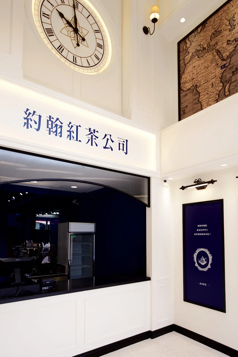
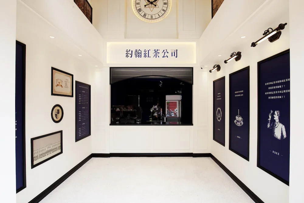
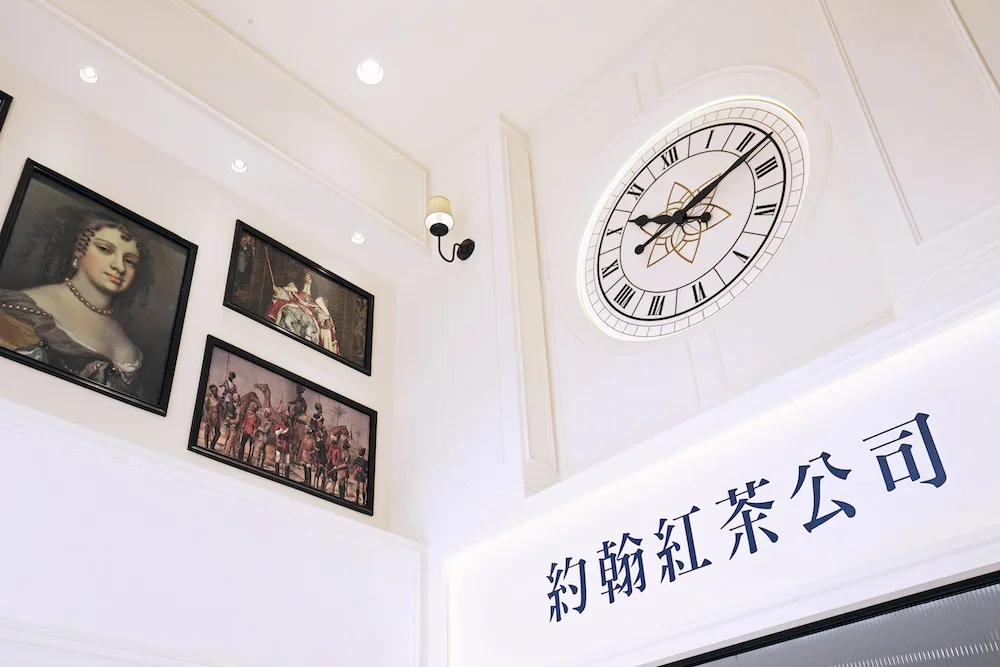
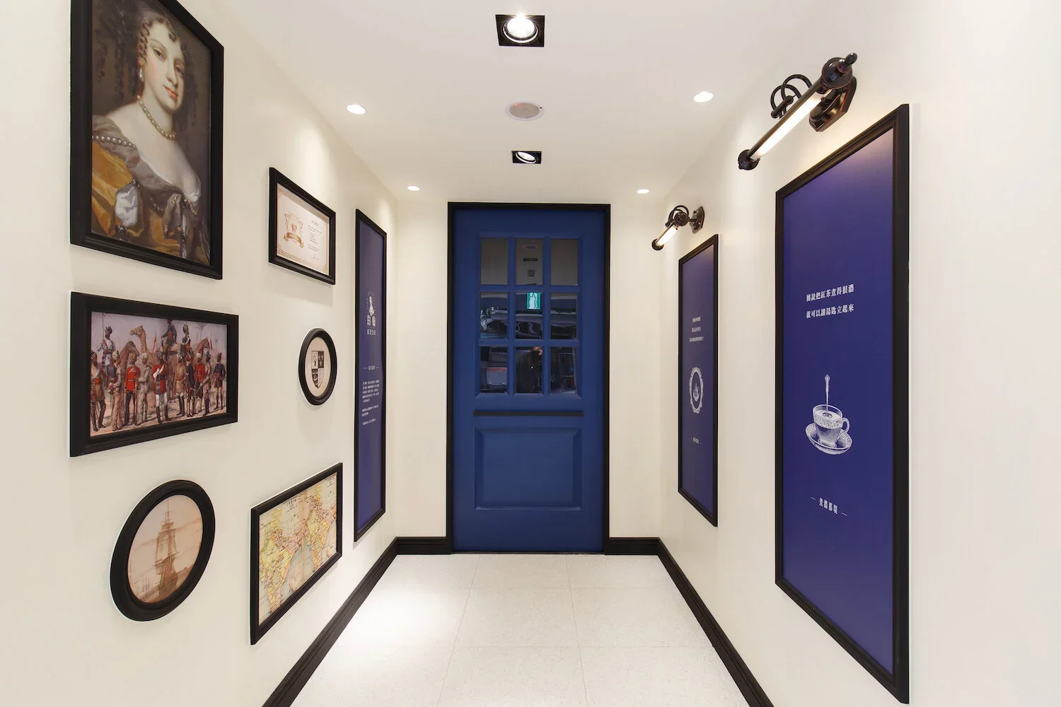
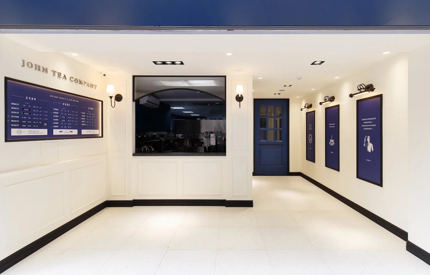
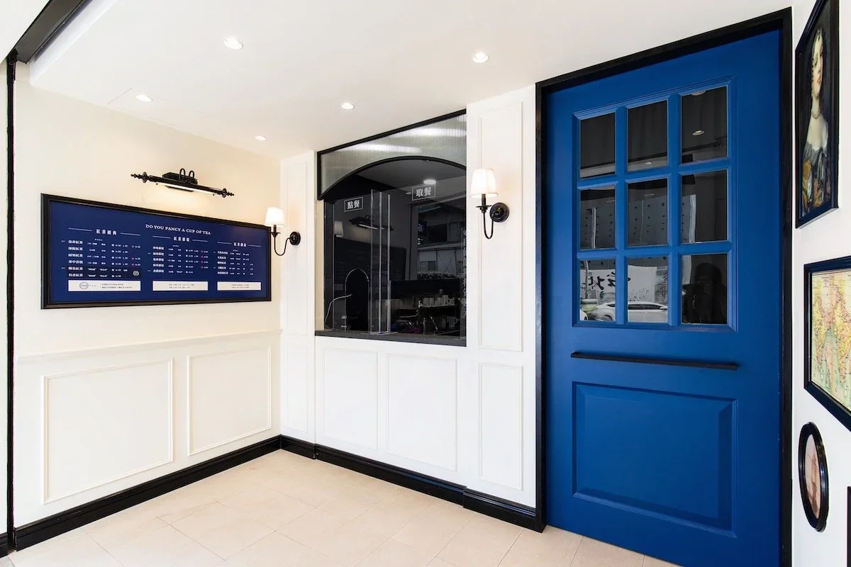
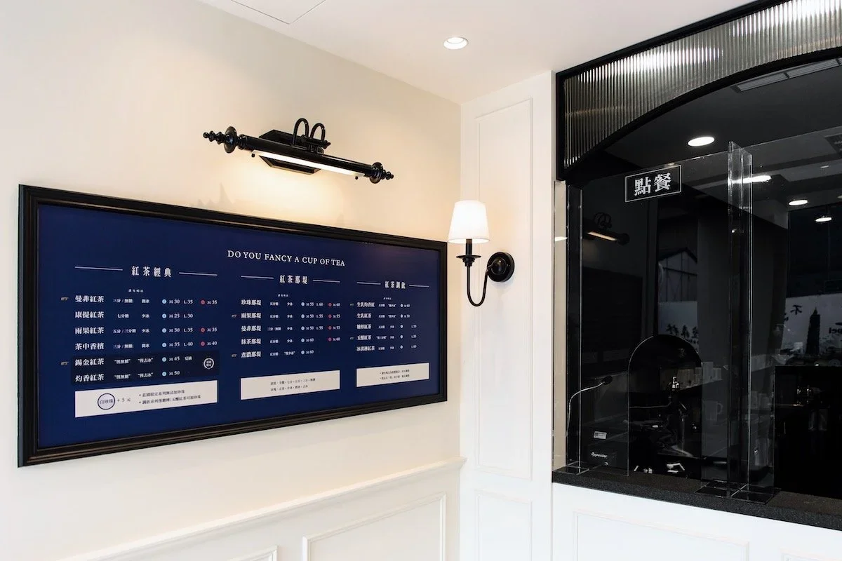
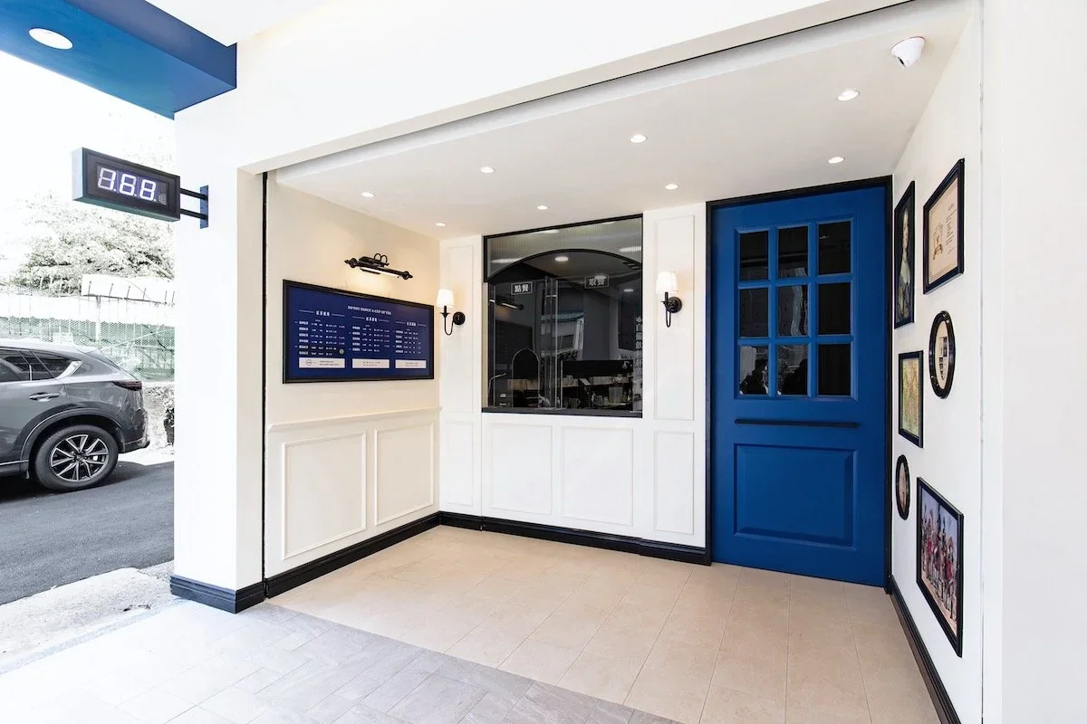
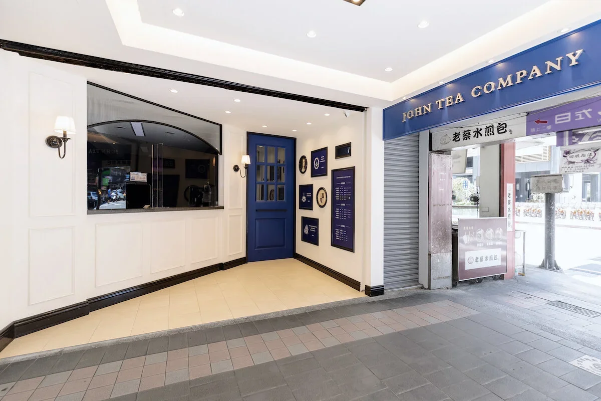
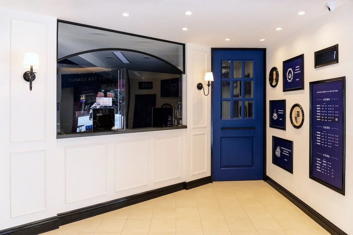
The interior design is also trace back to the year of British East India Company. The tradition Victorian house style is presented by a well combination of navy blue and wheat white. The decorations and lights on the wall illustrate the elegance of the British tradition. The paintings and posters show the history behind, so that when customers are waiting for their drinks, they can read the story.
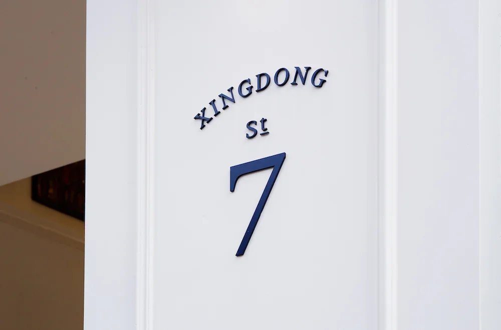
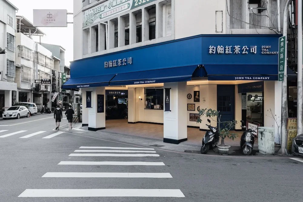
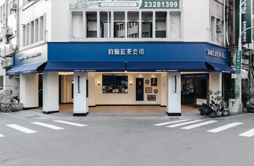
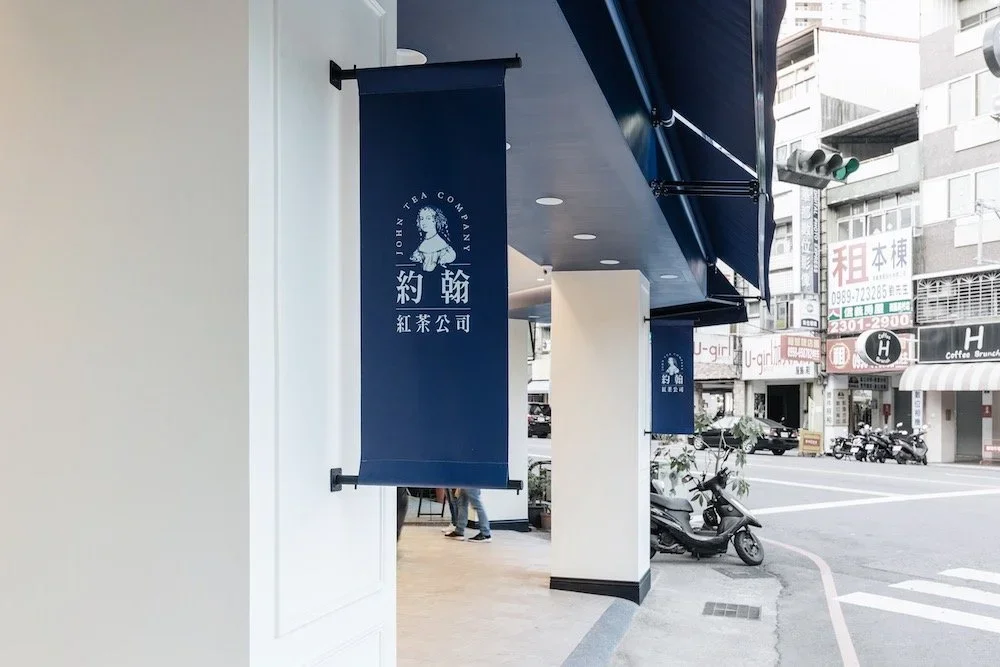
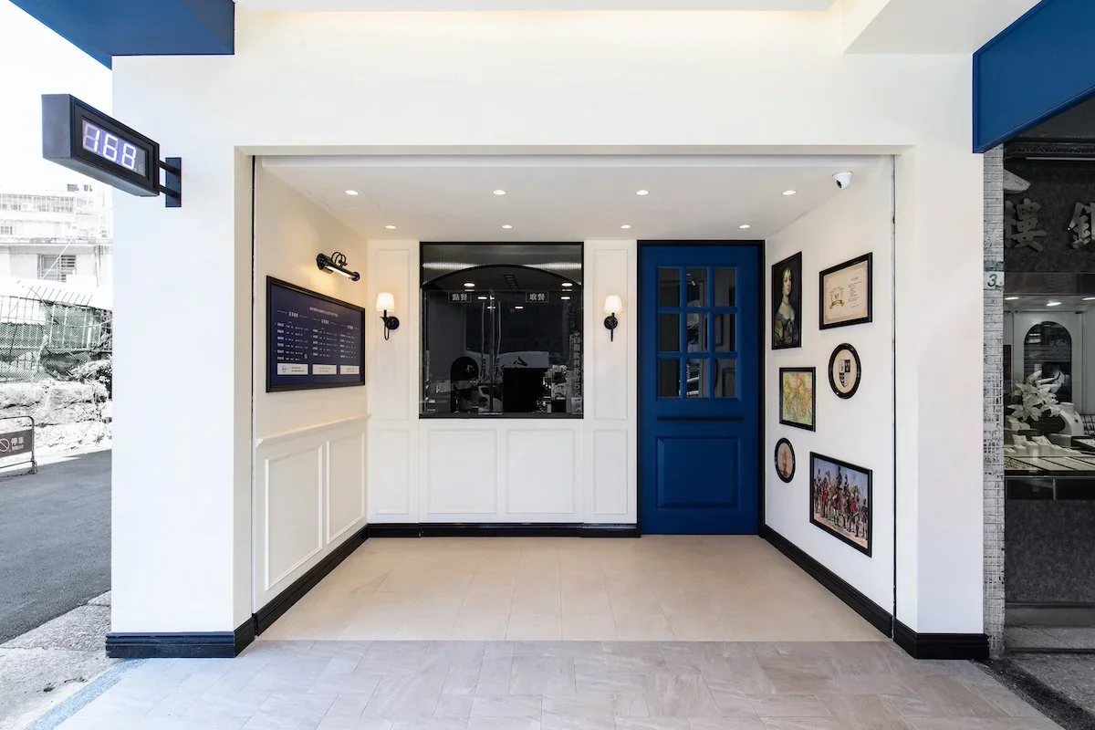
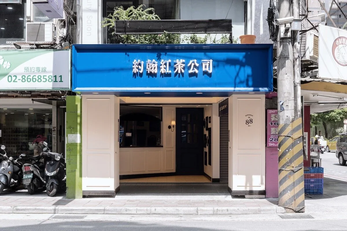
Outside the building, an elegant blue signage with delicate silver finished letters around the shop brings an unique style, which is very different from the ordinary tea shop in Taiwan. The wheat white is painted from outside into the shop, and the inner kitchen is painted in blue to separate the space from customers to staffs.