Branding / Visual Design
品牌設計 / 視覺設計
近年台灣牙醫發展迅速,頂尖的牙醫師不僅得表現醫療的專業度,更要重視整體的美學體驗。患者除了牙齒的健康,美觀更是首要的重點,因此在牙醫個人品牌的打造上,除了呈現個人特色外,美的視覺體驗也變得相當重要。
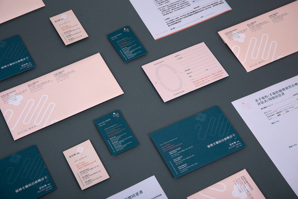
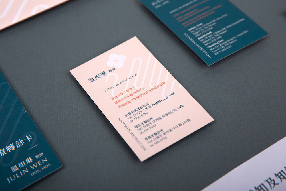
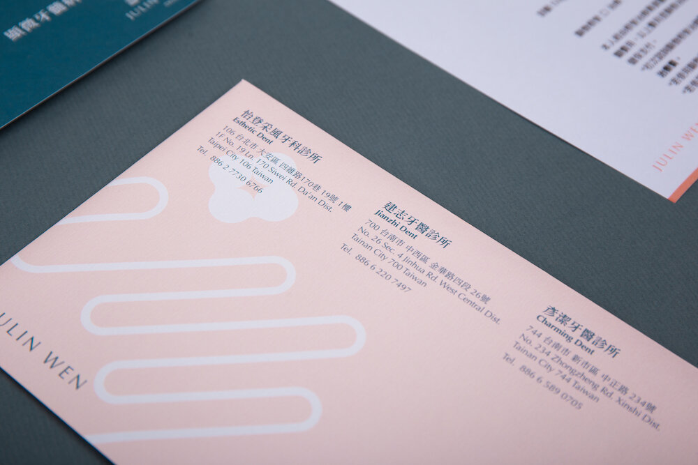
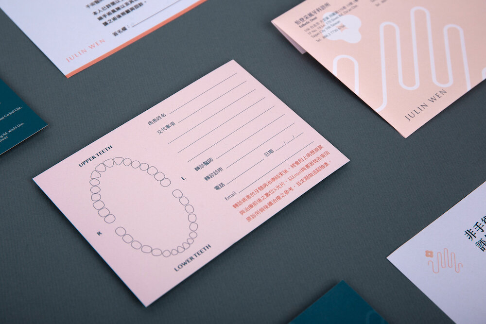
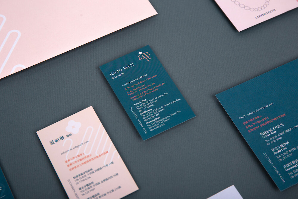
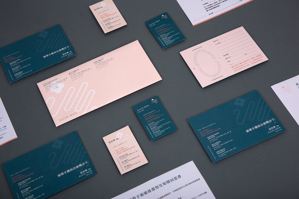
這個特別的設計案例,以溫醫師為病患看診時的巧手作為概念發想,將英文名字的縮寫「J」與「W」兩個字母的形象融入其中,象徵經溫醫師治療的牙齒能夠如花朵般健康美麗。
在色彩的運用上,以活潑積極的珊瑚粉色為整體帶來活力與生機;柔和的粉色展現溫醫師對患者的溫柔與細心;沈穩的藍綠色表現溫醫師在治療上的專業與可靠;用清新的藍綠色則是展現優雅的質感而不失朝氣。
The visual identity of a dentist should present not only profession but also aesthetics, because it is important that the patient’s need is both a precise and beauty medical treatment.
Regarding to Dr. Wen’s initial is ‘J’ and ‘W’, the logo design use this letters to illustrate the shape, narrates how Dr. Wen treat every single patient with her hands carefully, and the tooth is treated just like a delicate flower.
The colour palette of the brand is focusing on the patient, in terms of the treatment process. Coral Red brings energy and vitality feelings; Pink shows tender and considerate of Dr. Wen; Deep Aquamarine indicates reliable professions; and Light Blue-green presents fresh and elegant experiences.