品牌設計 / 商業空間設計 / 視覺設計 / 品牌氛圍營造
Branding / Commercial Space Design / Visual Design / Brand Curation
蒔以初心,風味層疊成形
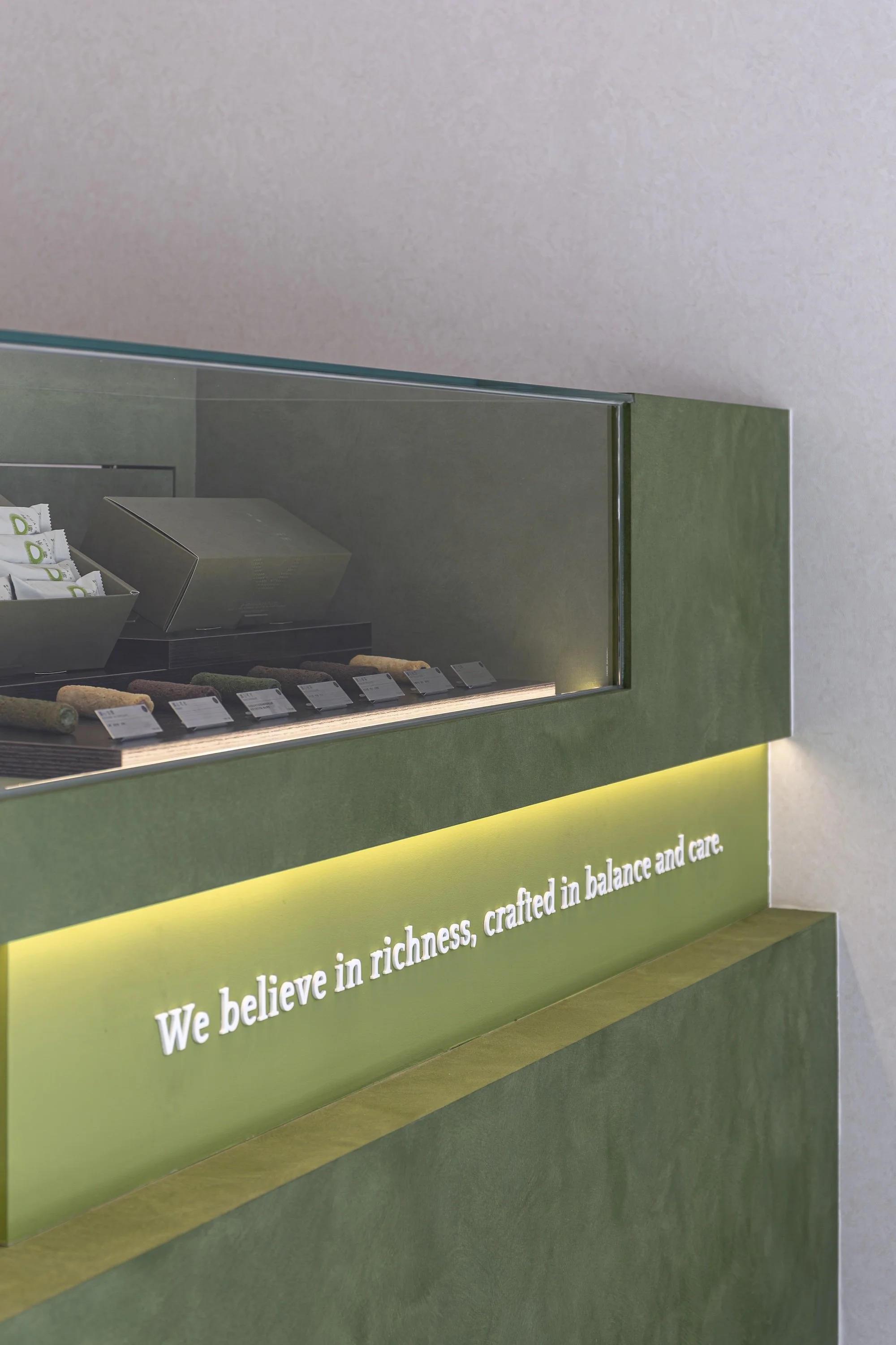
We Believe in Richness,
Crafted in Balance and Care.
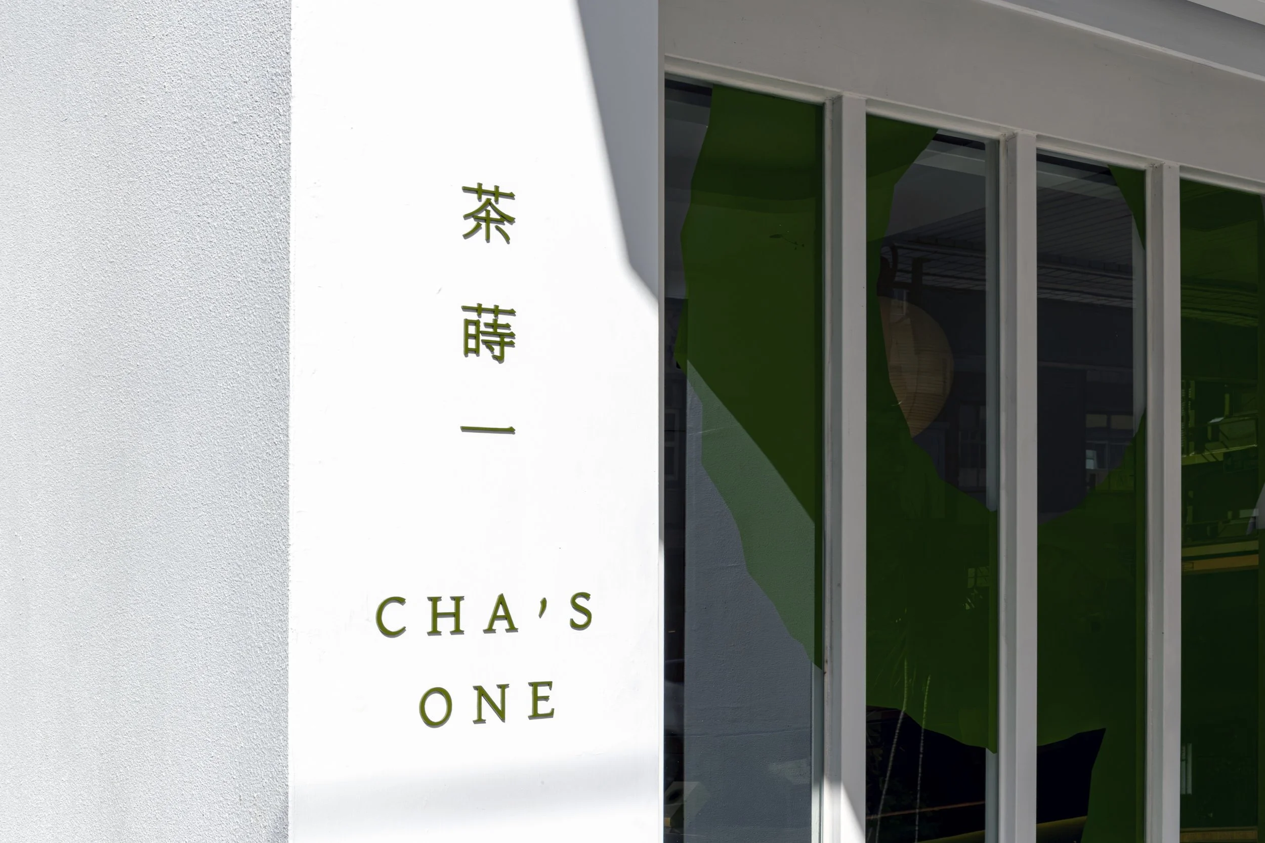
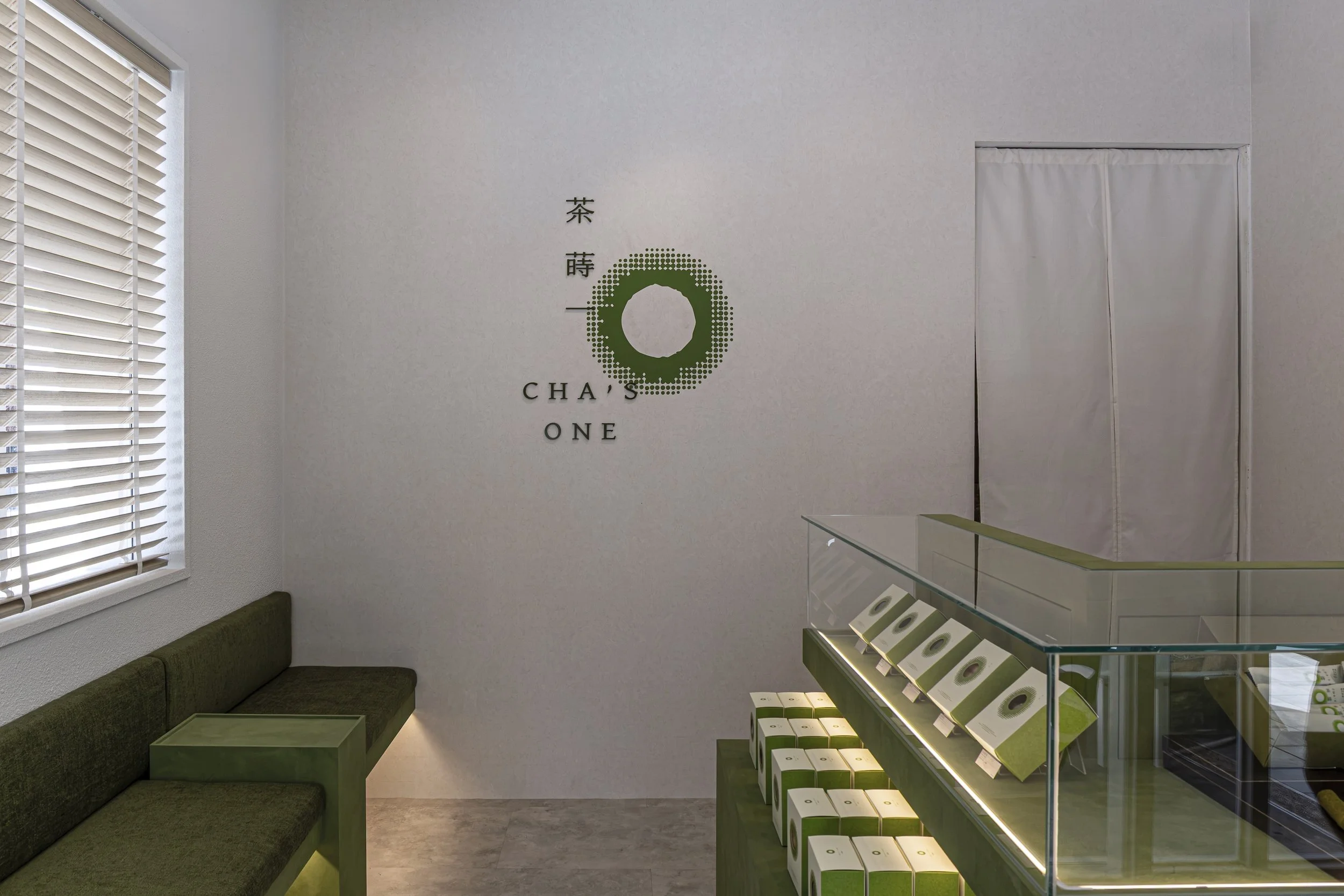
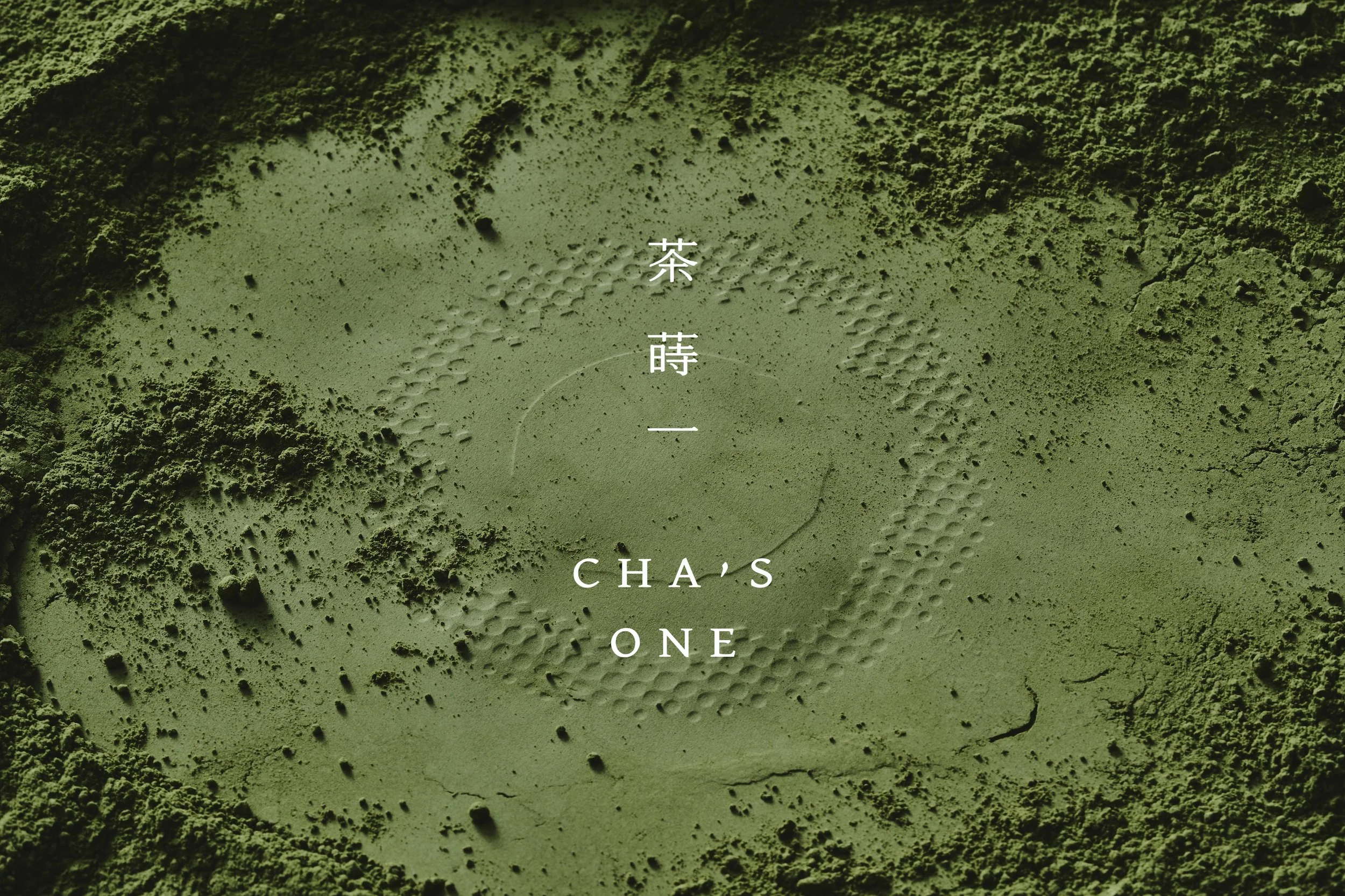
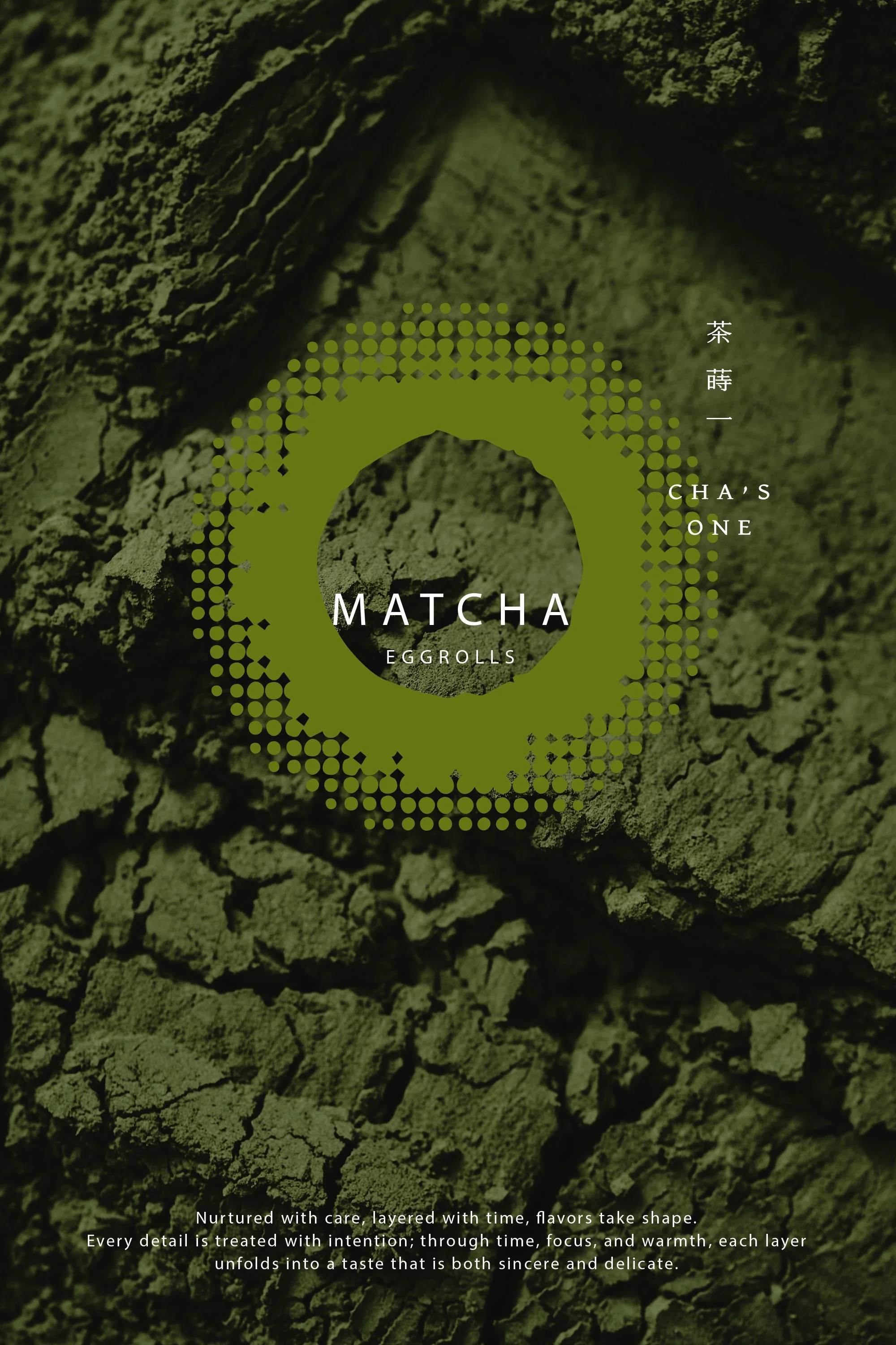
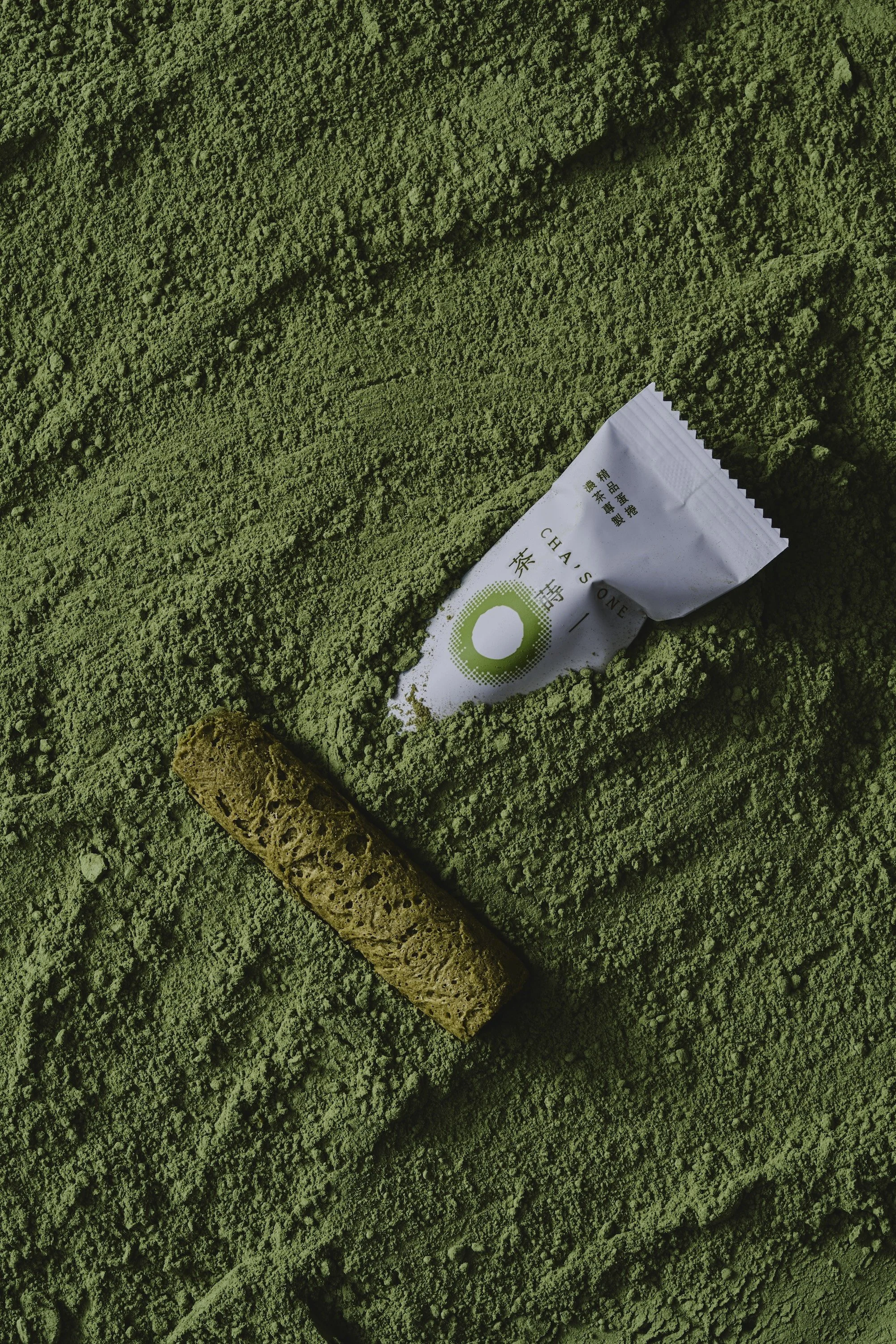
「蒔」象徵時間的累積與手作的溫度,如同播下一顆種子,從一份初心開始,經由時間與用心灌溉,讓風味逐漸生長、層層成形。品牌標誌以「環」為核心,中心向外延展的結構象徵風味與工藝不斷累積,同時也呼應了招牌濃茶蛋捲的意象;而外圍細緻的粉狀元素,如同茶、時間與風味的微小細節,在持續堆疊中形成完整而獨特的滋味。環形同時代表「ONE」的專一與純粹,傳達品牌對茶、製程與品質的堅持。
“蒔 Shi” symbolizes the accumulation of time and the warmth of craftsmanship. Like planting a seed, everything begins with an original intention. Through time, care, and patience, flavors gradually grow and take shape layer by layer.
The brand logo centers on the concept of a circle, with a structure that radiates outward from the center, symbolizing the continuous accumulation of flavor and craftsmanship. It also echoes the visual essence of the brand’s signature rich tea egg rolls. The delicate powder-like elements surrounding the circle represent the subtle details of tea, time, and flavor, which gradually build upon one another to create a complete and distinctive taste.
The circular form also represents the focus and purity of “ONE,” expressing the brand’s dedication to tea, craftsmanship, and uncompromising quality.

視覺、觸覺到開盒體驗
傳遞專注於品質的初心
every detail conveys
the original commitment to quality
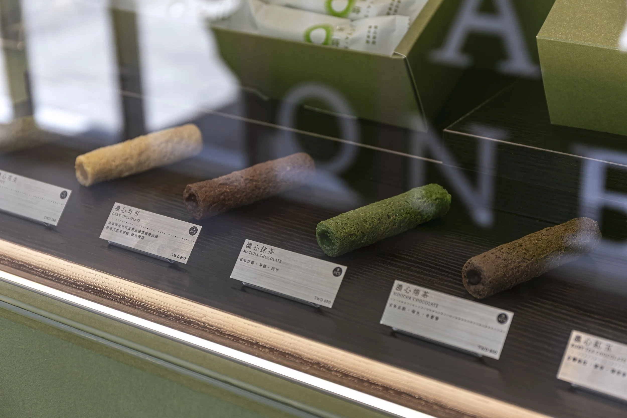
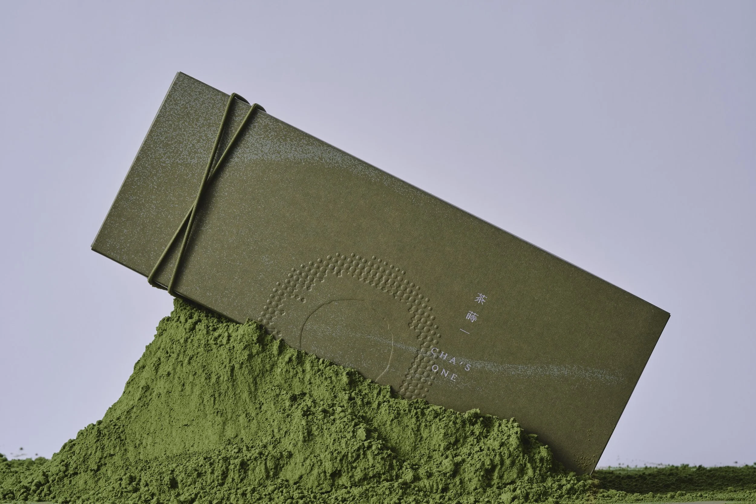
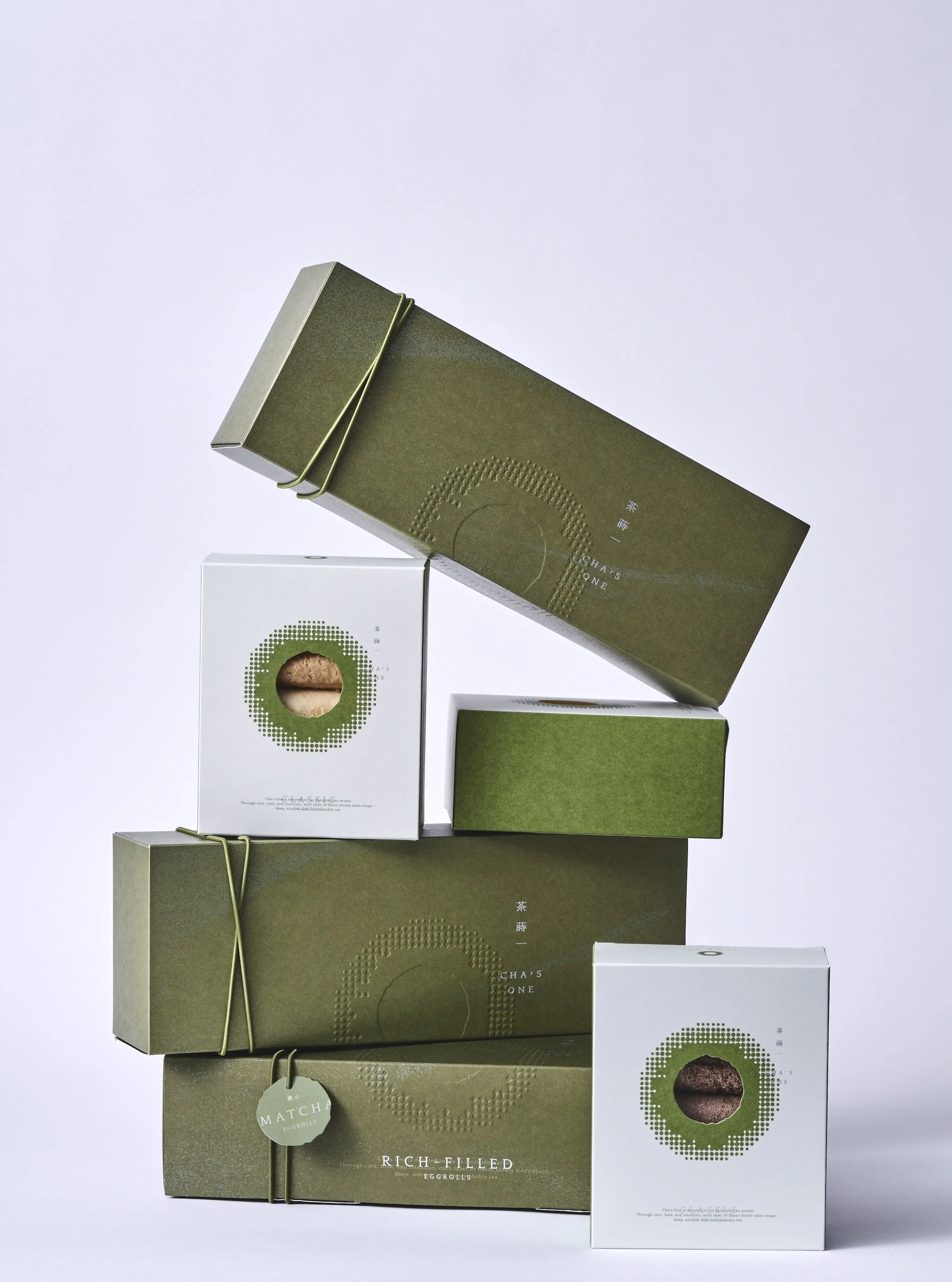
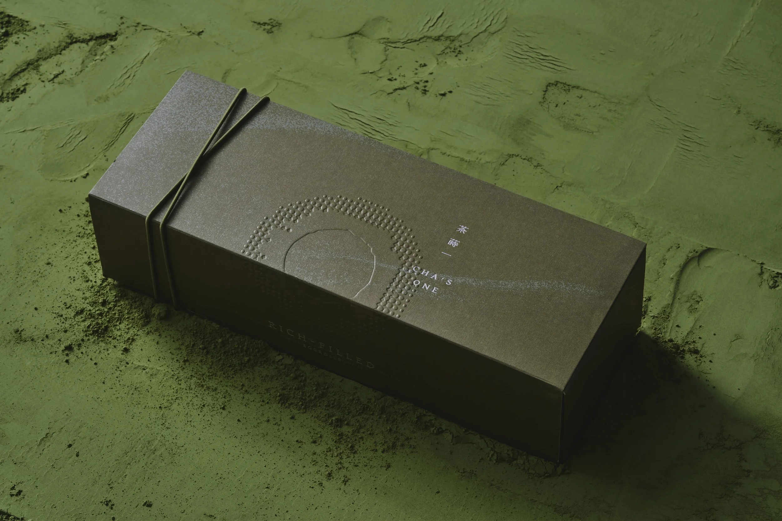
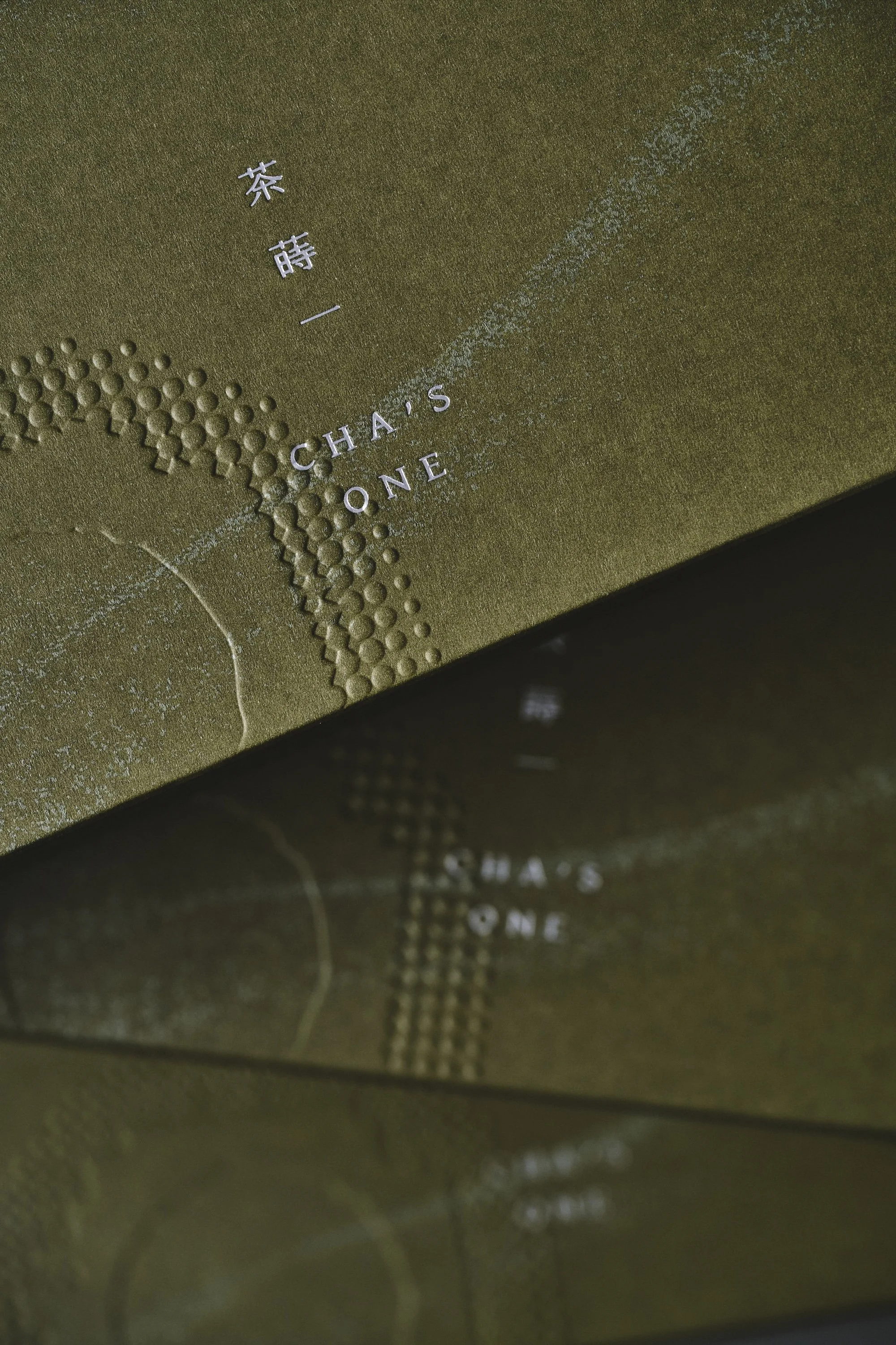
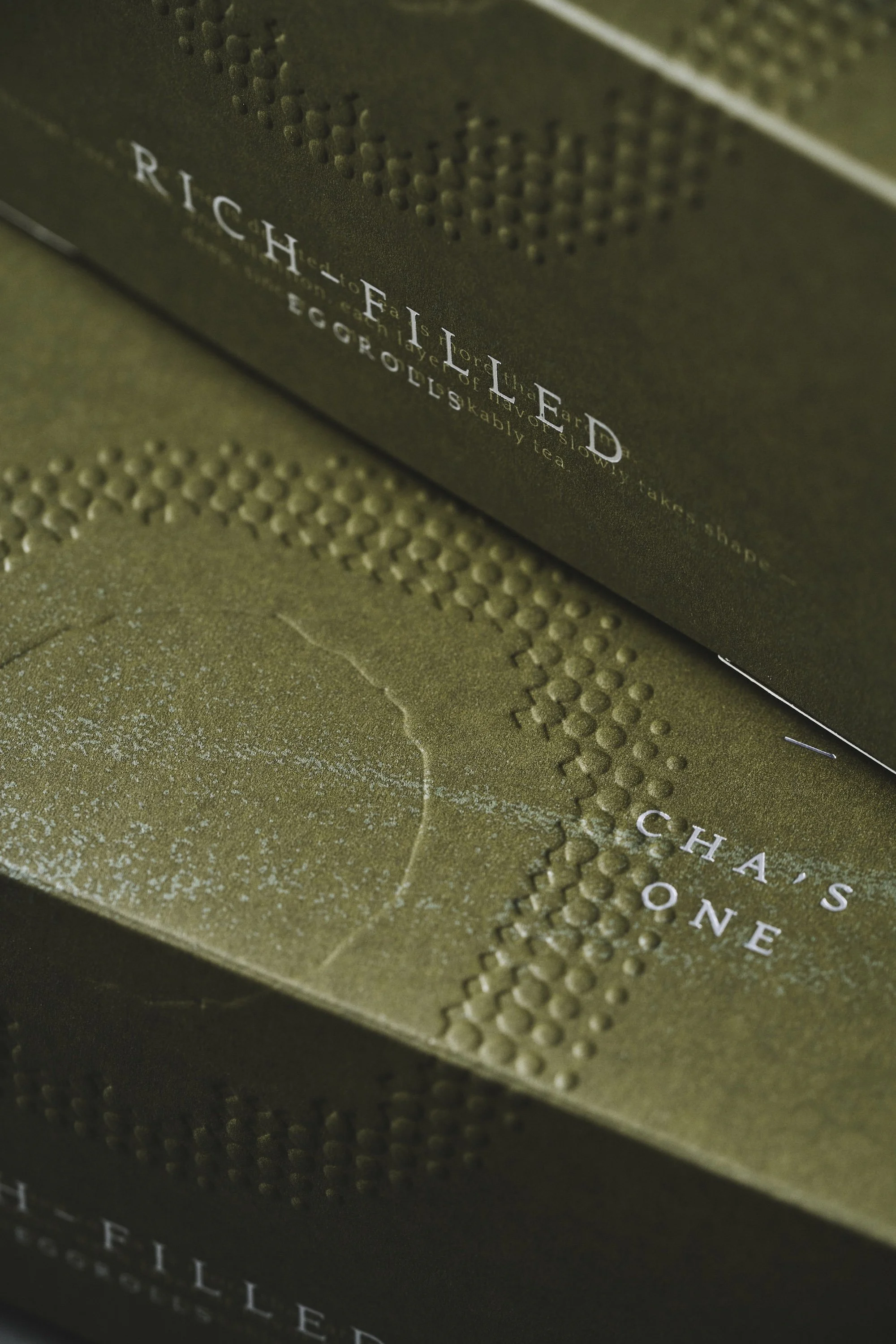
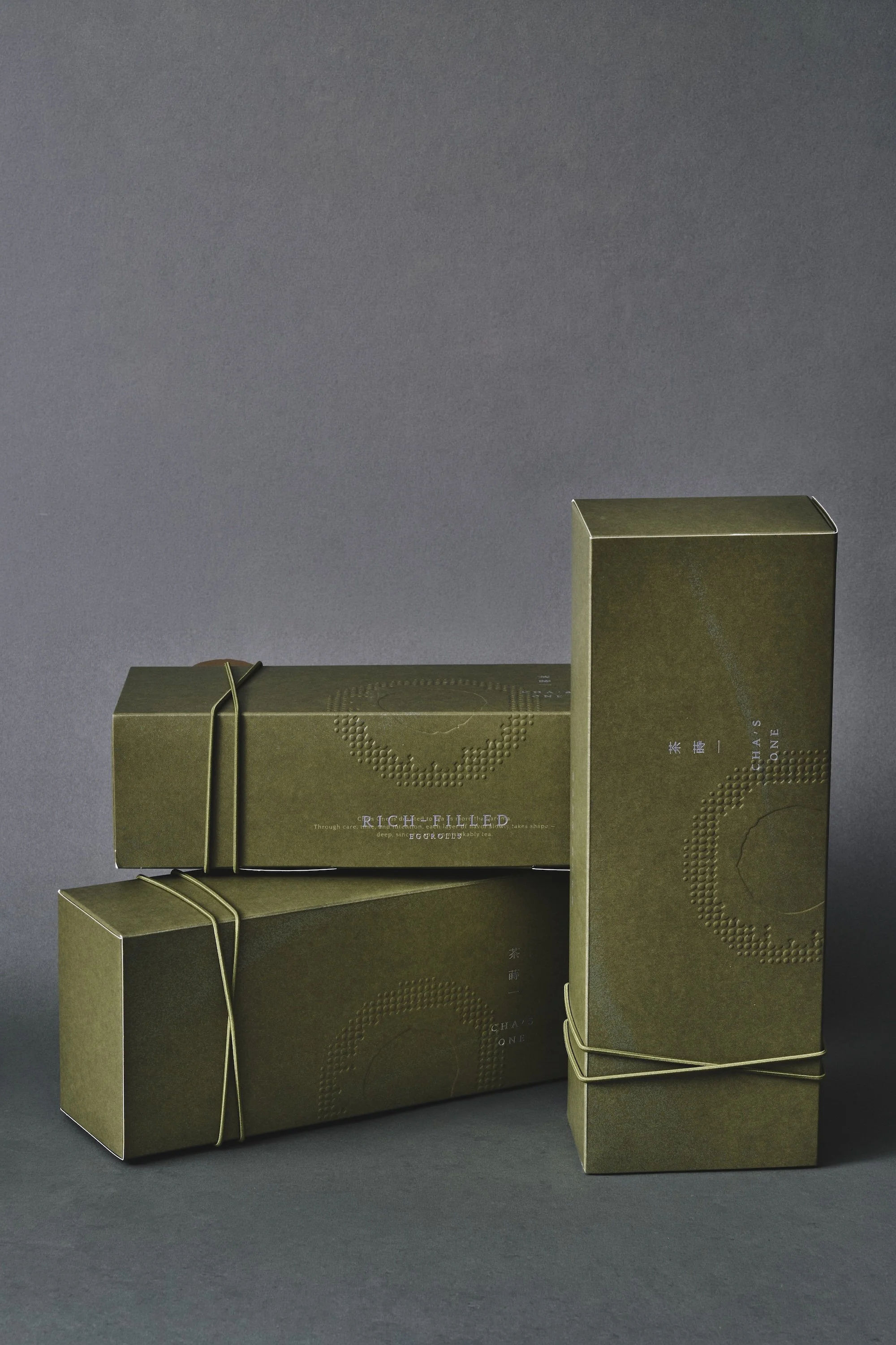
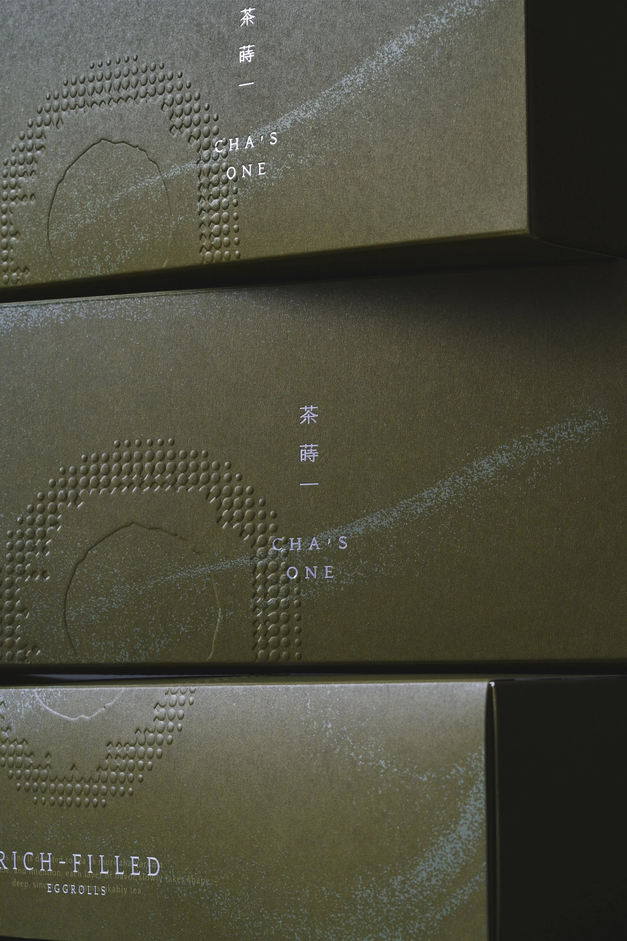
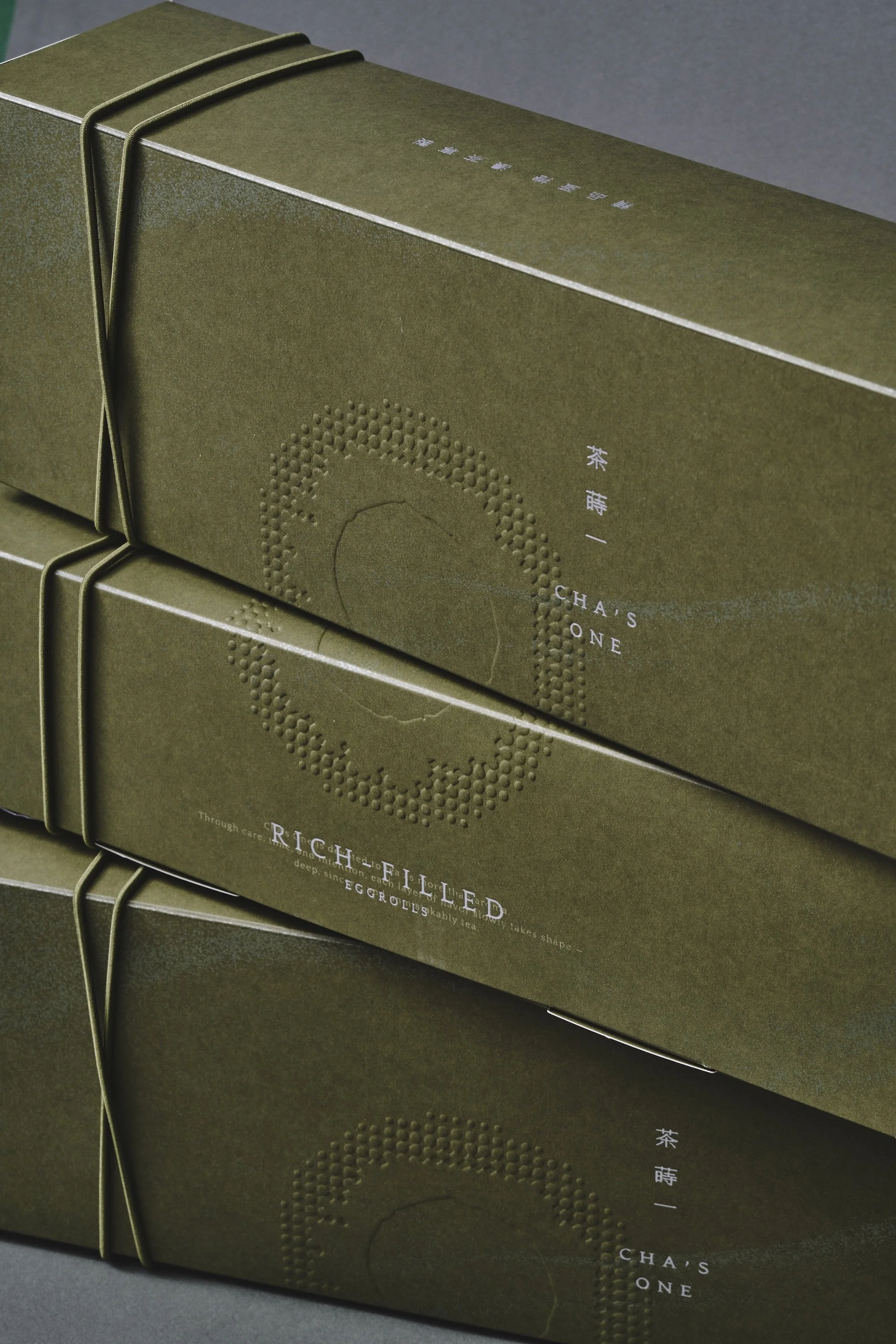
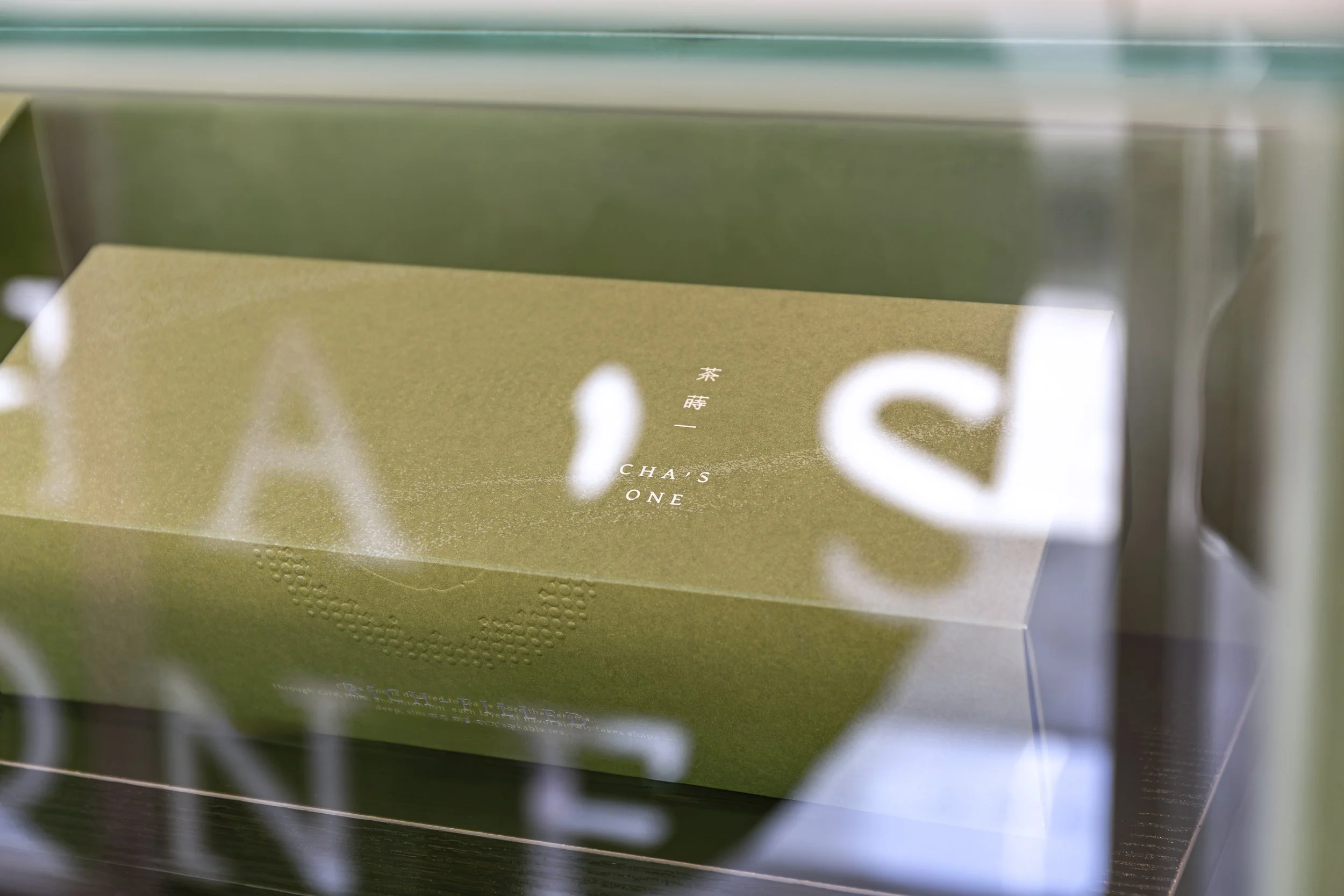
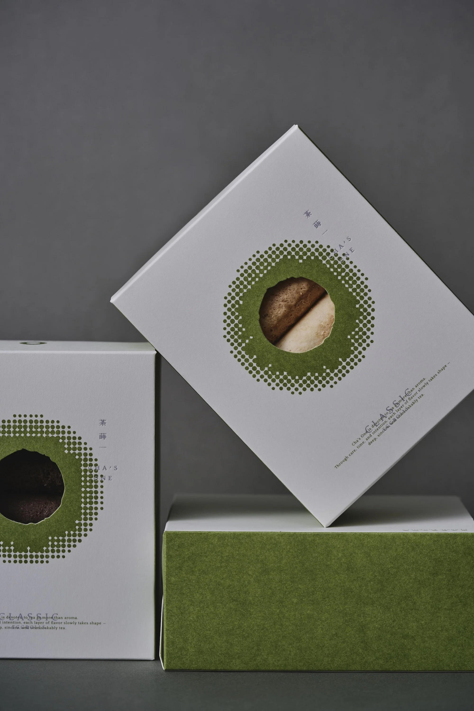
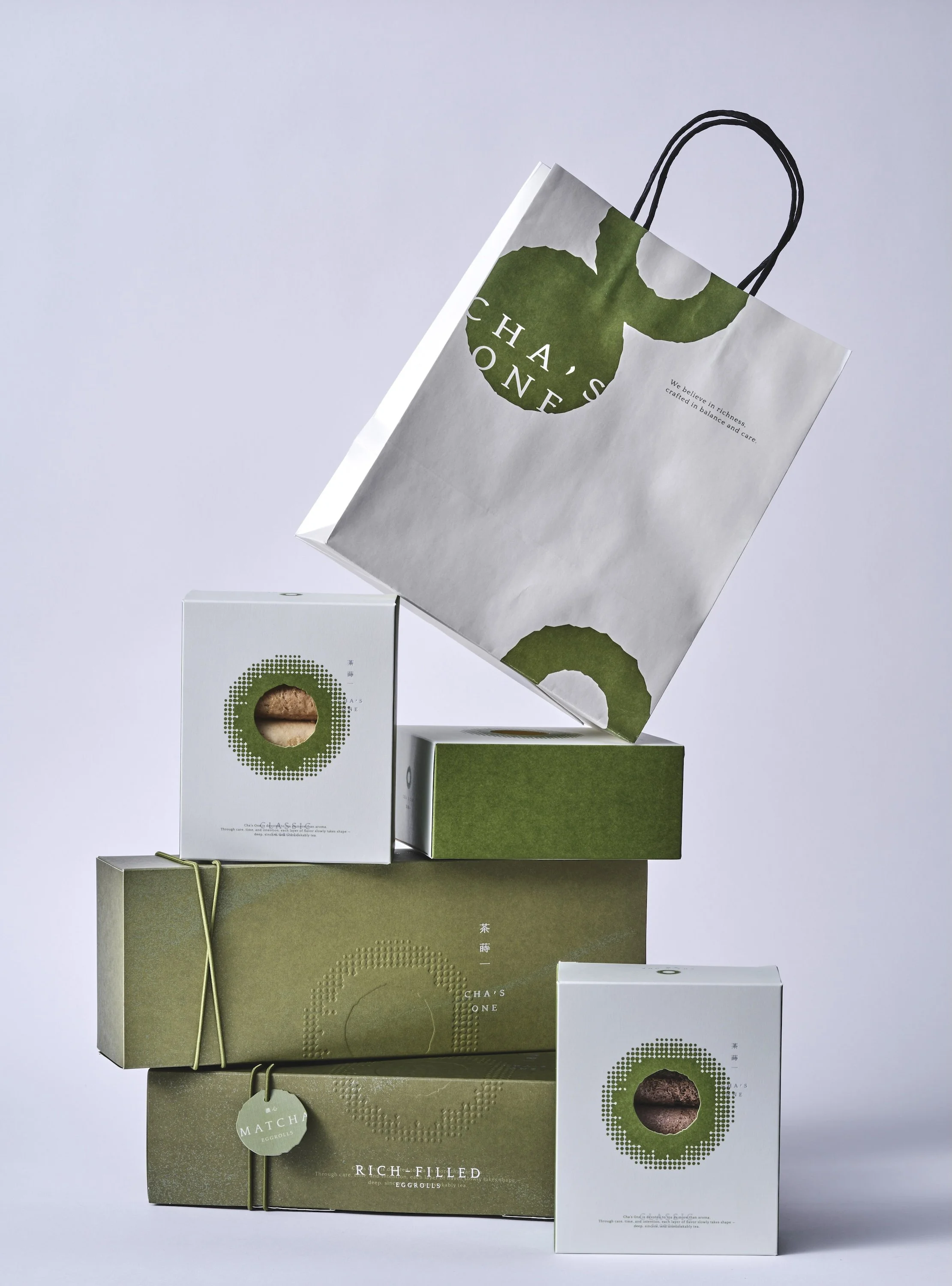
蛋捲的包裝設計,延續「蒔以初心,風味層疊成形」的品牌概念,以沉穩的抹茶綠作為主色,呼應茶、山林與自然的純粹質地。盒身以簡潔俐落的書卷式結構呈現,象徵時間翻頁,也呼應品牌對文化與工藝的尊重。環形的標誌圖騰以細緻壓紋工法呈現,讓粉狀元素在光影變化中若隱若現,如同風味隨時間逐層堆疊。整體包裝捨去繁複裝飾,以材質、比例與細節創造低調而精緻的質感,讓產品從視覺、觸覺到開盒體驗,都傳遞品牌專注於品質的初心。每一層包裝如同茶湯風味般逐步展開,將自然、時間與手作溫度完整封存其中。
The egg roll packaging continues the brand concept of “Rooted in Beginnings, Layered with Flavor.” A deep matcha green serves as the primary color, reflecting the pure essence of tea, mountains, forests, and nature.
The box features a clean and refined book-like structure, symbolizing the turning of pages through time while expressing the brand’s respect for culture and craftsmanship. The circular logo is presented through delicate embossed detailing, allowing the powder-like elements to subtly emerge and disappear with changes in light and shadow, much like flavors gradually unfolding over time.
The packaging intentionally avoids excessive decoration. Instead, material, proportion, and refined details create a quiet yet sophisticated aesthetic. From the visual and tactile experience to the moment of opening the box, every detail conveys the brand’s original commitment to quality.
Each layer of the packaging unfolds like the layers of flavor in a cup of tea, preserving the essence of nature, time, and the warmth of craftsmanship within.
留白,讓品牌成為主角
Negative Space,
Letting the Brand Take Center Stage
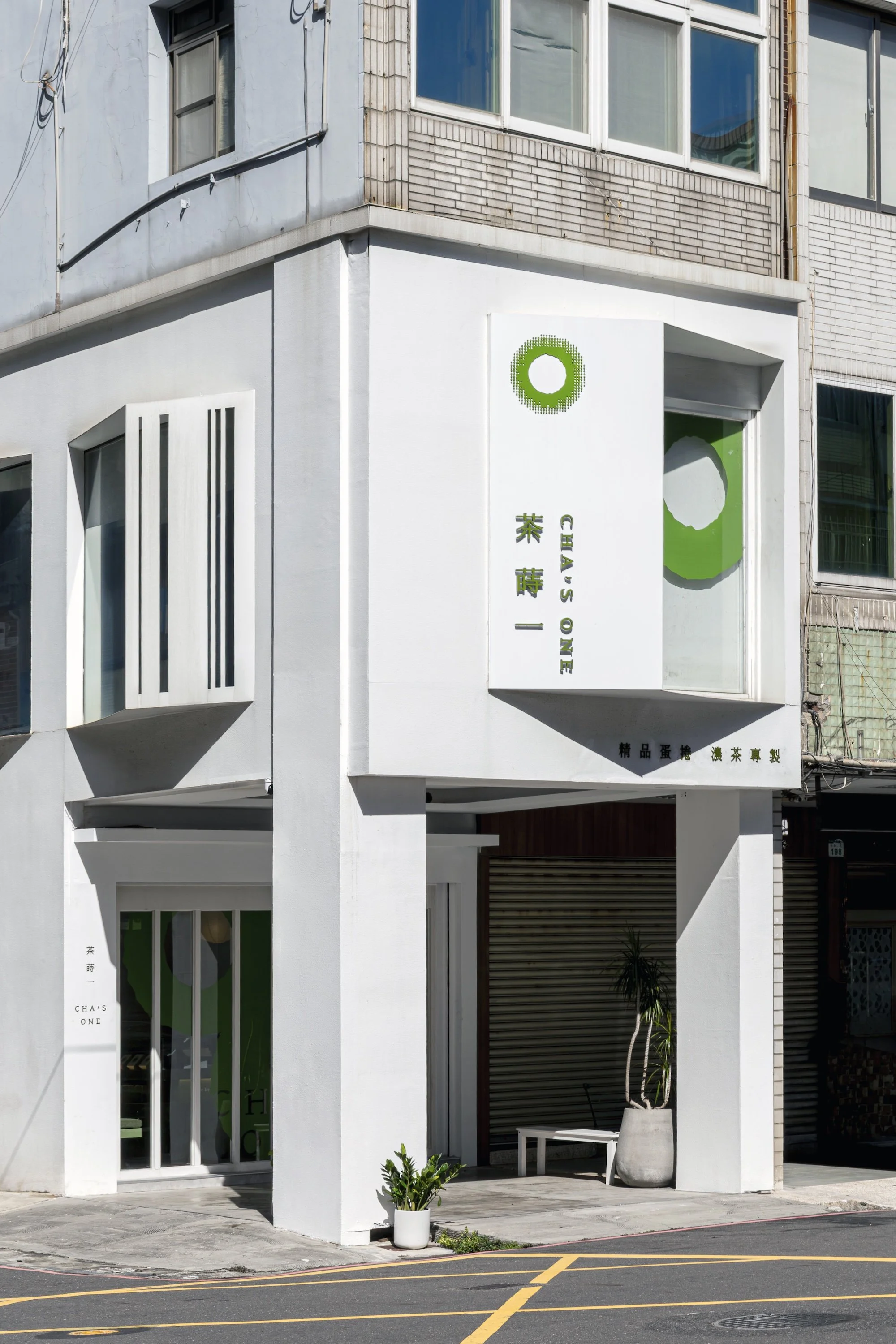
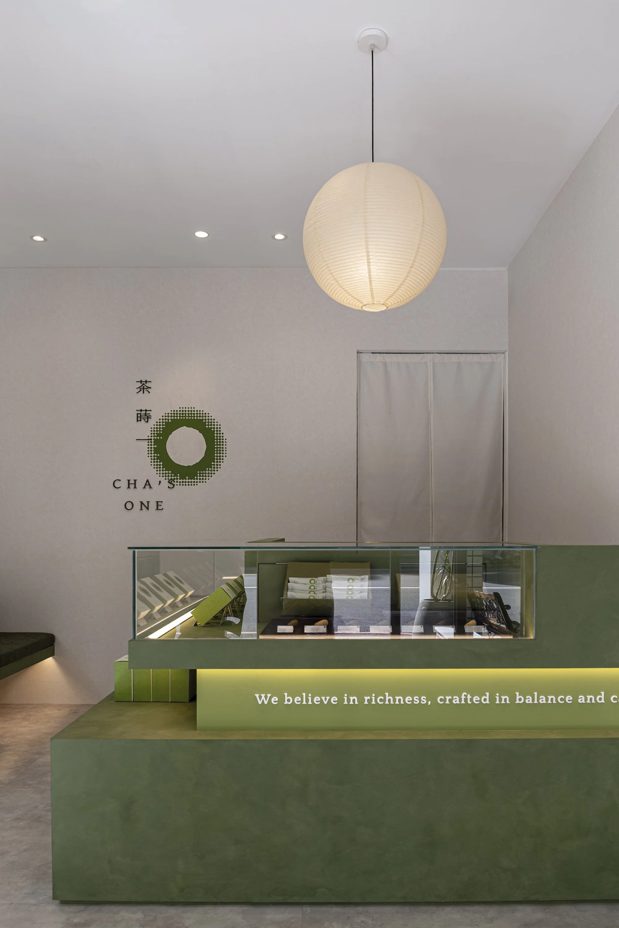
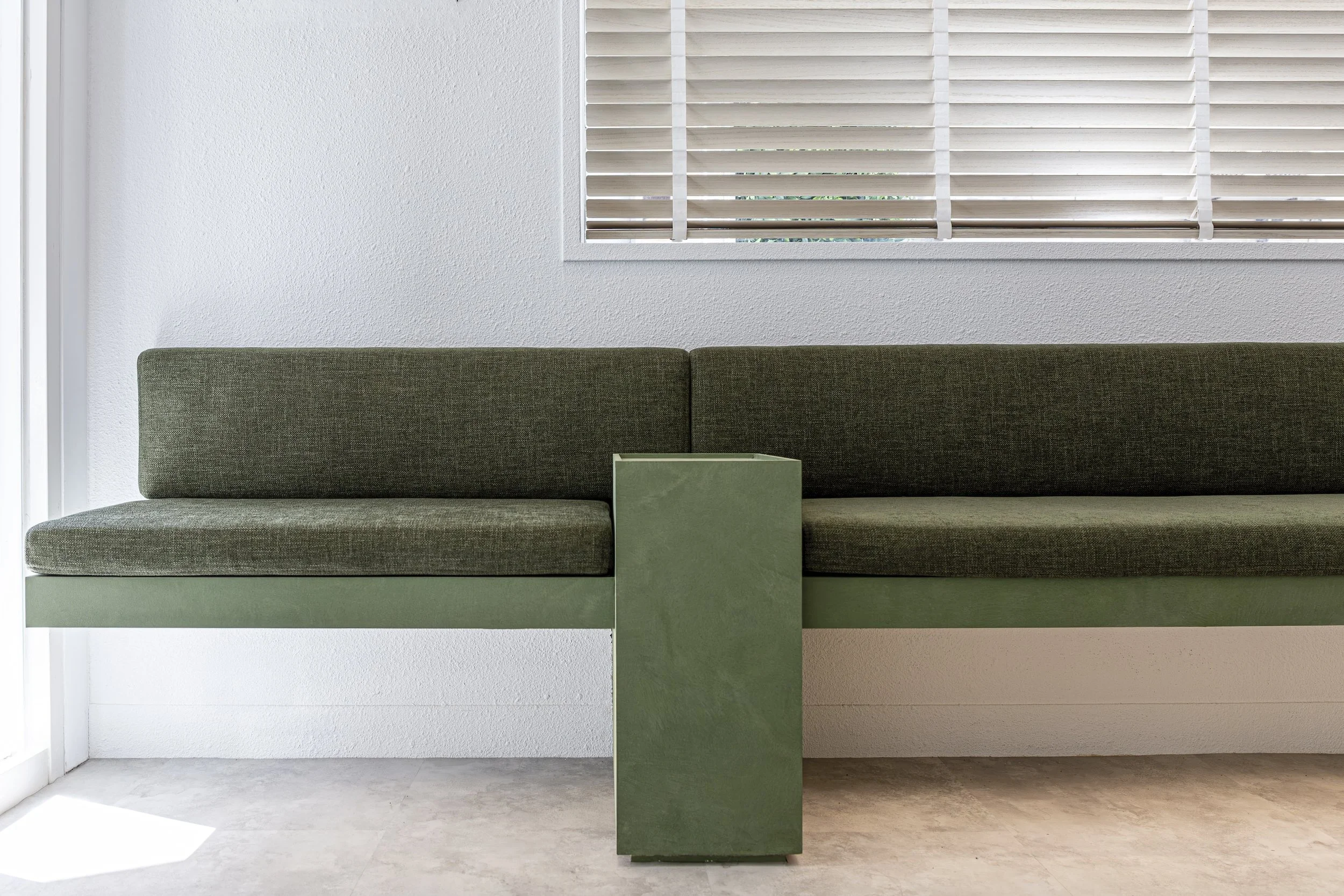
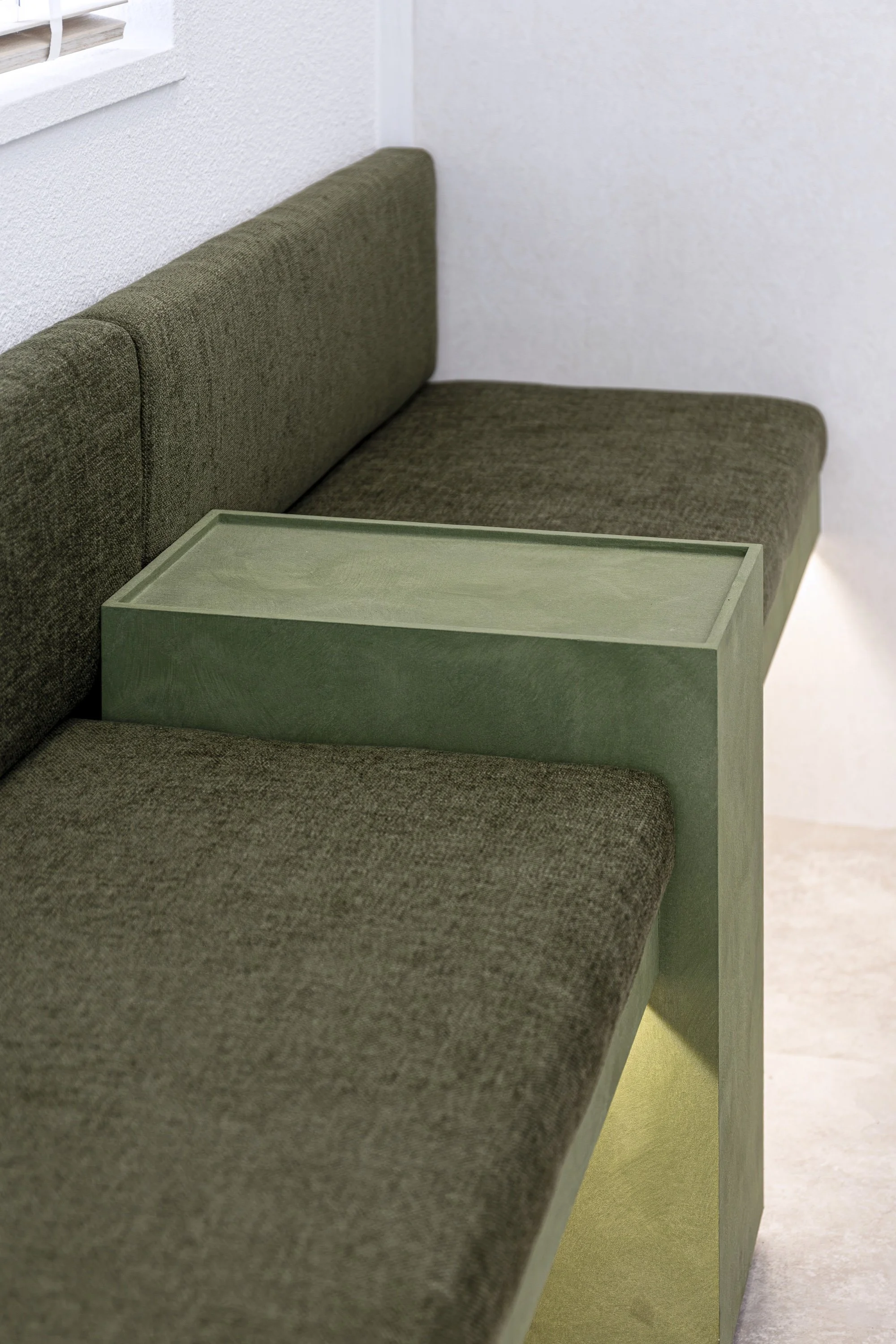
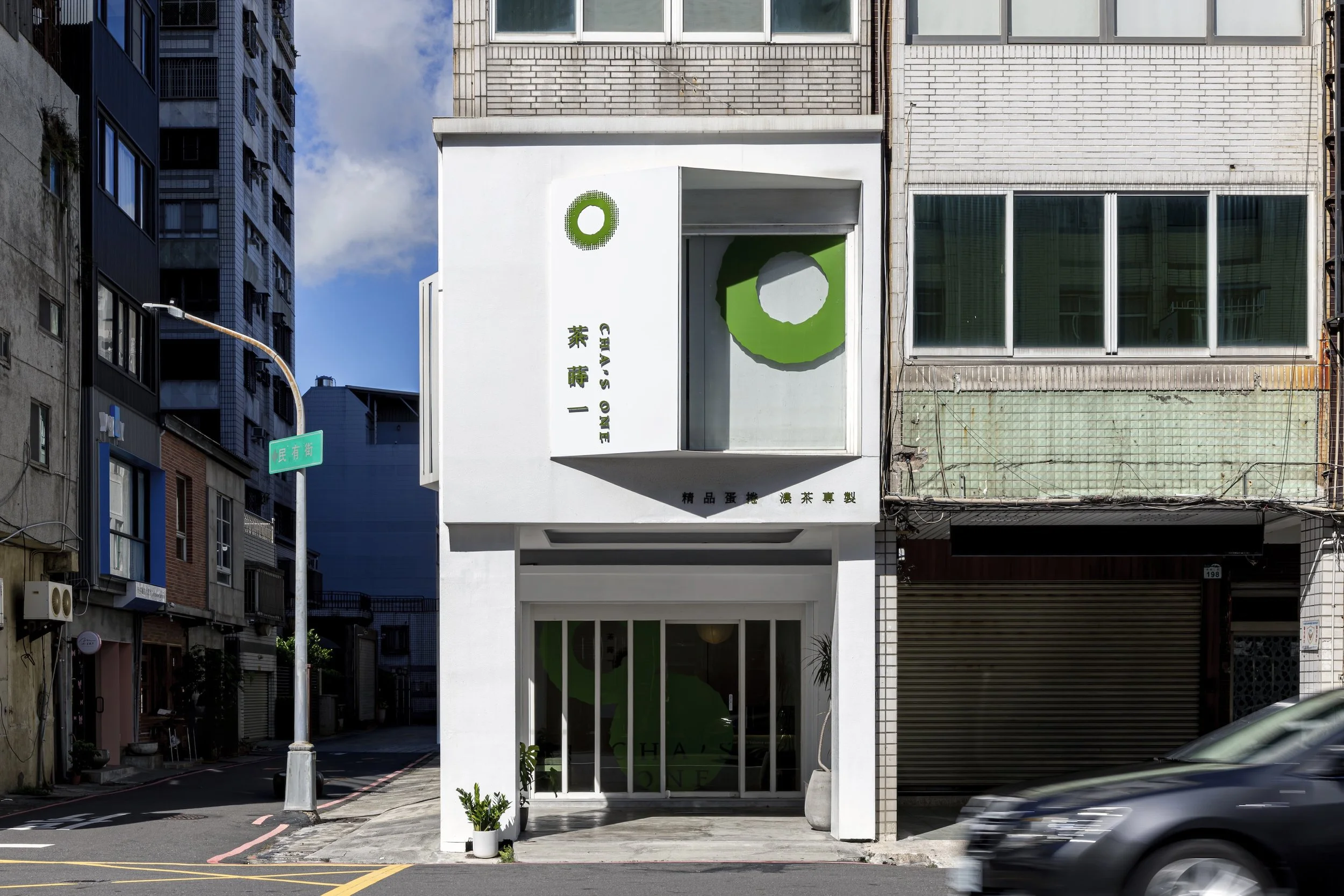
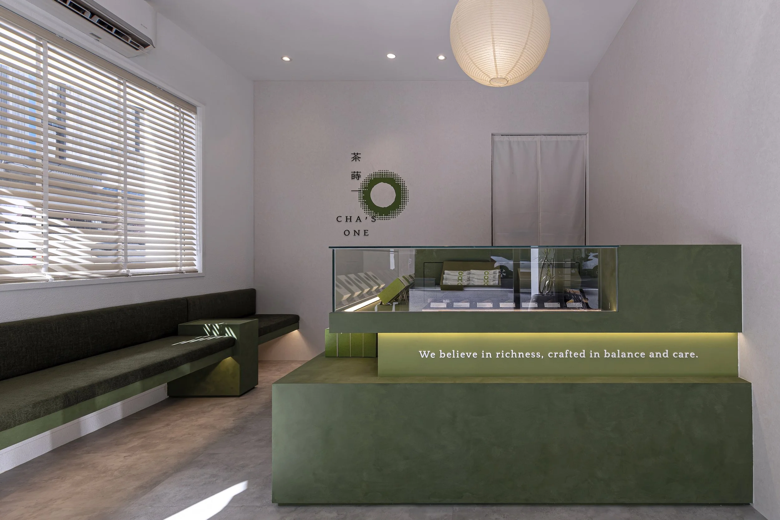
門市以潔白純粹的空間作為基底,透過大面積留白弱化繁複的視覺干擾,讓品牌主色調與商品自然成為空間中的視覺焦點。簡潔的線條、俐落的結構與適度的材質搭配,營造明亮、清新且具有質感的購物氛圍。空間不刻意強調裝飾,而是以「襯托」作為設計核心,讓商品在純粹的背景中被凸顯,完整展現產品本身的色彩、質地與特色。同時透過自然撒入的陽光與商品的陳列安排,建立舒適的購物體驗,使門市不只是販售商品的場所,更成為品牌精神與產品價值的舞台。
The store is built upon a clean, pure white interior, using generous negative space to minimize visual distractions and allow the brand’s signature color and products to naturally become the visual focus.
Simple lines, refined structures, and carefully selected materials create a bright, fresh, and sophisticated shopping environment. Rather than emphasizing decoration, the design centers on the idea of “enhancement”—allowing the products to stand out against a pure background and fully express their colors, textures, and unique characteristics.
Natural sunlight and thoughtfully arranged product displays further create a comfortable and inviting shopping experience. The store is therefore more than simply a place to purchase products; it becomes a stage where the brand’s spirit and product values can be fully expressed.