品牌設計 / 視覺設計 / 品牌氛圍營造
Branding / Visual Design / Brand Curation

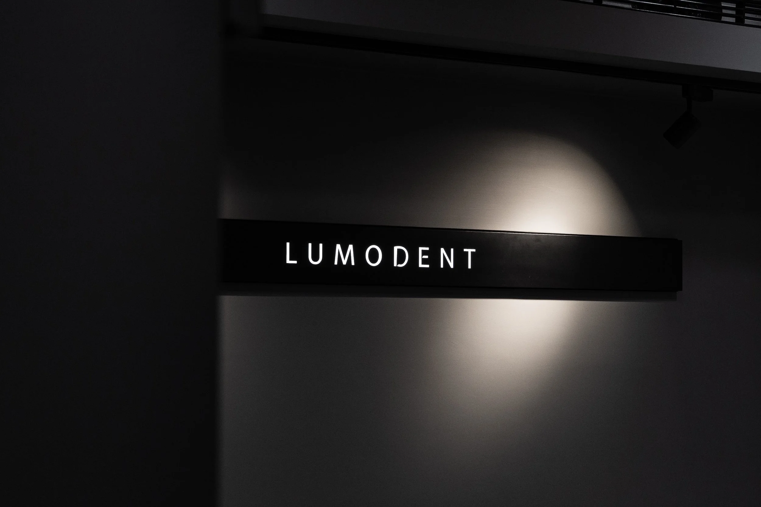
非黑即白的理性精神
The spirit of b/w
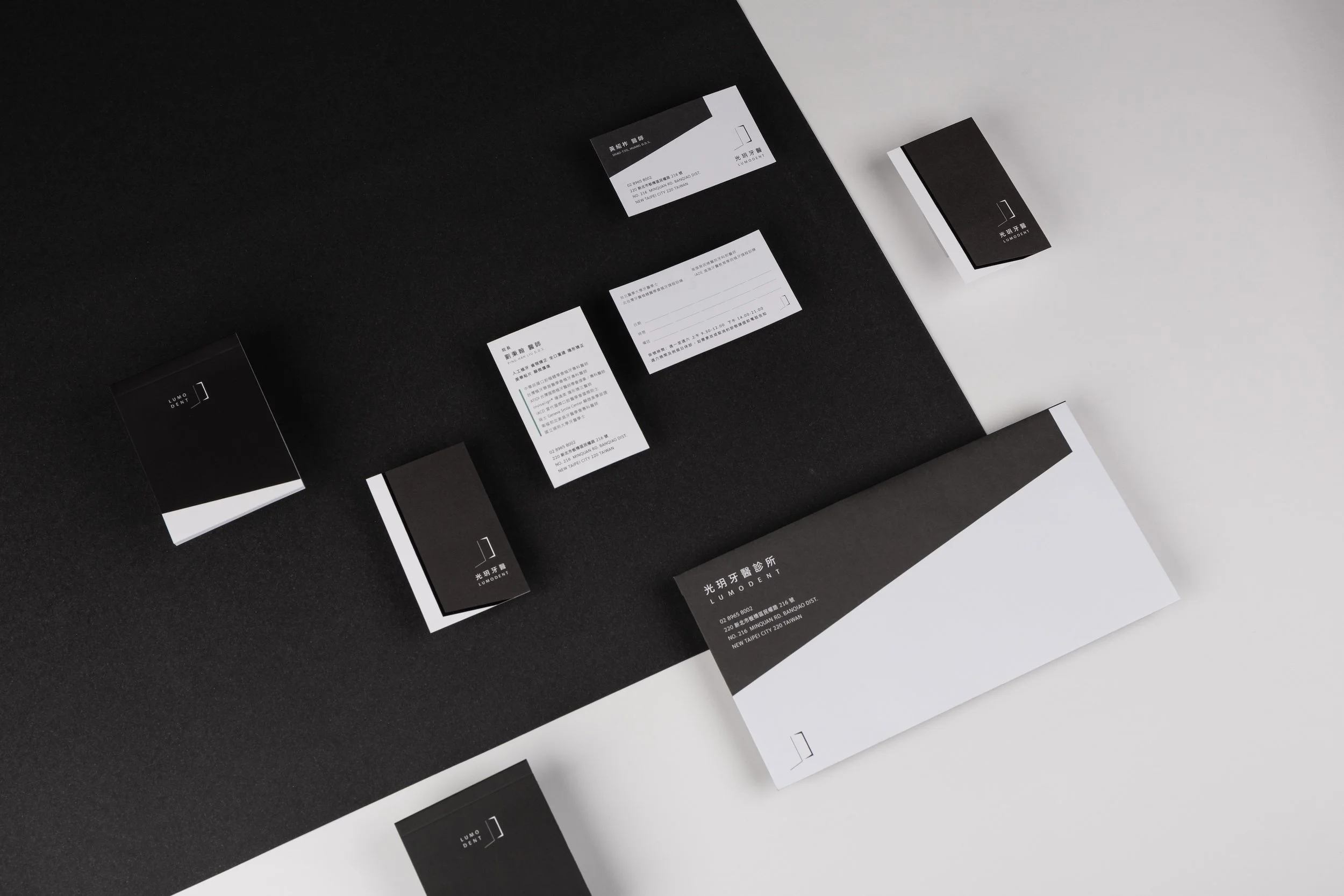
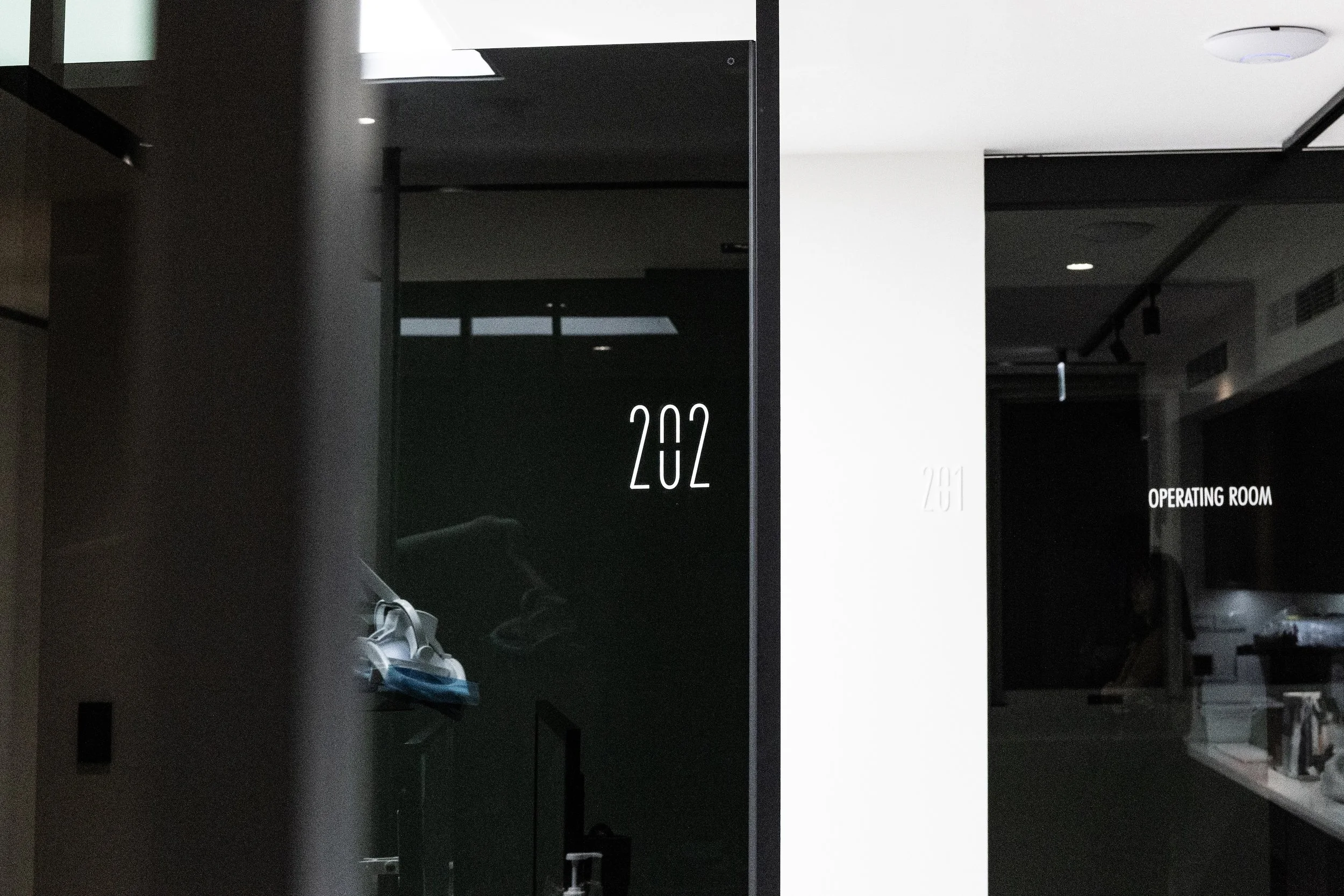
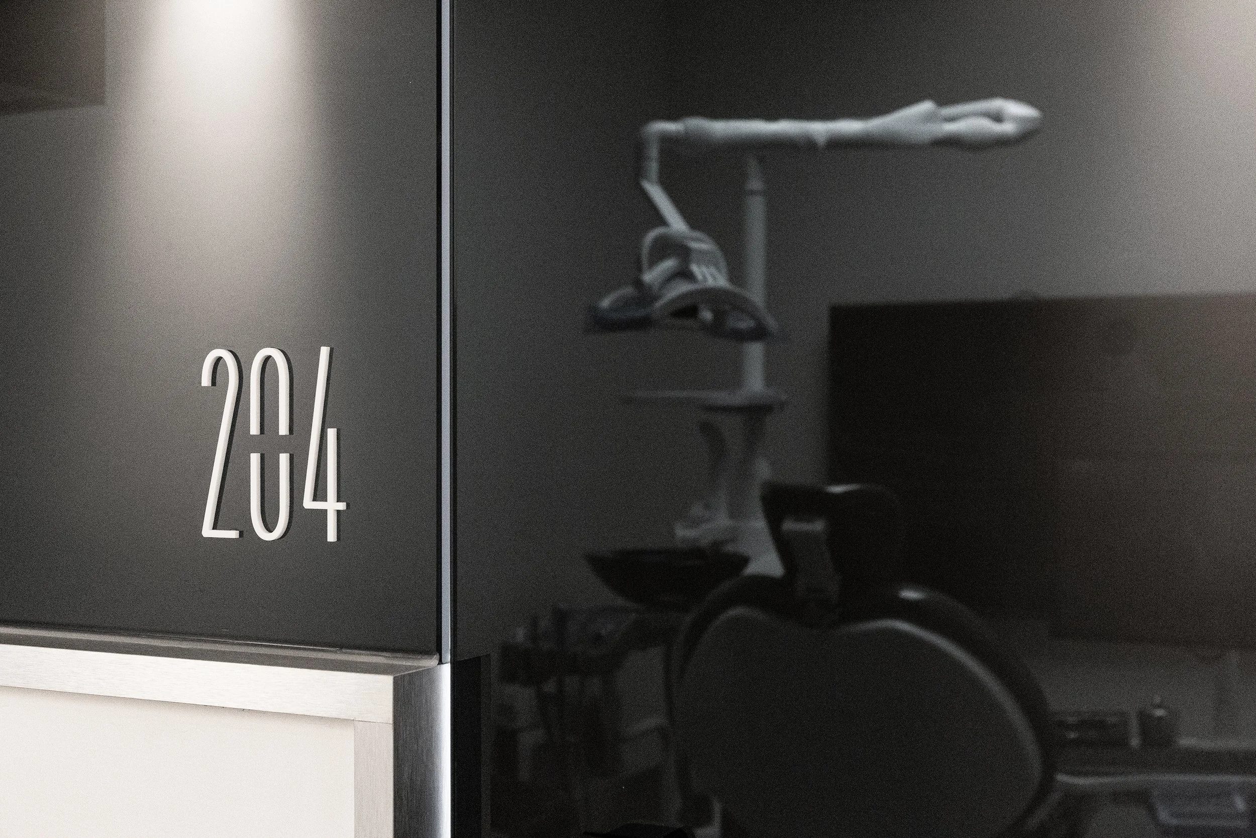
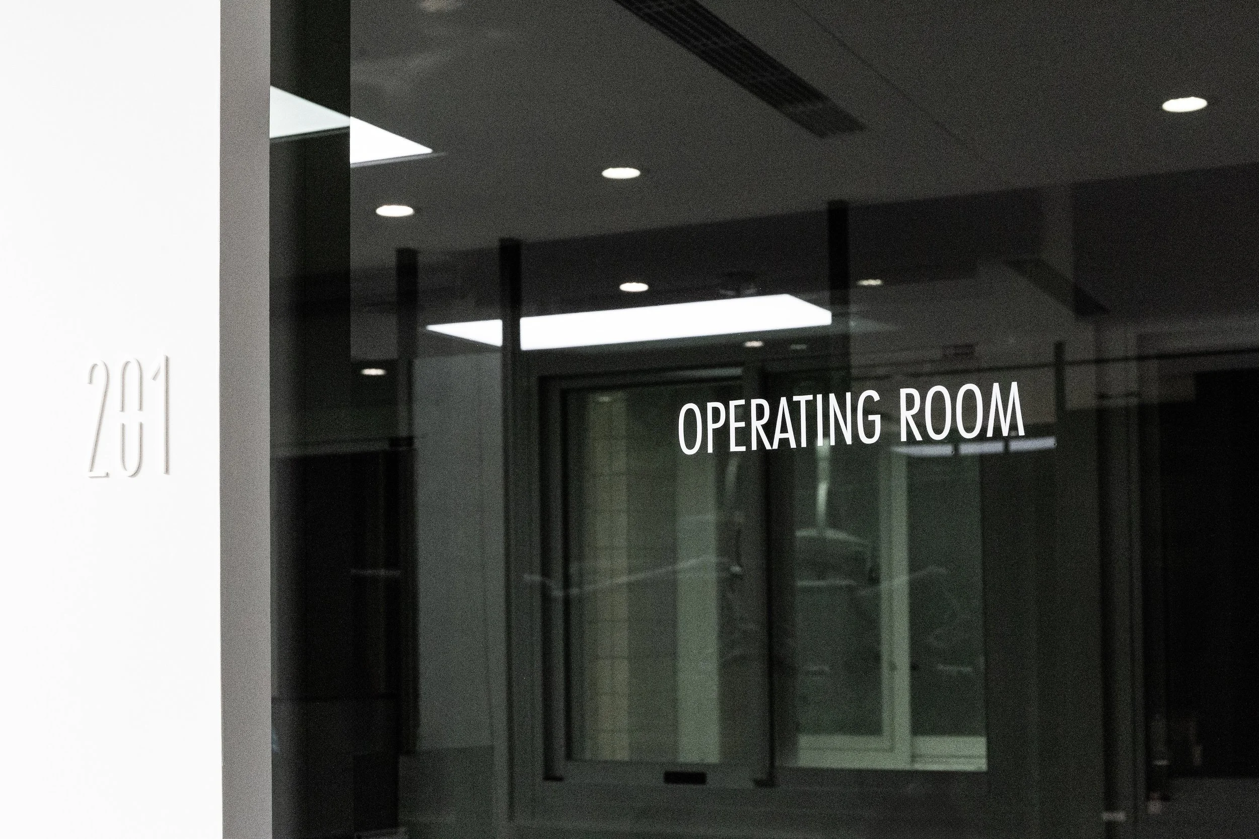
品牌以「非黑即白」的理性精神為核心,透過黑白色調構築出簡潔、純粹且專業的視覺語言,象徵診所對精準診斷與專業治療的堅持。黑色代表沉穩與專注,白色象徵潔淨與信任,兩者相互平衡,傳遞出專科醫師嚴謹而高效的醫療態度。
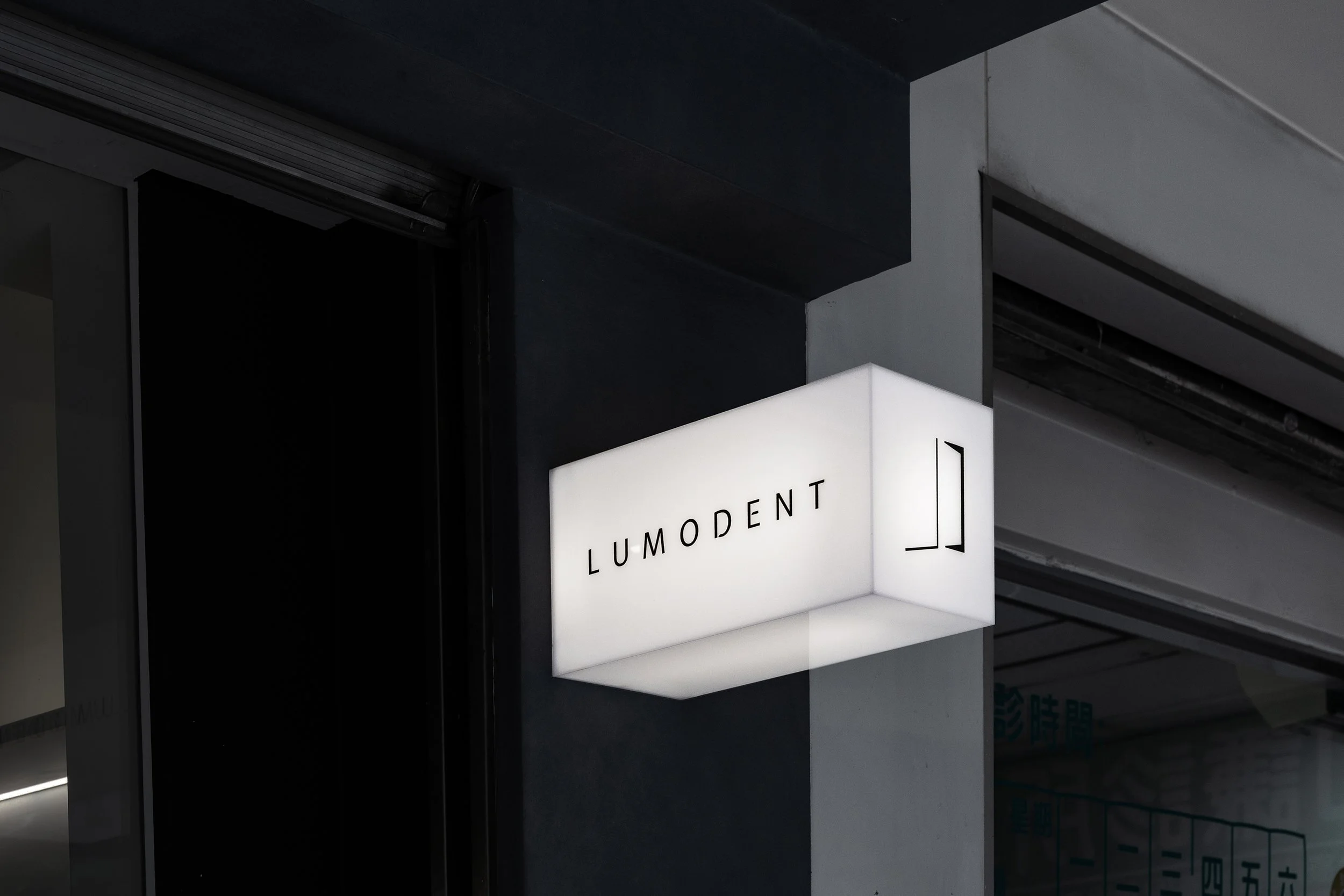
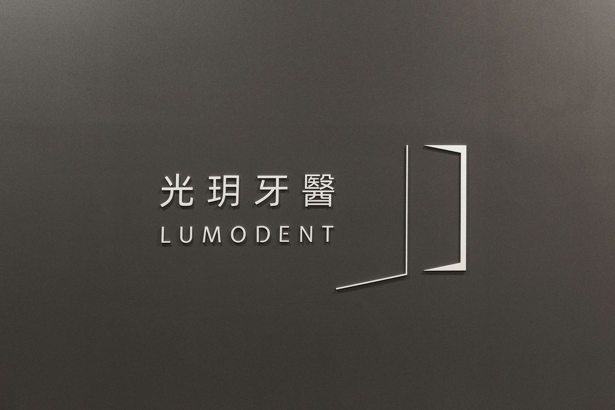
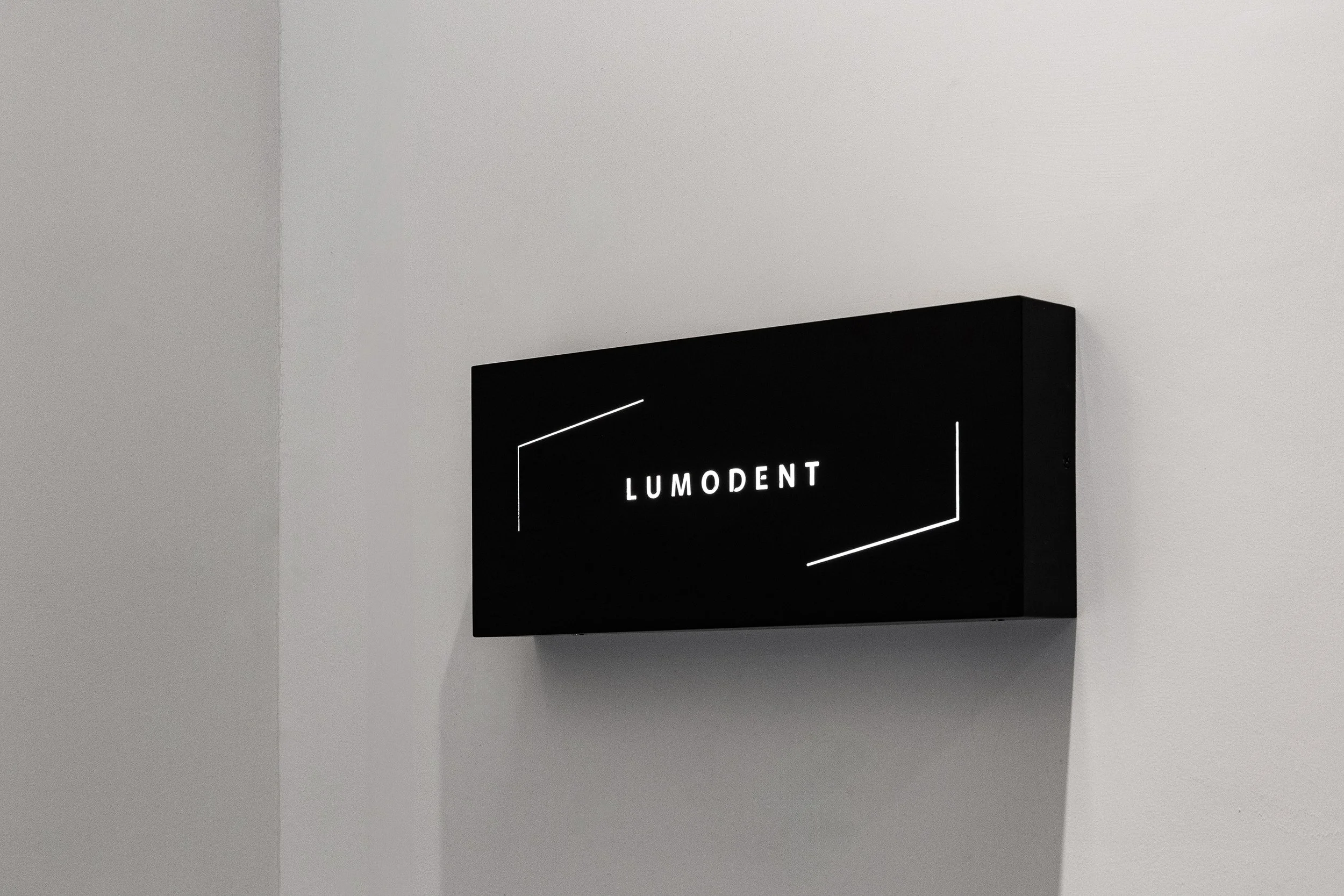
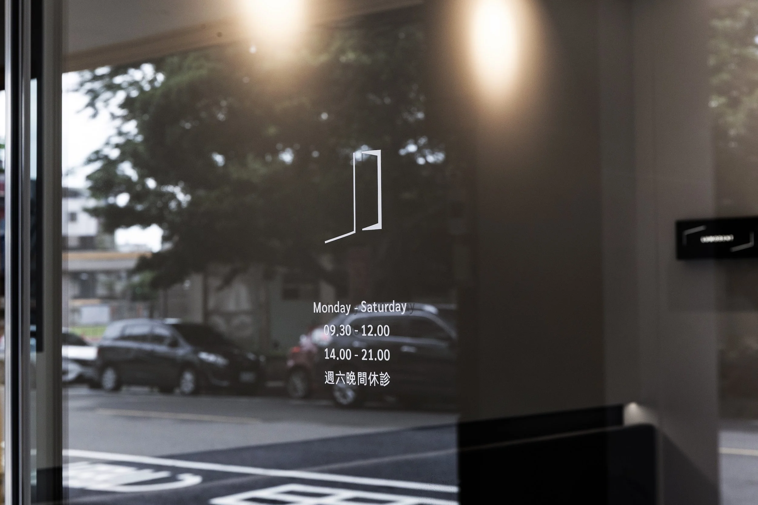
Logo 設計靈感源自一道自空間中透出的光芒,象徵知識與技術的啟發,亦如醫者在患者心中帶來的希望與安心感。這道光不僅是視覺上的亮點,更是品牌核心價值的凝縮 — 以專業技術照亮每一位患者的笑容與健康之路。
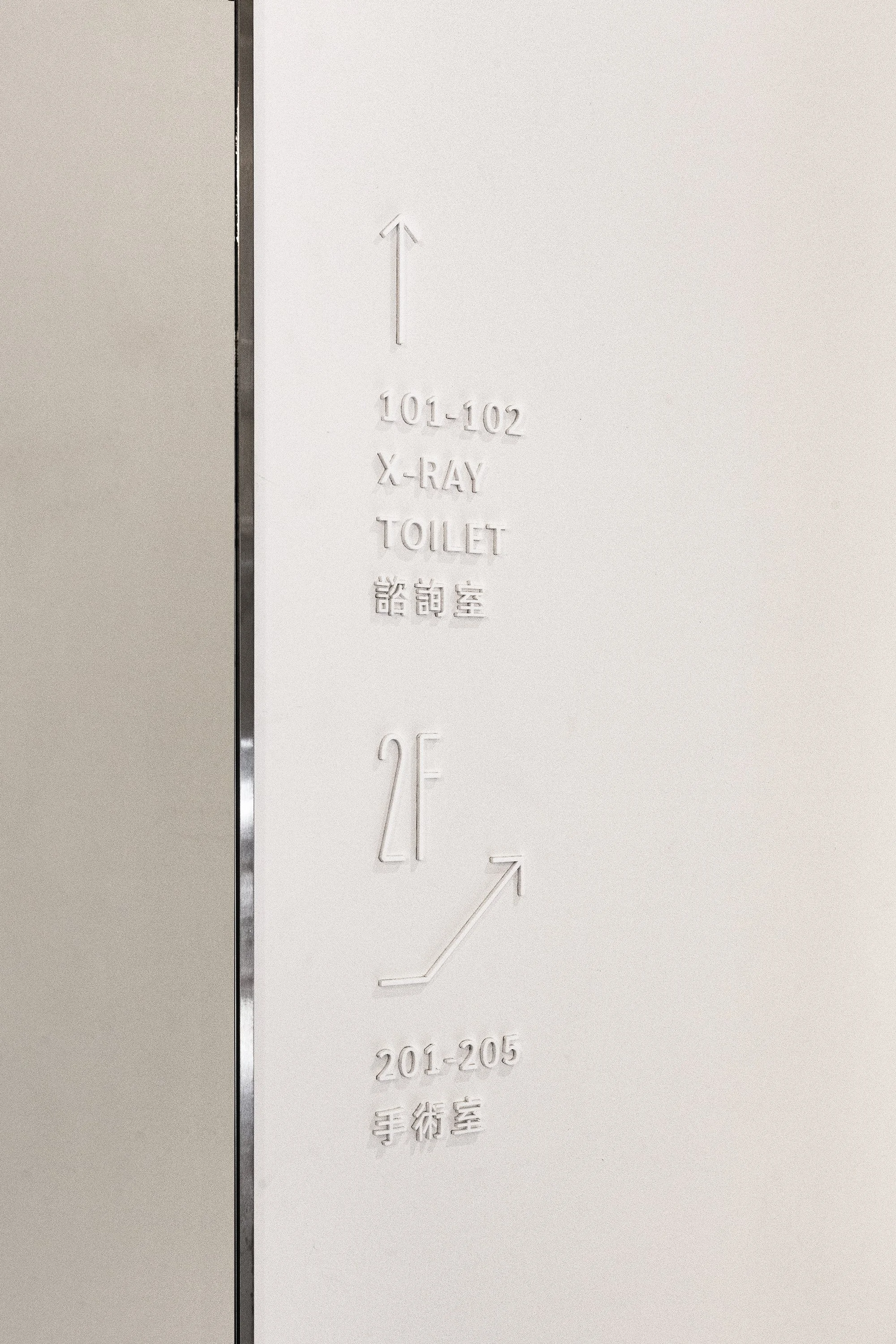
整體設計融合質感與功能性,確保在各類媒介與空間應用中都能展現清晰辨識度,同時維持高端醫療品牌的形象,傳達出診所提供全面性齒科診療服務的承諾與信賴感。
The brand is built on the rational spirit of “black or white,” using a monochrome palette to create a clean, pure, and professional visual language that symbolizes the clinic’s dedication to precise diagnosis and expert treatment. Black represents steadiness and focus, while white stands for cleanliness and trust — the two balancing each other to convey the rigorous and efficient medical approach of the specialists.
The logo design draws inspiration from a beam of light emerging from within a space, symbolizing the spark of knowledge and technique, as well as the hope and reassurance a doctor brings to a patient’s heart. This light is not only a visual focal point but also a distillation of the brand’s core values — illuminating each patient’s smile and path to health with professional expertise.
The overall design blends refinement with functionality, ensuring high clarity and recognition across various media and spatial applications while preserving the image of a premium medical brand. It communicates the clinic’s commitment and trust in providing comprehensive dental care.