ARCHIVE

亞源科技 越南

商業空間設計
Commercial Space Design


空間中流動的光影語彙

flowing light and shadow

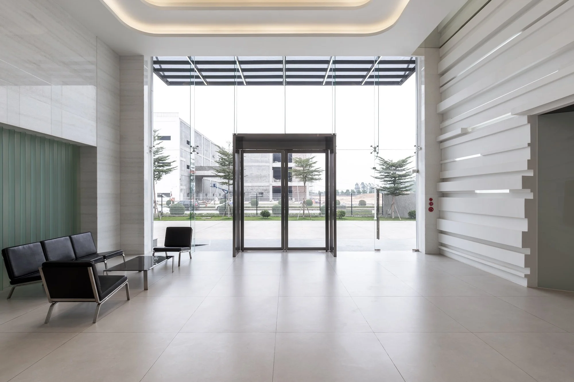
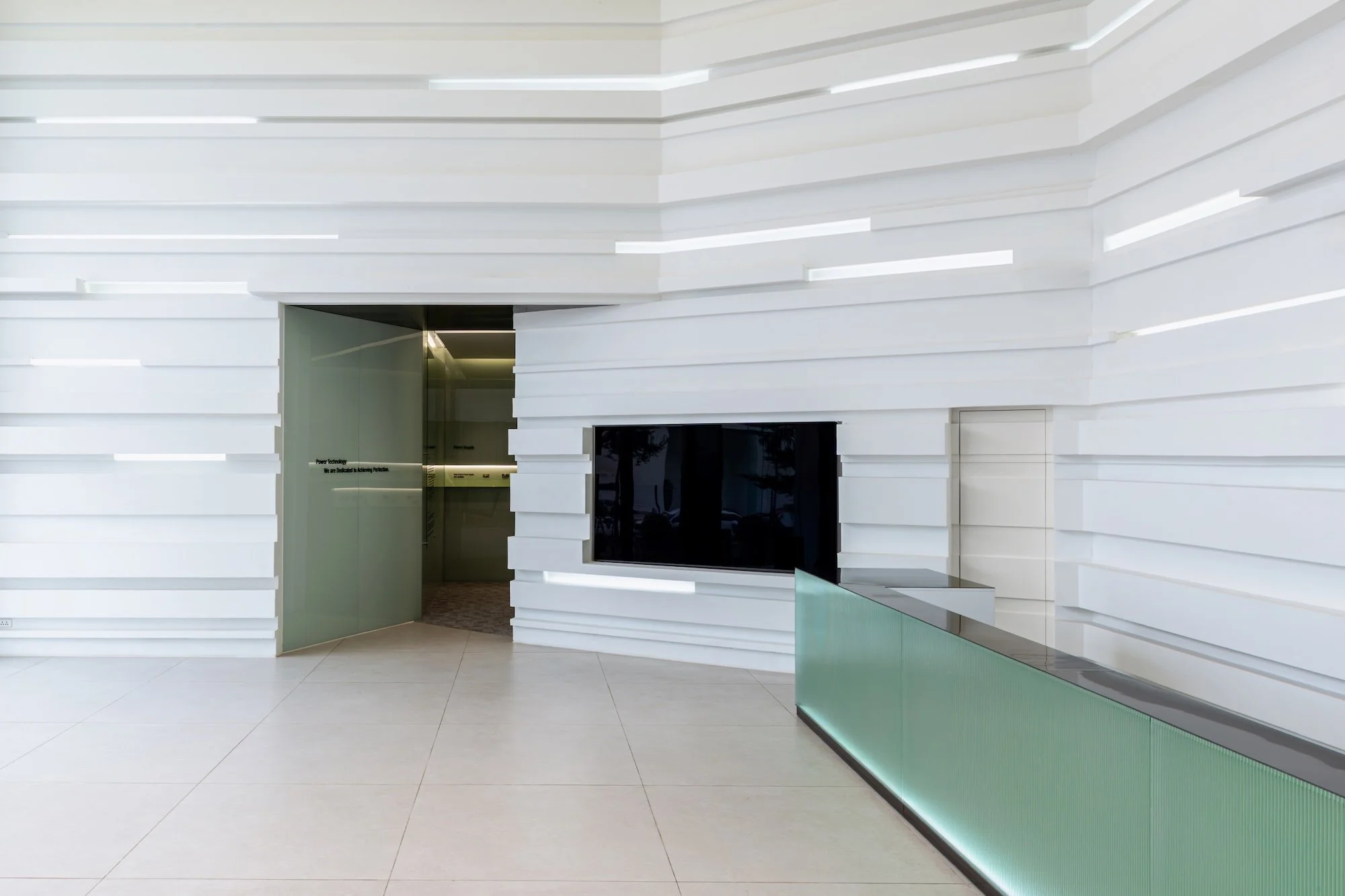
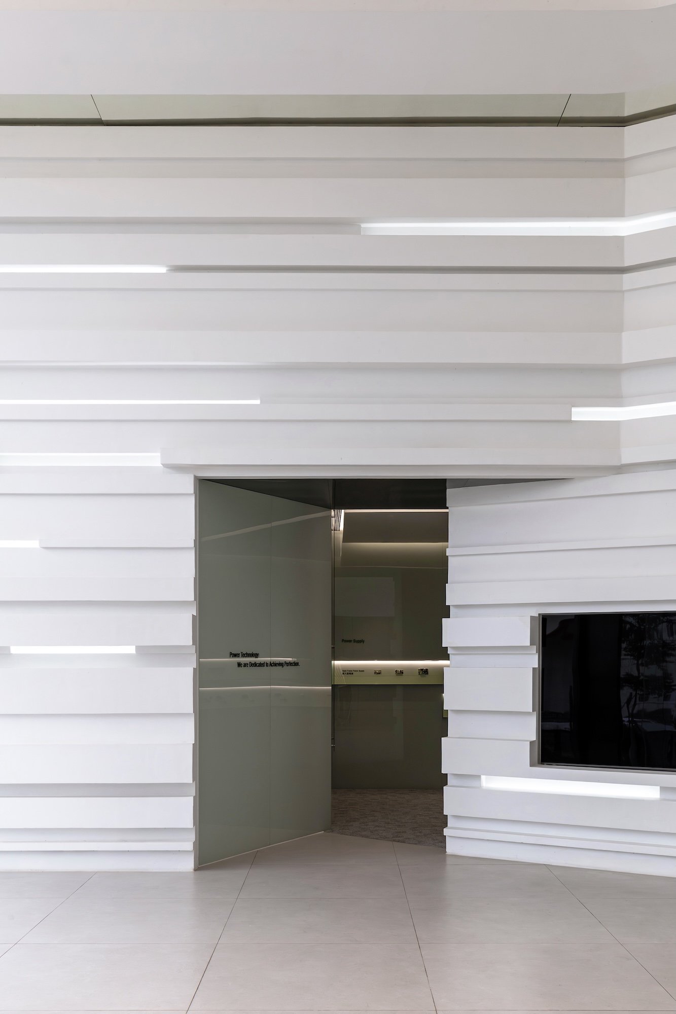
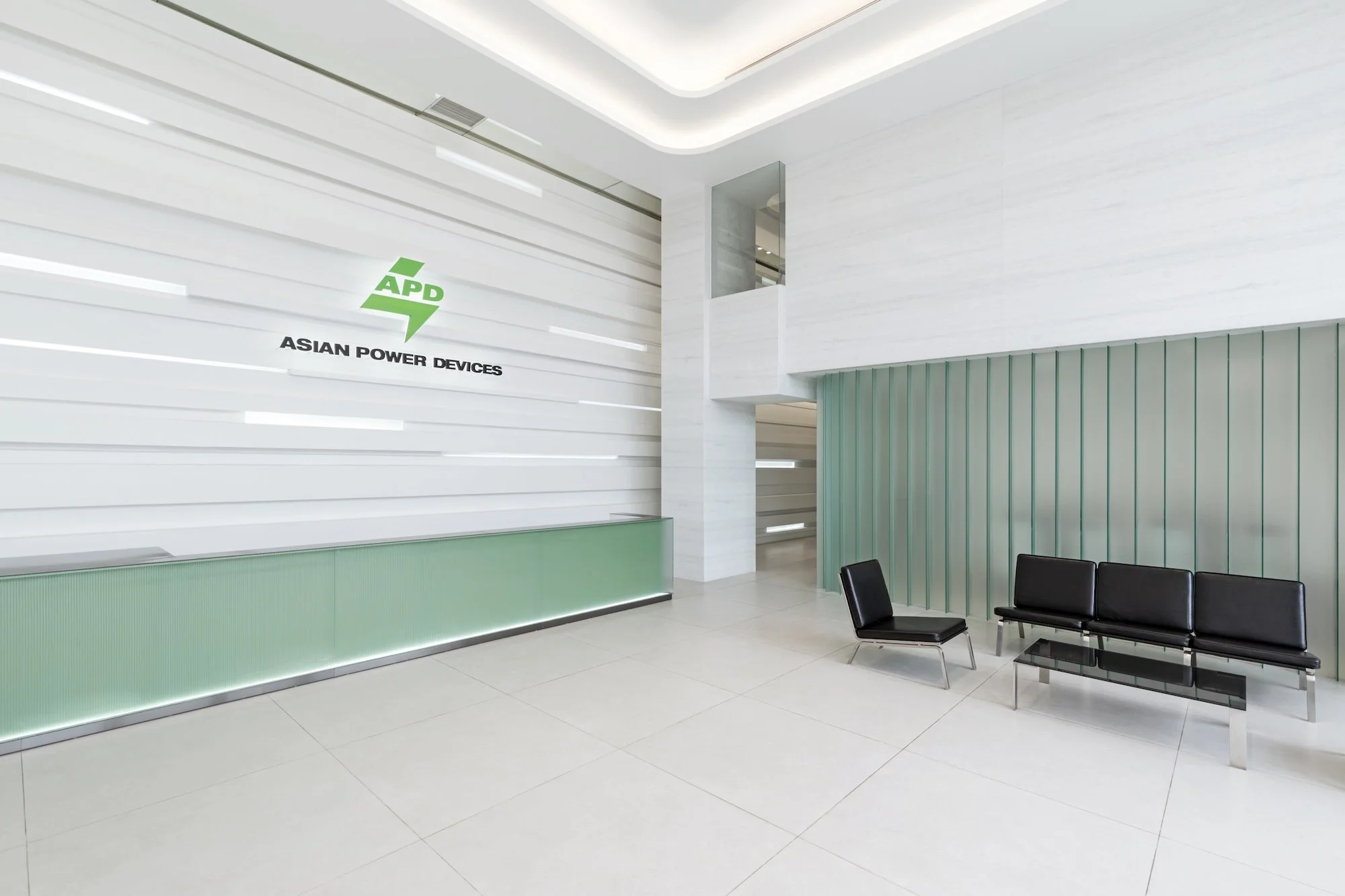
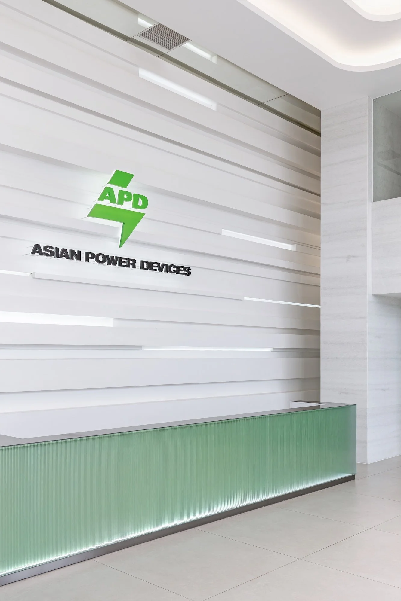
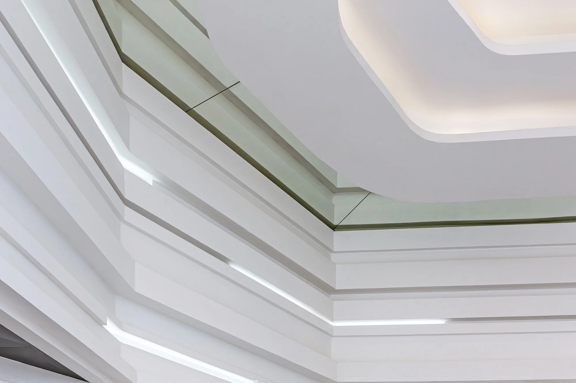
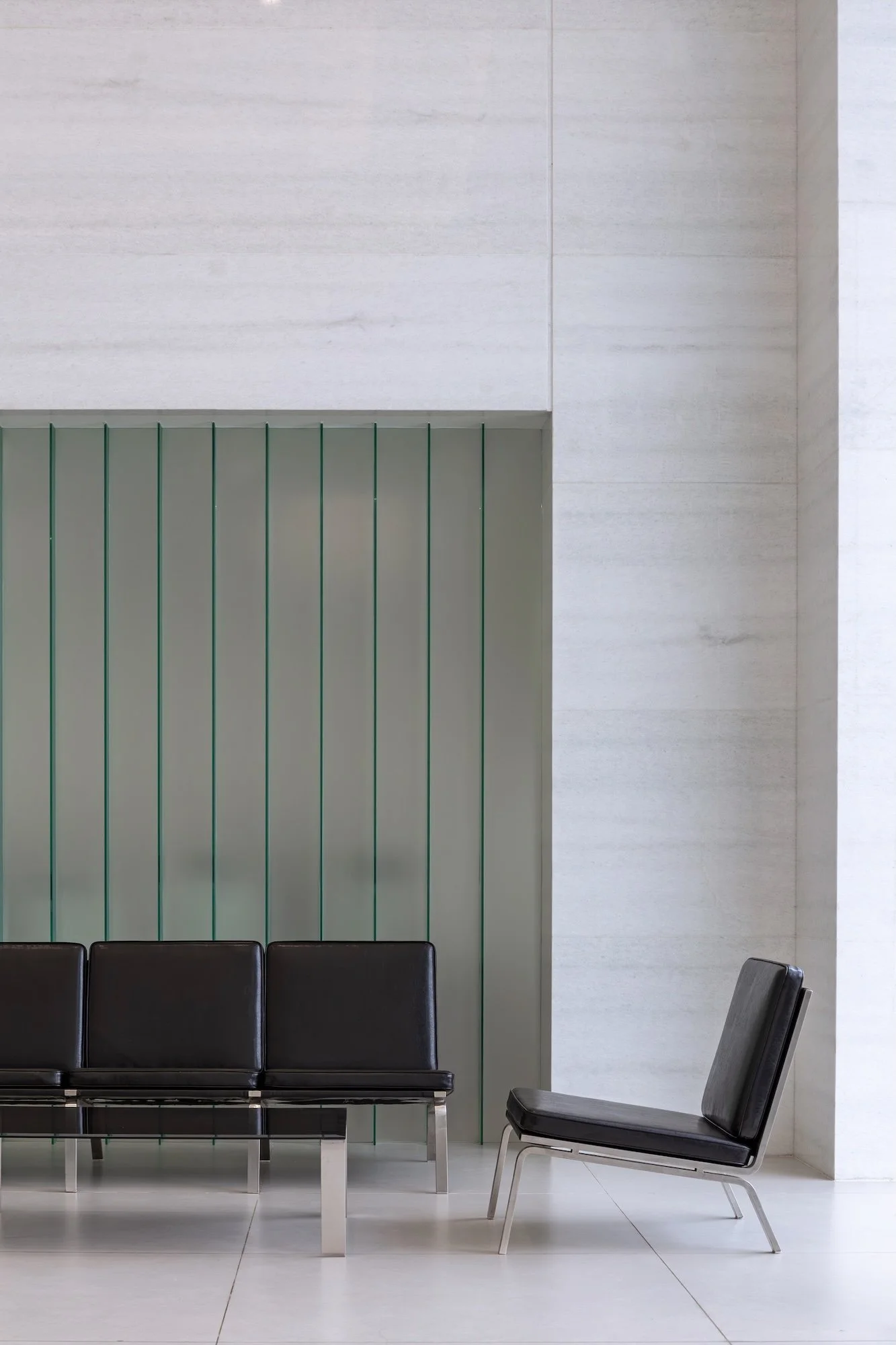
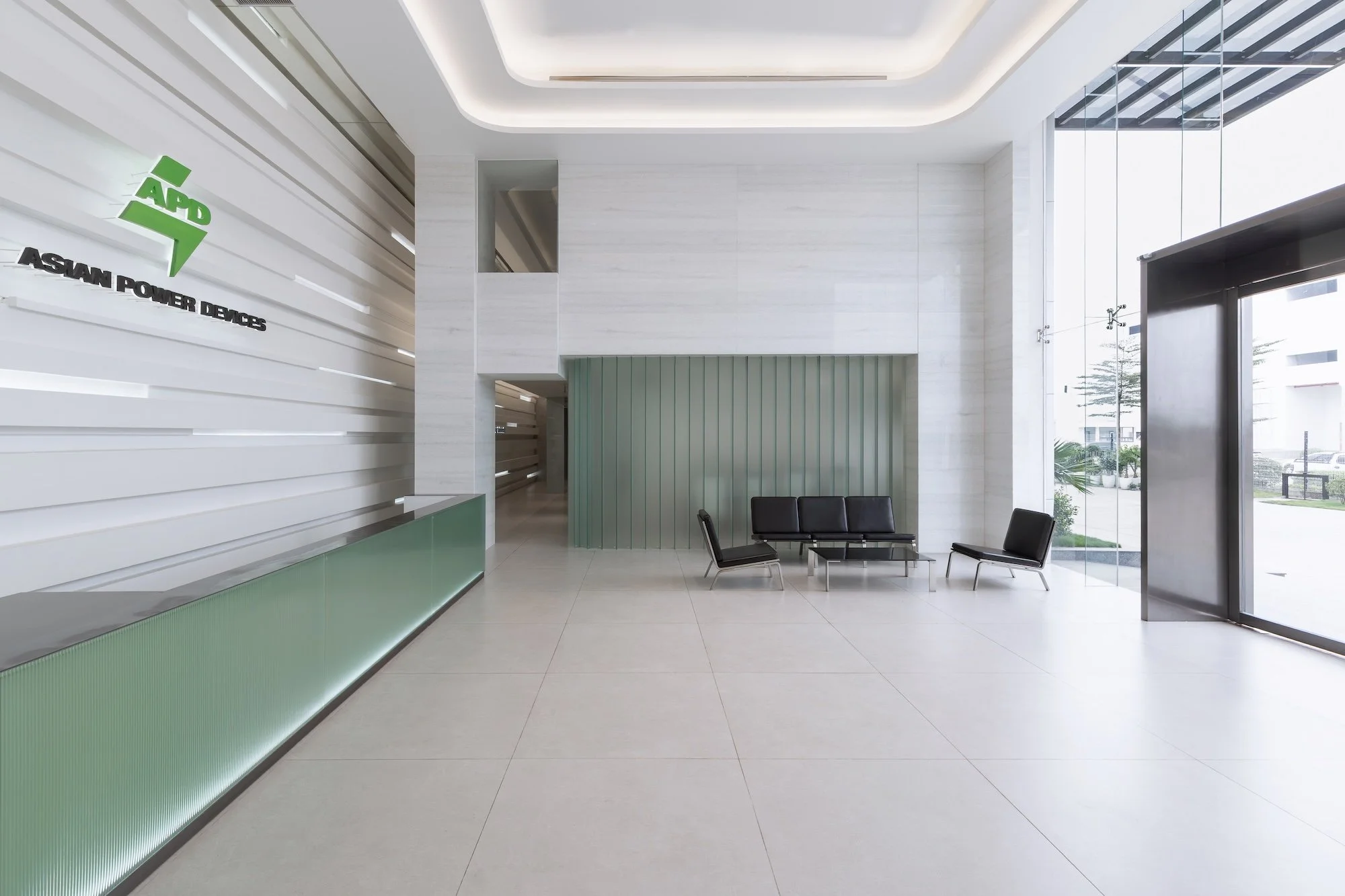
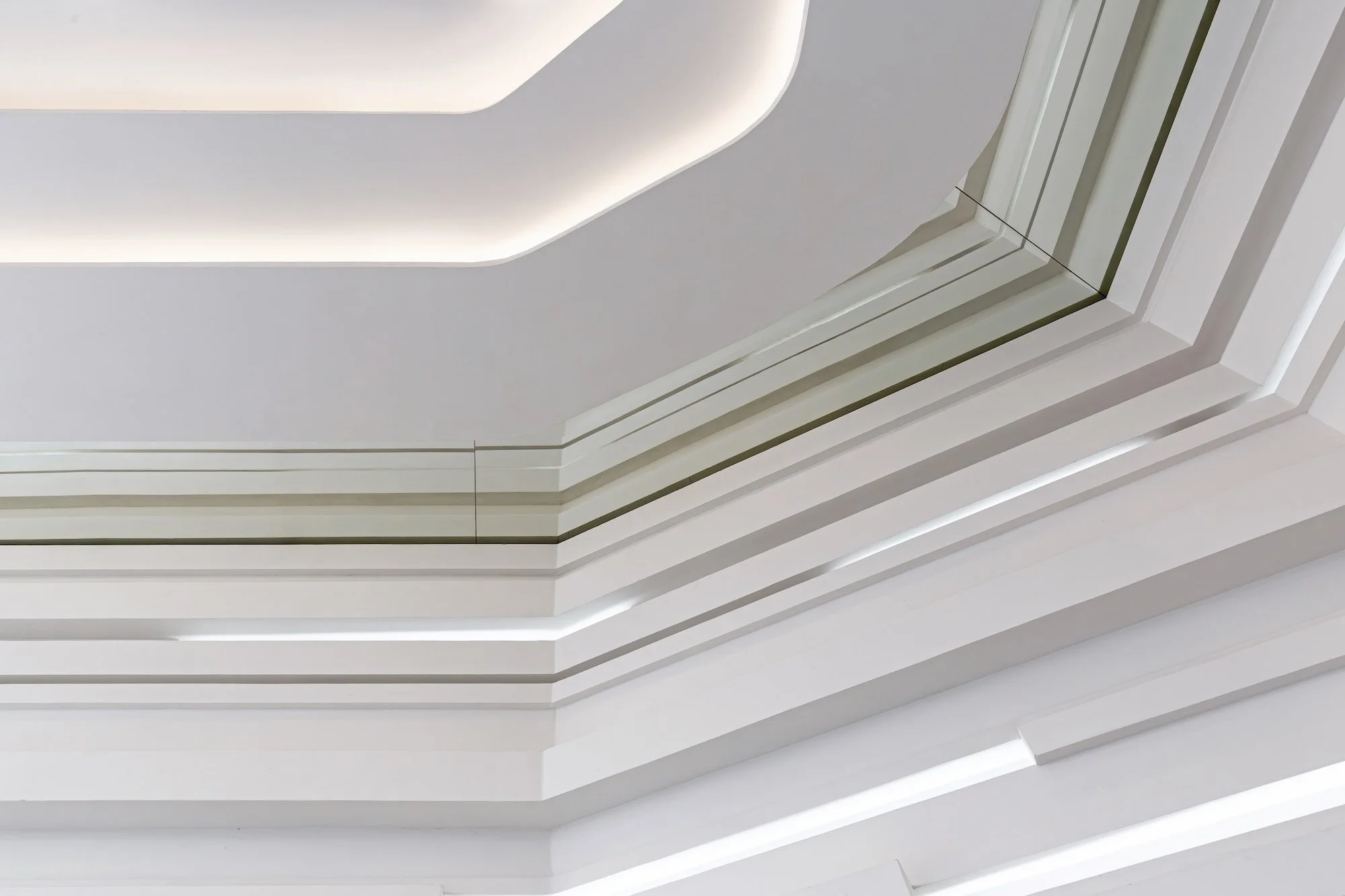
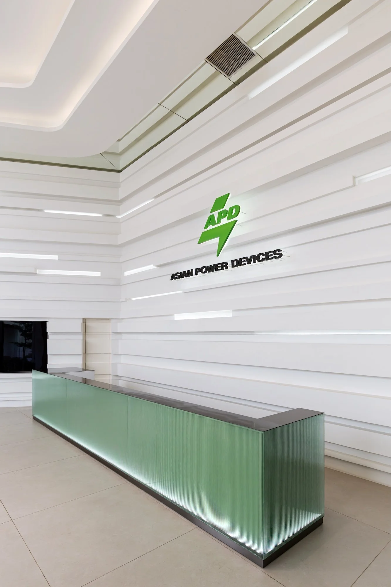
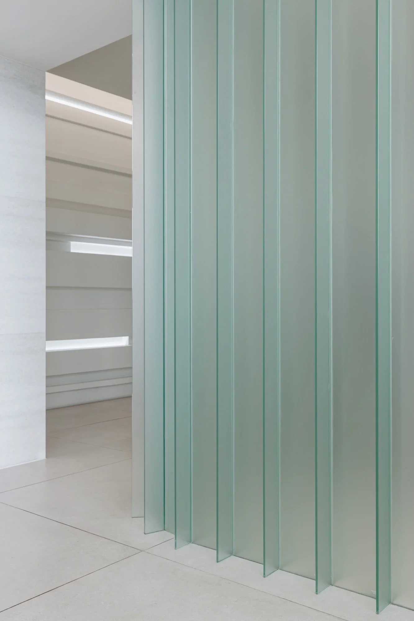
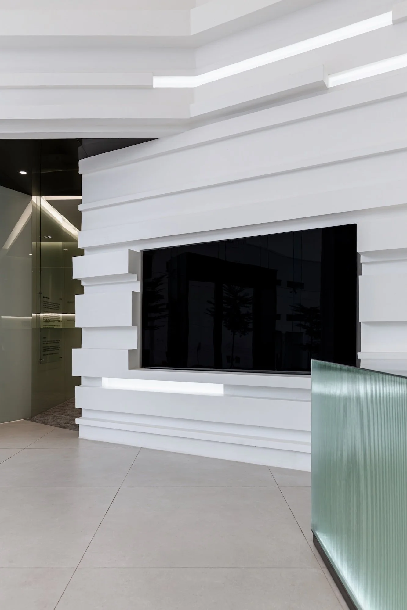
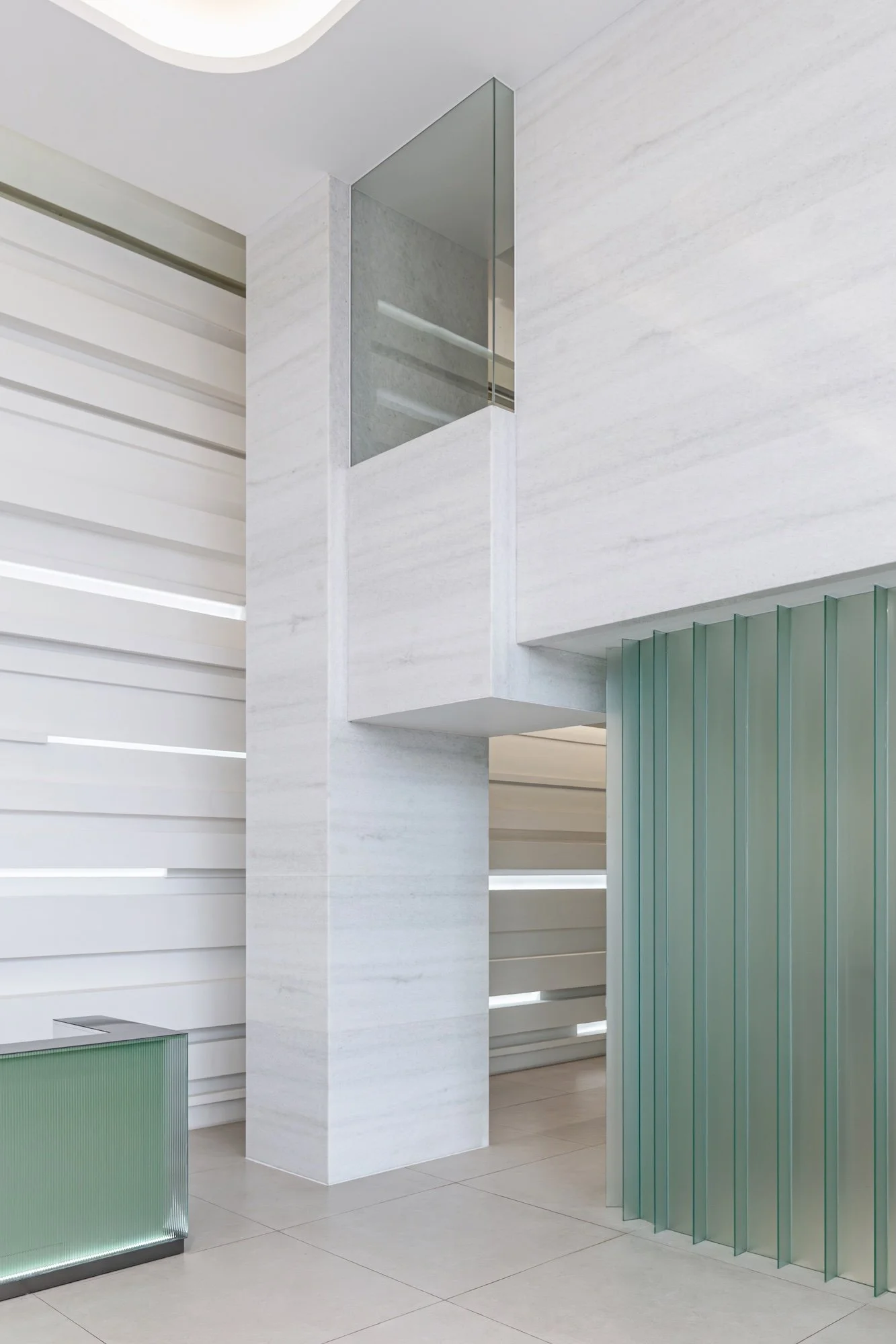
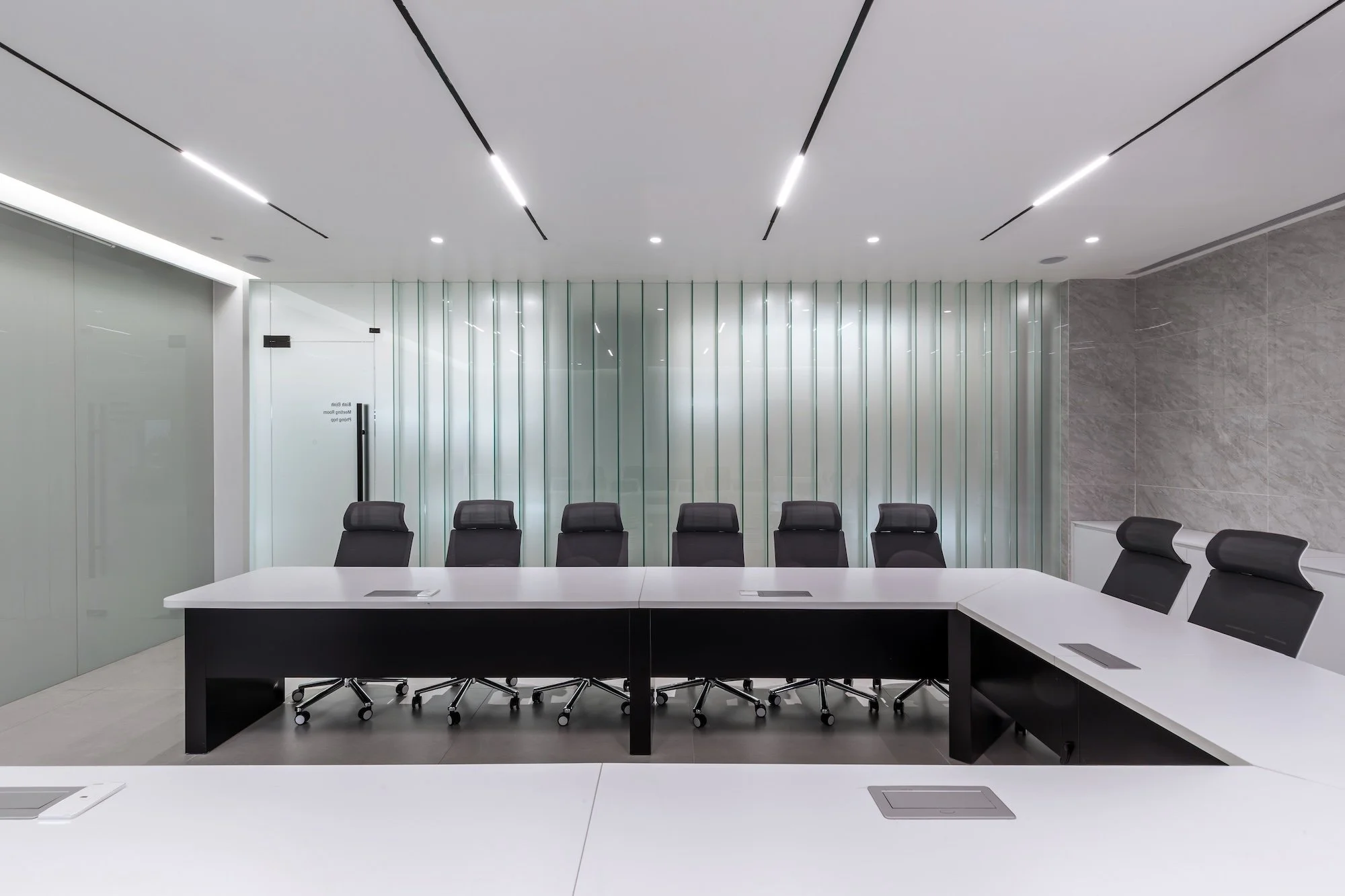
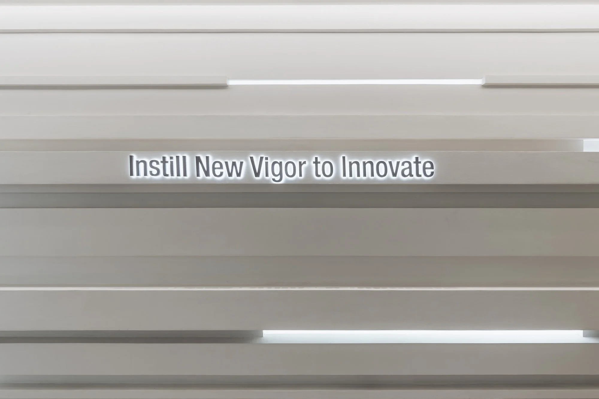
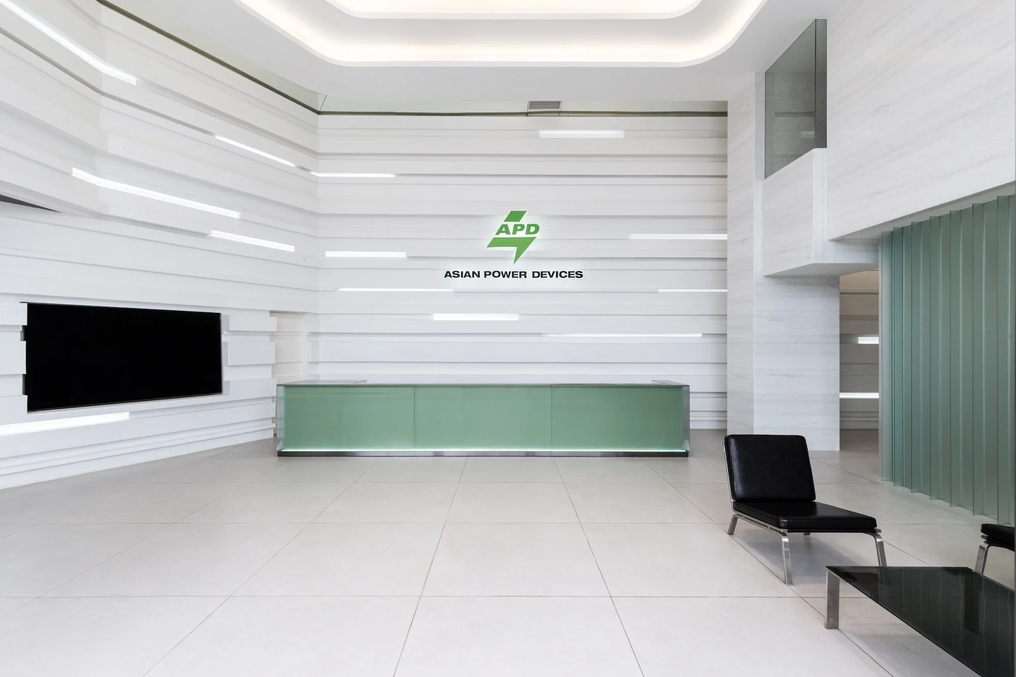
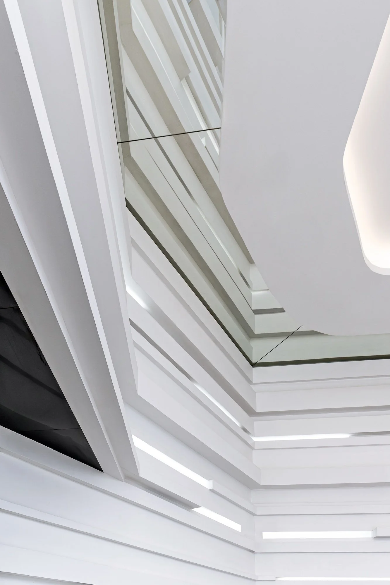
亞源科技越南廠的設計主軸,將無形的電能轉換與傳輸過程,轉譯為空間中流動的光影語彙,藉此呼應集團在電源供應器與電流交換器領域的頂尖技術。透過大量水平向度的幾何線條交疊於牆面,模擬電流在設備間高速穿梭的軌跡,並藉由嵌入式燈帶的律動感,使純白介面產生如電光般的動態視覺。牆側天花板巧妙利用鏡面反射將挑高立面做連續延伸,有效提升視覺高度並強化光譜的動態張力。

The core design concept translates the invisible process of power conversion and transmission into a visual vocabulary of flowing light and shadow, echoing APD industry-leading expertise in power supplies and current switching. A multitude of horizontal geometric lines overlap across the walls, simulating the high-speed trajectory of electrical currents coursing between devices. Complemented by the rhythmic pulse of embedded light strips, the pristine white surfaces come alive with a dynamic, lightning-like energy. Along the perimeter, mirrored ceilings create a continuous reflection of the lofty walls, effectively extending the visual height while amplifying the dynamic tension of the light spectrum.


高精密感的專業氛圍

a high-precision
professional atmosphere

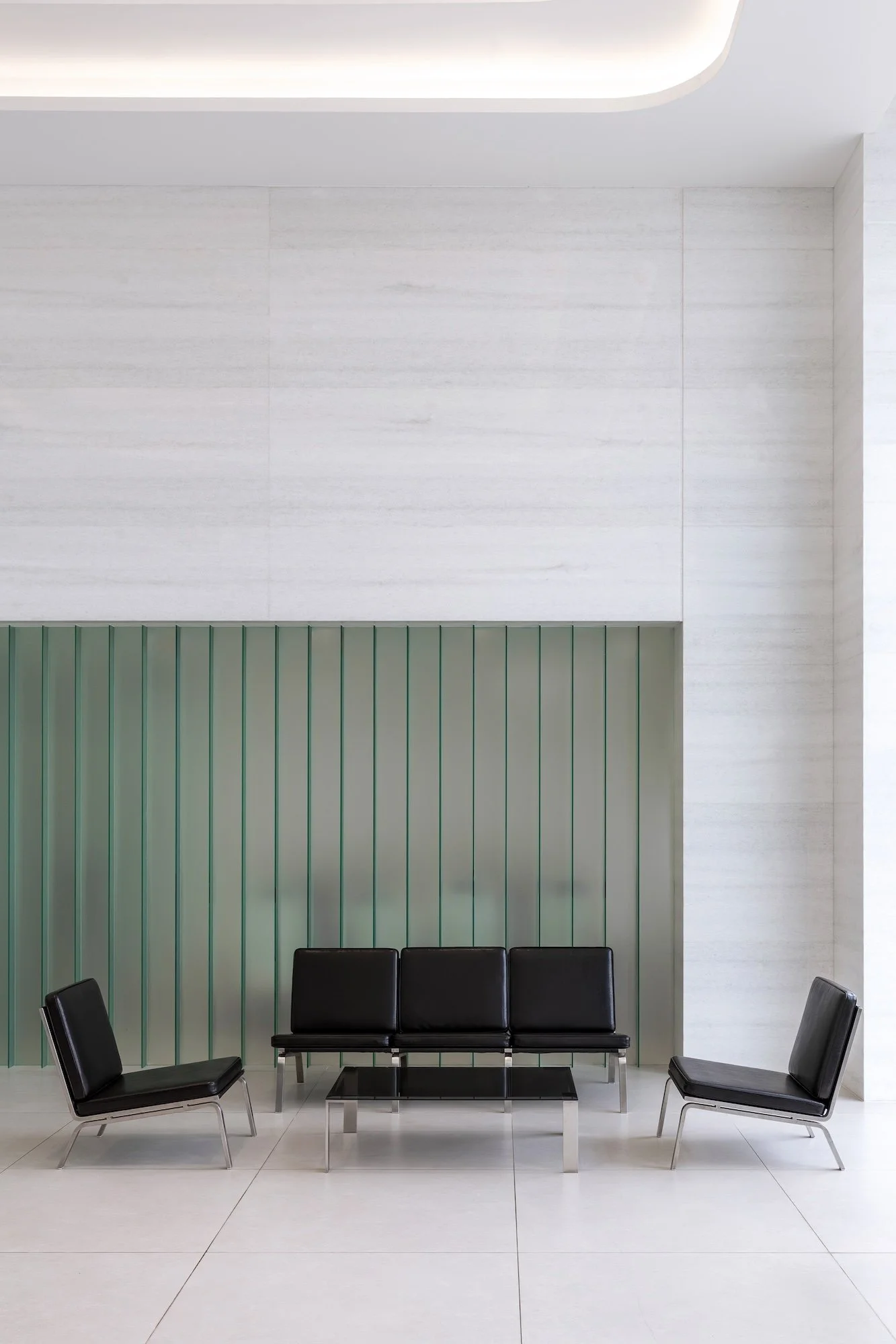
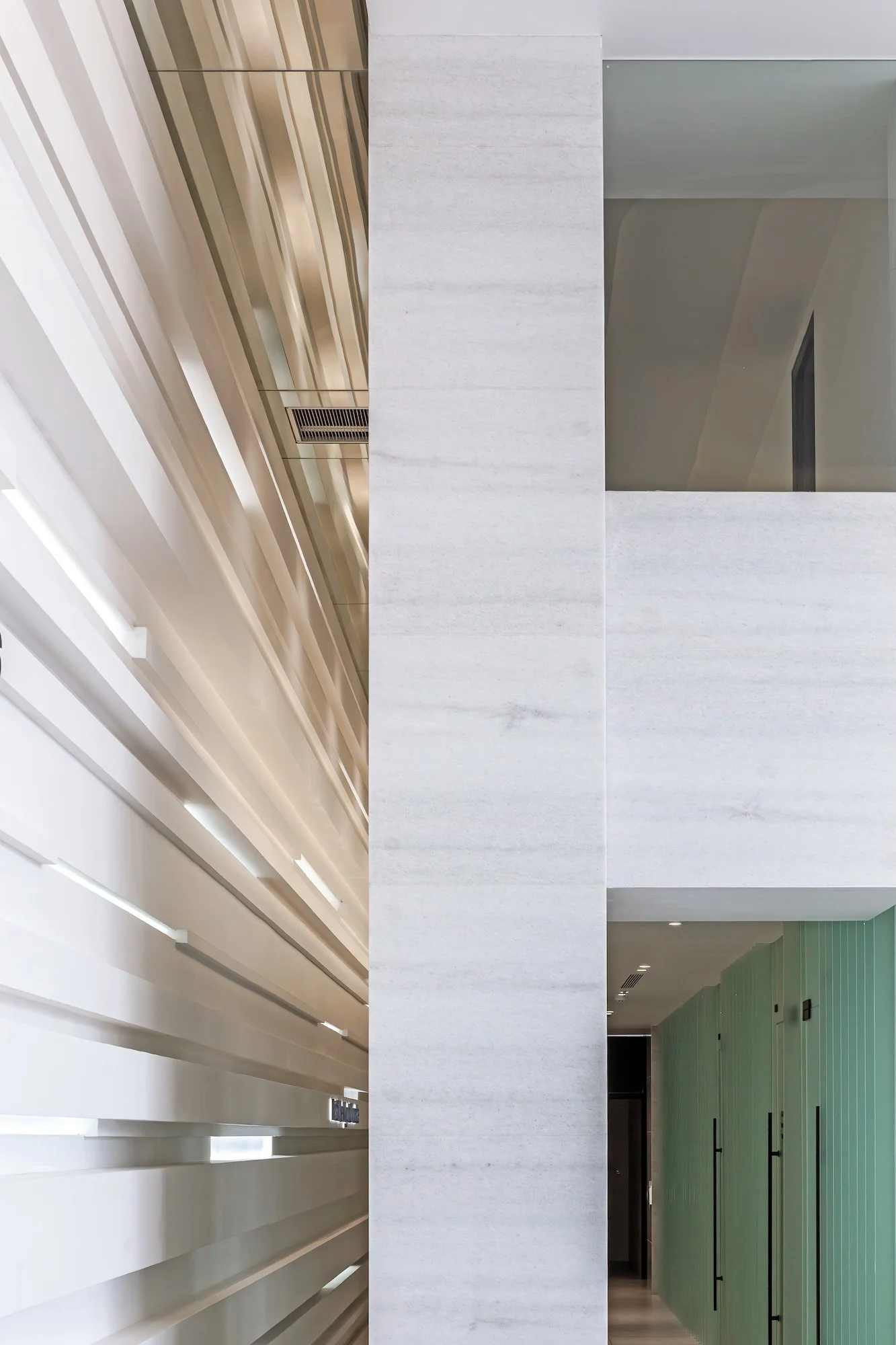
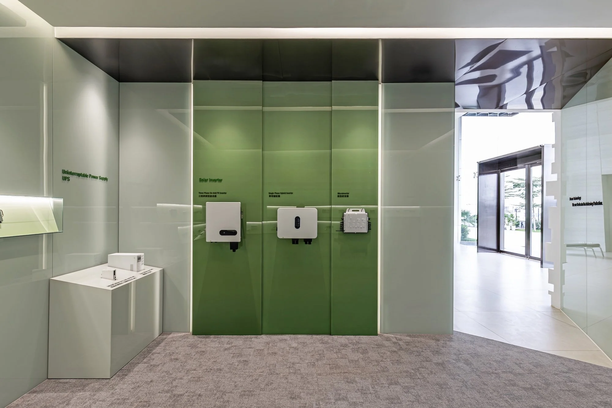
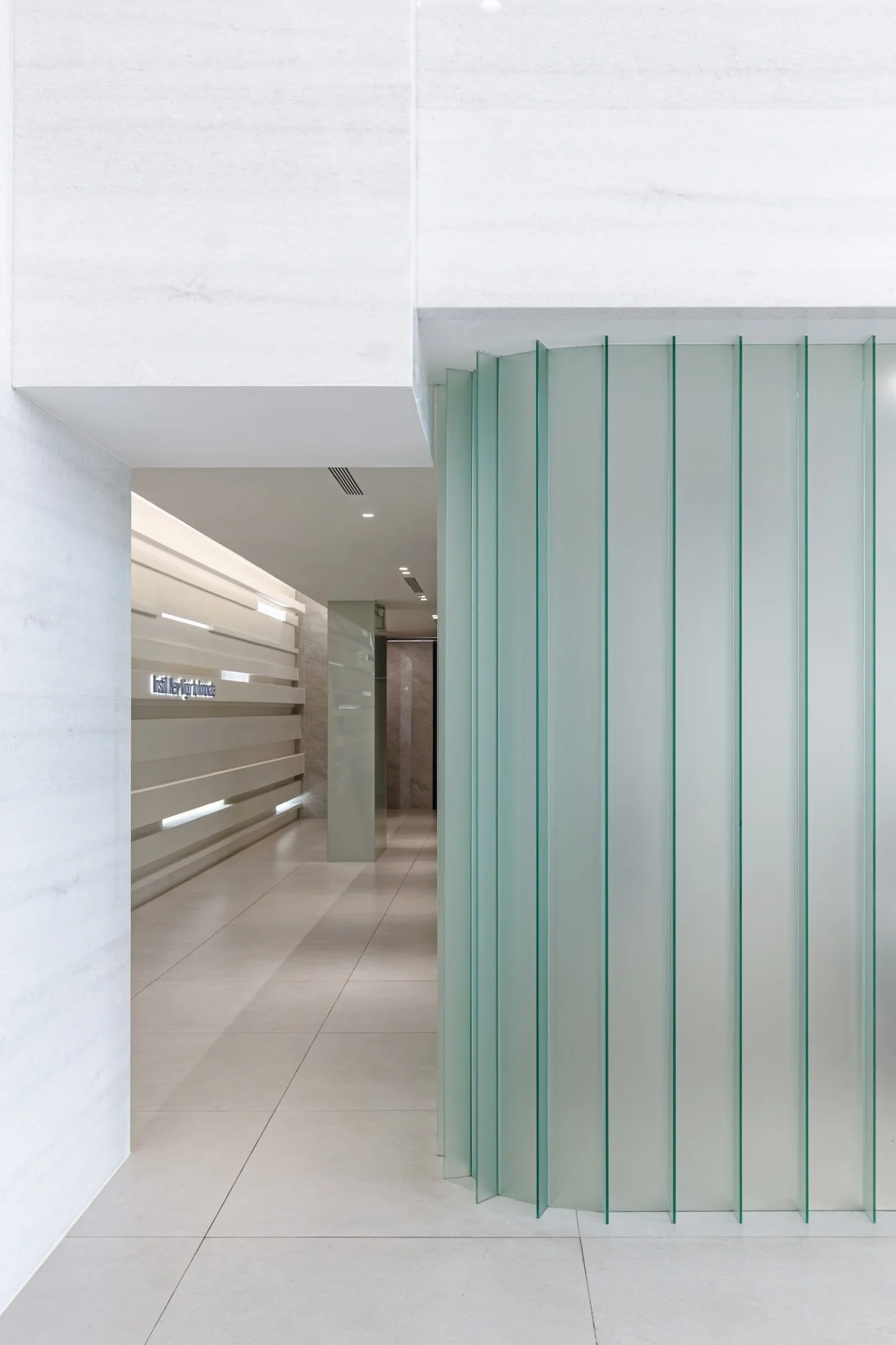
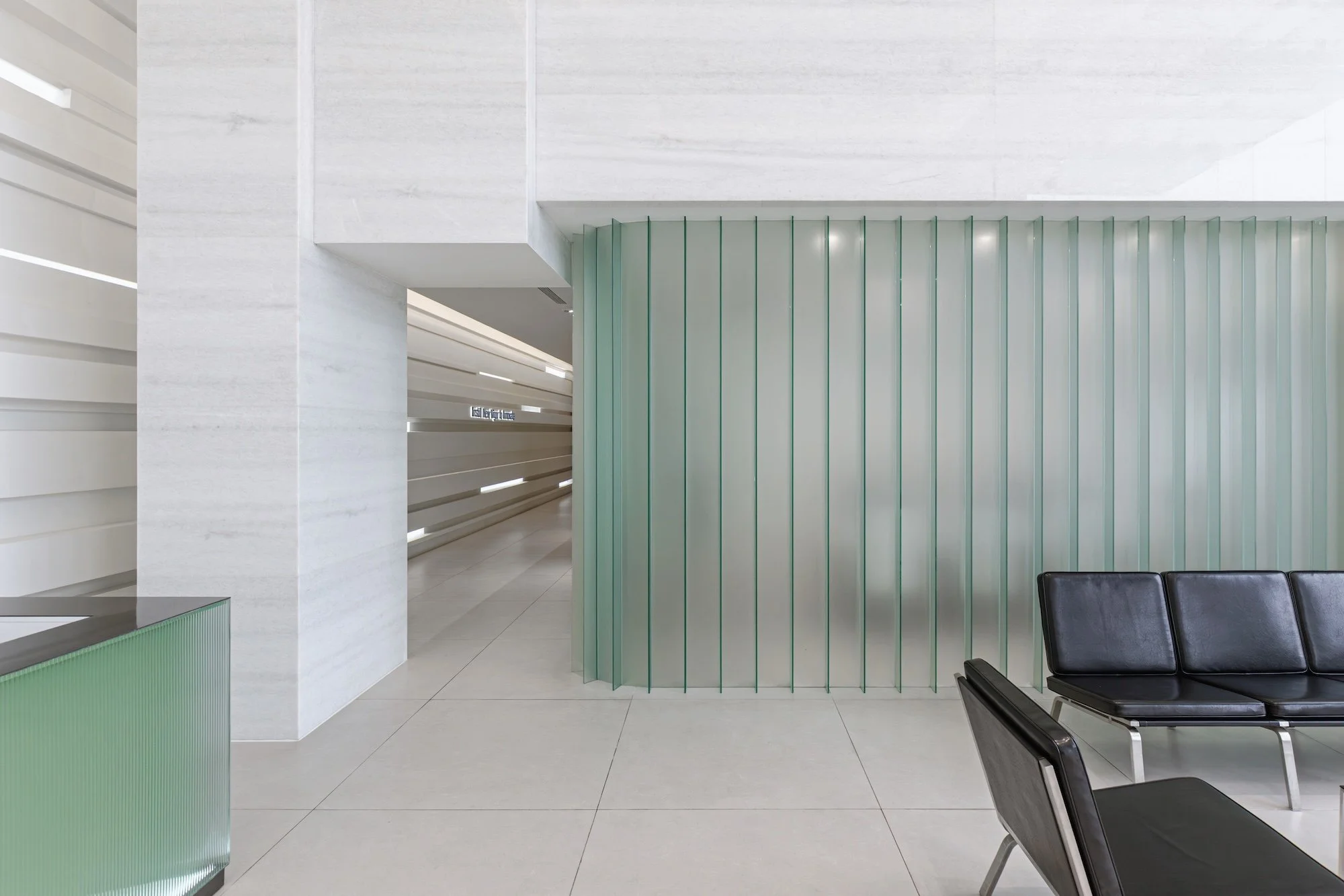
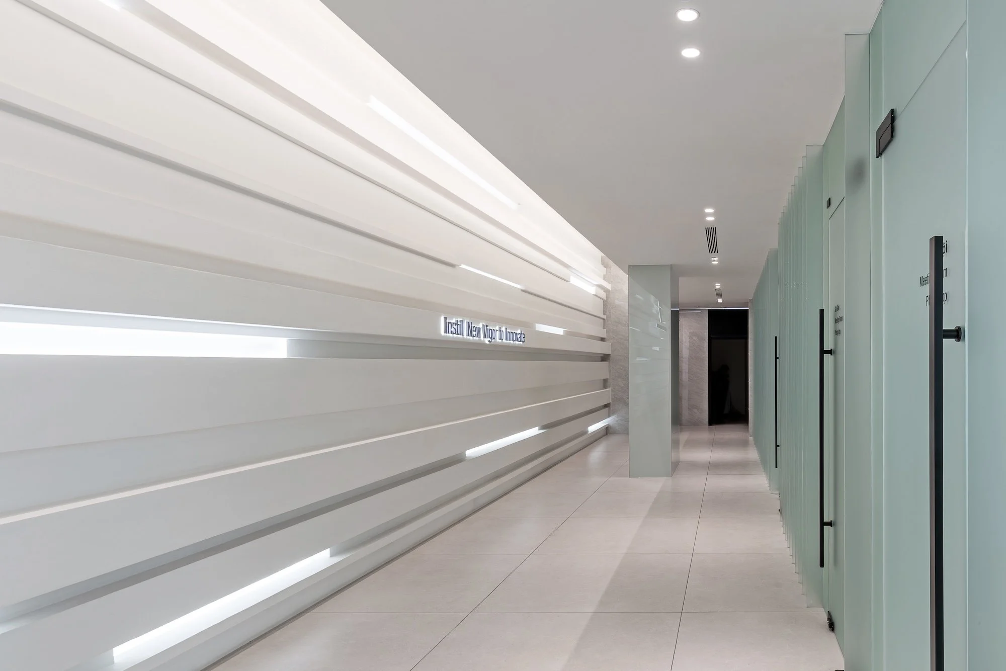
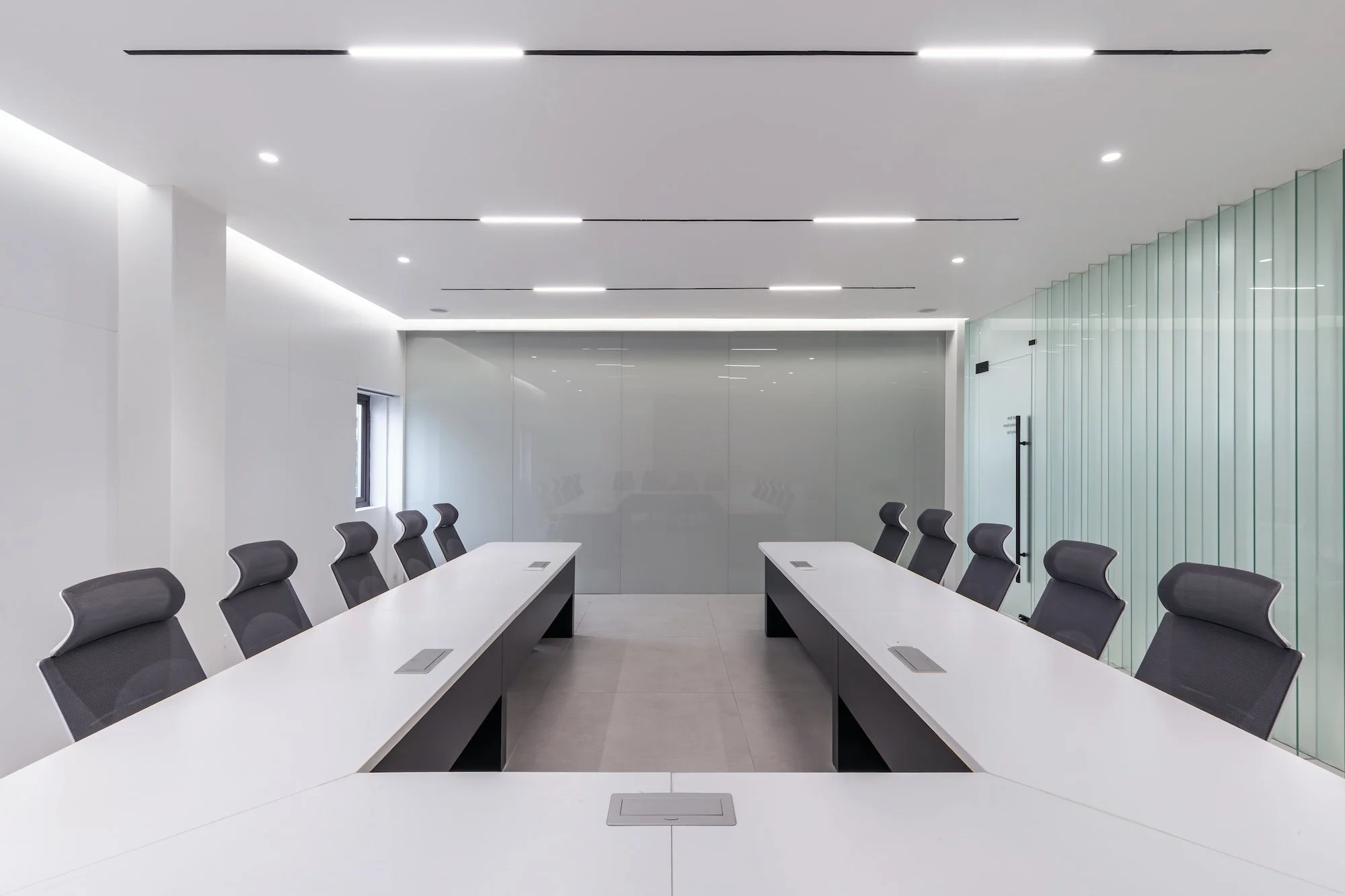
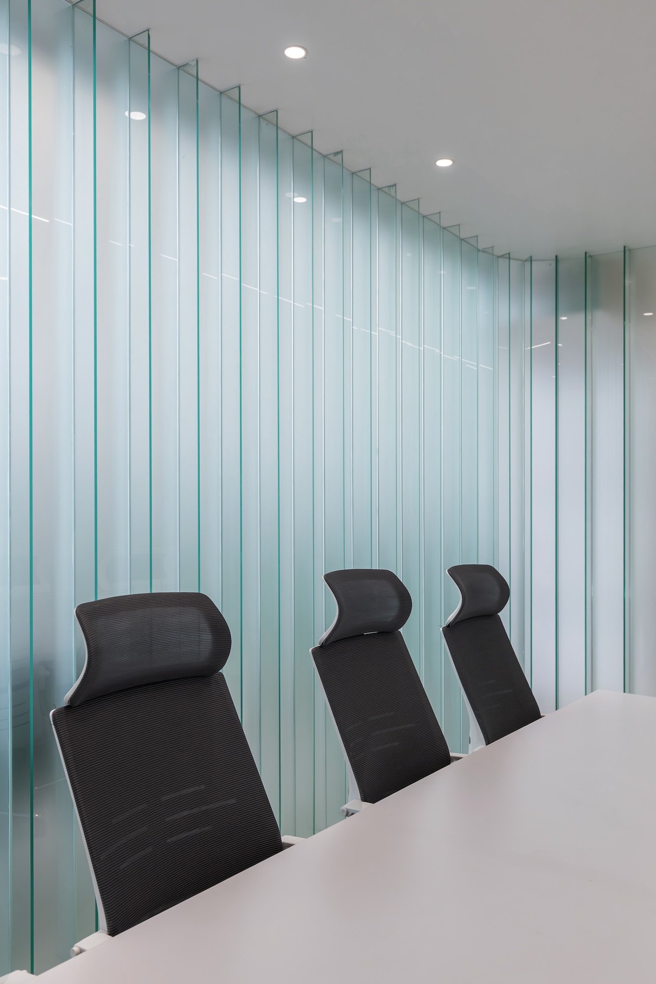
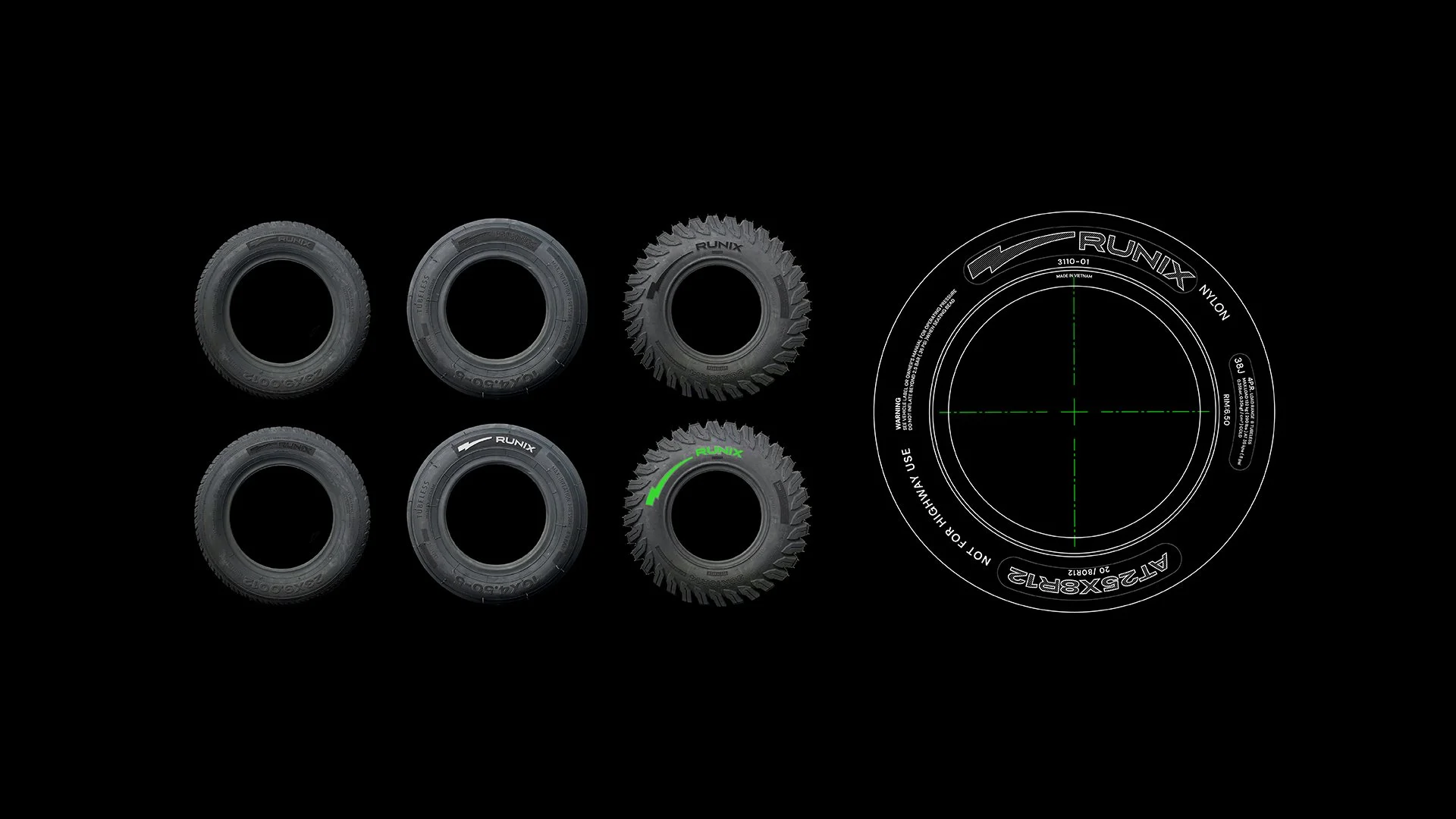
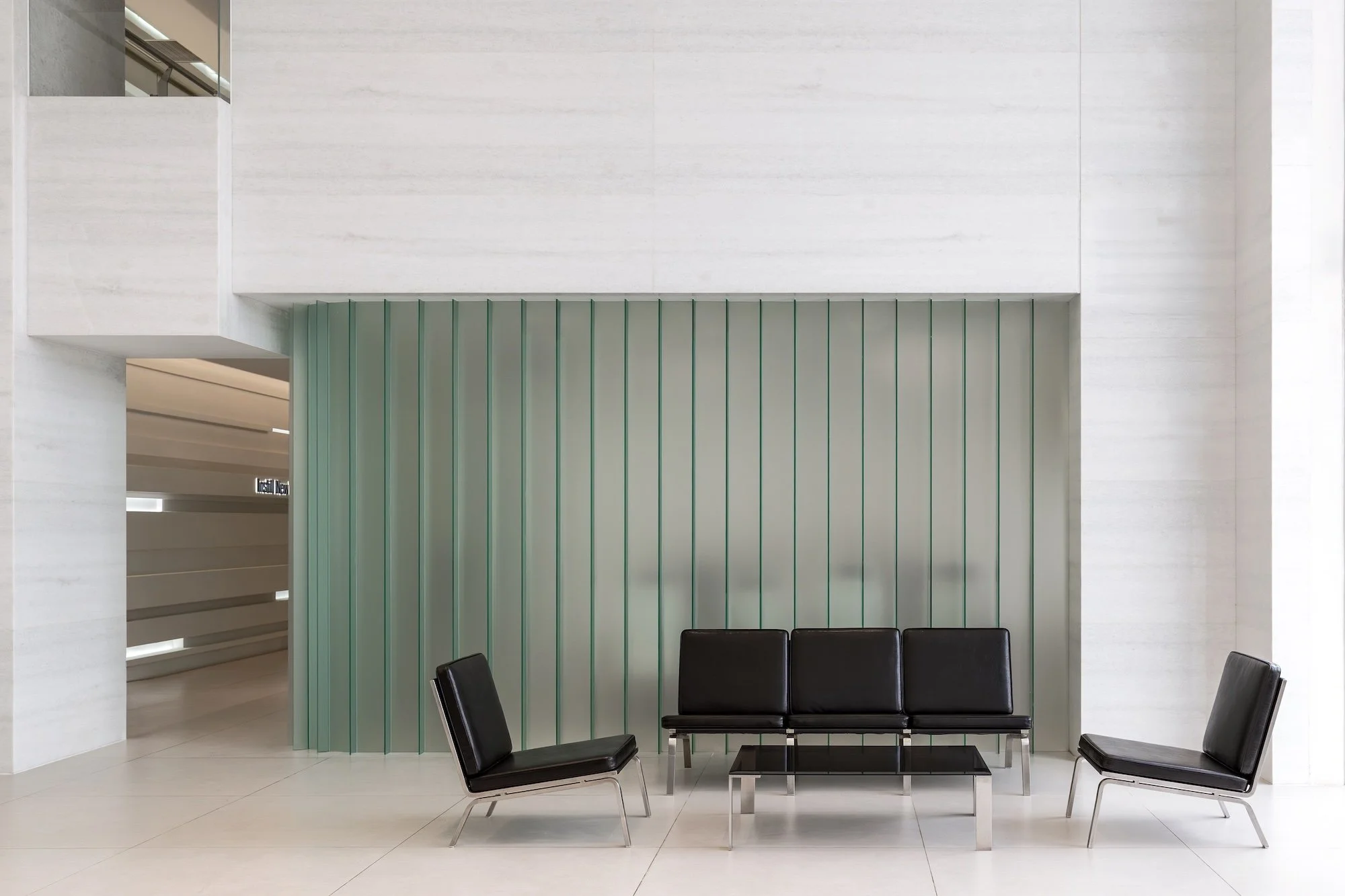
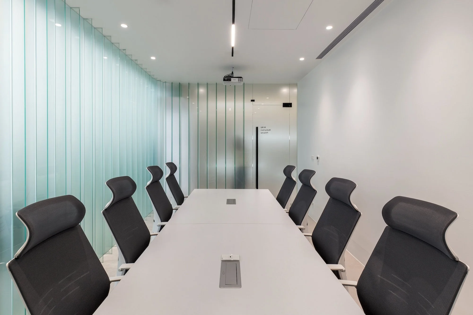
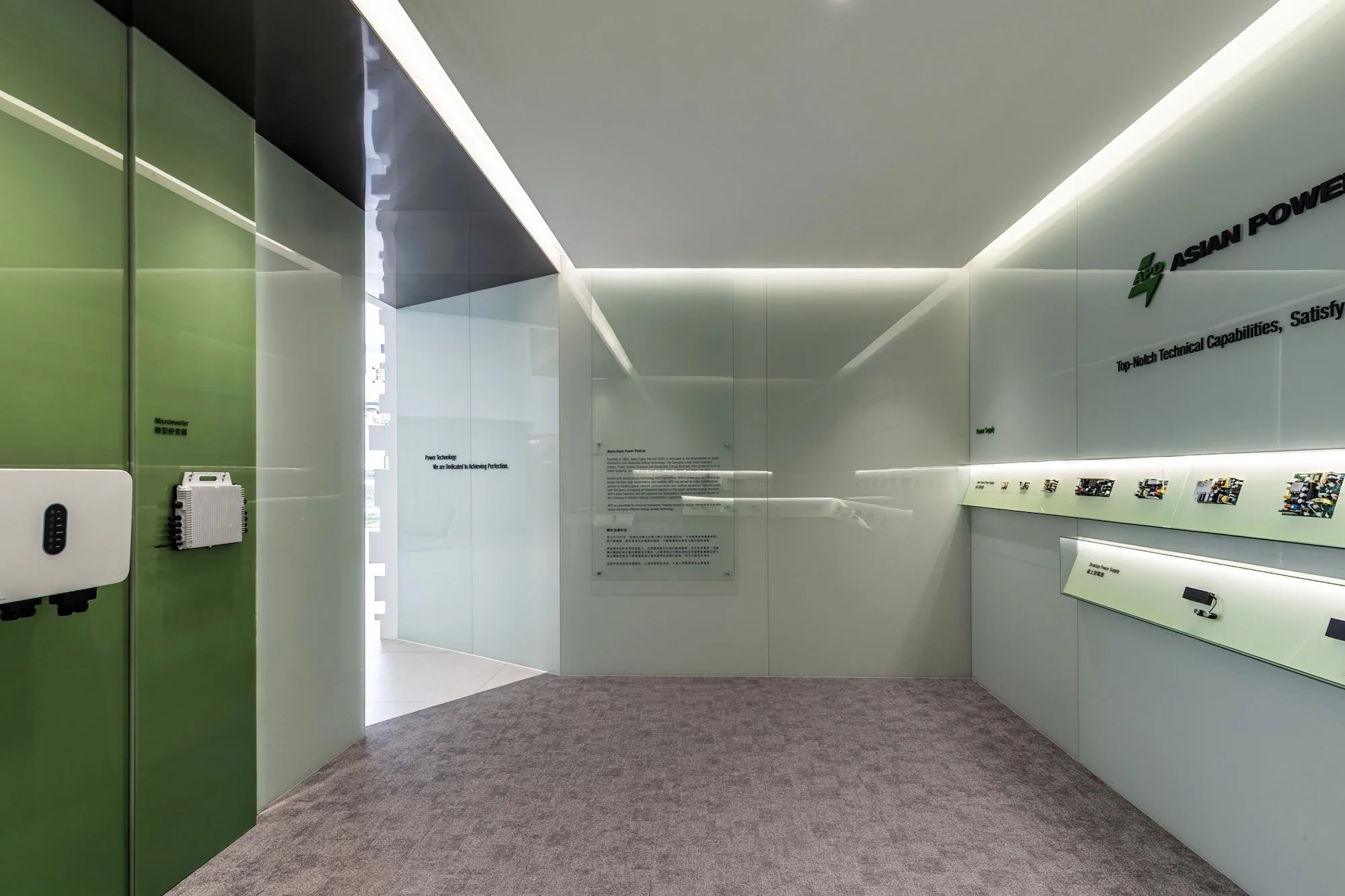
空間中運用大量霧面玻璃呈現自然透綠色彩,與品牌代表色進行材質對話,營造出清透且具高精密感的專業氛圍。會議室區採用直向玻璃分割構造,將不同功能的場域在統一的視覺語彙中串連,使平面配置上的培訓與辦公空間保有高度連貫性。

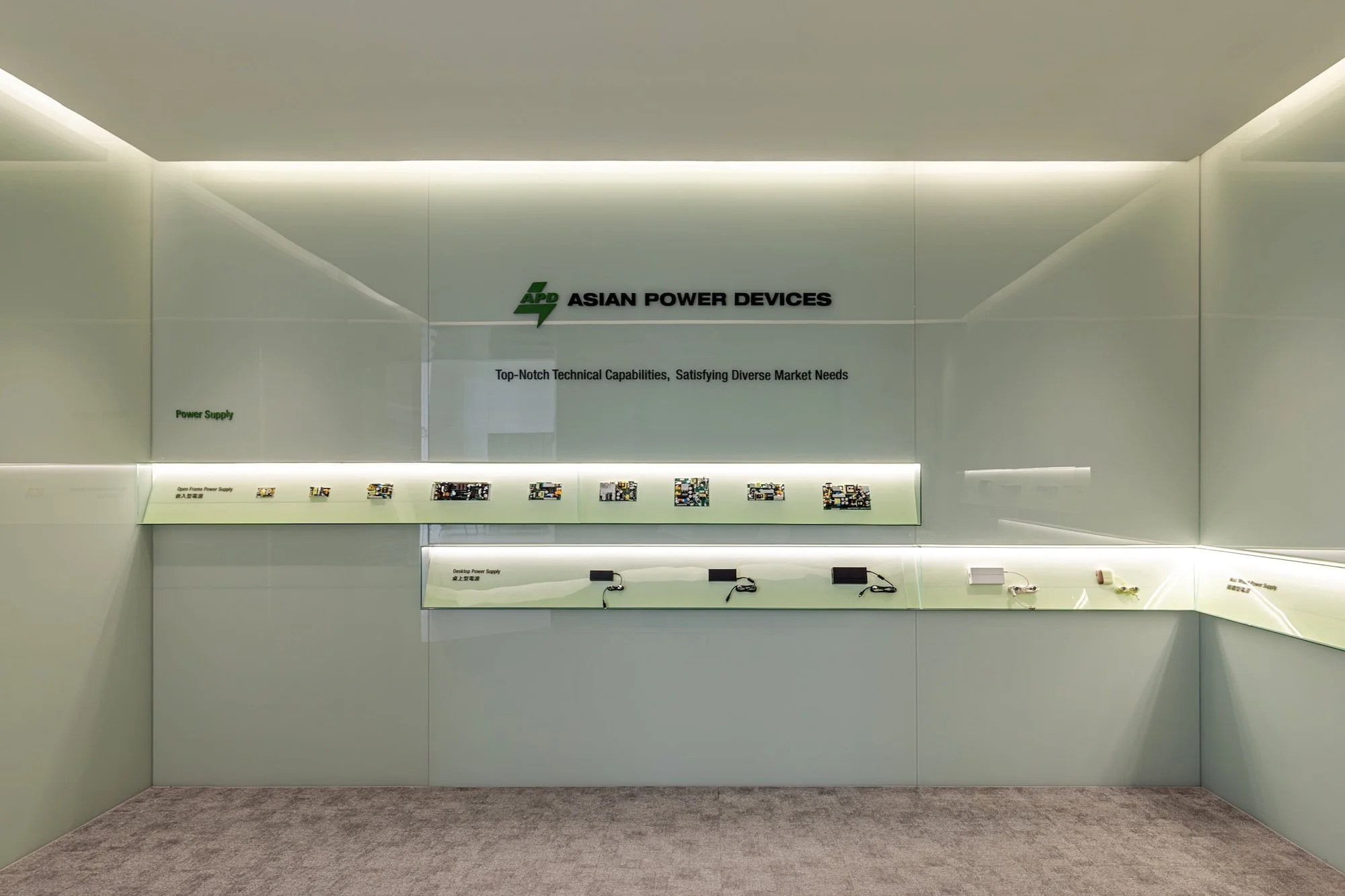
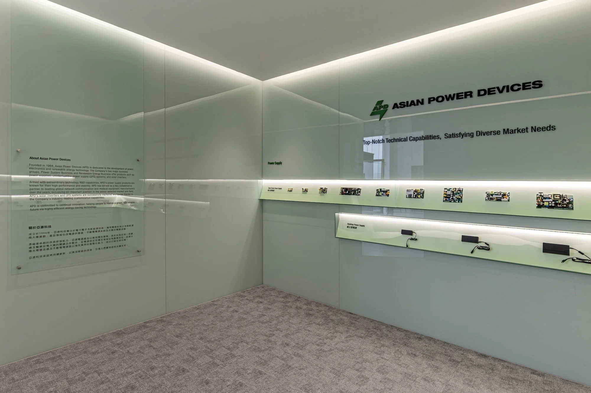
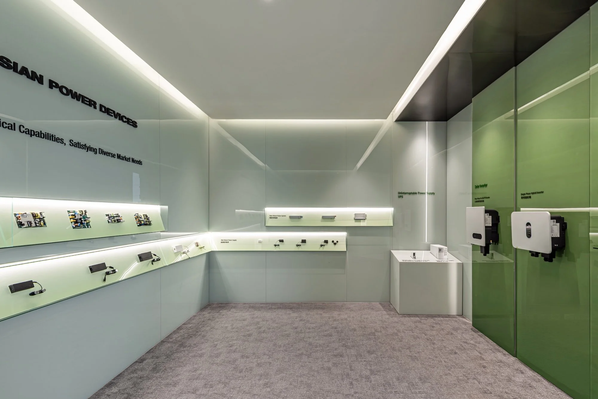
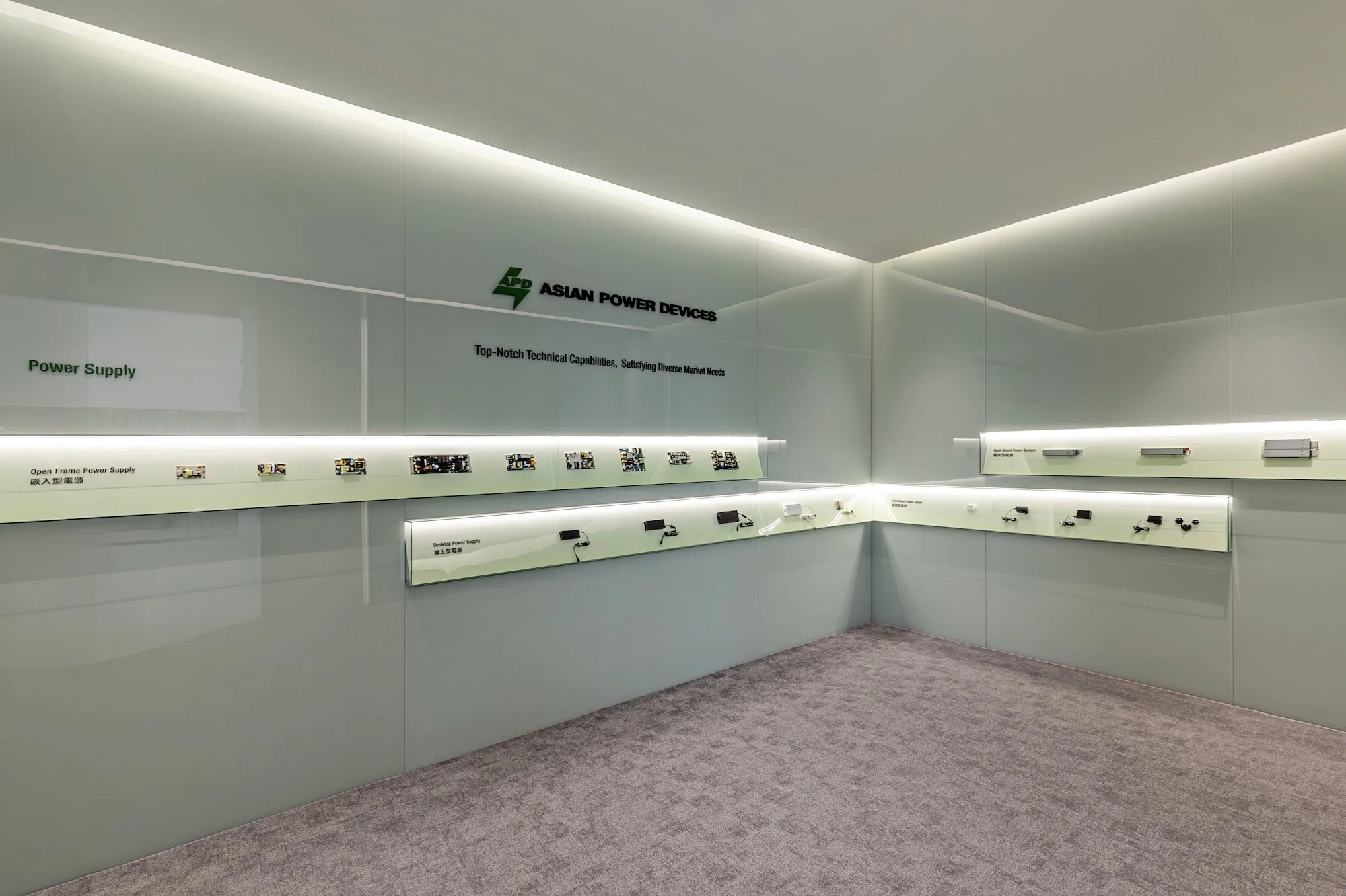
產品展示區則以漸層色彩的手法,讓牆面的透亮質感襯托出設備的精密細節,層架編排呼應了流動光影的核心概念,彼此間自然保留的位移斷差,賦予櫃體如電路跳動般的呈現。

The space utilizes extensive frosted glass to introduce natural translucent green tones, fostering a material dialogue with the brand’s signature green and cultivating a transparent, high-precision professional atmosphere. In the meeting areas, vertical glass partitions unify diverse functional zones—such as training and office spaces—within a consistent architectural language, ensuring a high degree of spatial continuity throughout the floor plan.

The product display area employs a gradient color technique, using the wall's luminous transparency to accentuate the intricate details of the high-precision equipment. The arrangement of the display shelves echoes the central theme of flowing light; natural offsets and staggered gaps between units imbue the cabinetry with a rhythmic, circuit-like vitality, showcasing the intersection of technology and spatial aesthetics.


RUNIX

品牌設計 / 視覺設計 / 字體設計 / 動態視覺 / 品牌氛圍營造
Branding / Visual Design / Typeface Design / Motion Graphic / Brand Curation

Credit

品牌設計|合聿設計
商業攝影|機電社
形象影片|A0 FILM


KEEP EXPLORING

RUNIX 是一家總部位於美國的專業輪胎製造商,專為 who expect more 的駕駛者而生 - 不只追求性能與耐久,更在意每一段旅程所帶來的感知與突破。RUNIX 相信,真正的駕馭體驗,來自對極限的不斷探索,以及持續向前的動能。

RUNIX is a U.S. based professional tire manufacturer designed for drivers who expect more - from performance and durability to the experience of every mile. The brand is built on the belief that driving is a continuous pursuit of progress, precision, and possibility.


ON N ON

品牌設計以名稱核心字母 N 為出發點,延伸出 RUNIX 的精神主軸:象徵駕駛感知的無限延展,如同 N 次方般持續加乘,推動每一個瞬間的自我超越。我們將字母 N 轉化為線性且具有速度感的品牌識別符號,線條向上延伸,代表不斷進化的性能、成長與可能性,也呼應 RUNIX 引領駕駛破風前行的品牌角色。同時,N 亦成為品牌語言的一部分,發展出標誌性口號 ON N ON(on and on),強化品牌記憶點,並為未來行銷溝通創造高度延展性,例如:Keep Exploring, ON N ON.

在色彩策略上,品牌選用高識別度的螢光綠作為主色,象徵能量、速度與前進的力量,搭配緊湊俐落的視覺節奏與動態影像表現,完整詮釋 RUNIX 持續突破、永不停歇的品牌精神。

The brand identity centers on the letter N, the core of the RUNIX name. N represents heightened driving perception and limitless growth, where performance and momentum are amplified to the power of N. Transformed into a linear visual mark, the upward-extending N conveys speed, progression, and an uncompromising drive to move forward without limits. N also becomes part of RUNIX’s verbal identity through the slogan “ON N ON” (on and on), reinforcing the idea of ongoing exploration and endurance. This flexible phrase strengthens brand recognition and supports future messaging, such as “KEEP EXPLORING, ON N ON.”

Visually, RUNIX is defined by a bold fluorescent green that conveys energy, motion, and high performance. Paired with dynamic layouts and motion-driven visuals, the brand reflects RUNIX’s relentless spirit - engineered to go further, push harder, and keep moving forward, mile after mile.


TYPOGRAPHY

為 RUNIX 量身客製的品牌字體,完整體現品牌充滿能量與動感的精神。字形結構俐落而具張力,傳達速度、力量與前進的動能。此字體不僅應用於品牌標誌,也可延伸至標語視覺、產品上的輪胎型號與規格標示,使品牌語彙在所有接觸點上保持一致,讓 RUNIX 的視覺識別全面而有力地落實於每個細節之中。

The custom typeface designed for RUNIX embodies the brand’s energetic and dynamic spirit. With a sharp and powerful structure, it conveys speed, strength, and forward momentum. This typeface is not only applied to the brand logo, but also extended across slogan visuals, tire model names, and product specifications, ensuring a consistent and cohesive visual identity at every brand touchpoint.


RUNIX VEHICLE

我們為 RUNIX 打造專屬形象車款,作為產品性能展示與品牌宣傳影片的核心載體。這台 ATV 不僅是展示工具,更是 RUNIX 精神的具象化呈現。車身設計大量運用品牌識別中的動態幾何語彙,透過俐落線條與速度感構圖,完整延伸品牌主視覺系統,展現充滿能量、無畏挑戰、勇於探索的品牌性格。形象車在高速移動與極限場景中,成為性能實力與品牌態度的最佳代言者,象徵 RUNIX 持續突破、ON N ON 前行的核心精神。

We created a dedicated concept vehicle for RUNIX to serve as the centerpiece for product performance demonstrations and promotional films. More than just a display unit, this ATV is a physical embodiment of the RUNIX spirit. The body design incorporates dynamic geometric elements derived from the brand identity, using sharp lines and speed-driven compositions to fully extend the core visual language. It reflects RUNIX’s energy, boldness, and adventurous character. In high-speed and extreme environments, the vehicle becomes the ultimate ambassador of both performance and attitude - symbolizing RUNIX’s relentless drive to push forward, ON N ON.


LANDER

品牌設計 / 視覺設計
Branding / Visual Design


LANDER
從根本解決痛點


Lander 致力於從根本解決現有牙科儀器的使用痛點,如同牙材界從天而降的「登陸者」,以全新視角重新審視臨床需求,探索並打造最佳的 A 級解決方案。品牌創辦人本身即為牙醫師,憑藉多年臨床經驗,深入理解各類牙材與器械在實際操作中的優劣與限制。

Lander 將這些第一線的使用體驗轉化為創新設計思維,從使用者角度出發,重新定義牙醫師每日必備的設備。透過細節優化與流程重構,使看診更流暢、操作更直覺,進而提升整體醫療效率與品質。Lander 不只是器材供應者,更是站在臨床最前線、為專業而生的革新者。

Lander is committed to addressing the fundamental challenges of existing dental instruments. Like a true “lander” in the dental materials industry, the brand approaches innovation from a fresh perspective - starting with real clinical needs to develop best-in-class, Grade A solutions.

Founded by a practicing dentist, Lander is built upon years of hands-on clinical experience. Through extensive daily use of dental materials and equipment, the founder gained deep insight into their strengths, limitations, and practical shortcomings.

By translating firsthand experience into purposeful design, Lander reimagines the essential tools dentists rely on every day. Every product is developed from the user’s perspective, optimizing details and refining workflows to create smoother procedures and more intuitive operation. The result is enhanced clinical efficiency and improved quality of care.

Lander is not merely an equipment provider - it is an innovation-driven partner, engineered by clinicians, for clinicians.


靜築

商業空間設計 / 企業總部
Commercial Space Design / Corporate Headquarter


本作品榮獲

2025 第十三屆 TINTA 金邸獎 辦公空間類 優勝獎
2025 SBID International Design Awards Finalist


通過自然材質與簡約設計,營造出時間感與和諧的空間。外觀以具手感的灰色水泥磚牆面與柔和燈光突顯材質層次,低調融合於環境,賦予建築寧靜氣息。

入口處的吧台因應梯的特殊基地,透過不同面向的轉折,以符合每個面向呈現出視覺上的平衡。辦公區利用桌面高度,巧妙地形成視覺上的水平分割效果,讓空間在不對稱的設計中達到自然的平衡。


Yale 台灣

室內設計 / 專櫃設計 / 商業空間設計
Interior Design / Commercial Space Design


百年鎖具品牌 Yale 以全新的品牌形象專櫃在高雄漢神百貨呈現。

門鎖是每個人回到家中第一個會碰觸到的東西,因此本案依家為中心作為設計的出發點,整體以潔白的牆體去襯出全新的品牌形象,並使用大量的溫潤木紋,讓高科技的電子鎖商品不在令人有距離感,反而更能喚醒出商品對家的連結感及重要性。

BN WORKS

品牌設計
Branding


一個以「本」為發想,提倡本墨生活的新創文具品牌,結合台灣在地設計、文具工藝,志在保存書寫工具帶來的價值。

我們深信生活中每一種細微的感動來自於文字,取「本」字音作為品牌名稱,提醒自己一切從頭開始。如今用自己的工具,記錄自己的故事,透過一筆一劃,延續一個價值,讓年輕世代重拾書寫工具,且相信每一筆都是改變的開始。

"一支好筆宛如一位好友,總是能傾聽想法,釐清脈絡,帶你回到根本,發現新的感動!"

FitMe

品牌設計
Branding


Eat Smart, Get Fit!

FitMe 致力為健身族群打造美好的餐點體驗。健身族群努力健身卻不容易有適切的飲食管理,造成事倍功半的結果。因此 FitMe 打造出健身餐服務來方便、適當得助健身族群一臂之力。FitMe 團隊特別針對不同體型,分出男女需求:男性不需要在吃一般市面上一視同仁的份量,而是精準蛋白質、碳水化合物及脂肪的比例,不用餓肚子遷就少少的份量。女性也不需要再浪費食物,剛好吃完剛好飽。

在商標的設計上,我們以富有活力的字體、搭配上簡約的圓型圖章設計,讓標誌在不同地方出現的時候,都能有代表品質的標章效果,來強化品牌的精神。在顏色的選用上,我們以代表能量的橘紅色作為主視覺色調,讓品牌更有活力。在包裝的設計上,採用透明的收縮外袋,可以清楚地看見食材的樣貌,並且在每道菜餚的標籤設計上,以數字清楚的標示出健身族群最在意的熱量、蛋白質、碳水化合物、脂肪含量,以達到營養控制的效果,並且以顏色為不同功能取向的菜色做區隔。並以白色的紙箱,搭配上佈滿商標的封箱膠帶,讓收到的顧客能夠一眼辨識出我們的貨品,並即時做妥善的冷藏。

Boffotto 寶豐堂

品牌設計 / 企業識別系統
Brand Design / Corporation Identity


Boffotto is driven by a clear concept: The Combination of Innovation and Tradition. The Combination means that across the Boffotto organization, we are unified in our approach and collaborative in our efforts to make the machine tools that we produce are not only providing the latest technology but also giving a sense of humanity. This effort applies to everything we do — from our scientific methodology, to our manufacturing processes, to the tone, look, and feel of our communications.

The Brand was developed to help us work together to build consistent, branded communications that collectively build Boffotto’s reputation in the communities we serve. Using these guidelines will enable us to create materials that speak to specific audiences while maintaining one, unified voice.

Together, we can contribute to Boffotto’s reputation as a leader in global machine tool industry.

寶豐堂以創新與傳統的結合來打造工具機品牌,強調最新的技術外也以人性化的角度設計每項產品。無論在技術研發丶生產制造到整體設計與形象,都以這個結合的概念為核心價值。

這份企業識別系統,將制定出寶豐堂的整體形象規劃,協助我們將這個核心價值傳遞給我們的客戶,建立出一致的企業形象系統,甚至將品牌推向國際,在全球工具機產業中立足。