品牌設計 / 視覺設計 / 字體設計 / 動態視覺 / 品牌氛圍營造
Branding / Visual Design / Typeface Design / Motion Graphic / Brand Curation
Credit
品牌設計|合聿設計
商業攝影|機電社
形象影片|A0 FILM
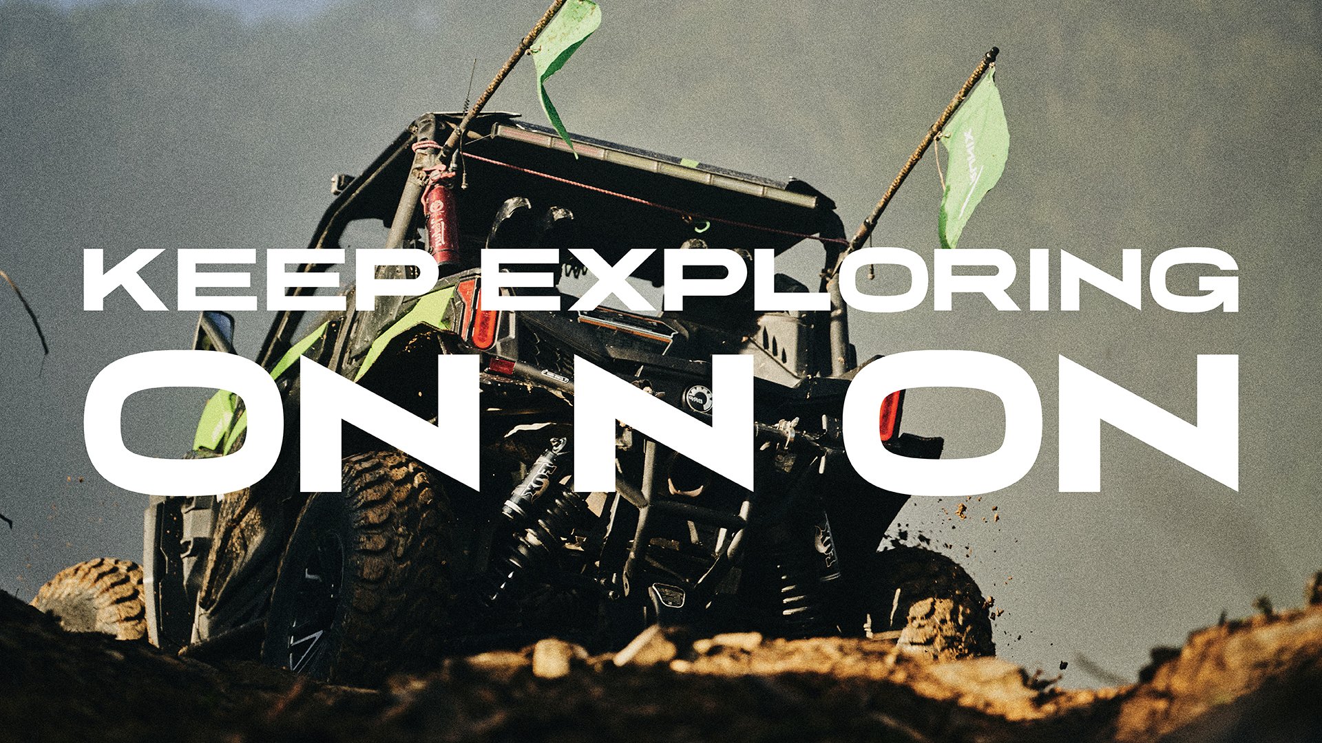
KEEP EXPLORING
RUNIX 是一家總部位於美國的專業輪胎製造商,專為 who expect more 的駕駛者而生 - 不只追求性能與耐久,更在意每一段旅程所帶來的感知與突破。RUNIX 相信,真正的駕馭體驗,來自對極限的不斷探索,以及持續向前的動能。
RUNIX is a U.S. based professional tire manufacturer designed for drivers who expect more - from performance and durability to the experience of every mile. The brand is built on the belief that driving is a continuous pursuit of progress, precision, and possibility.
ON N ON
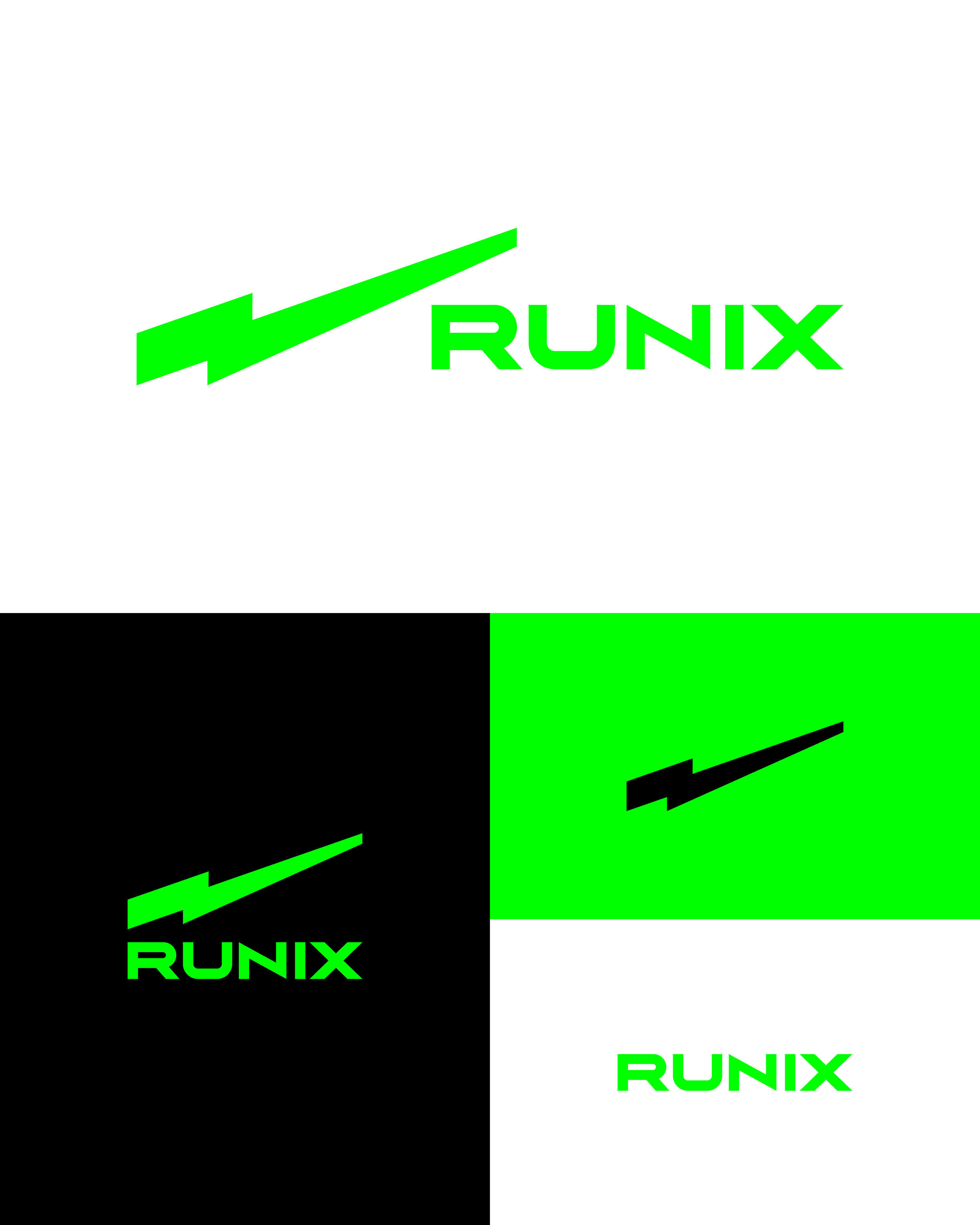
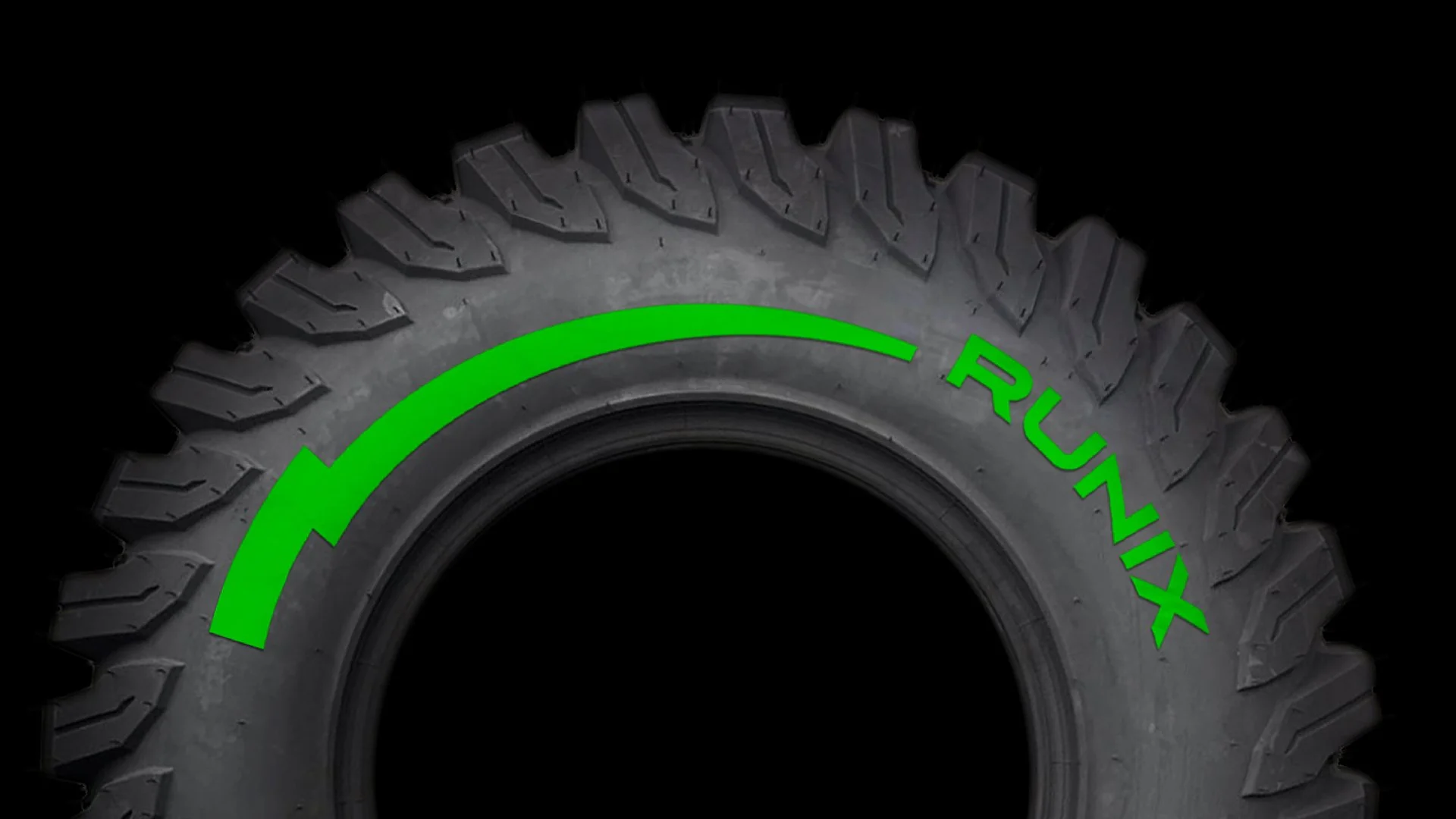
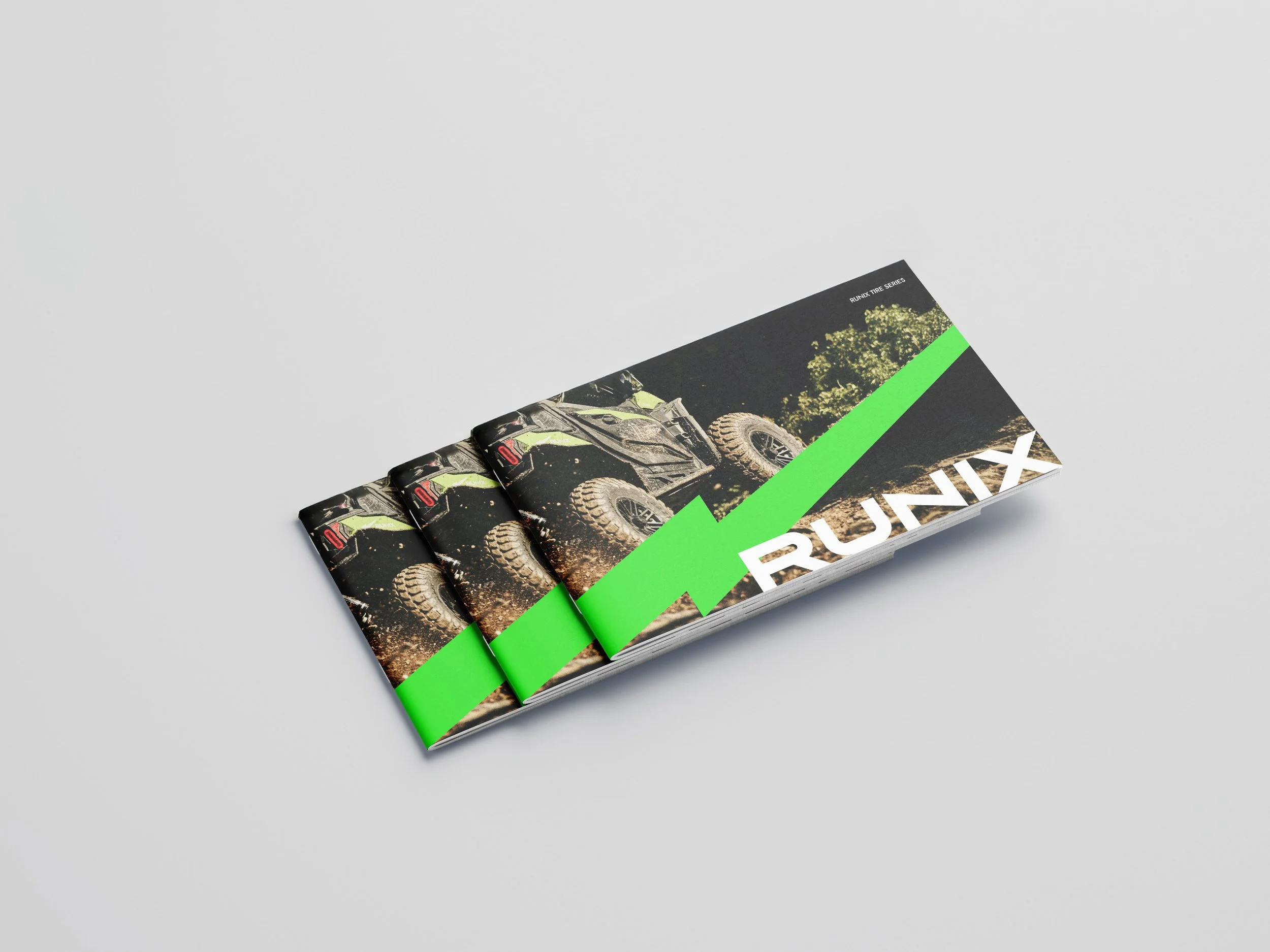
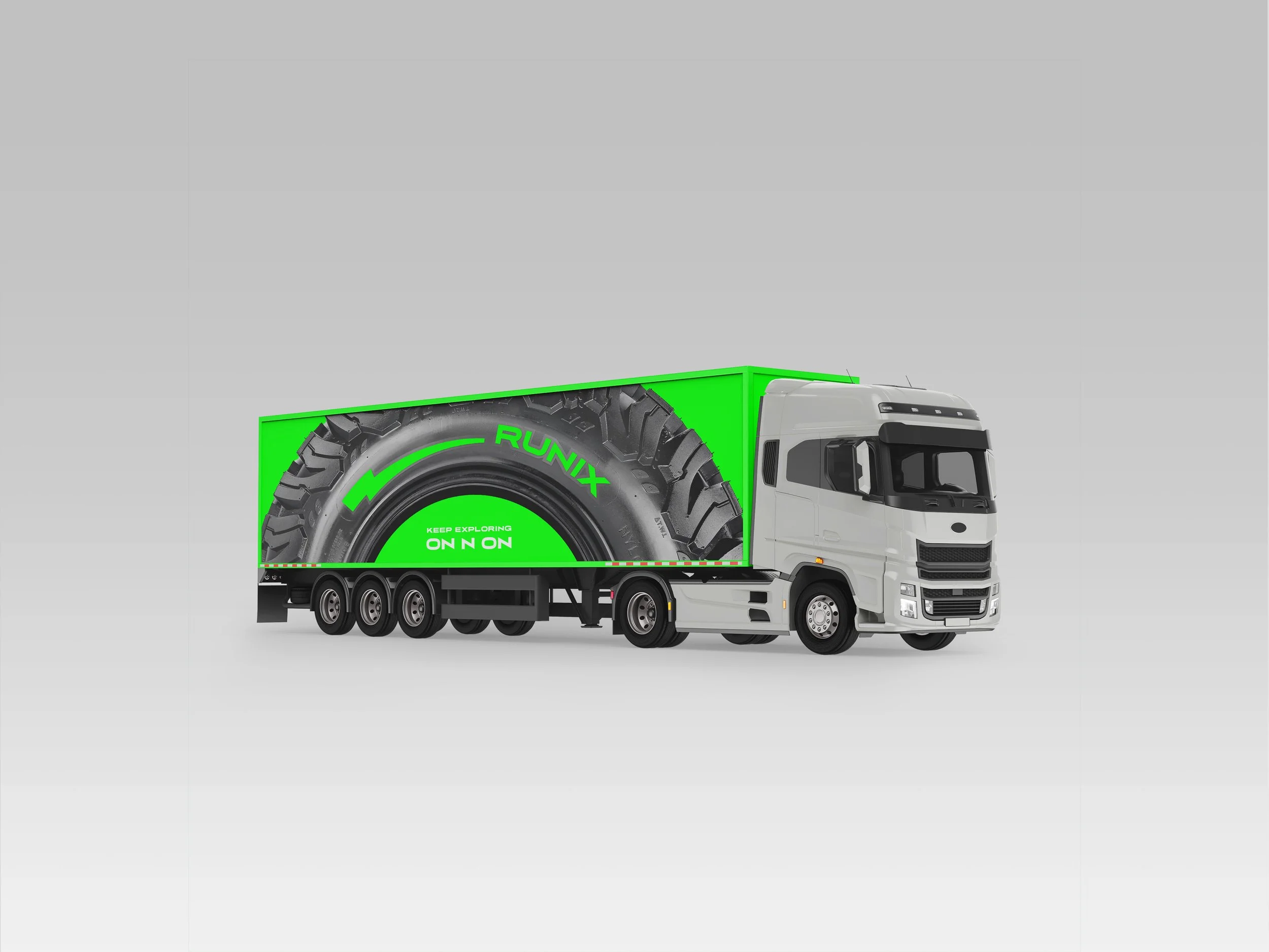
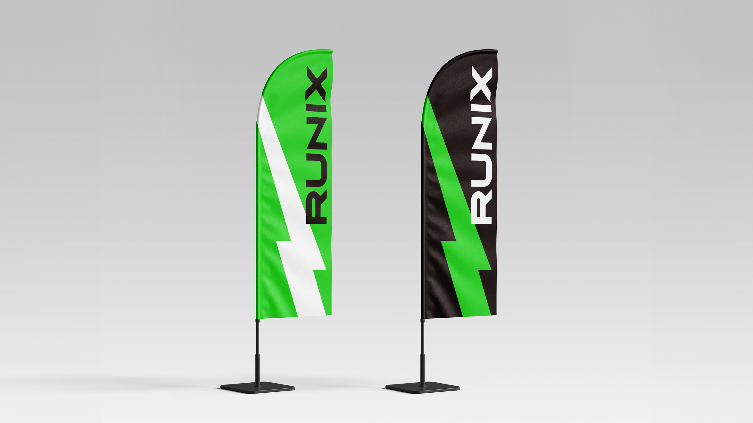
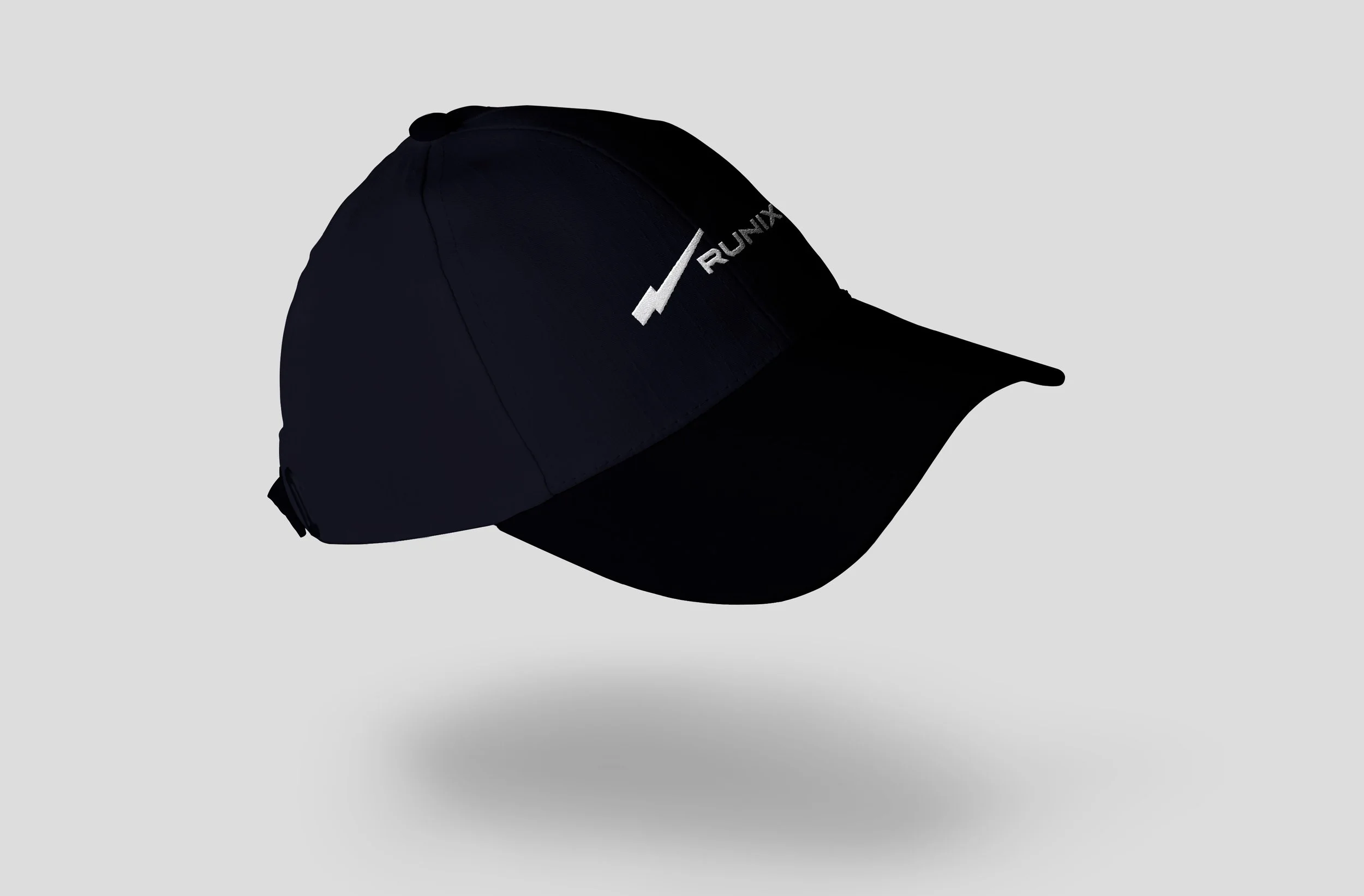
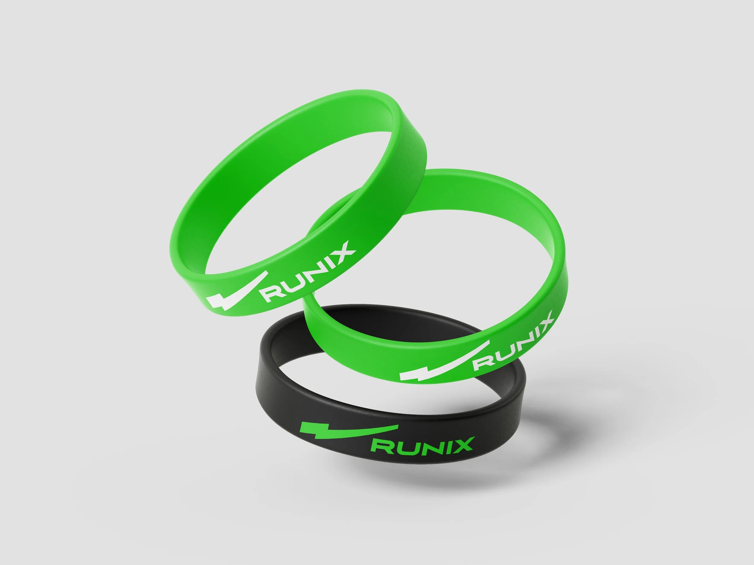
品牌設計以名稱核心字母 N 為出發點,延伸出 RUNIX 的精神主軸:象徵駕駛感知的無限延展,如同 N 次方般持續加乘,推動每一個瞬間的自我超越。我們將字母 N 轉化為線性且具有速度感的品牌識別符號,線條向上延伸,代表不斷進化的性能、成長與可能性,也呼應 RUNIX 引領駕駛破風前行的品牌角色。同時,N 亦成為品牌語言的一部分,發展出標誌性口號 ON N ON(on and on),強化品牌記憶點,並為未來行銷溝通創造高度延展性,例如:Keep Exploring, ON N ON.
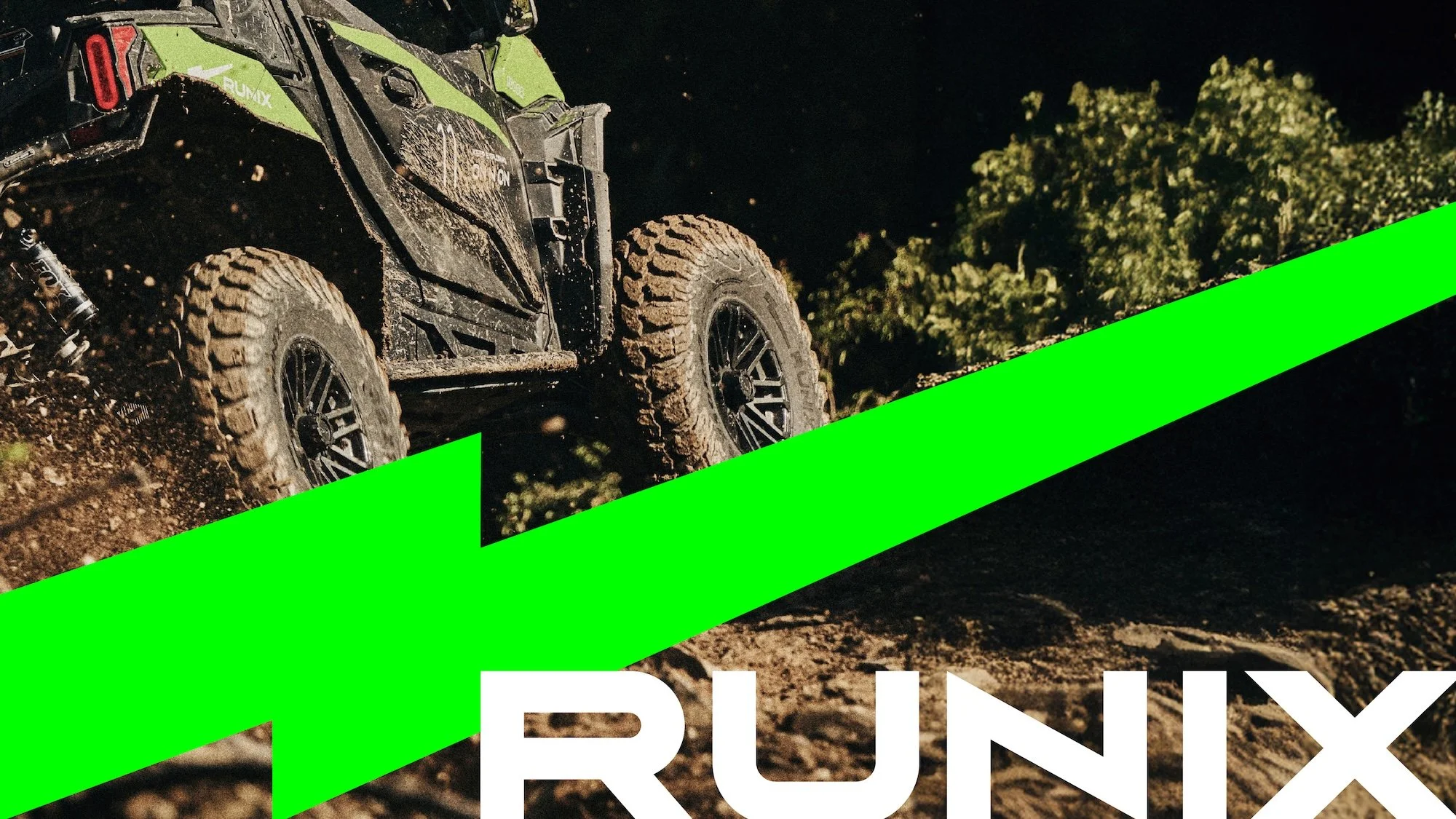
在色彩策略上,品牌選用高識別度的螢光綠作為主色,象徵能量、速度與前進的力量,搭配緊湊俐落的視覺節奏與動態影像表現,完整詮釋 RUNIX 持續突破、永不停歇的品牌精神。
The brand identity centers on the letter N, the core of the RUNIX name. N represents heightened driving perception and limitless growth, where performance and momentum are amplified to the power of N. Transformed into a linear visual mark, the upward-extending N conveys speed, progression, and an uncompromising drive to move forward without limits. N also becomes part of RUNIX’s verbal identity through the slogan “ON N ON” (on and on), reinforcing the idea of ongoing exploration and endurance. This flexible phrase strengthens brand recognition and supports future messaging, such as “KEEP EXPLORING, ON N ON.”
Visually, RUNIX is defined by a bold fluorescent green that conveys energy, motion, and high performance. Paired with dynamic layouts and motion-driven visuals, the brand reflects RUNIX’s relentless spirit - engineered to go further, push harder, and keep moving forward, mile after mile.
TYPOGRAPHY
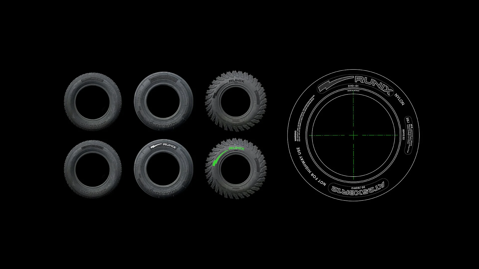
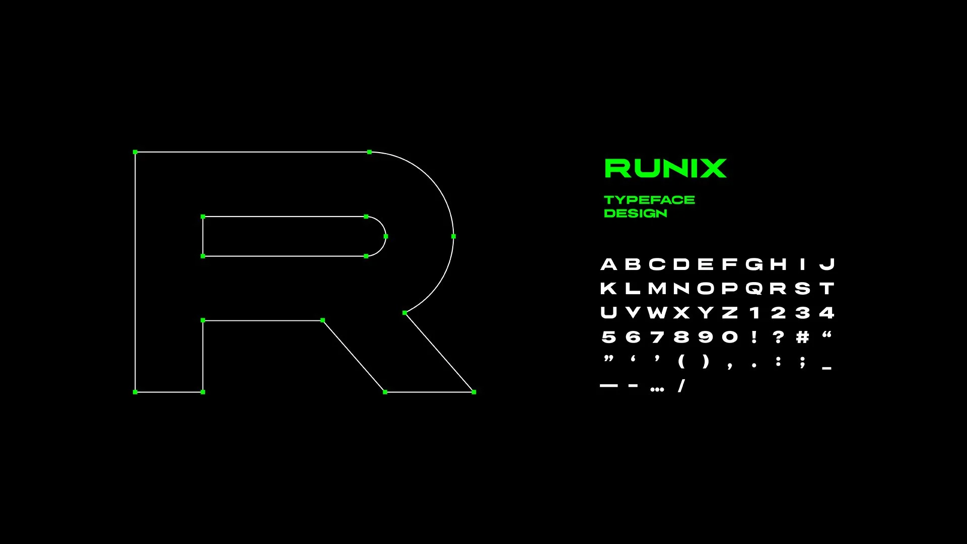
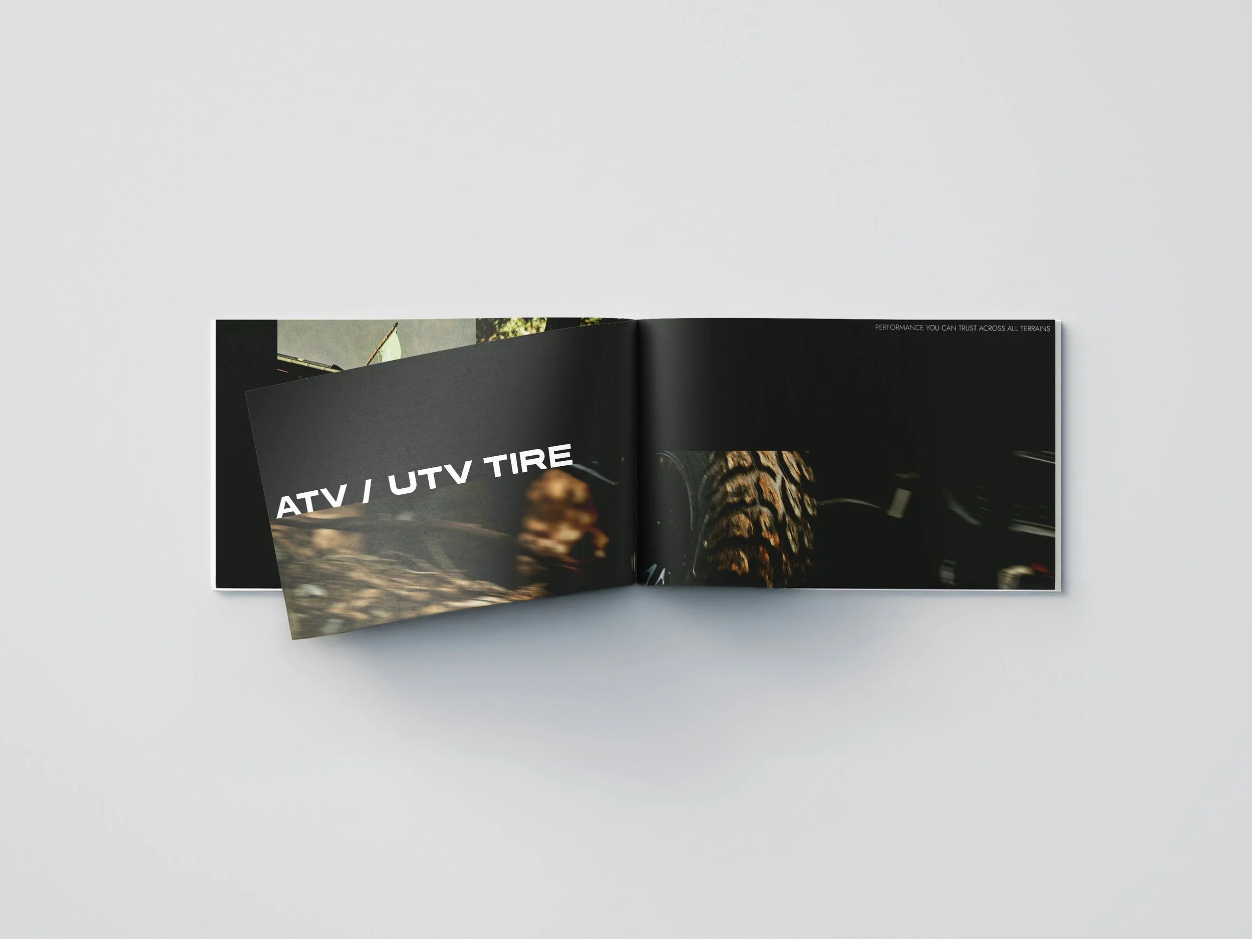
為 RUNIX 量身客製的品牌字體,完整體現品牌充滿能量與動感的精神。字形結構俐落而具張力,傳達速度、力量與前進的動能。此字體不僅應用於品牌標誌,也可延伸至標語視覺、產品上的輪胎型號與規格標示,使品牌語彙在所有接觸點上保持一致,讓 RUNIX 的視覺識別全面而有力地落實於每個細節之中。
The custom typeface designed for RUNIX embodies the brand’s energetic and dynamic spirit. With a sharp and powerful structure, it conveys speed, strength, and forward momentum. This typeface is not only applied to the brand logo, but also extended across slogan visuals, tire model names, and product specifications, ensuring a consistent and cohesive visual identity at every brand touchpoint.
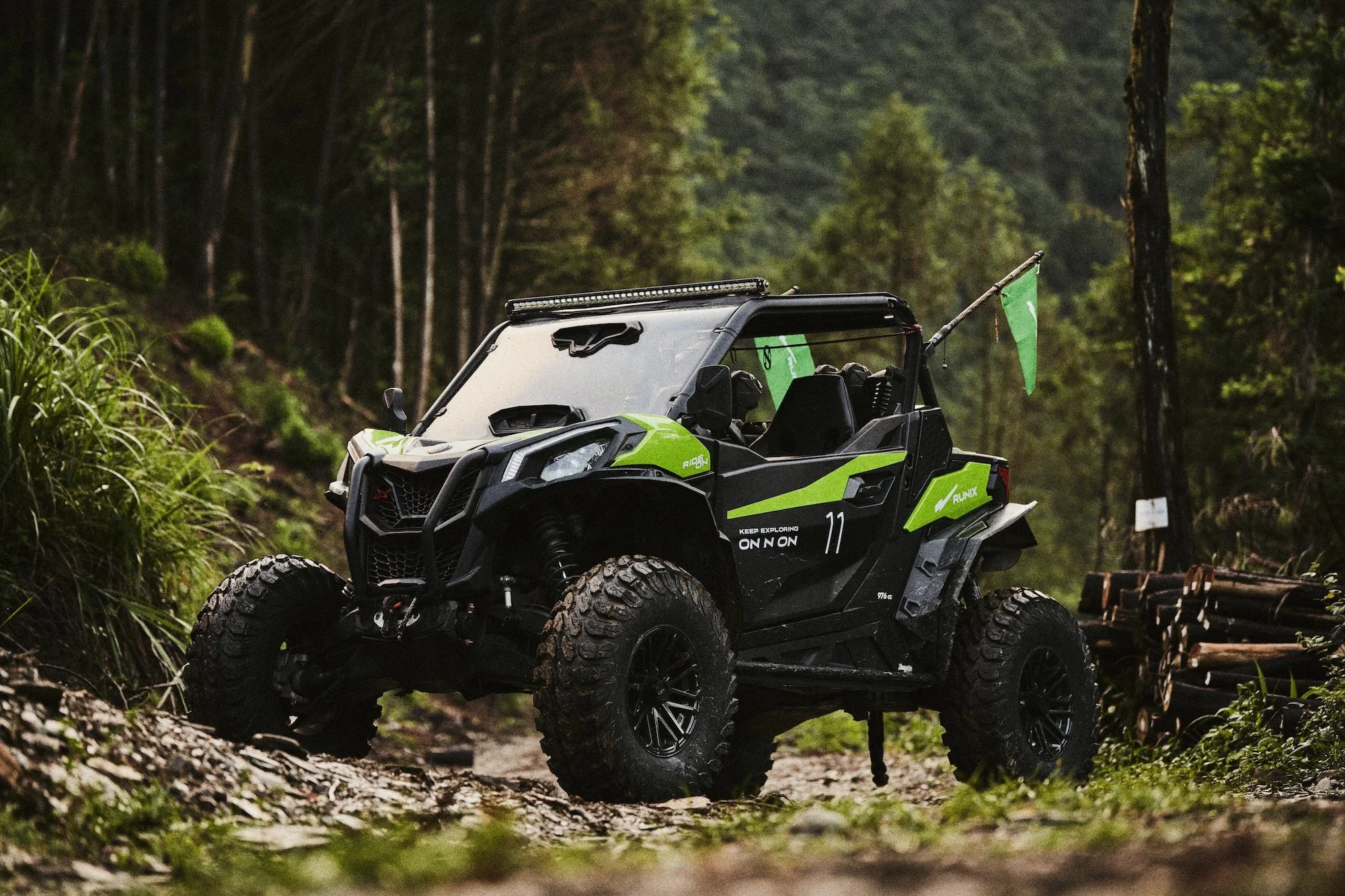
RUNIX VEHICLE
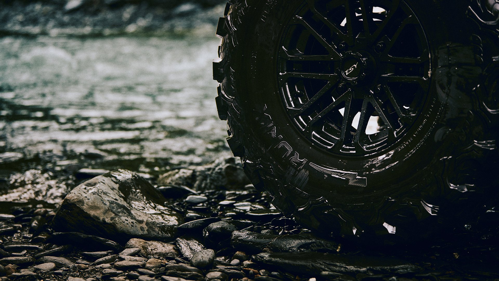
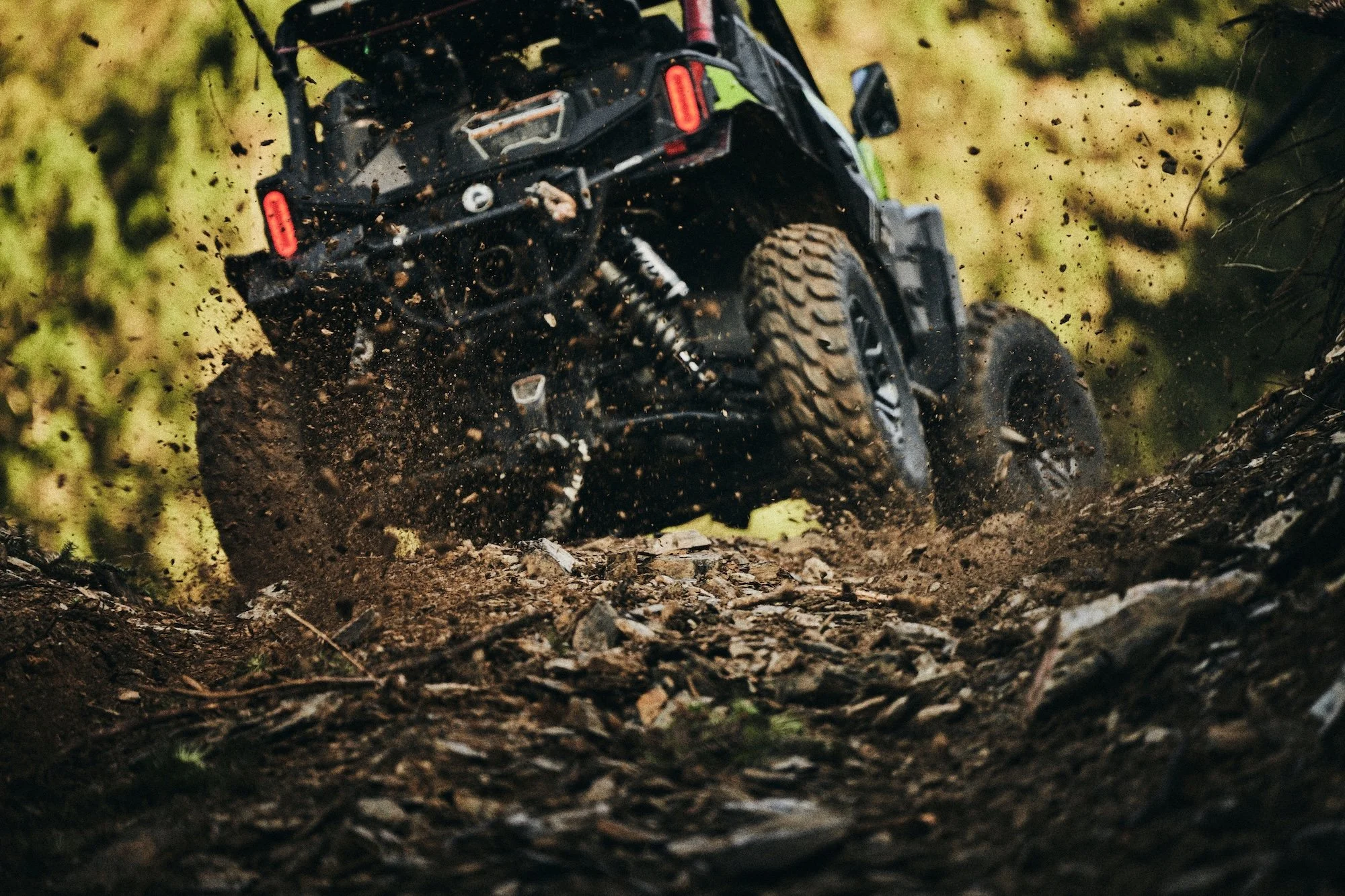
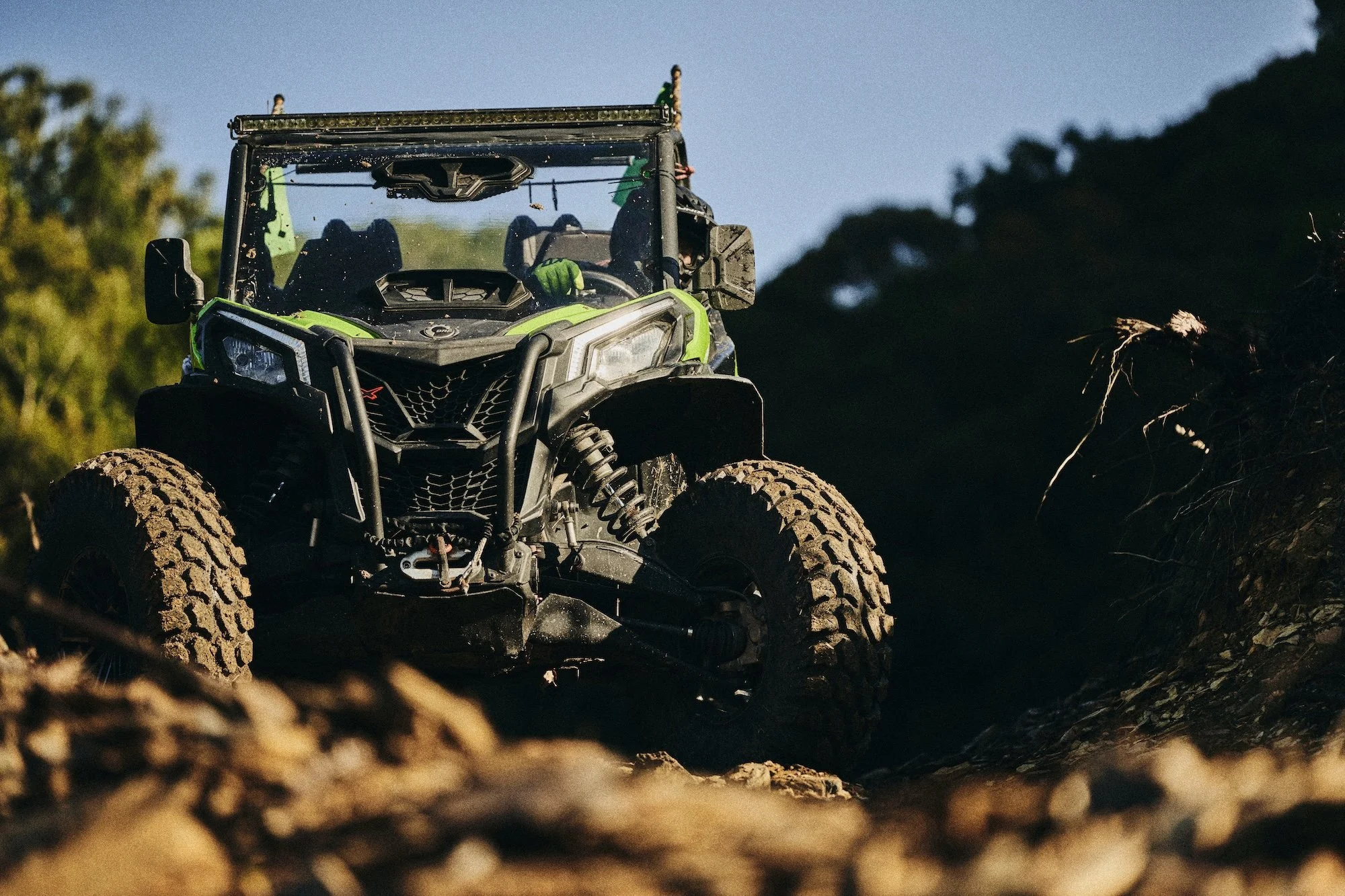
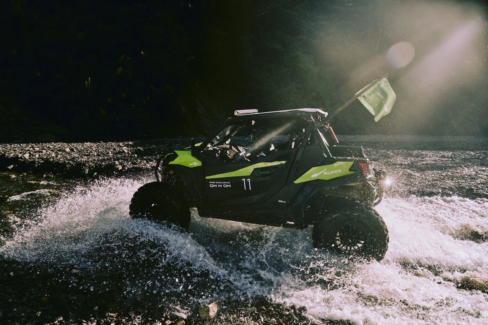
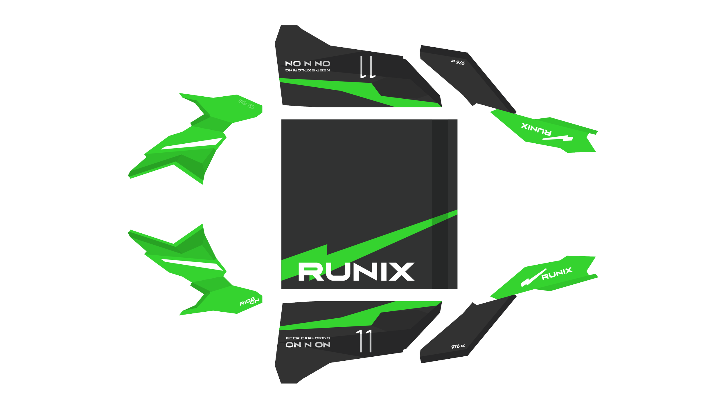
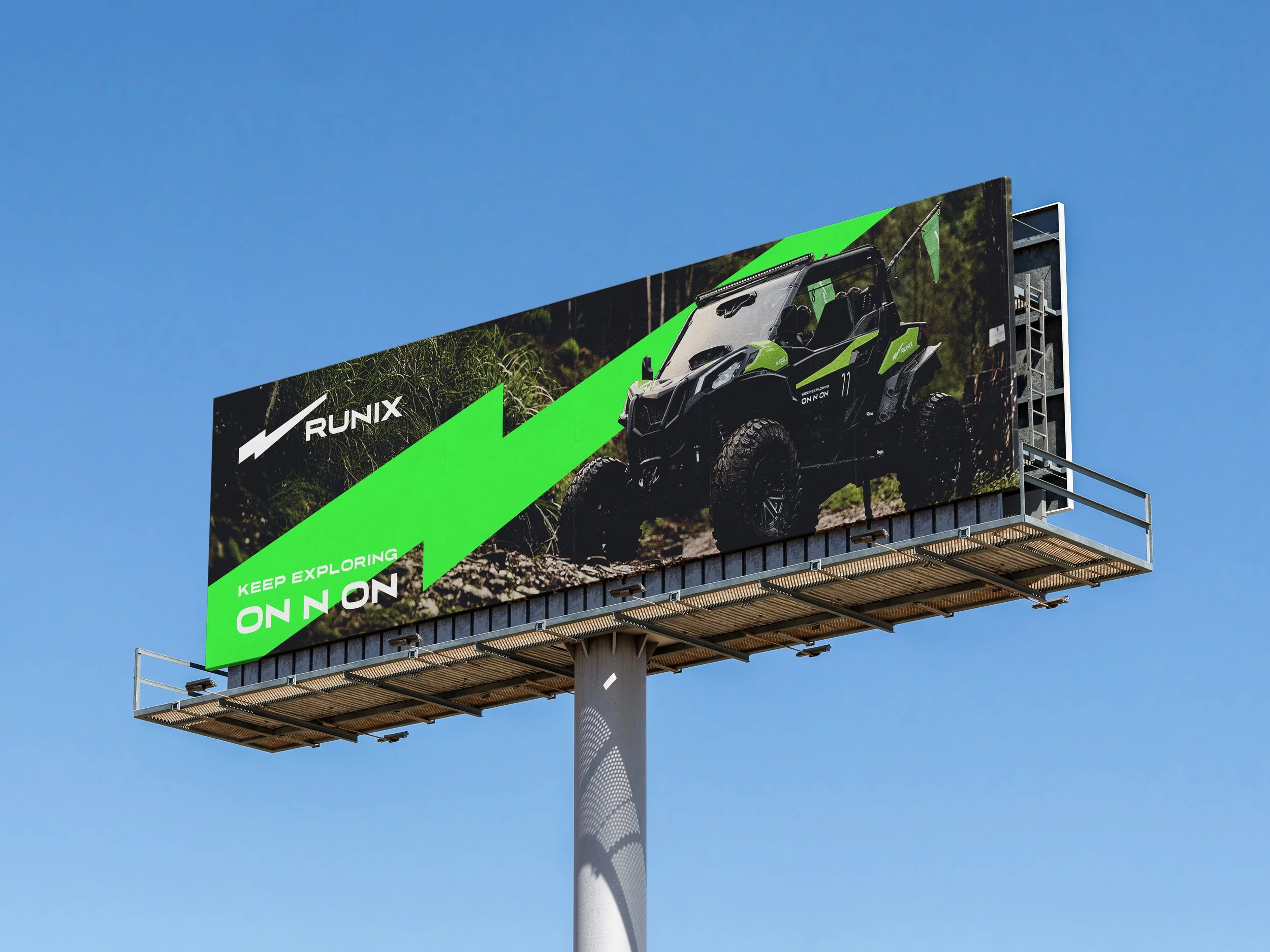
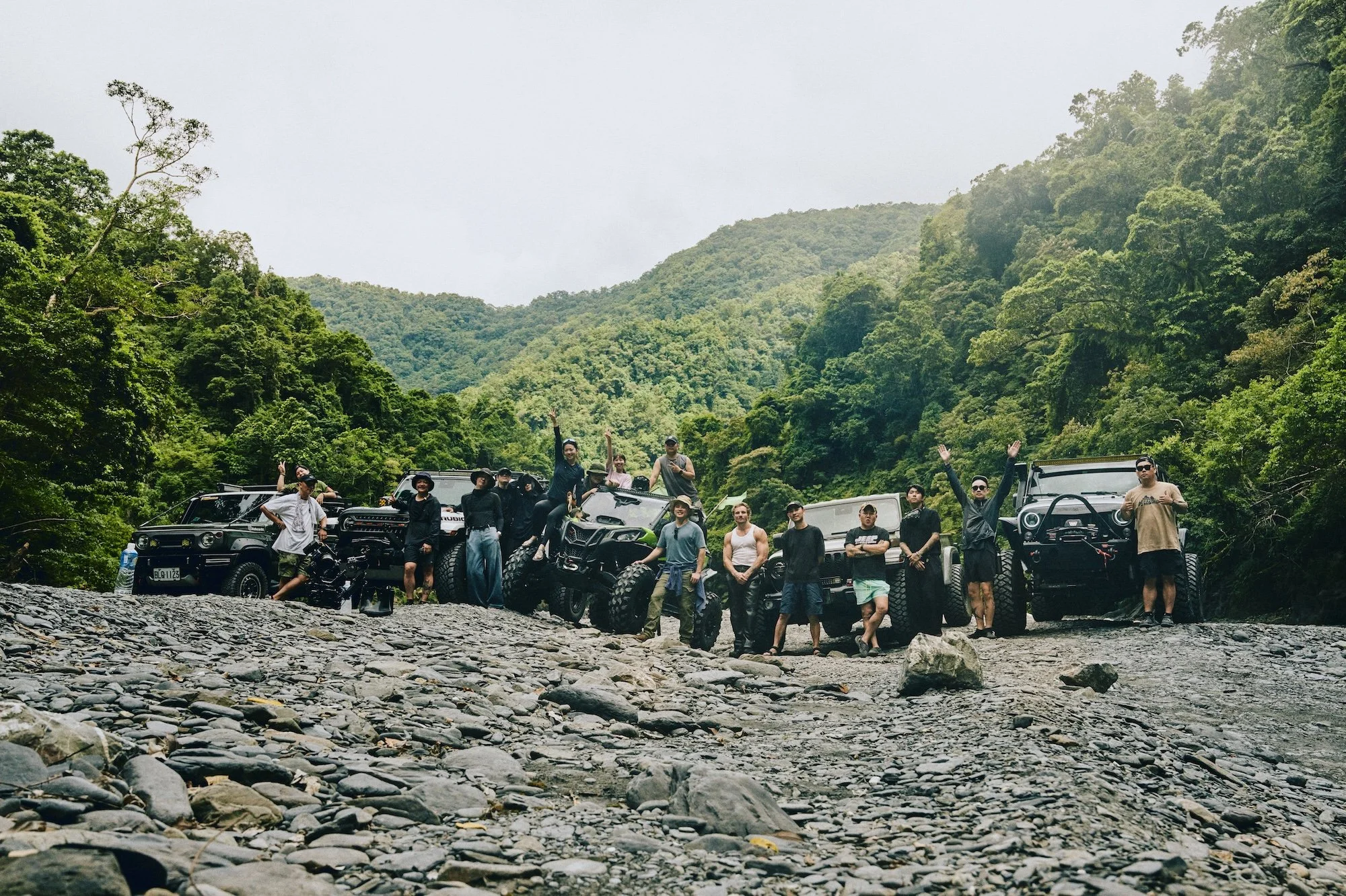
我們為 RUNIX 打造專屬形象車款,作為產品性能展示與品牌宣傳影片的核心載體。這台 ATV 不僅是展示工具,更是 RUNIX 精神的具象化呈現。車身設計大量運用品牌識別中的動態幾何語彙,透過俐落線條與速度感構圖,完整延伸品牌主視覺系統,展現充滿能量、無畏挑戰、勇於探索的品牌性格。形象車在高速移動與極限場景中,成為性能實力與品牌態度的最佳代言者,象徵 RUNIX 持續突破、ON N ON 前行的核心精神。
We created a dedicated concept vehicle for RUNIX to serve as the centerpiece for product performance demonstrations and promotional films. More than just a display unit, this ATV is a physical embodiment of the RUNIX spirit. The body design incorporates dynamic geometric elements derived from the brand identity, using sharp lines and speed-driven compositions to fully extend the core visual language. It reflects RUNIX’s energy, boldness, and adventurous character. In high-speed and extreme environments, the vehicle becomes the ultimate ambassador of both performance and attitude - symbolizing RUNIX’s relentless drive to push forward, ON N ON.
