ARCHIVE

亞源科技 越南

商業空間設計
Commercial Space Design


空間中流動的光影語彙

flowing light and shadow

亞源科技越南廠的設計主軸,將無形的電能轉換與傳輸過程,轉譯為空間中流動的光影語彙,藉此呼應集團在電源供應器與電流交換器領域的頂尖技術。透過大量水平向度的幾何線條交疊於牆面,模擬電流在設備間高速穿梭的軌跡,並藉由嵌入式燈帶的律動感,使純白介面產生如電光般的動態視覺。牆側天花板巧妙利用鏡面反射將挑高立面做連續延伸,有效提升視覺高度並強化光譜的動態張力。

The core design concept translates the invisible process of power conversion and transmission into a visual vocabulary of flowing light and shadow, echoing APD industry-leading expertise in power supplies and current switching. A multitude of horizontal geometric lines overlap across the walls, simulating the high-speed trajectory of electrical currents coursing between devices. Complemented by the rhythmic pulse of embedded light strips, the pristine white surfaces come alive with a dynamic, lightning-like energy. Along the perimeter, mirrored ceilings create a continuous reflection of the lofty walls, effectively extending the visual height while amplifying the dynamic tension of the light spectrum.


高精密感的專業氛圍

a high-precision
professional atmosphere

空間中運用大量霧面玻璃呈現自然透綠色彩,與品牌代表色進行材質對話,營造出清透且具高精密感的專業氛圍。會議室區採用直向玻璃分割構造,將不同功能的場域在統一的視覺語彙中串連,使平面配置上的培訓與辦公空間保有高度連貫性。

產品展示區則以漸層色彩的手法,讓牆面的透亮質感襯托出設備的精密細節,層架編排呼應了流動光影的核心概念,彼此間自然保留的位移斷差,賦予櫃體如電路跳動般的呈現。

The space utilizes extensive frosted glass to introduce natural translucent green tones, fostering a material dialogue with the brand’s signature green and cultivating a transparent, high-precision professional atmosphere. In the meeting areas, vertical glass partitions unify diverse functional zones—such as training and office spaces—within a consistent architectural language, ensuring a high degree of spatial continuity throughout the floor plan.

The product display area employs a gradient color technique, using the wall's luminous transparency to accentuate the intricate details of the high-precision equipment. The arrangement of the display shelves echoes the central theme of flowing light; natural offsets and staggered gaps between units imbue the cabinetry with a rhythmic, circuit-like vitality, showcasing the intersection of technology and spatial aesthetics.


得悅身心診所

品牌設計 / 視覺設計 / 品牌氛圍營造
Branding / Visual Design / Brand Curation


悅然綻放的心旅程

A Joyful Journey
of the Heart in Bloom

當生活壓力與情緒低潮籠罩心靈時,我們希望成為你安心停靠的避風港。透過專業的醫療與細緻的陪伴,引導你逐步梳理內在,重新找回安定的力量。如同初春的花朵悄然萌芽,情緒也能在關懷中綻放出希望,這不只是治療的過程,更是一場自我療癒的契機。當心靈重拾平衡,那份美好綻放的笑容,將伴隨你悅然前行,迎向更完整的自己,這段心的旅程,你從不孤單。

When life’s pressures and emotional lows cast a shadow over the heart, we hope to be a safe harbor where you can rest with peace of mind. Through professional medical care and attentive companionship, we guide you step by step in sorting through your inner world, helping you regain a sense of calm and strength.

Like blossoms quietly budding in early spring, emotions can bloom with hope through care and understanding. This is not merely a process of treatment, but an opportunity for self-healing. When the heart regains its balance, that radiant smile will accompany you forward with lightness and confidence toward a more complete self. On this journey of the heart, you are never alone.


將飛鳥及笑容所結合,描繪了療癒的旅程,飛翔中的笑容象徵著在支持與陪伴中,患者越過風浪回歸內心的平靜與喜悅,診所的專業與溫暖陪伴,幫助每位患者在生命的風浪中找到力量,展翅前行。

The identity design combines the image of a flying bird with a smile, portraying a journey of healing. The smiling form in flight symbolizes patients overcoming life’s storms with support and companionship, returning to inner peace and joy. With professional expertise and warm guidance, the clinic helps each individual find strength amid life’s turbulence and spread their wings to move forward.


RUNIX

品牌設計 / 視覺設計 / 字體設計 / 動態視覺 / 品牌氛圍營造
Branding / Visual Design / Typeface Design / Motion Graphic / Brand Curation

Credit

品牌設計|合聿設計
商業攝影|機電社
形象影片|A0 FILM


KEEP EXPLORING

RUNIX 是一家總部位於美國的專業輪胎製造商,專為 who expect more 的駕駛者而生 - 不只追求性能與耐久,更在意每一段旅程所帶來的感知與突破。RUNIX 相信,真正的駕馭體驗,來自對極限的不斷探索,以及持續向前的動能。

RUNIX is a U.S. based professional tire manufacturer designed for drivers who expect more - from performance and durability to the experience of every mile. The brand is built on the belief that driving is a continuous pursuit of progress, precision, and possibility.


ON N ON

品牌設計以名稱核心字母 N 為出發點,延伸出 RUNIX 的精神主軸:象徵駕駛感知的無限延展,如同 N 次方般持續加乘,推動每一個瞬間的自我超越。我們將字母 N 轉化為線性且具有速度感的品牌識別符號,線條向上延伸,代表不斷進化的性能、成長與可能性,也呼應 RUNIX 引領駕駛破風前行的品牌角色。同時,N 亦成為品牌語言的一部分,發展出標誌性口號 ON N ON(on and on),強化品牌記憶點,並為未來行銷溝通創造高度延展性,例如:Keep Exploring, ON N ON.

在色彩策略上,品牌選用高識別度的螢光綠作為主色,象徵能量、速度與前進的力量,搭配緊湊俐落的視覺節奏與動態影像表現,完整詮釋 RUNIX 持續突破、永不停歇的品牌精神。

The brand identity centers on the letter N, the core of the RUNIX name. N represents heightened driving perception and limitless growth, where performance and momentum are amplified to the power of N. Transformed into a linear visual mark, the upward-extending N conveys speed, progression, and an uncompromising drive to move forward without limits. N also becomes part of RUNIX’s verbal identity through the slogan “ON N ON” (on and on), reinforcing the idea of ongoing exploration and endurance. This flexible phrase strengthens brand recognition and supports future messaging, such as “KEEP EXPLORING, ON N ON.”

Visually, RUNIX is defined by a bold fluorescent green that conveys energy, motion, and high performance. Paired with dynamic layouts and motion-driven visuals, the brand reflects RUNIX’s relentless spirit - engineered to go further, push harder, and keep moving forward, mile after mile.


TYPOGRAPHY

為 RUNIX 量身客製的品牌字體,完整體現品牌充滿能量與動感的精神。字形結構俐落而具張力,傳達速度、力量與前進的動能。此字體不僅應用於品牌標誌,也可延伸至標語視覺、產品上的輪胎型號與規格標示,使品牌語彙在所有接觸點上保持一致,讓 RUNIX 的視覺識別全面而有力地落實於每個細節之中。

The custom typeface designed for RUNIX embodies the brand’s energetic and dynamic spirit. With a sharp and powerful structure, it conveys speed, strength, and forward momentum. This typeface is not only applied to the brand logo, but also extended across slogan visuals, tire model names, and product specifications, ensuring a consistent and cohesive visual identity at every brand touchpoint.


RUNIX VEHICLE

我們為 RUNIX 打造專屬形象車款,作為產品性能展示與品牌宣傳影片的核心載體。這台 ATV 不僅是展示工具,更是 RUNIX 精神的具象化呈現。車身設計大量運用品牌識別中的動態幾何語彙,透過俐落線條與速度感構圖,完整延伸品牌主視覺系統,展現充滿能量、無畏挑戰、勇於探索的品牌性格。形象車在高速移動與極限場景中,成為性能實力與品牌態度的最佳代言者,象徵 RUNIX 持續突破、ON N ON 前行的核心精神。

We created a dedicated concept vehicle for RUNIX to serve as the centerpiece for product performance demonstrations and promotional films. More than just a display unit, this ATV is a physical embodiment of the RUNIX spirit. The body design incorporates dynamic geometric elements derived from the brand identity, using sharp lines and speed-driven compositions to fully extend the core visual language. It reflects RUNIX’s energy, boldness, and adventurous character. In high-speed and extreme environments, the vehicle becomes the ultimate ambassador of both performance and attitude - symbolizing RUNIX’s relentless drive to push forward, ON N ON.


熊巫秀鳳

品牌設計 / 商業空間設計 / 視覺設計 / 品牌氛圍營造
Branding / Commercial Space Design / Visual Design / Brand Curation


燒暖个客家味瑞

The Taste
of Hakka Warmth

創辦人的外婆 —— 熊巫秀鳳,一位從日據時代走到今日的傳統客家女性。她象徵著家族的根、客家人的勤懇精神,以及代代相承的生活智慧。早年外婆務農,不吃牛,卻常為家人與餐廳員工準備客家料理,這份溫暖也促使原以全牛大餐為主的「牛稼莊」,逐漸將客家菜納入菜單之中,成為深具地方特色的飲食印記。

The founder’s grandmother, Hsiung Wu Hsiu Fong, is a traditional Hakka woman who lived through the Japanese colonial era and into the present day. She represents the roots of the family, the diligence of the Hakka people, and the life wisdom passed down through generations. In her early years, she worked in agriculture and did not eat beef, yet she often prepared Hakka dishes for her family and the restaurant staff. This warmth and care gradually inspired the originally all-beef restaurant, Niu Jia Zhuang, to incorporate Hakka cuisine into its menu, becoming a distinctive culinary symbol deeply rooted in the local culture.


屋下个燒暖同記憶,
世代直直延續落去个客家食雜。

The warmth of home and memories,
carrying Hakka flavors through generations.

品牌以外婆之名,延伸成全新餐廳「熊巫秀鳳」,希望重新詮釋客家料理,滿足東豐鐵馬道旅人與在地居民的味蕾。而「火囪」意象為概念核心,傳統客家暖爐也是外婆無言關懷的象徵,如同她常說的:「轉來咧,遽遽食飯,菜還燒燒。」透過店內親切的客家語、充滿情懷的料理香與火囪藤編意象的呈現,我們紀念熊巫秀鳳,也將她的溫暖與親切化作品牌精神,迎接每一位來訪的客人,讓人感受到家的滋味與歸屬感。

Named after the founder’s grandmother, the brand has evolved into a new restaurant, “Hsiung Wu Hsiu Fong,” reimagining Hakka cuisine to delight both travelers along the Dongfeng Bikeway and local residents alike.

The concept centers on the image of the “fire stove” (Huo Cong) — a traditional Hakka hearth and a silent symbol of the grandmother’s care and devotion. As she often said in Hakka, “You’re back—come eat quickly, the food is still hot.”

Through the warm use of the Hakka language in the restaurant, the nostalgic aromas of home-style cooking, and the woven rattan imagery inspired by the hearth, we honor Hsiung Wu Hsiu-Feng and transform her kindness and warmth into the spirit of the brand. We welcome every guest with the taste of home and a deep sense of belonging.


菜單設計以手繪插畫呈現,線條溫潤質樸,傳遞客家文化的踏實與溫度。透過細膩筆觸與自然構圖,讓用餐者在閱讀之間感受土地情感與家的親切滋味。

The menu design features hand-drawn illustrations with warm, simple lines, conveying the sincerity and warmth of Hakka culture. Through delicate brushstrokes and natural compositions, diners can feel a connection to the land and the comforting, familiar taste of home as they read the menu.


傳統意象與現代空間語彙的轉化

From Tradition
to Modern Space

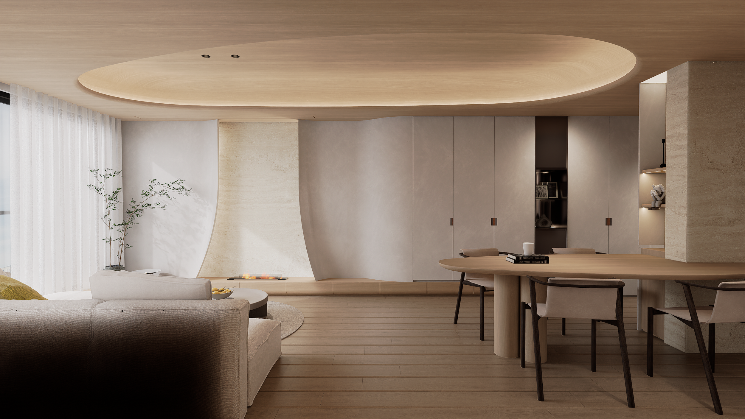
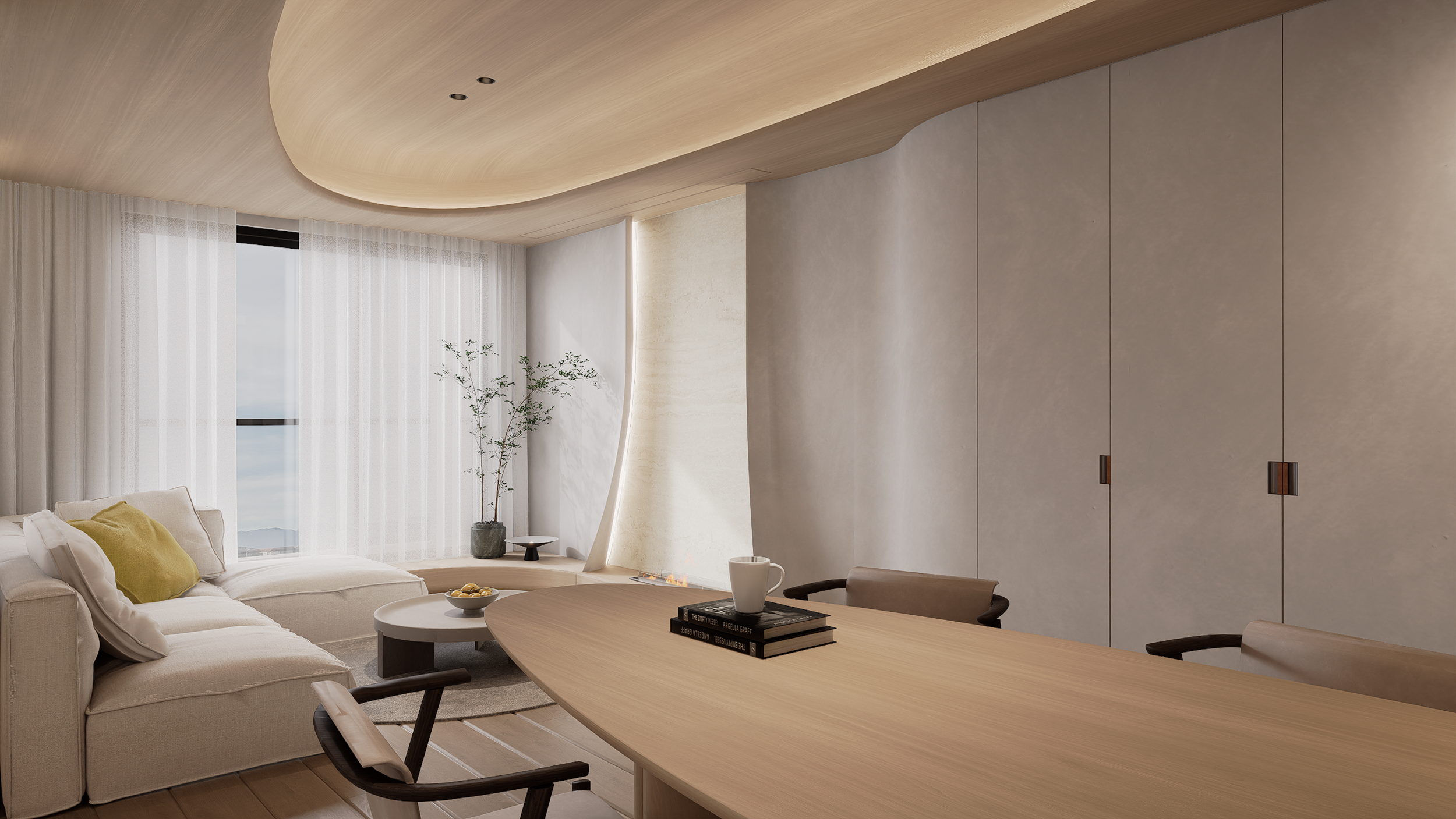
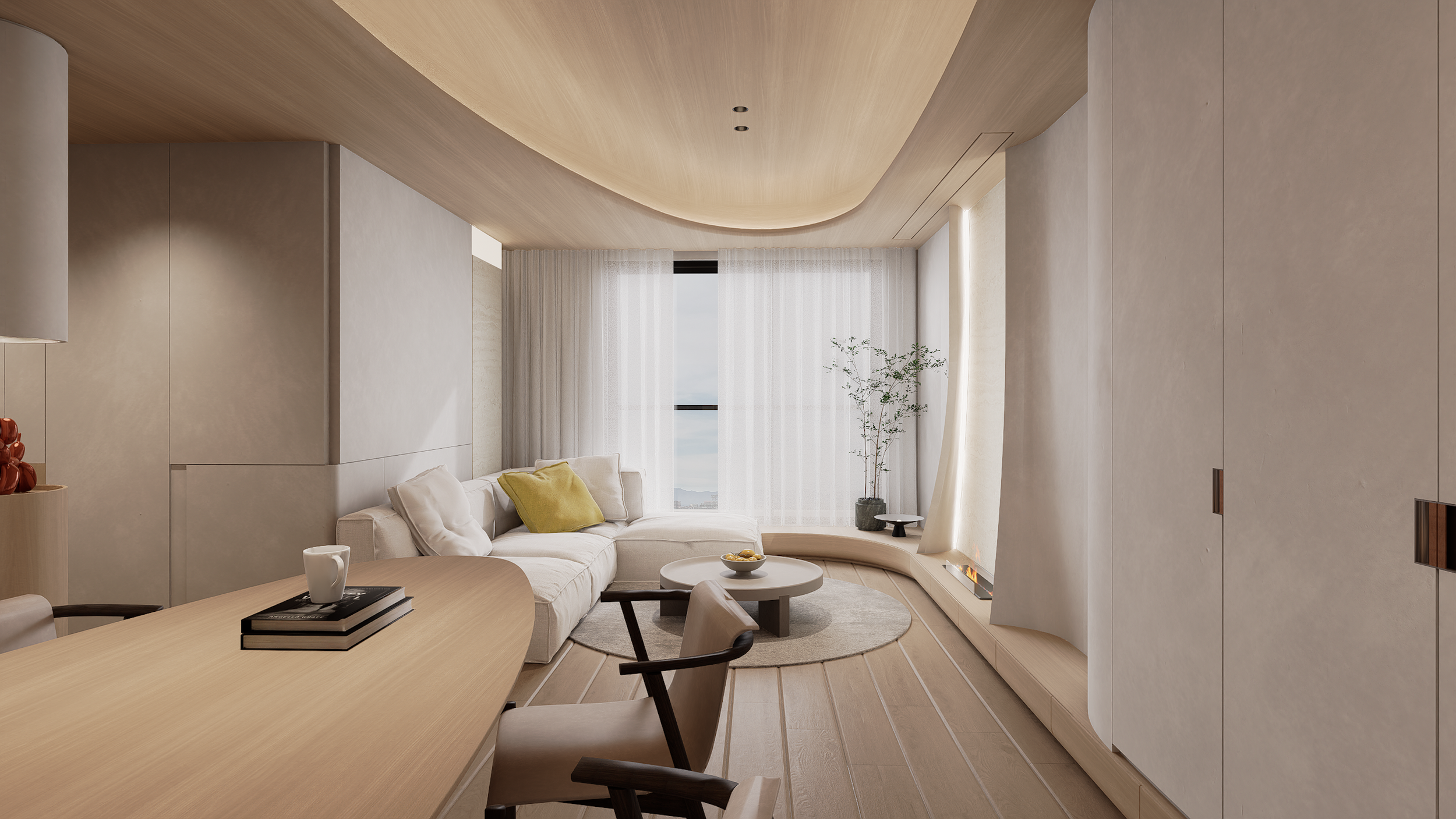
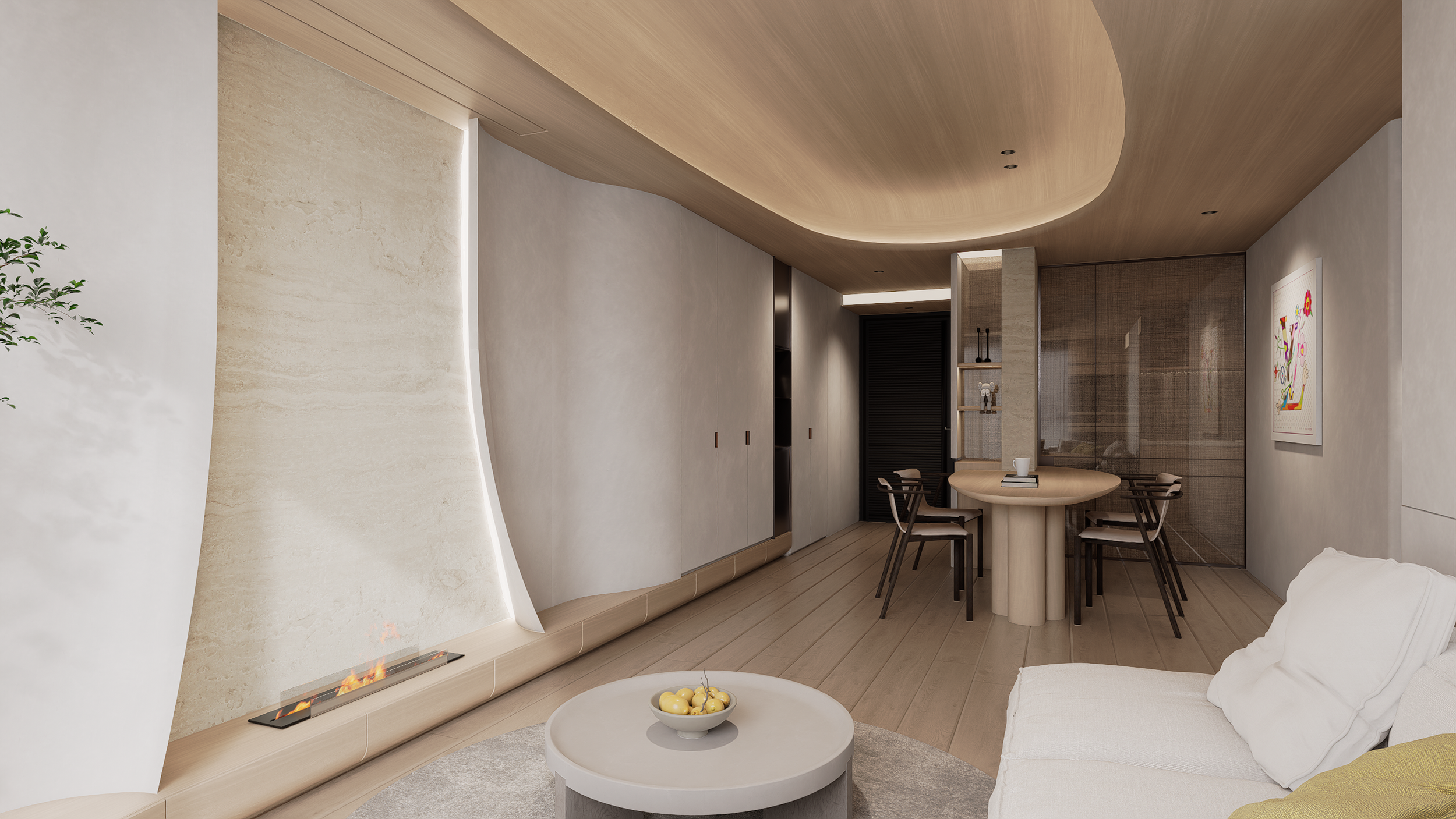
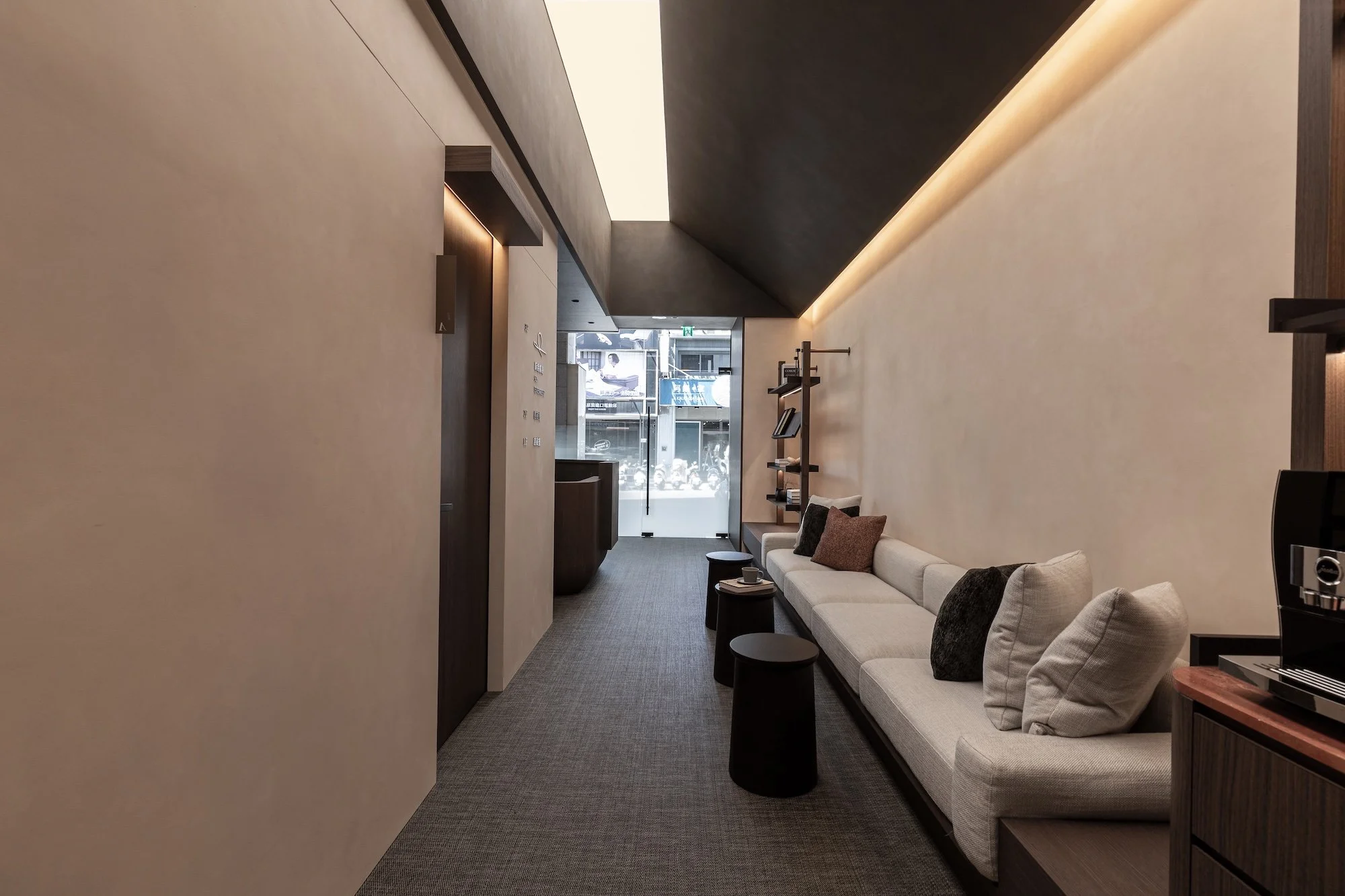
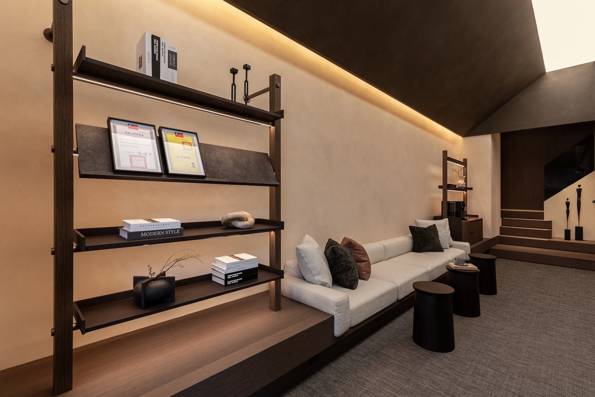
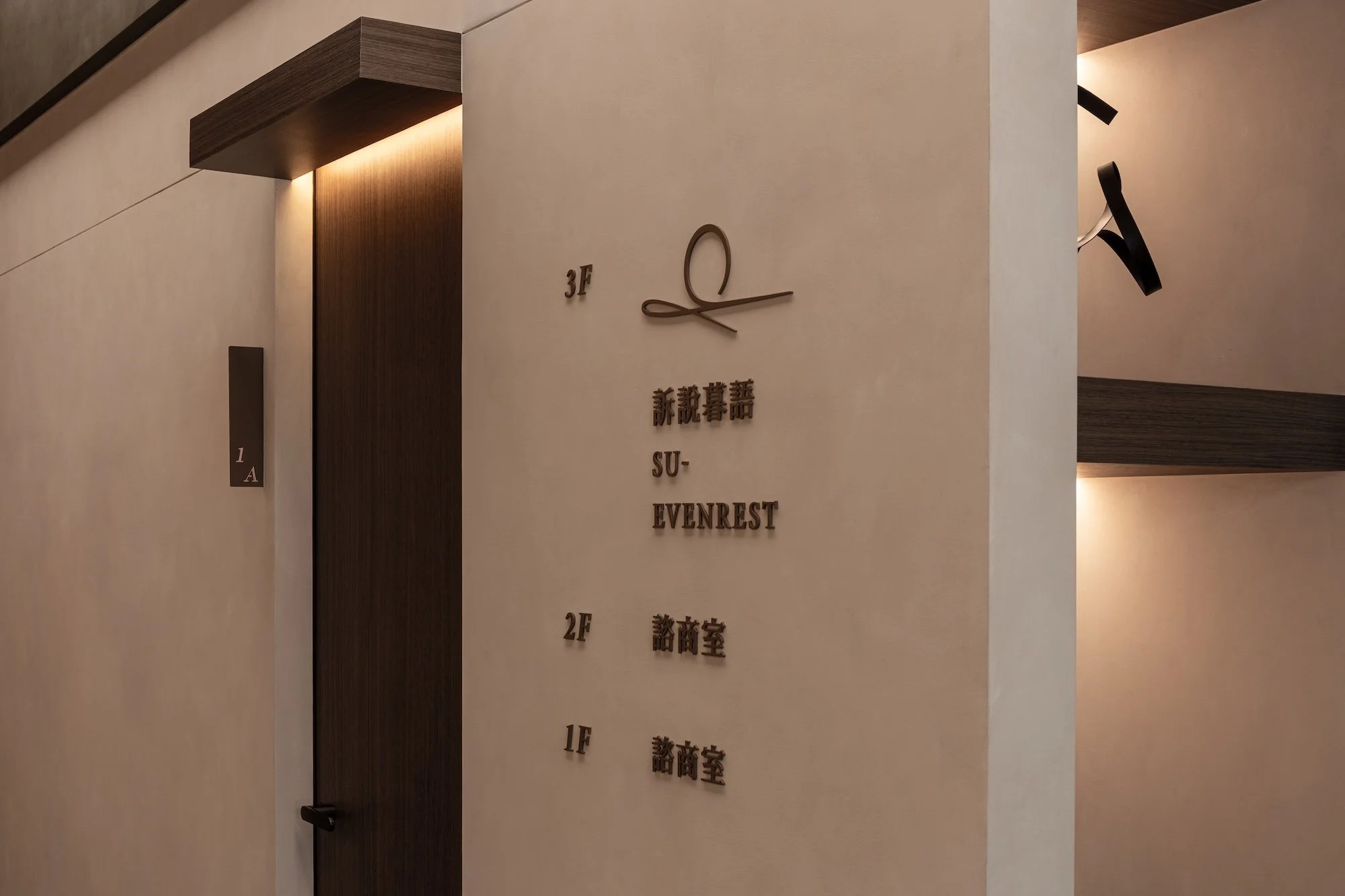
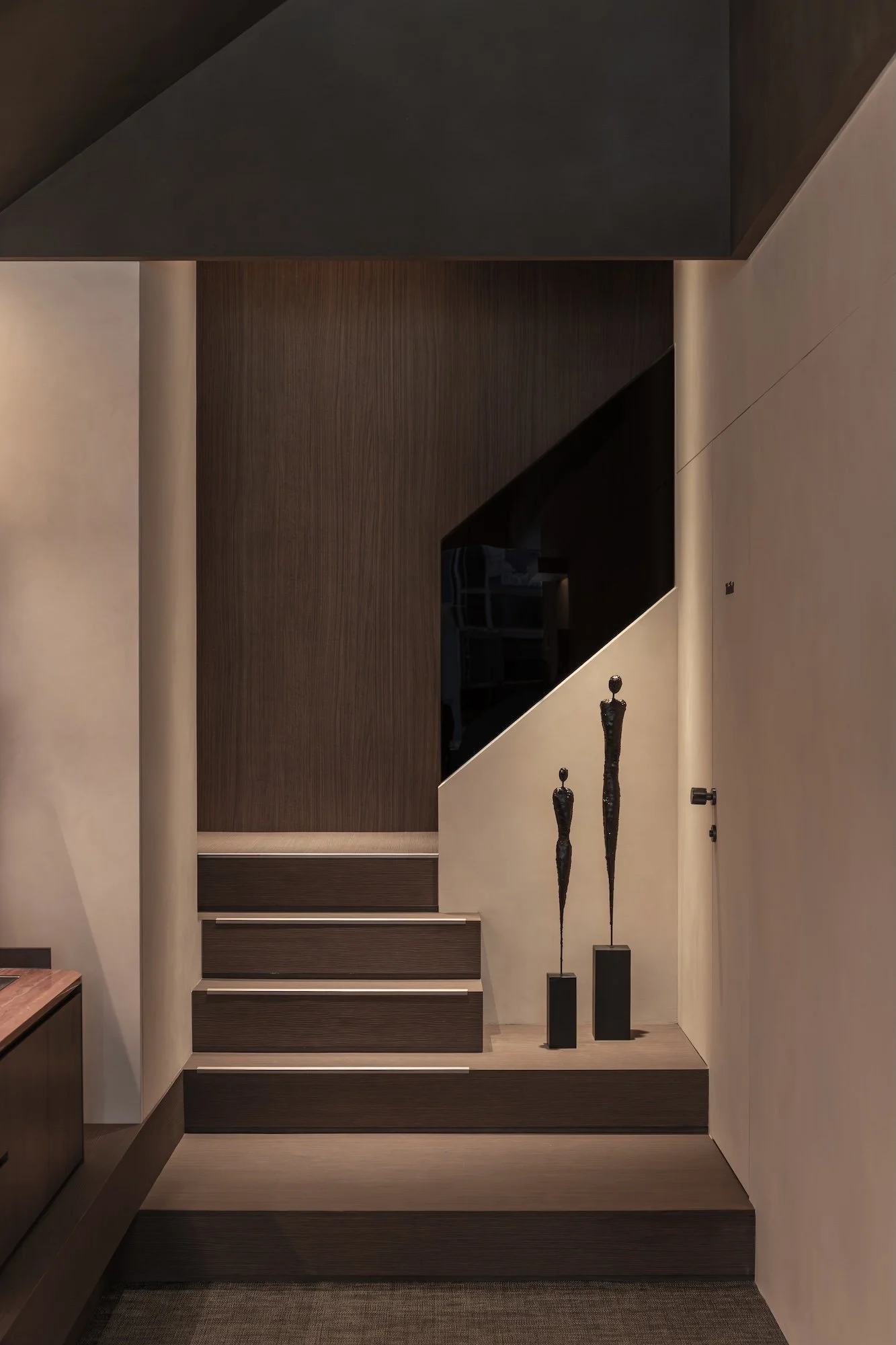
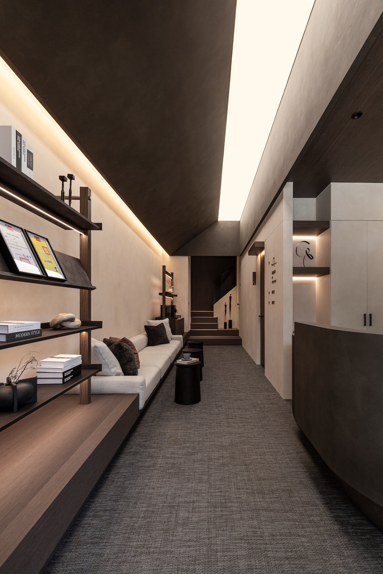
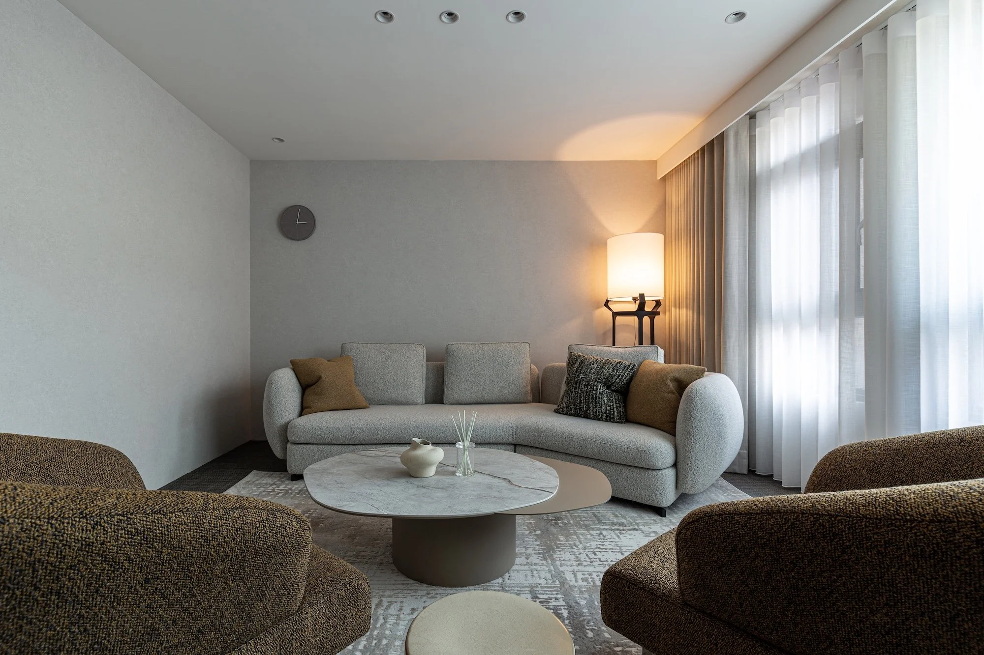
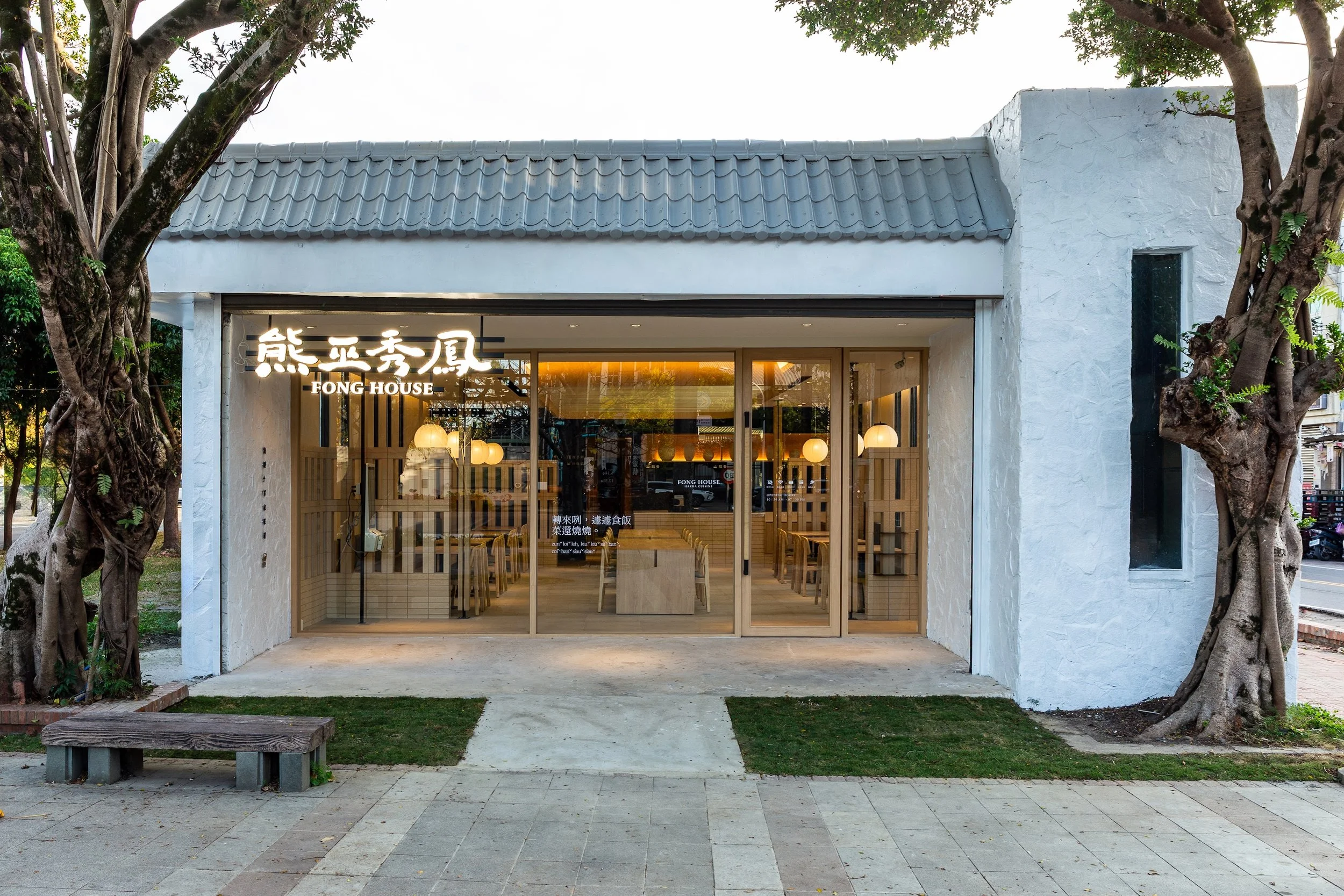
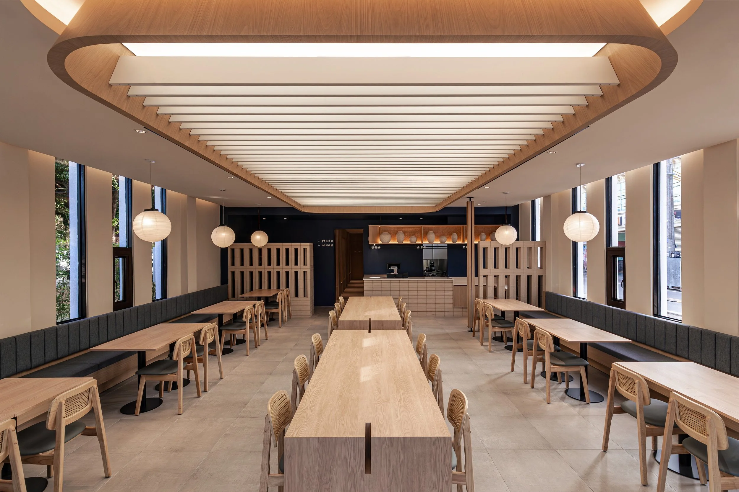
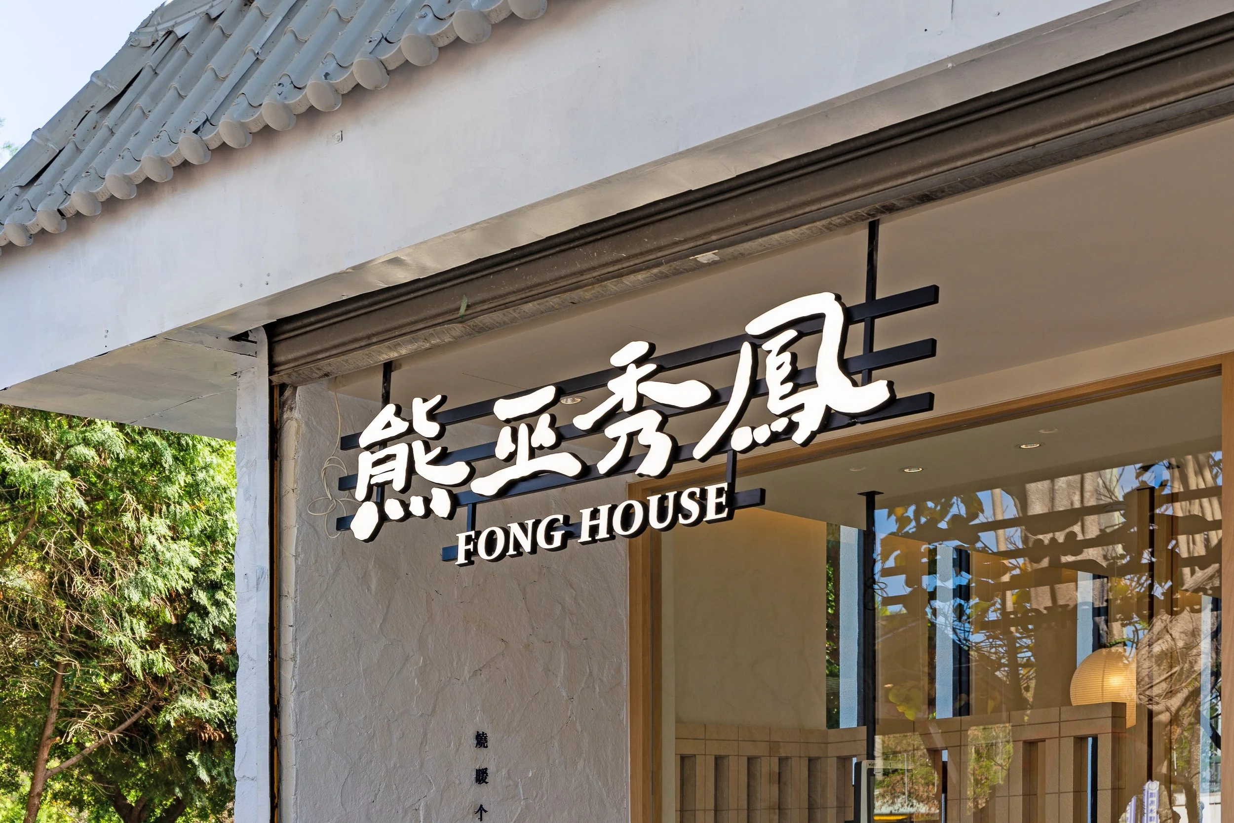
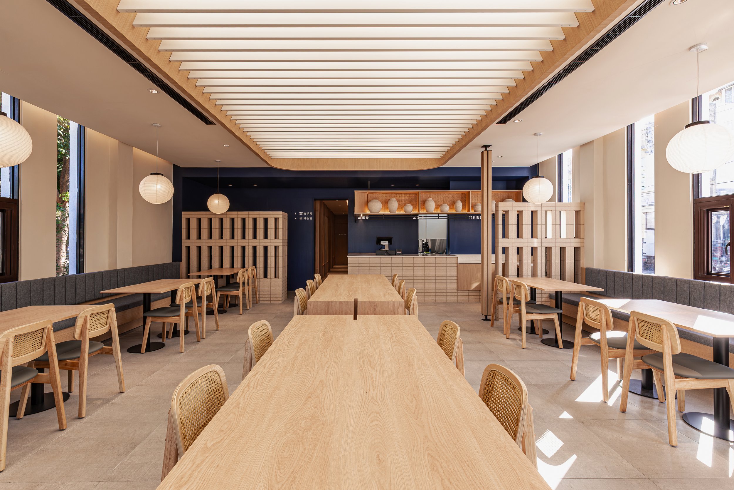
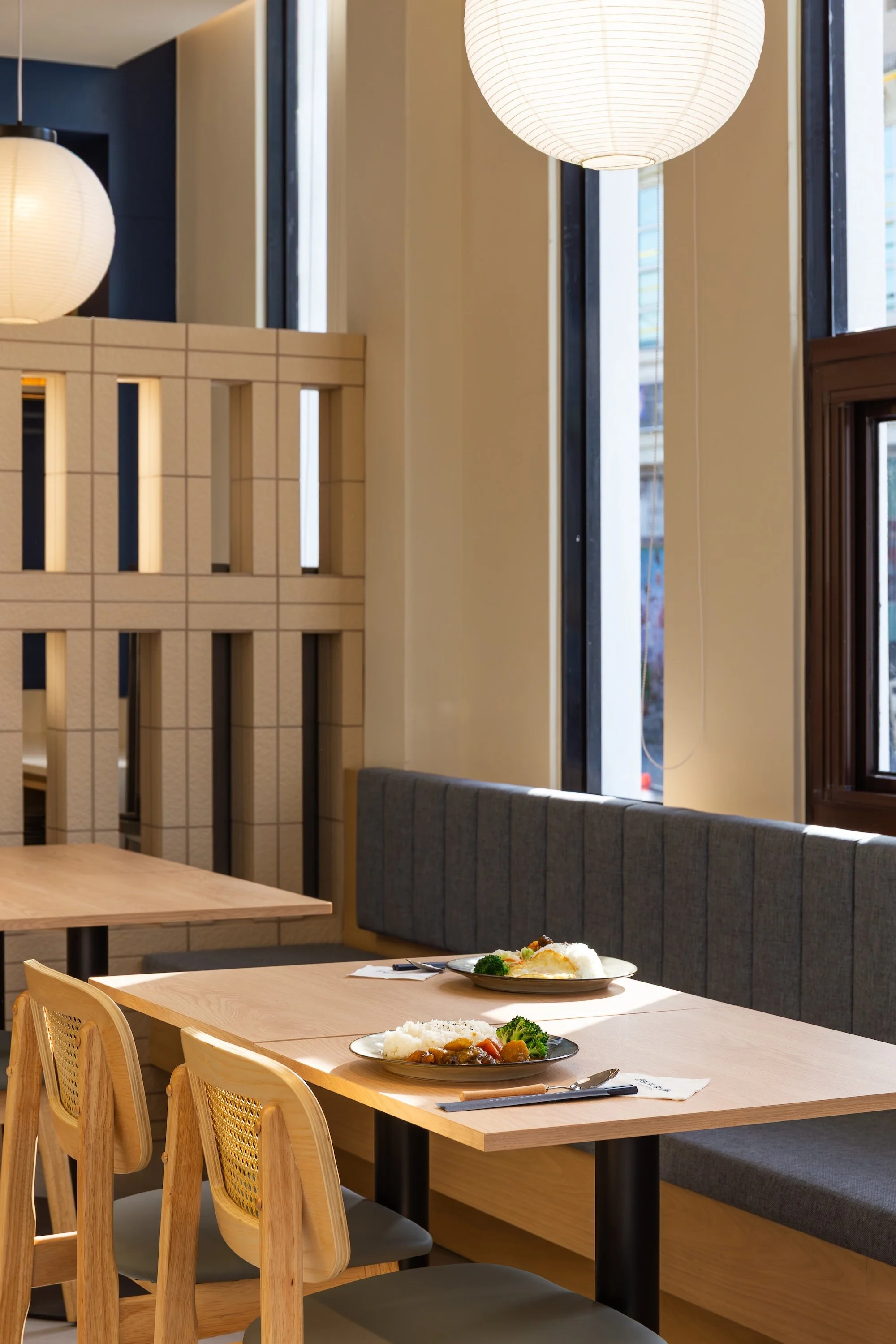
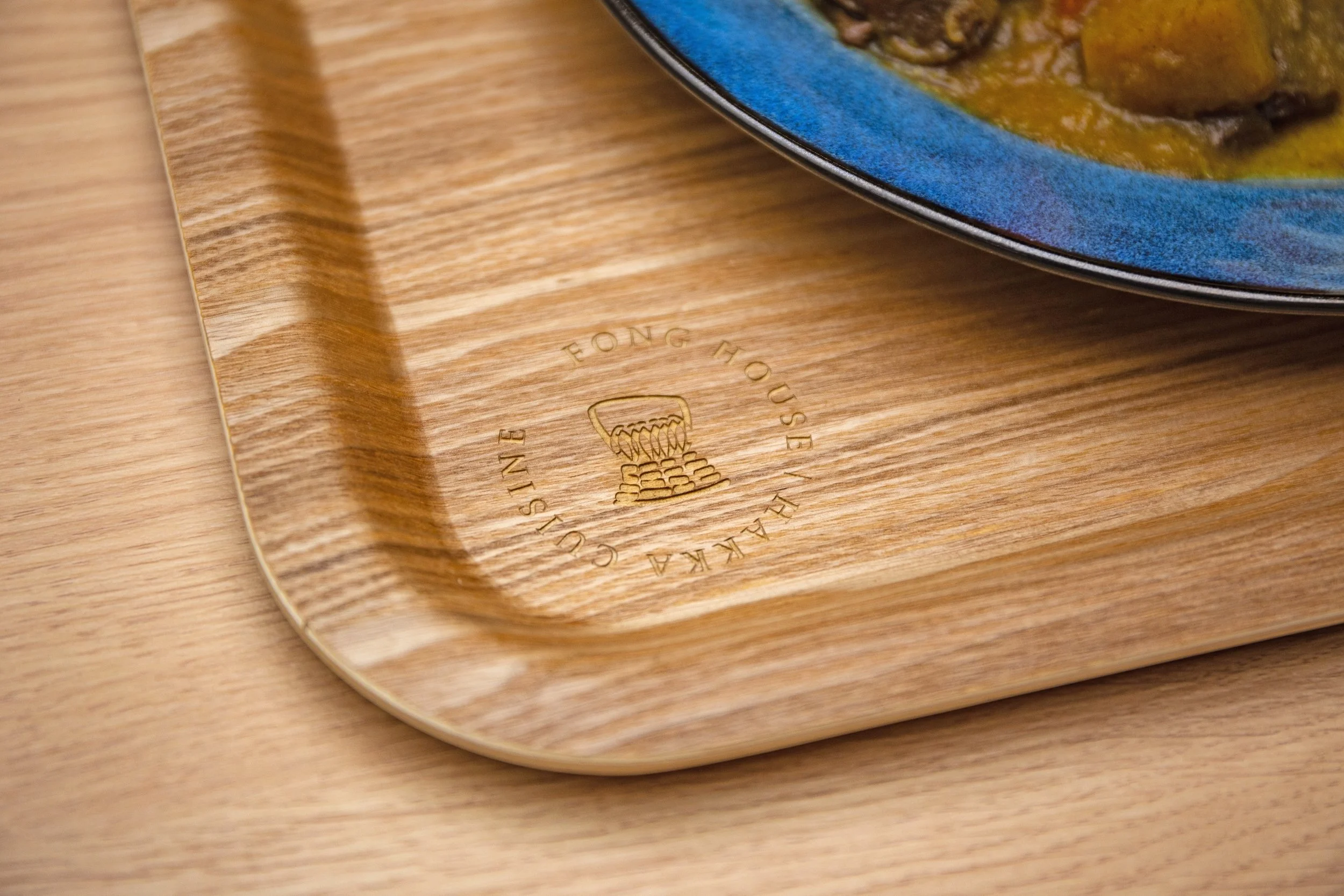
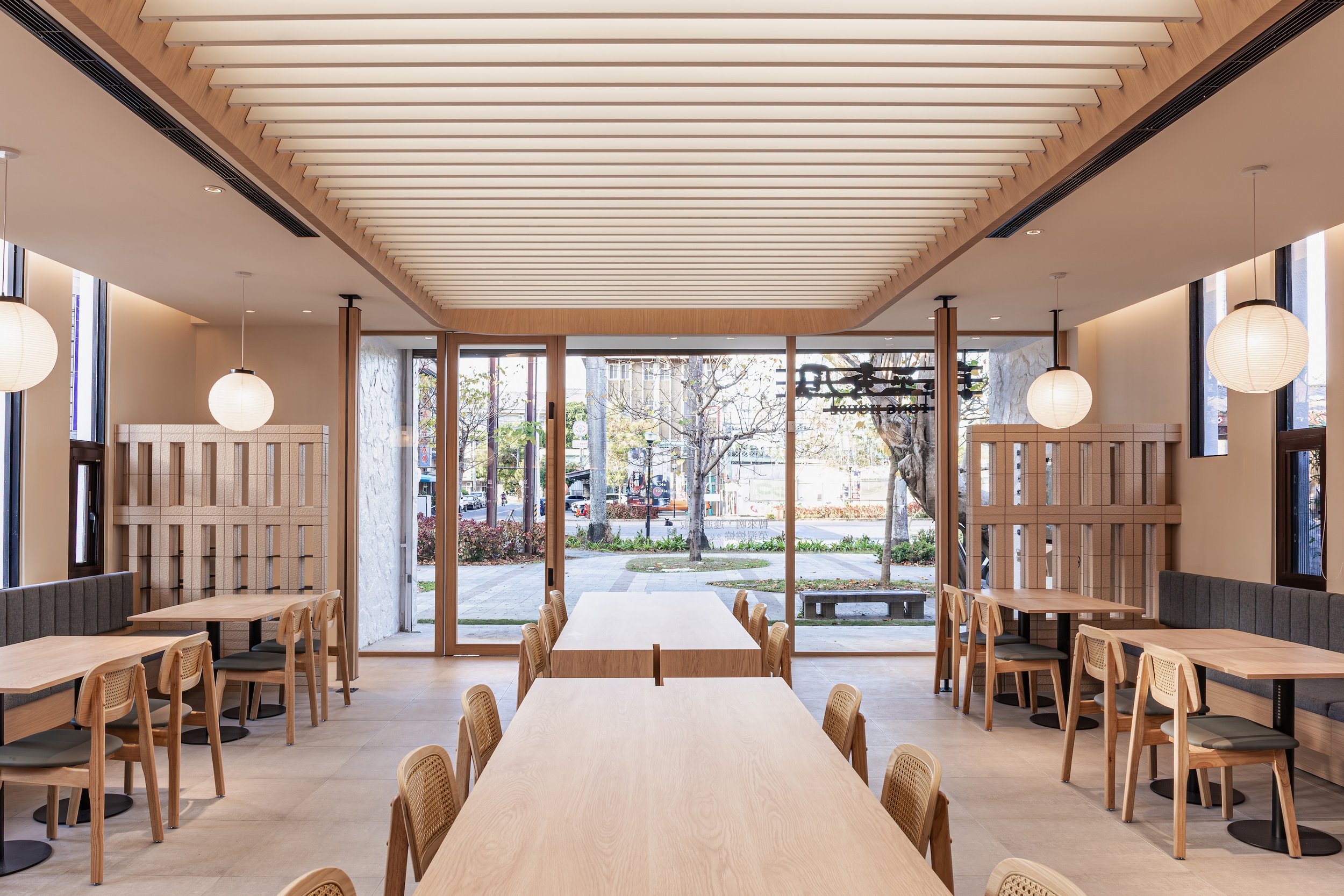
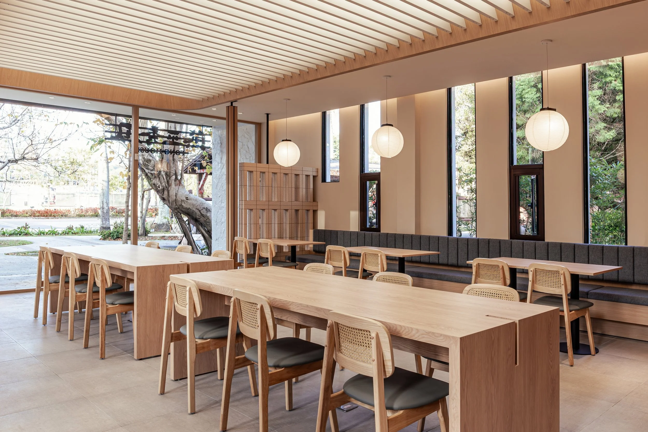
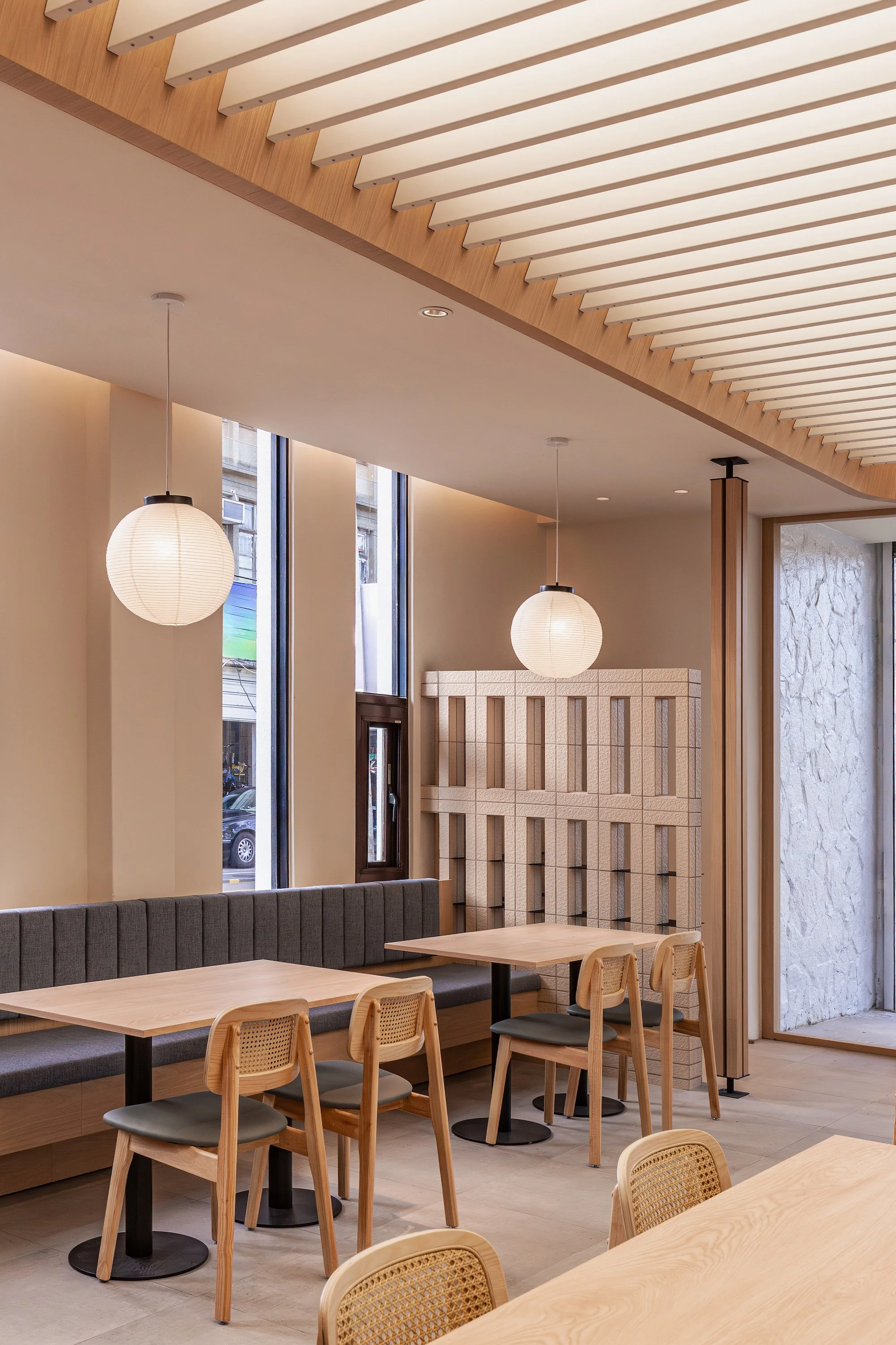
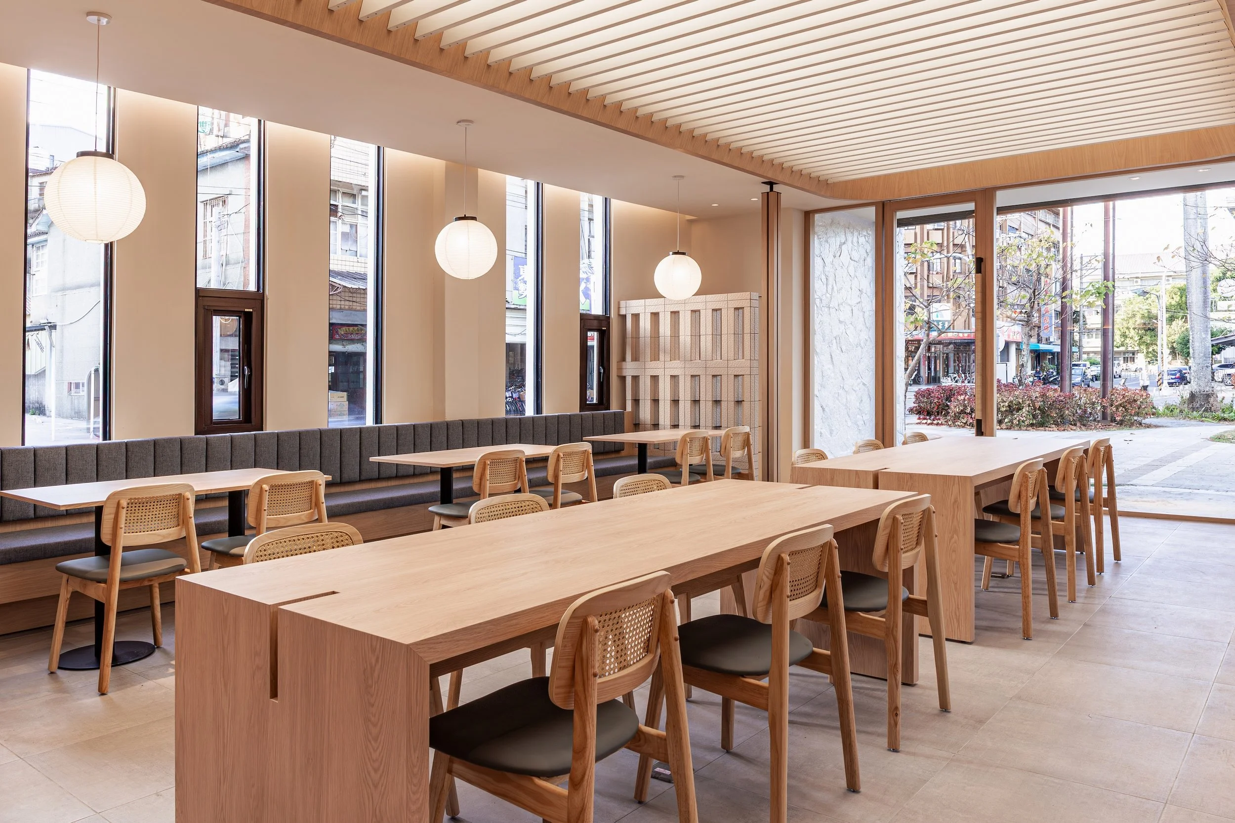
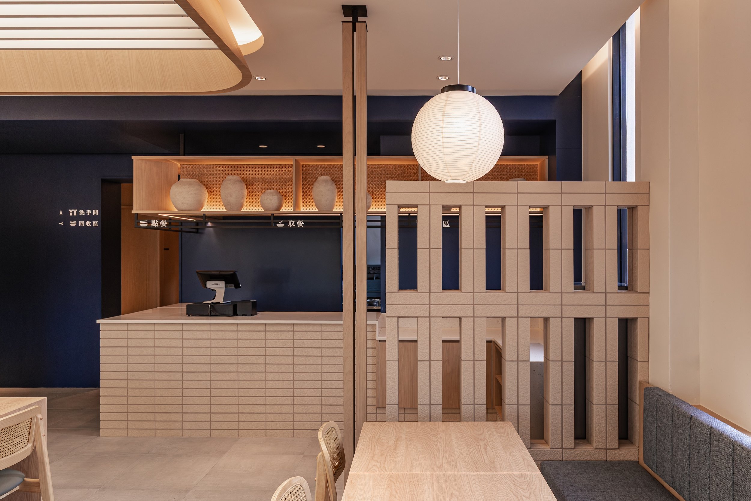
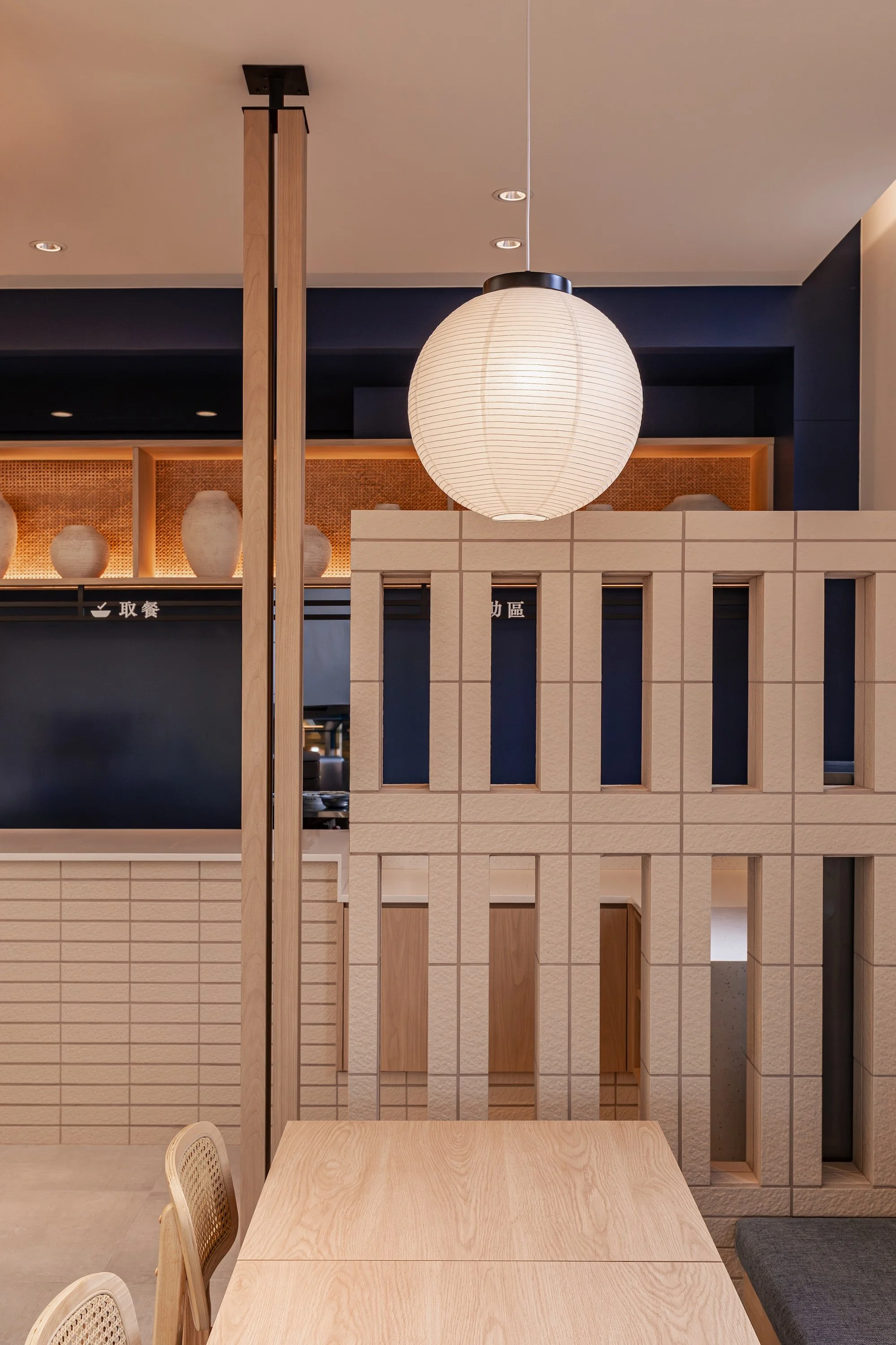
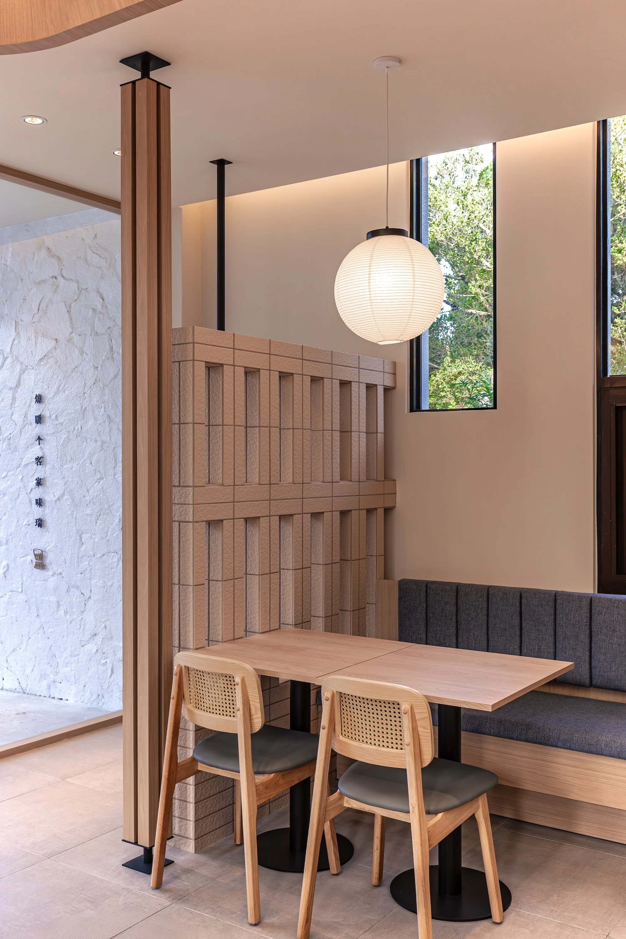
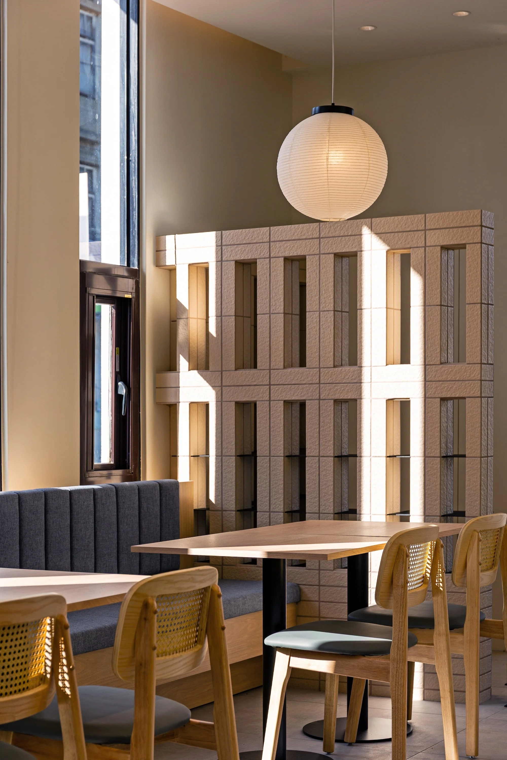
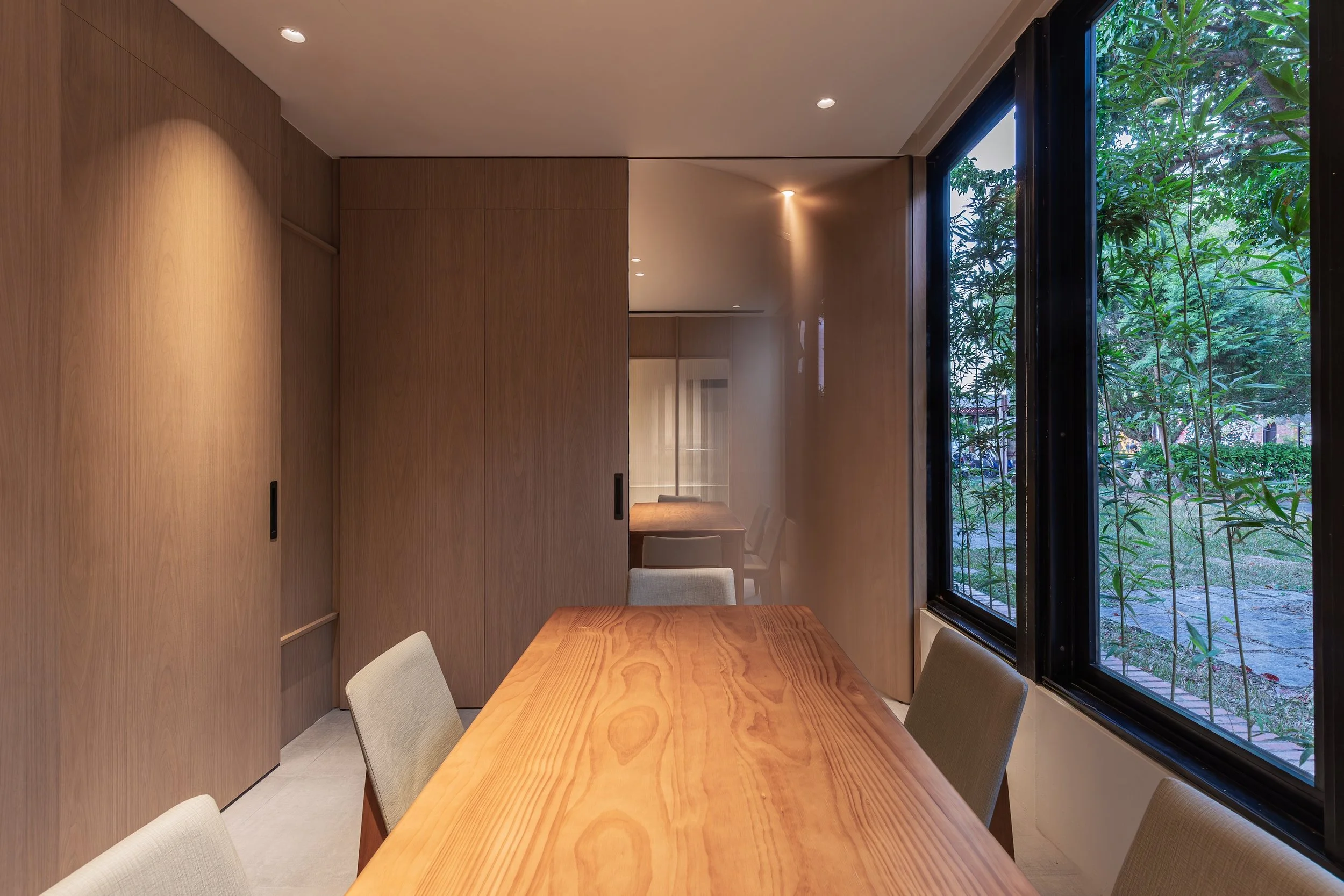
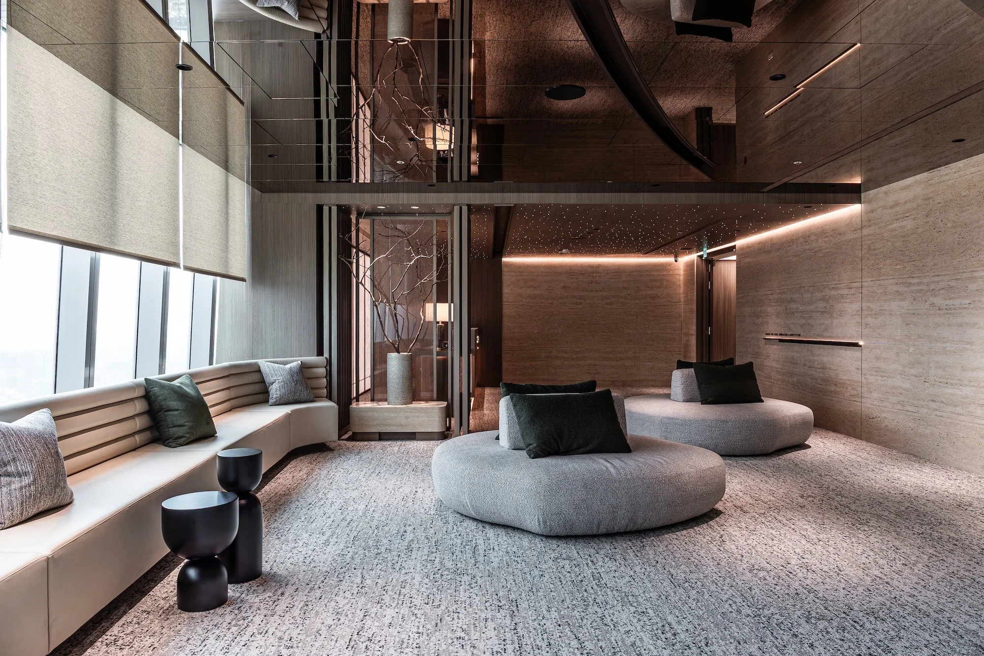
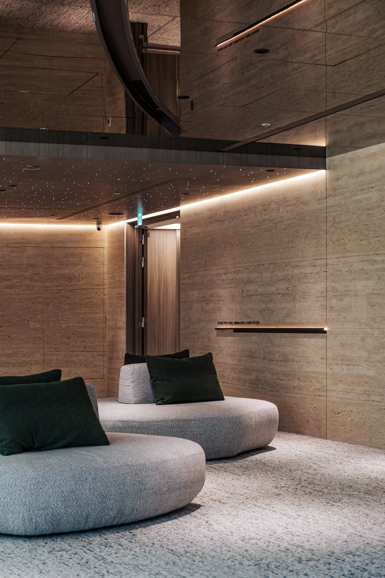
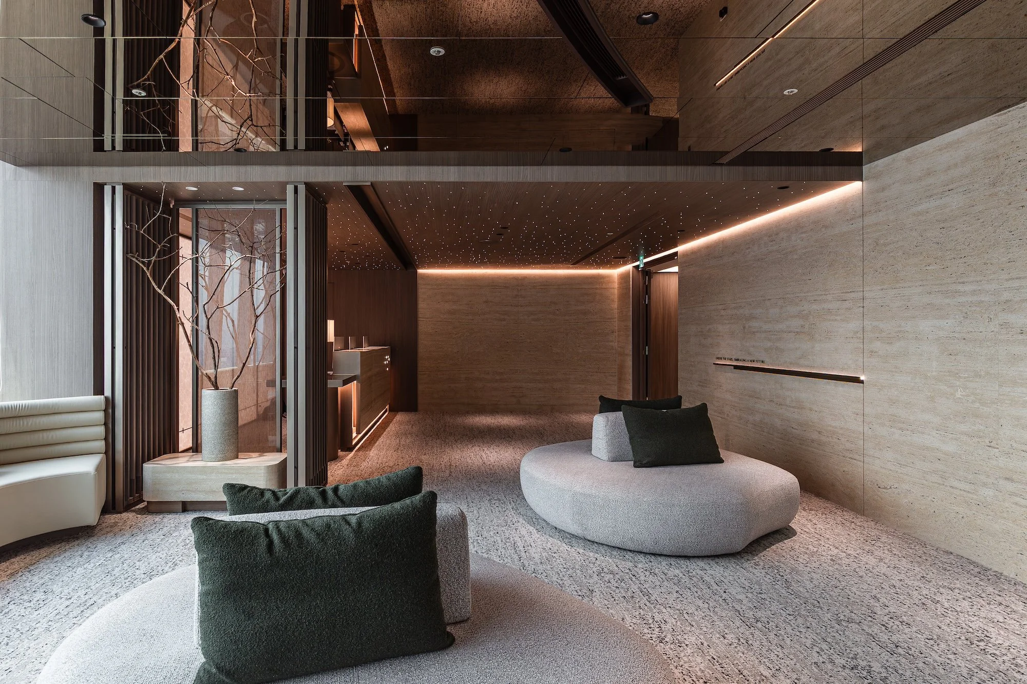
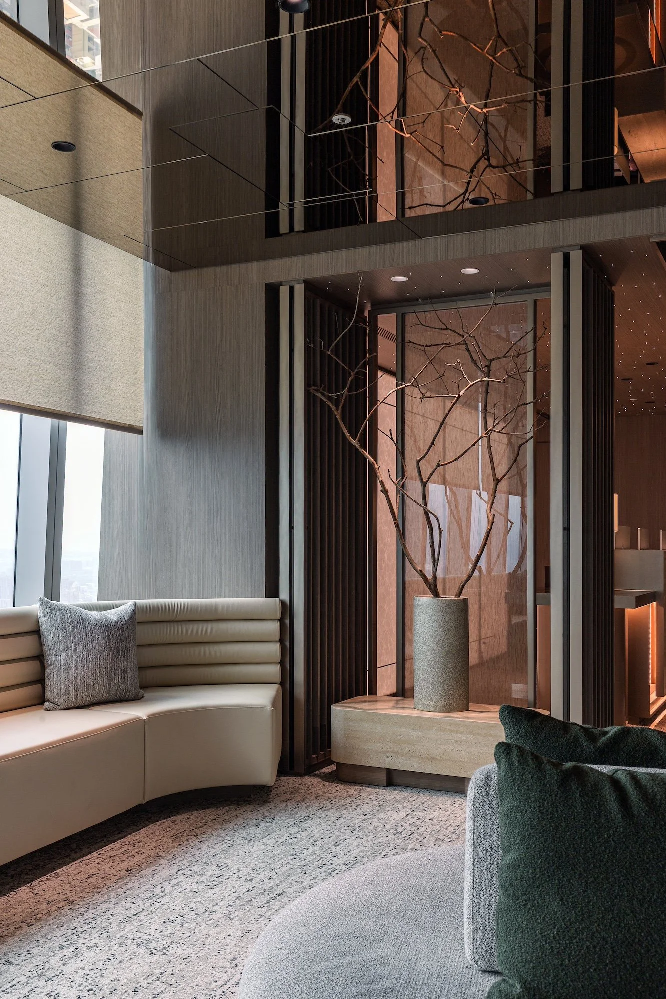
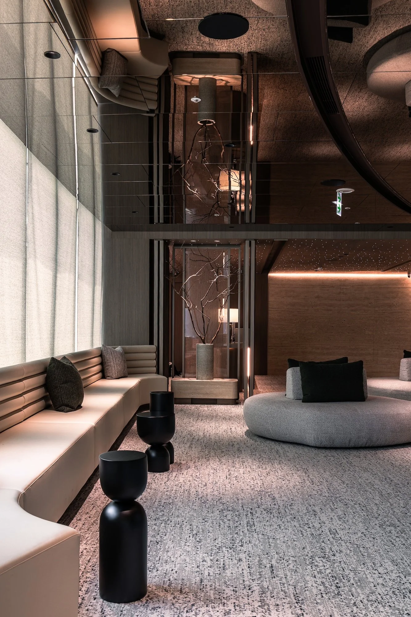
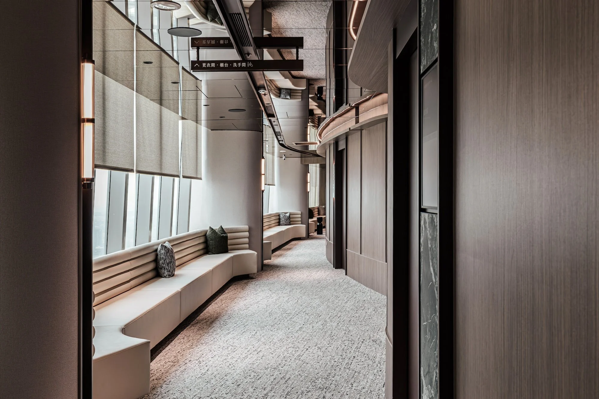
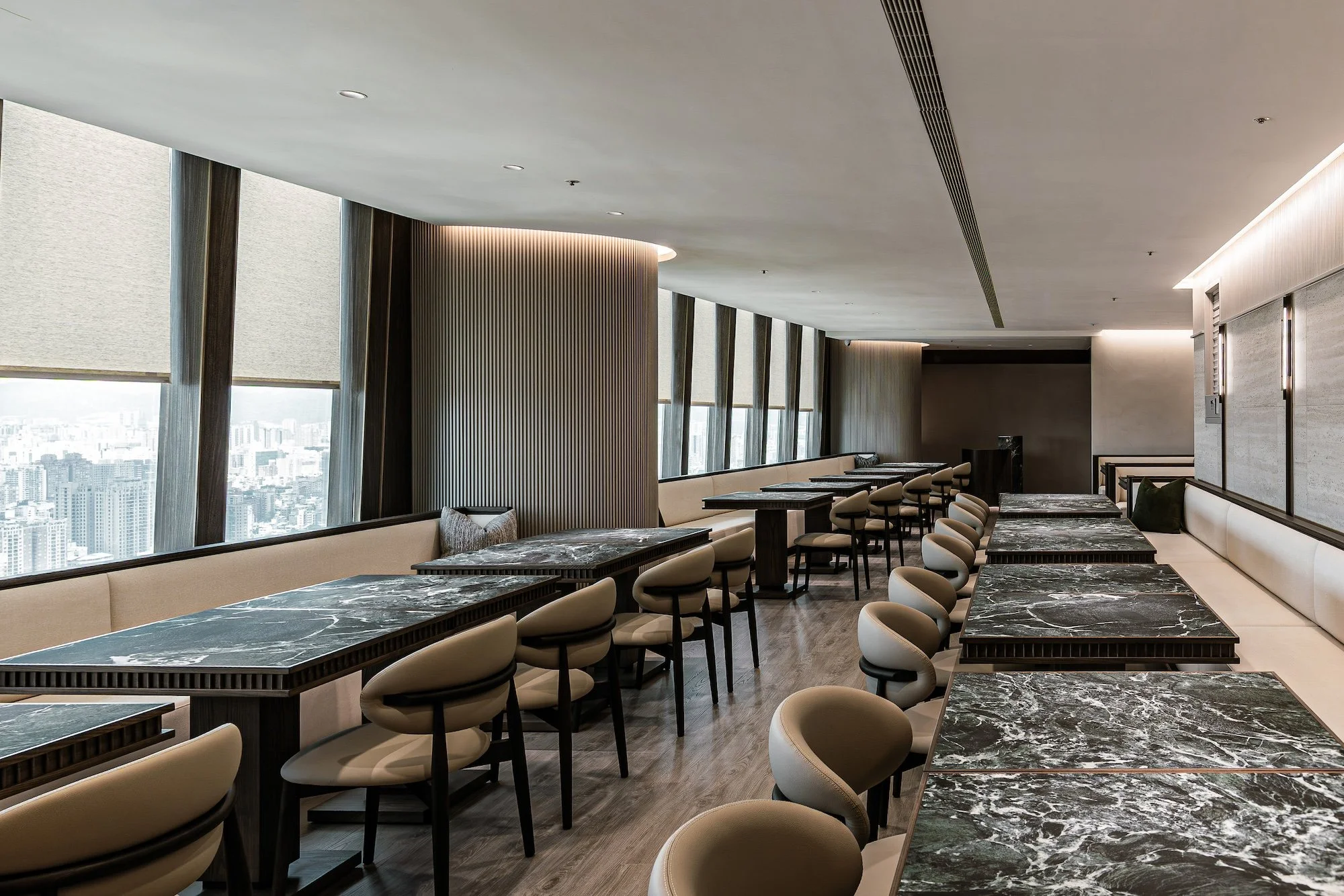
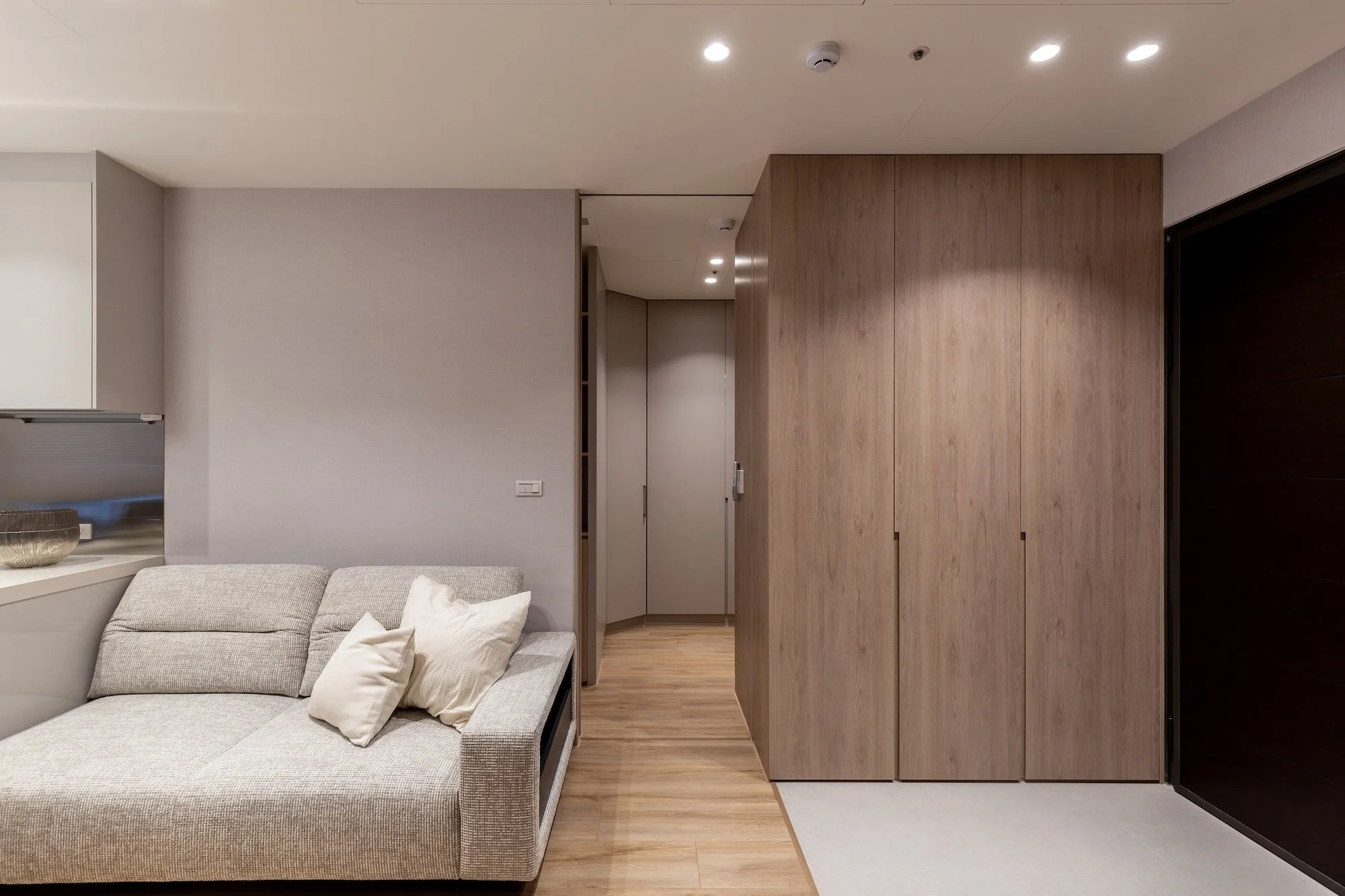
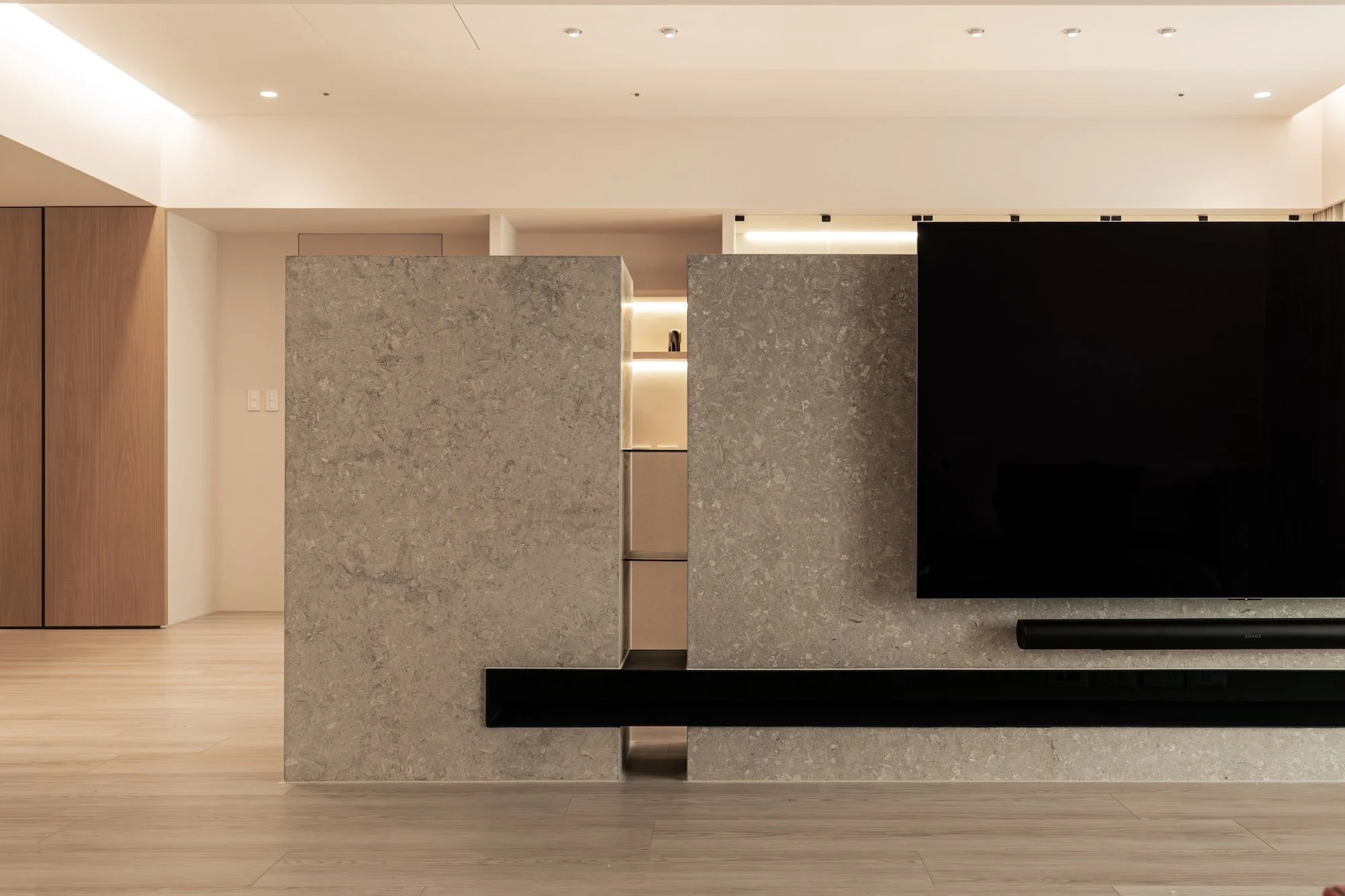
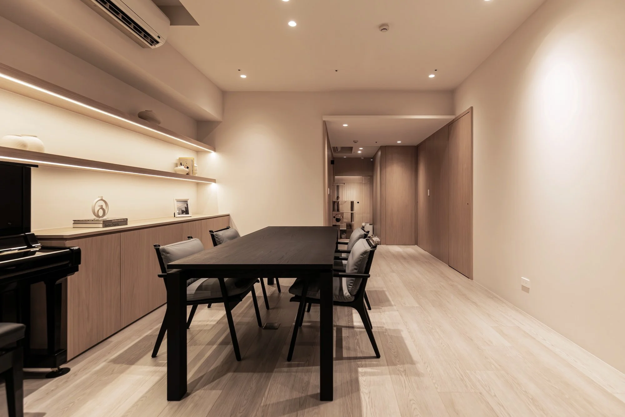
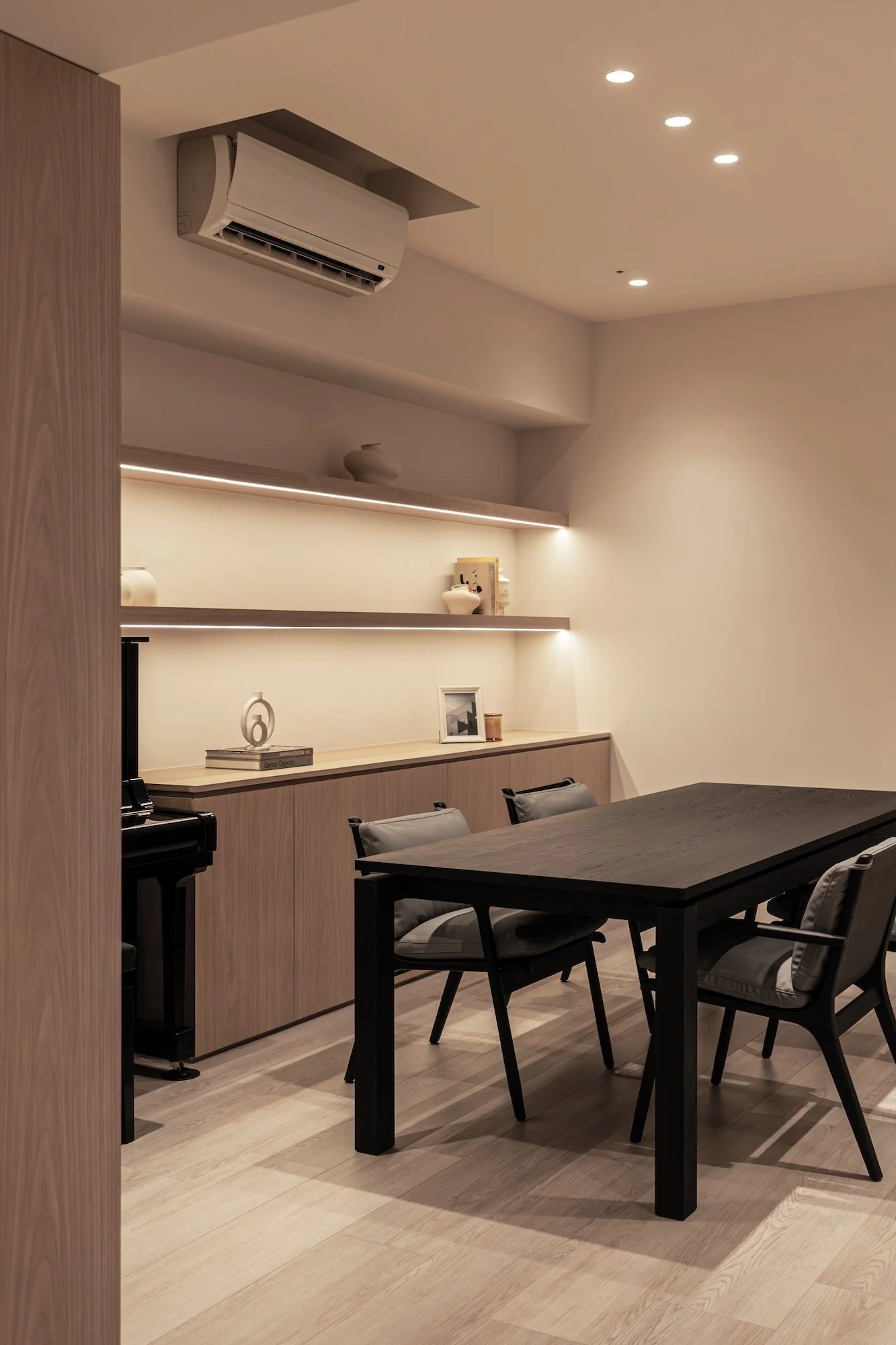
以客家文化中用於取暖的竹製提籃「火囪」為設計核心,將傳統暖爐意象轉化為現代空間語彙。空間中軸處配置一座長達 6.5 米的大型圓弧天花燈具,內部採用光膜模擬自然天光,呼應火囪散發的柔和熱能;外層則覆蓋橫向格柵,藉由遮蔽直射光以消除眩光。這座巨型裝置透過格柵縫隙使光影溢散,讓整座結構具備如呼吸般的視覺動態,如同火囪持續傳遞溫度;在提升視覺舒適度的同時,亦透過線性延伸強化空間縱深,將傳統智慧落實於當代機能美學之中。

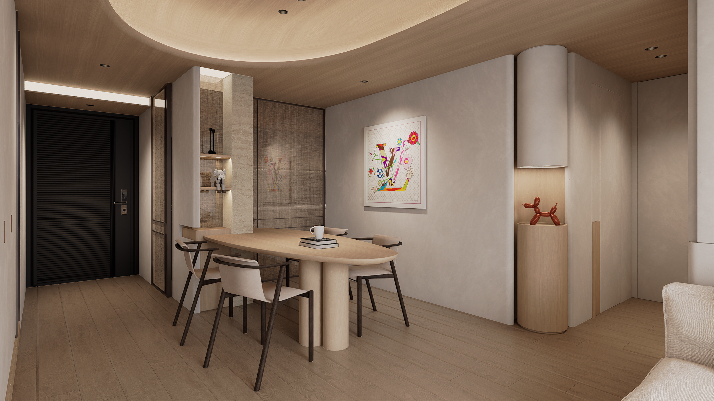
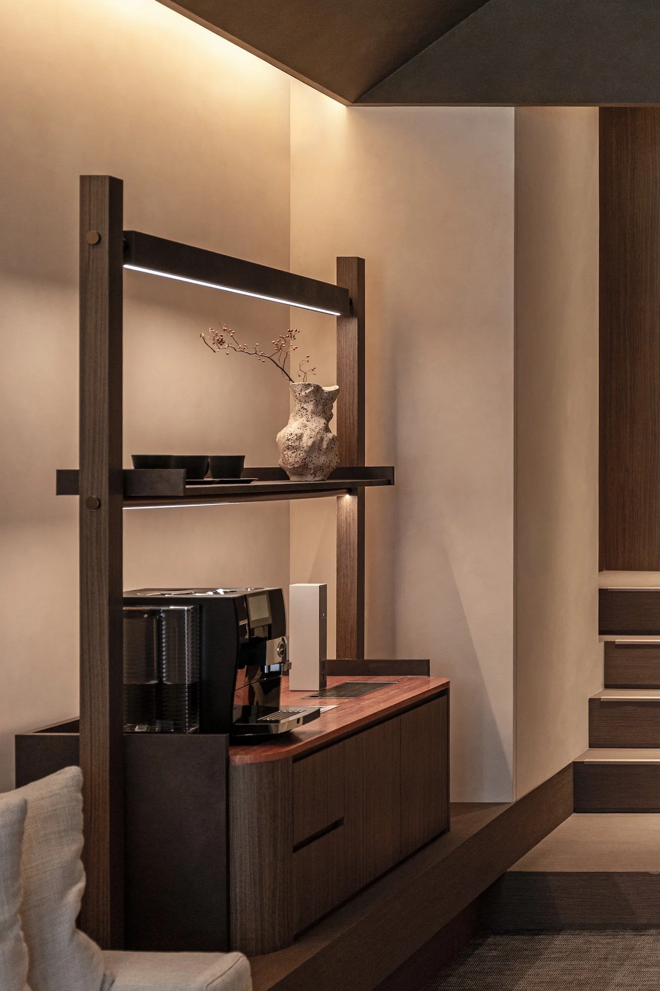
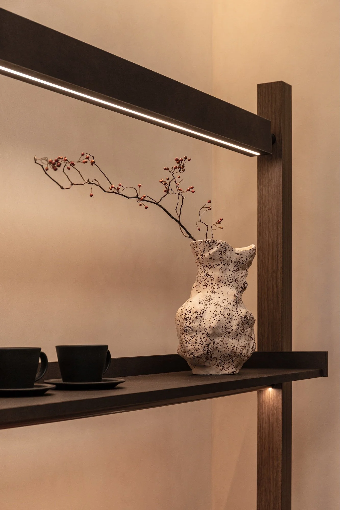
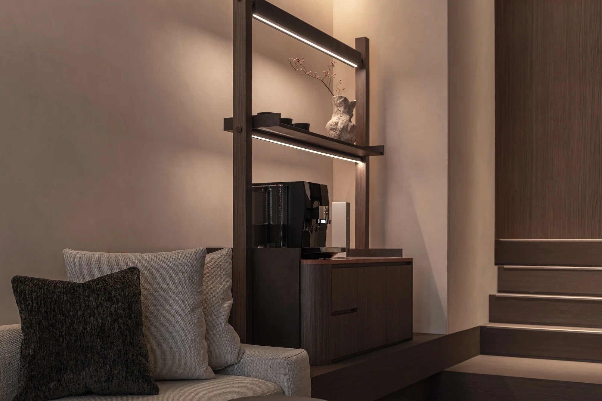
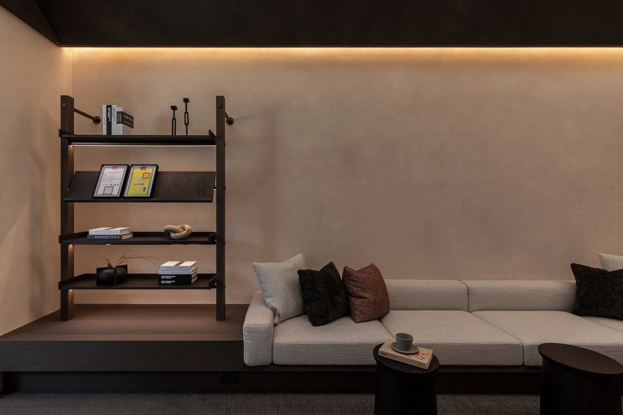
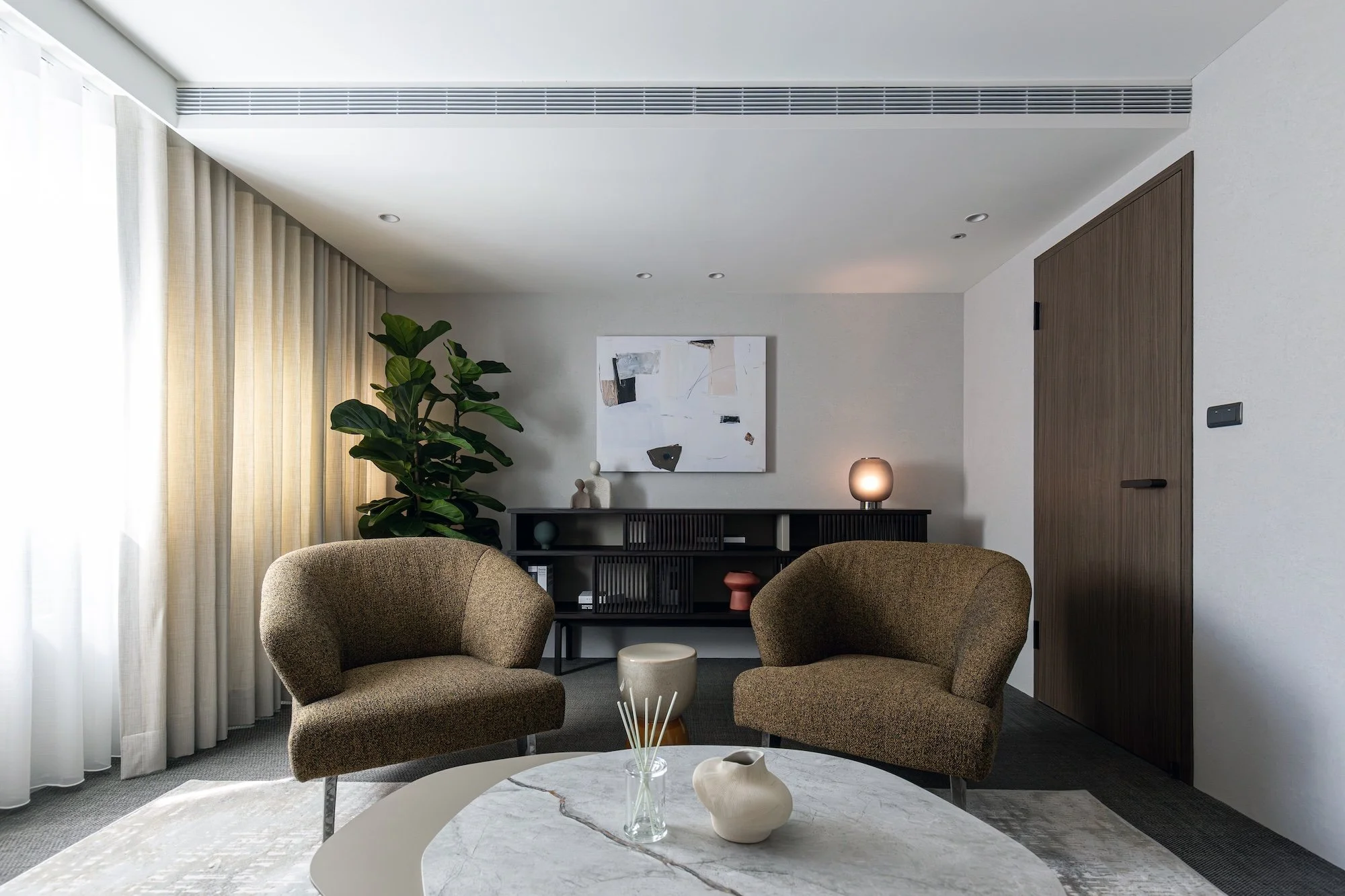
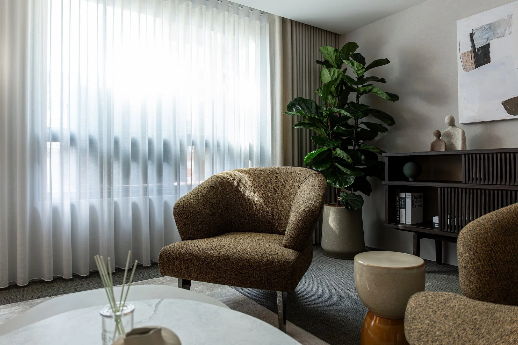
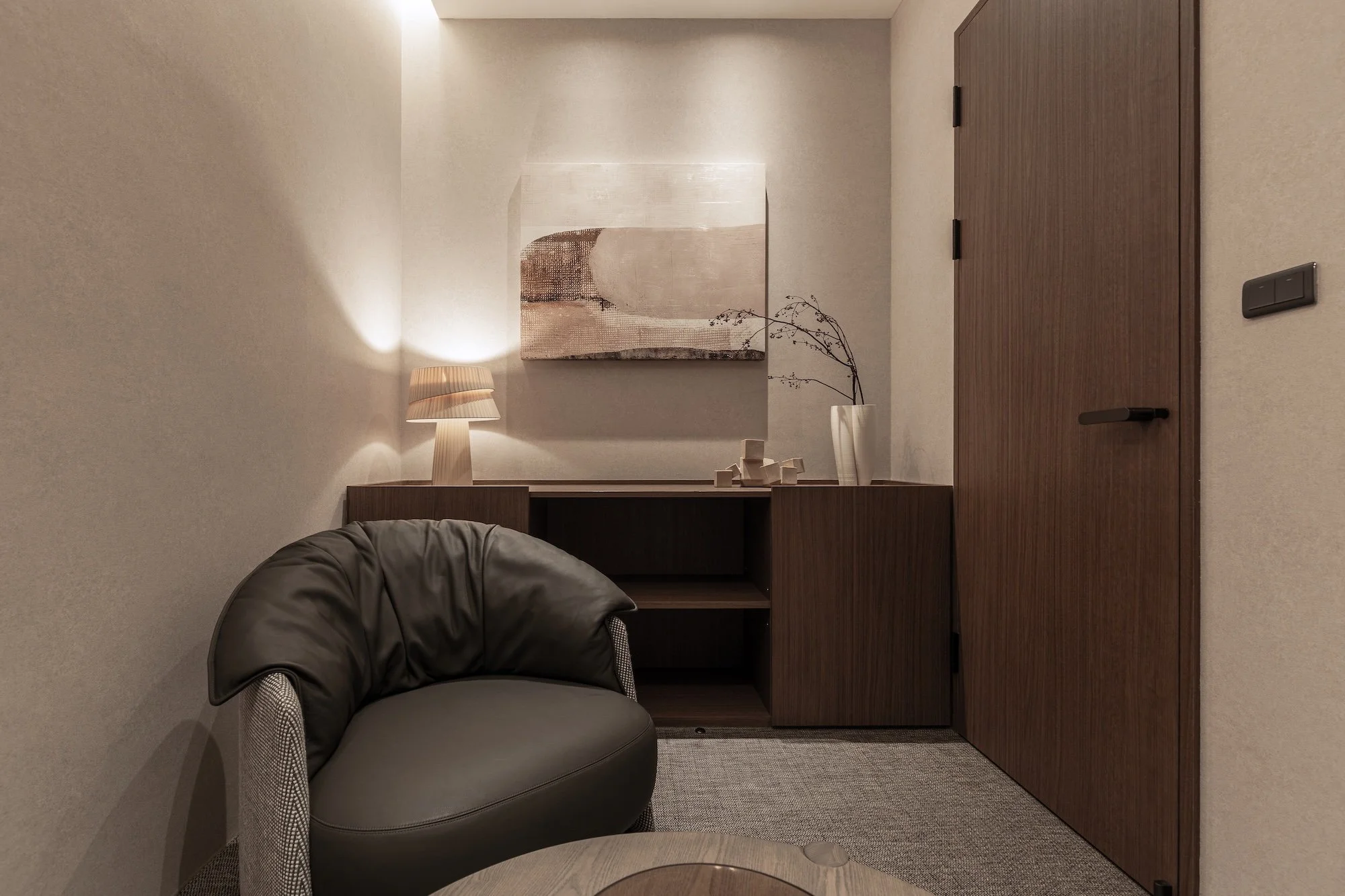
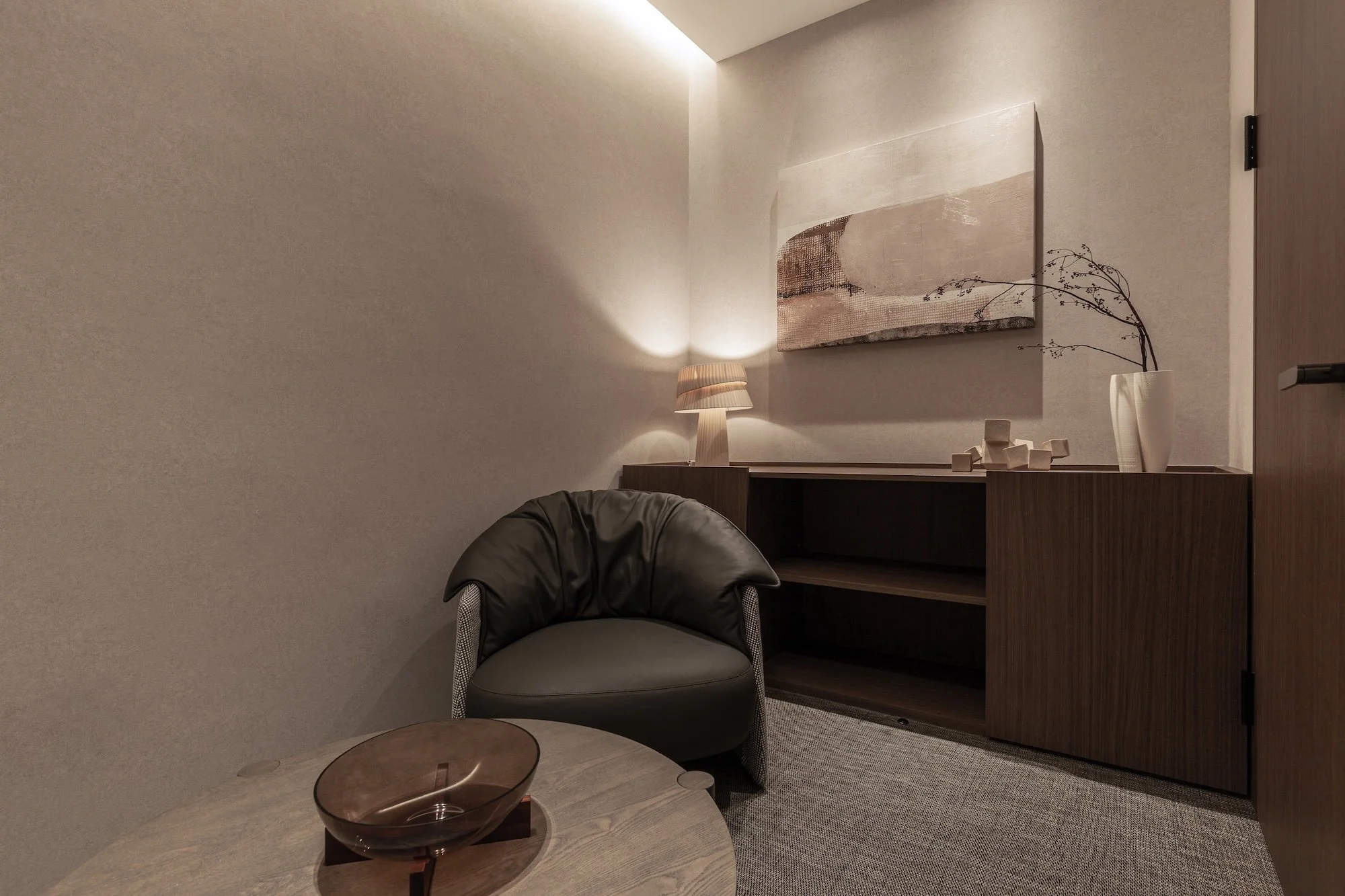
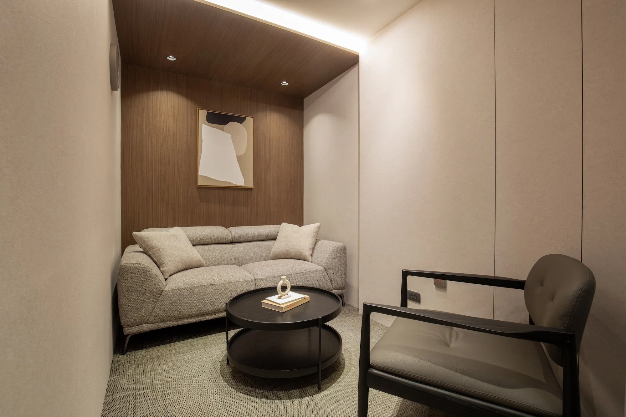
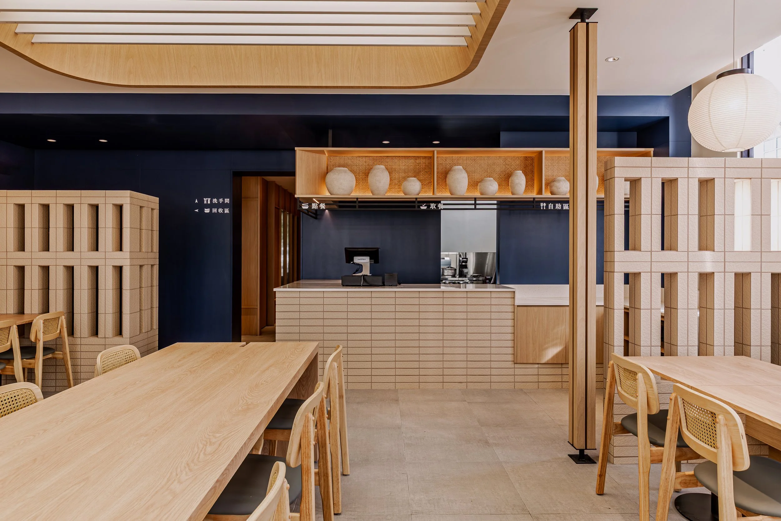
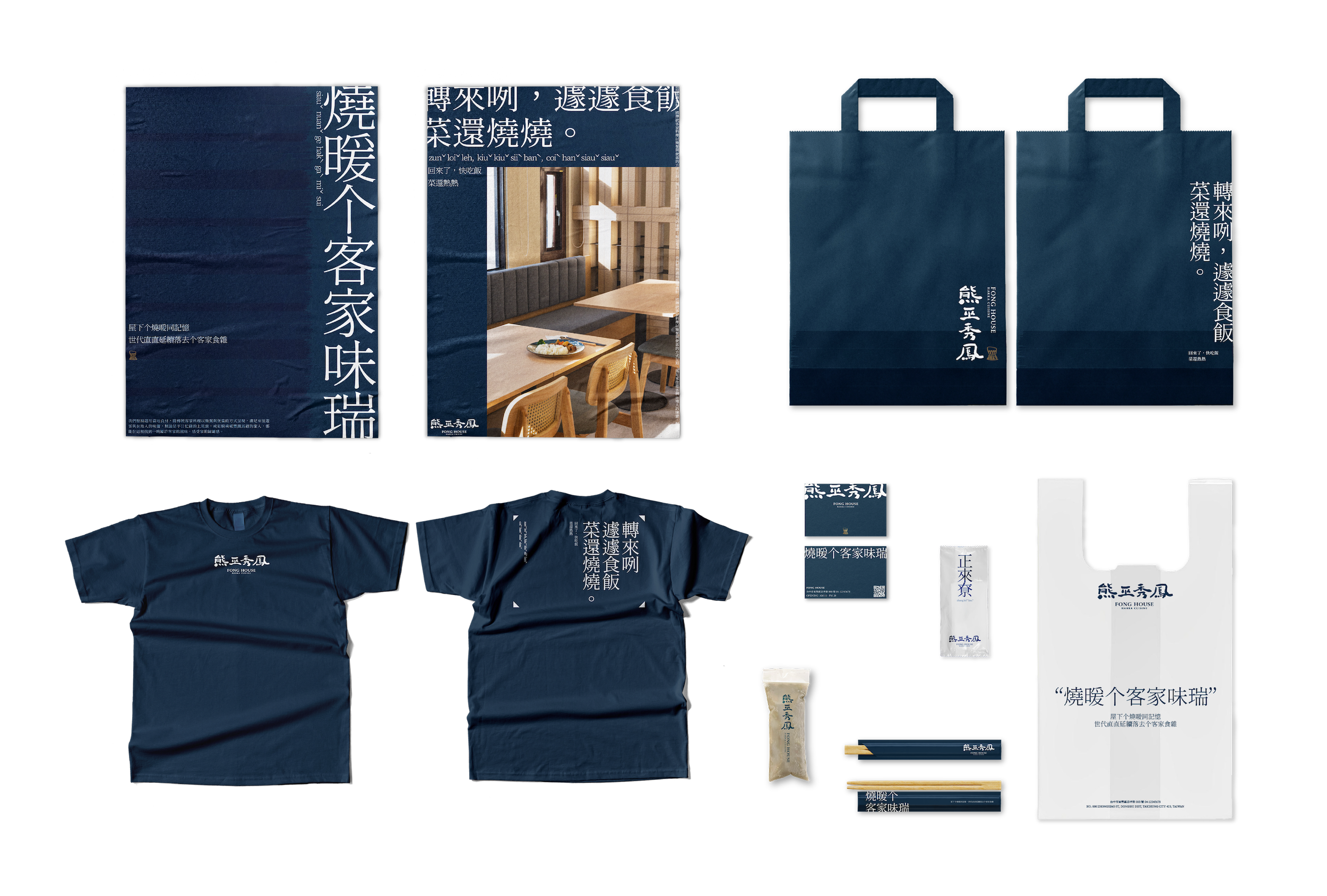
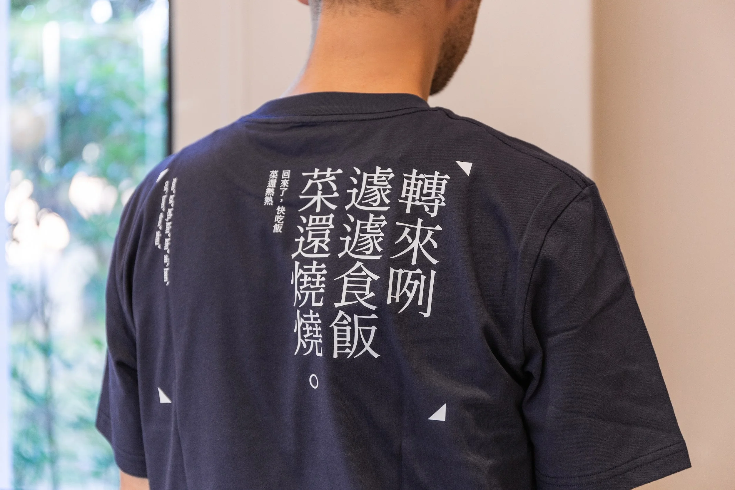
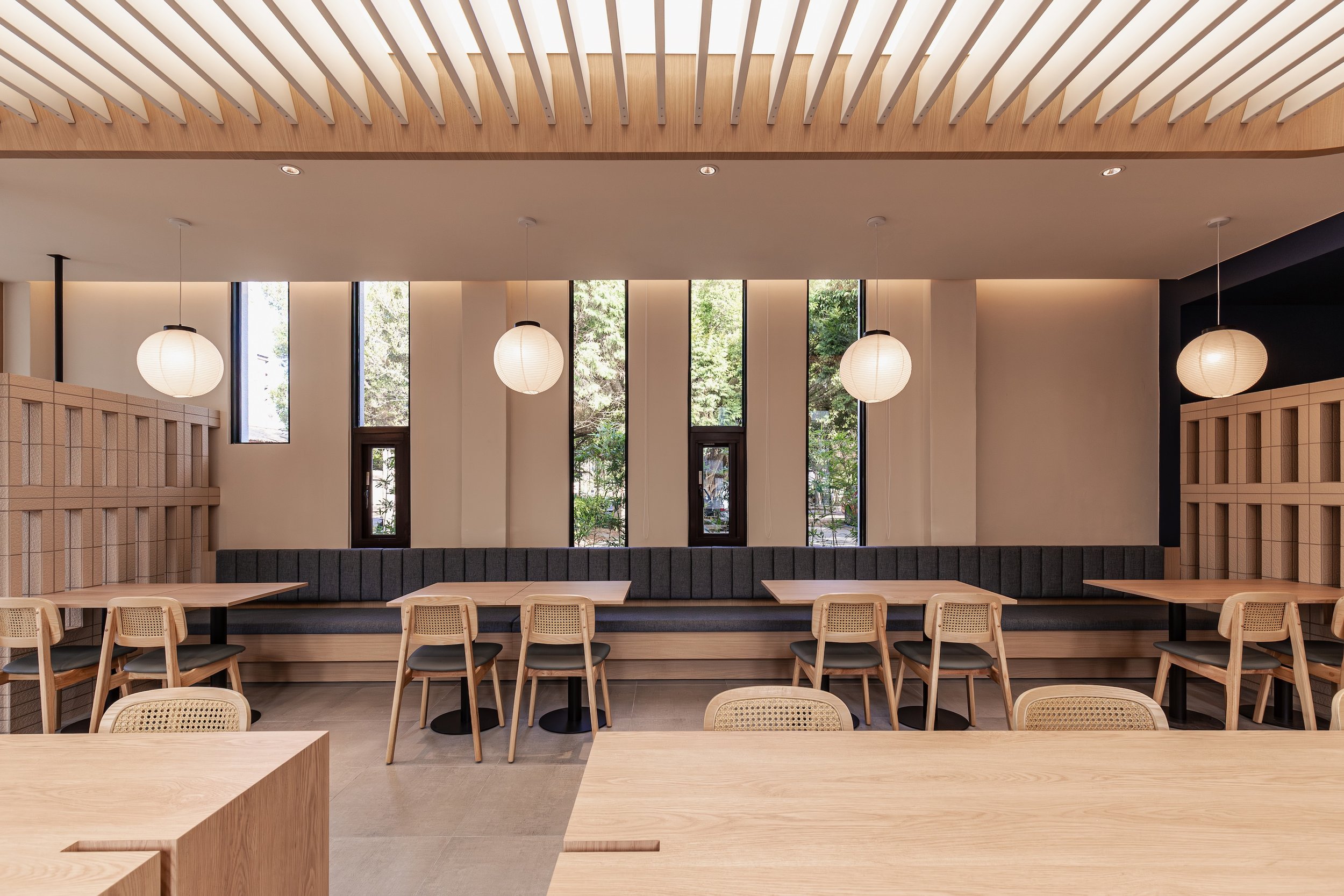
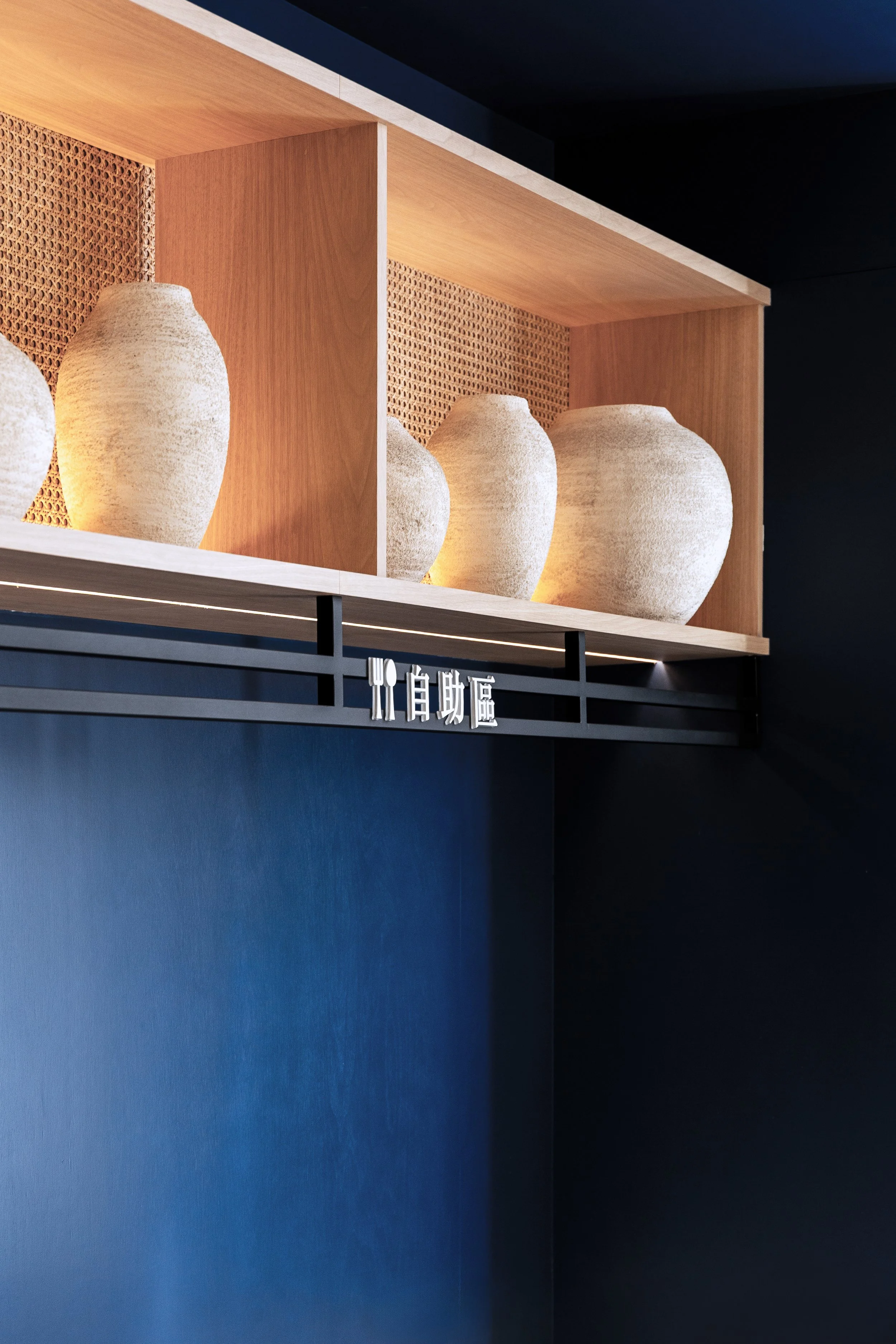
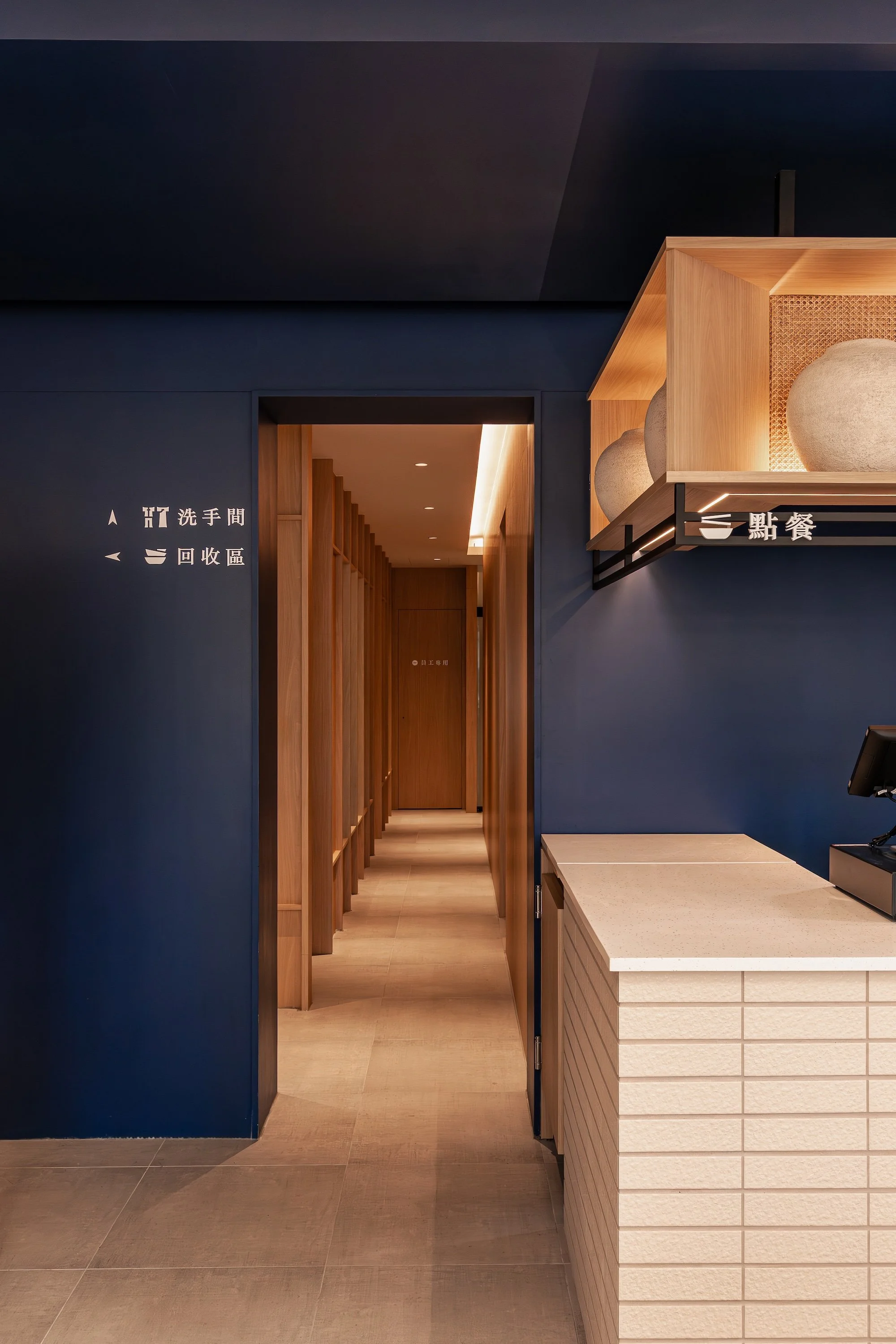
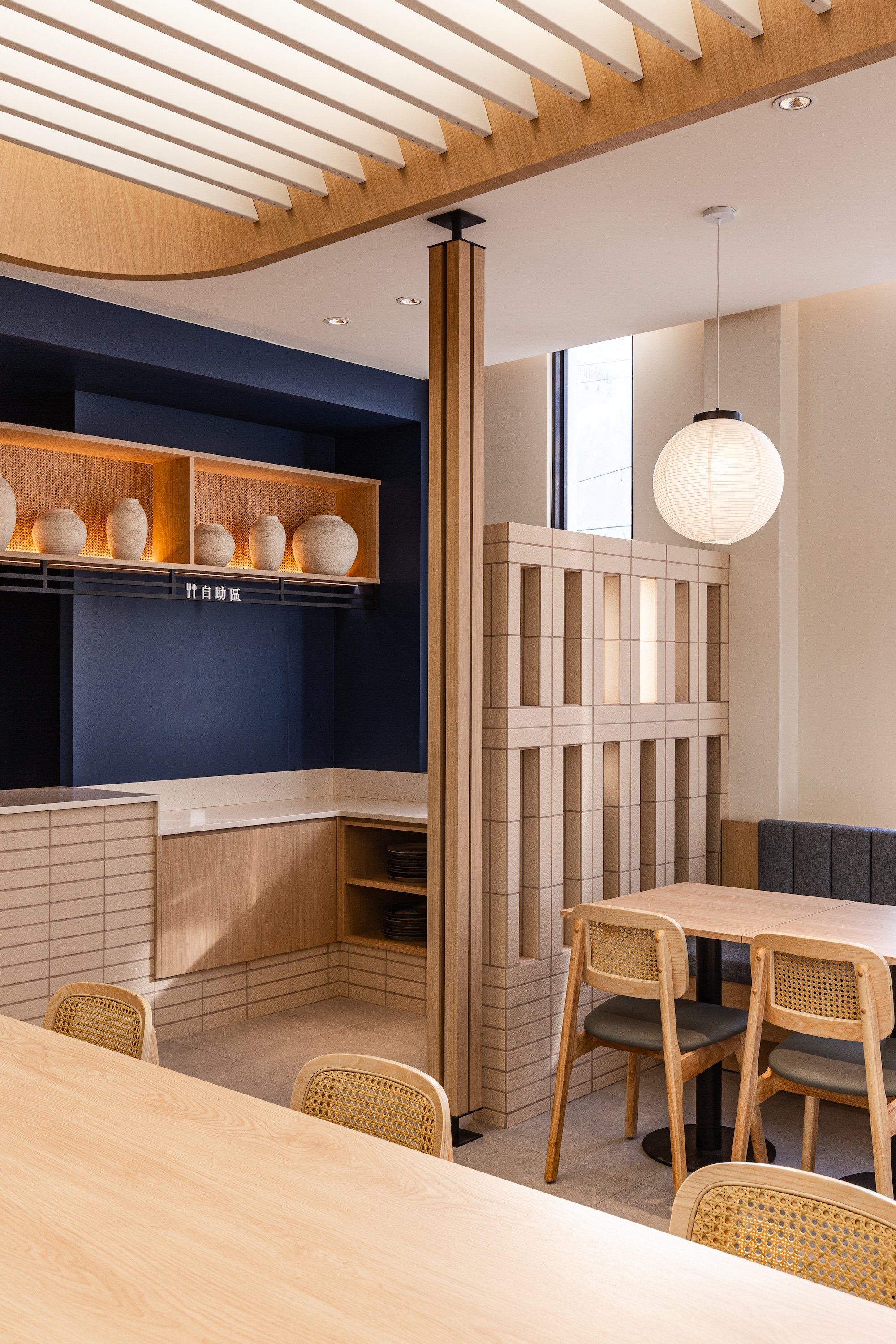
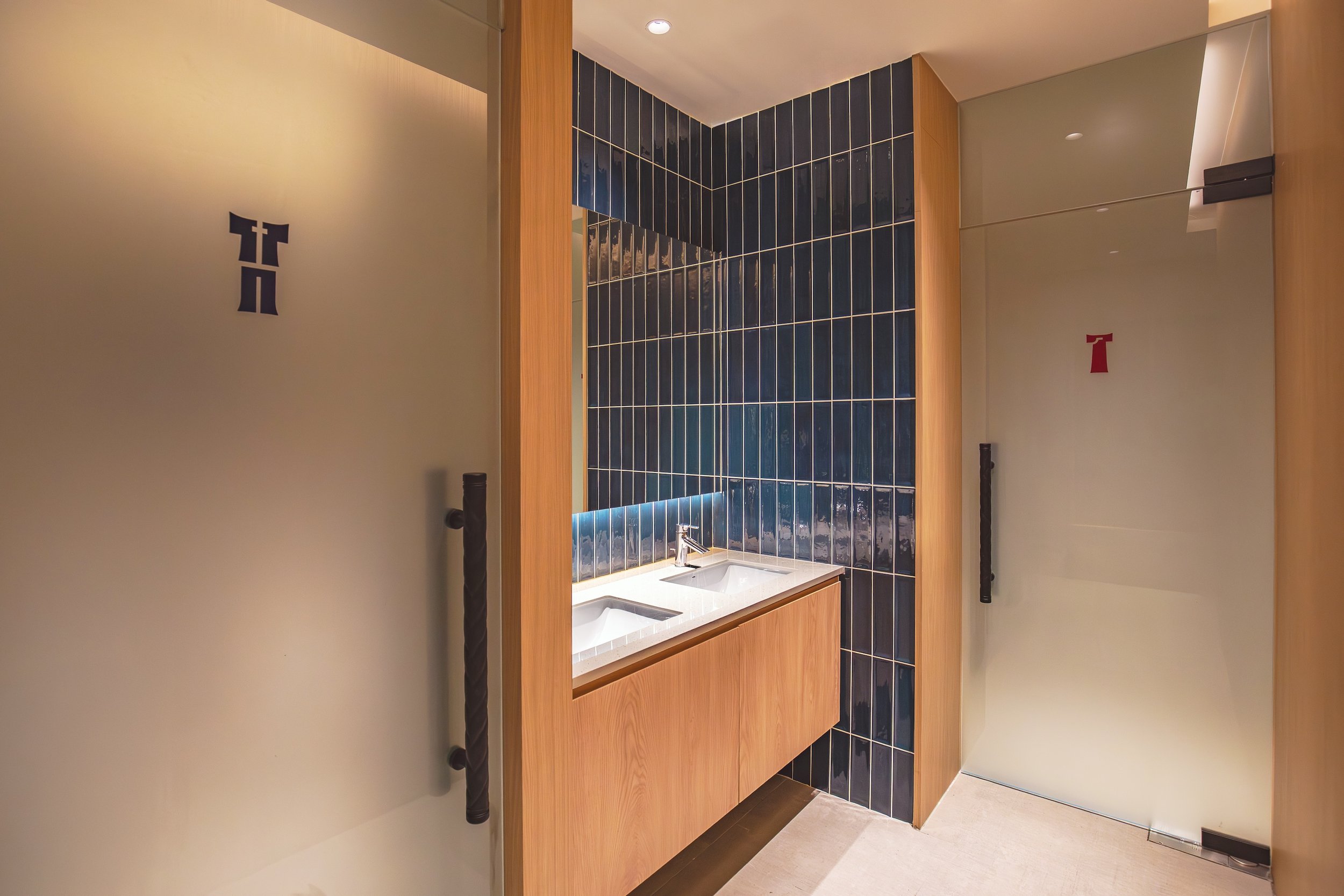
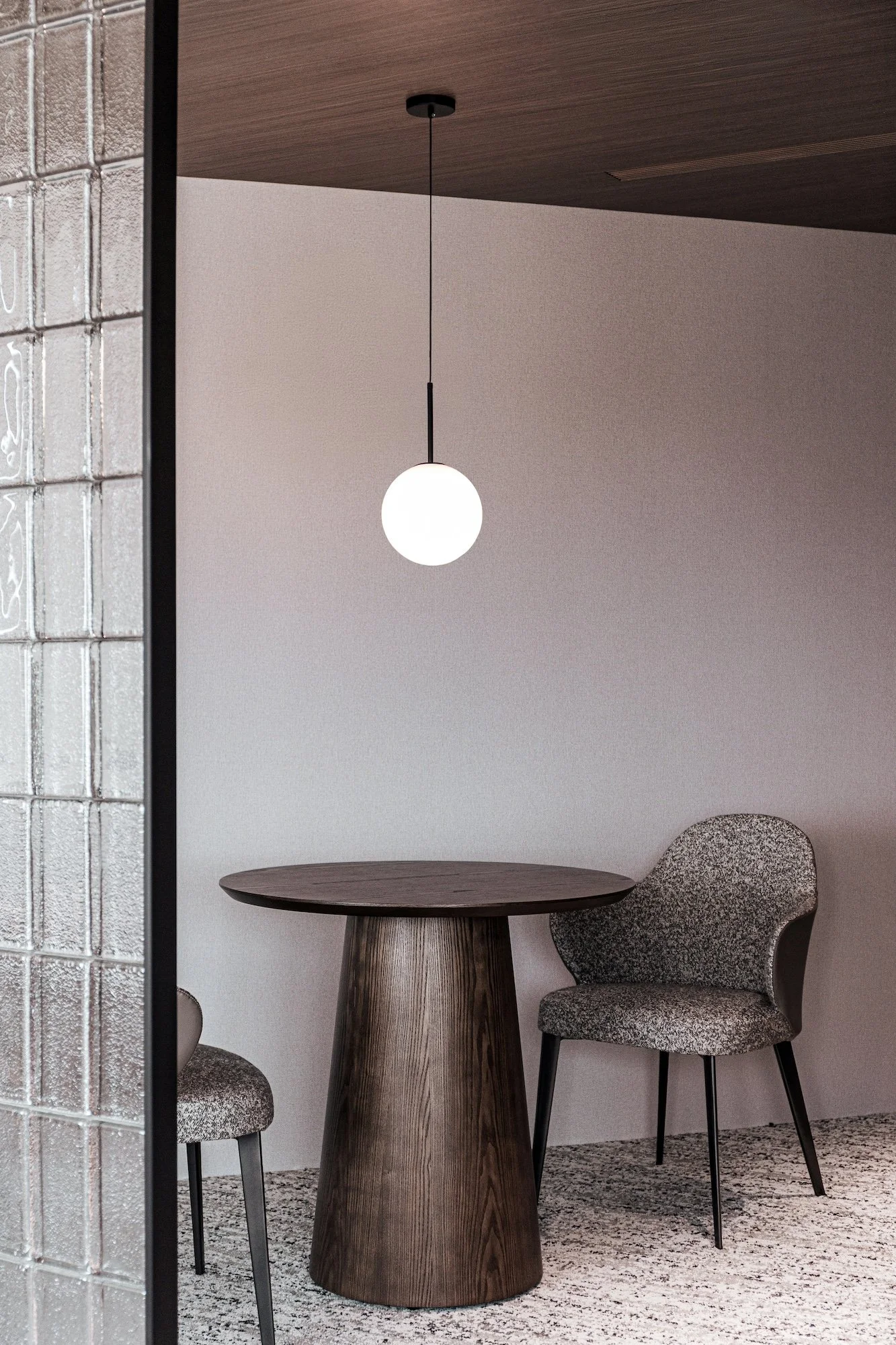
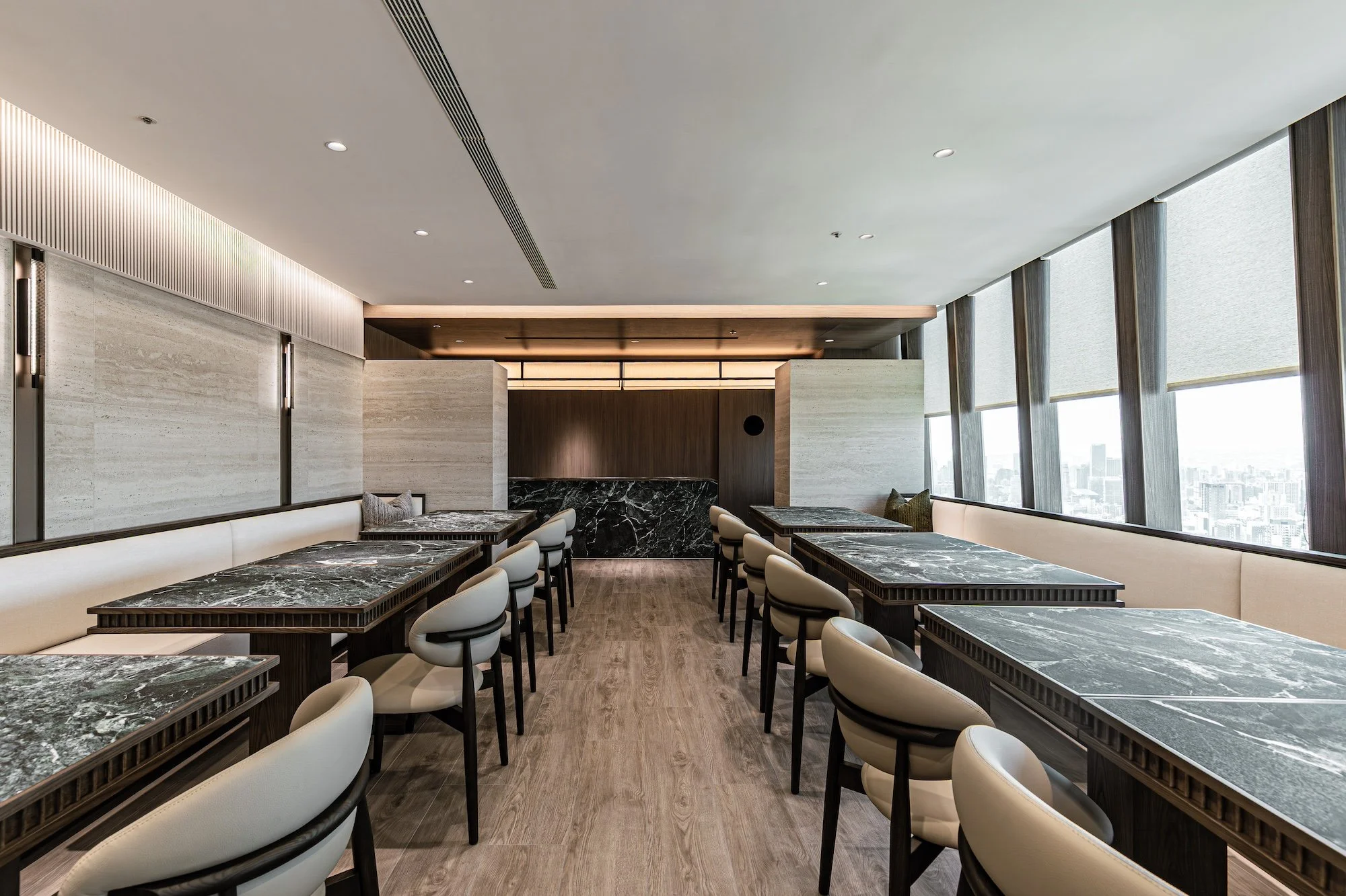
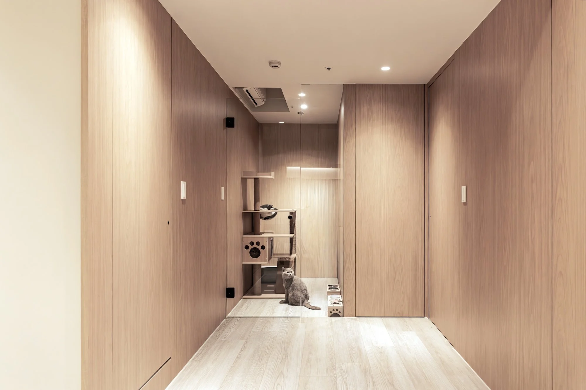
立面色彩計畫選用源自客家「藍染」工藝的深靛色為主調,象徵客家族群沉穩內斂的性格。家具與裝飾融入大量藤編元素,致敬客家常民生活中的編織手工藝,利用藤材柔韌的質地,將傳統火囪的編織結構巧妙轉化為場域裝飾。整體空間設計強烈呼應了客家的文化底蘊與生活哲學,透過現代設計手法的轉譯,將原本屬於家庭私領域的溫暖延伸至公共用餐環境。

Centered on the “Huo Cong,” a traditional bamboo basket used for warmth in Hakka culture, the design transforms the imagery of the traditional hearth into a contemporary spatial language. At the central axis of the space stands a large-scale, curved ceiling installation measuring 6.5 meters in length. Its interior light membrane simulates natural daylight, echoing the gentle heat once emitted by the Huo Cong, while the exterior is wrapped in horizontal louvers that shield direct light and eliminate glare.

Light and shadow diffuse softly through the gaps between the louvers, giving the structure a breathing-like visual rhythm, as if continuously radiating warmth like the traditional hearth. Beyond enhancing visual comfort, the linear extension of the installation also reinforces the depth of the space, translating traditional wisdom into modern functional aesthetics.

The façade color scheme features deep indigo inspired by traditional Hakka blue-dyeing craftsmanship, symbolizing the calm and reserved character of the Hakka people. Furniture and decorative elements incorporate extensive rattan weaving, paying tribute to everyday Hakka handicrafts. The flexible texture of rattan cleverly reinterprets the woven structure of the Huo Cong as spatial ornamentation.

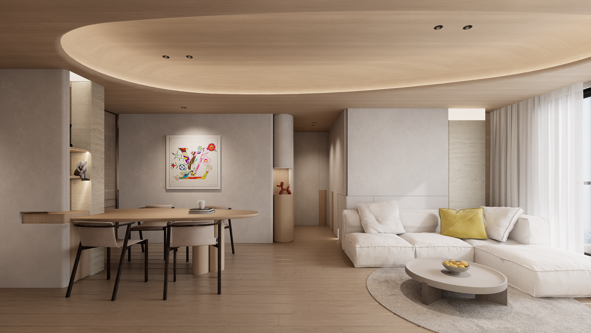
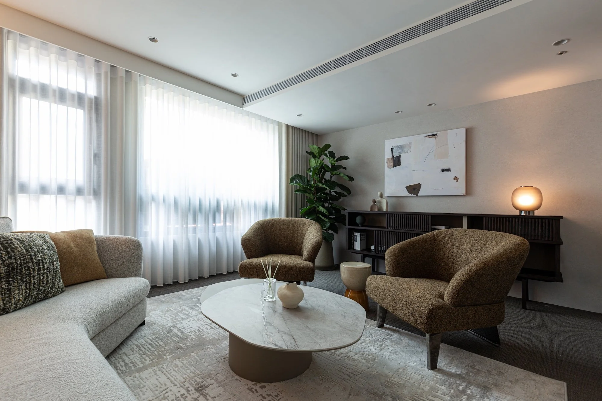
Overall, the design strongly reflects the cultural foundation and philosophy of Hakka life. Through contemporary design techniques, it extends the warmth once found in private domestic spaces into a shared public dining environment.


洗手間標誌以傳統客家農業社會的服飾為靈感,將人物輪廓與服裝特徵簡化為現代圖像語彙,不僅保有實用機能,也讓文化記憶在日常動線中自然被看見與感受。

The restroom signage is inspired by traditional attire from Hakka agricultural society, simplifying human figures and clothing details into a modern visual language. Subtly integrated into the spatial details, the design serves both practical wayfinding needs and allows cultural memory to be naturally seen and felt within everyday movement through the space.


LANDER

品牌設計 / 視覺設計
Branding / Visual Design


LANDER
從根本解決痛點


Lander 致力於從根本解決現有牙科儀器的使用痛點,如同牙材界從天而降的「登陸者」,以全新視角重新審視臨床需求,探索並打造最佳的 A 級解決方案。品牌創辦人本身即為牙醫師,憑藉多年臨床經驗,深入理解各類牙材與器械在實際操作中的優劣與限制。

Lander 將這些第一線的使用體驗轉化為創新設計思維,從使用者角度出發,重新定義牙醫師每日必備的設備。透過細節優化與流程重構,使看診更流暢、操作更直覺,進而提升整體醫療效率與品質。Lander 不只是器材供應者,更是站在臨床最前線、為專業而生的革新者。

Lander is committed to addressing the fundamental challenges of existing dental instruments. Like a true “lander” in the dental materials industry, the brand approaches innovation from a fresh perspective - starting with real clinical needs to develop best-in-class, Grade A solutions.

Founded by a practicing dentist, Lander is built upon years of hands-on clinical experience. Through extensive daily use of dental materials and equipment, the founder gained deep insight into their strengths, limitations, and practical shortcomings.

By translating firsthand experience into purposeful design, Lander reimagines the essential tools dentists rely on every day. Every product is developed from the user’s perspective, optimizing details and refining workflows to create smoother procedures and more intuitive operation. The result is enhanced clinical efficiency and improved quality of care.

Lander is not merely an equipment provider - it is an innovation-driven partner, engineered by clinicians, for clinicians.


昕澄健康管理中心

品牌設計 / 商業空間設計 / 品牌氛圍營造
Branding / Commercial Space Design / Brand Curation


UNDER THE STARS
EMBRACING A NEW FUTURE

昕澄健康管理中心以「昕」的晨光與「澄」的清透為名,象徵希望、更新與回到身心澄明的力量。並以同音意象「星辰」作為空間設計之核心概念,延伸出日夜循環、精準指引與多面向健康視角的品牌精神。視覺識別中的深綠線條象徵穩定的節律與醫學的科學結構,圓點則如星辰般散落,在品牌圖像與空間設計中形成健康旅程的星圖。

Omni Health Care Center derives its name from “昕” (Xīn), meaning morning light, and “澄” (Chéng), meaning clarity—symbols of hope, renewal, and the return to a clear and balanced body and mind. The homophonic imagery of “stars” serves as the core concept for the spatial design, reflecting the brand spirit of day-and-night cycles, precise guidance, and a multi-dimensional approach to health. In the visual identity, deep green lines symbolize stable rhythms and the scientific structure of medicine, while circular dots scattered like stars form a “star map” of the health journey within brand graphics and the spatial environment.


這些元素交織成一幅象徵健康旅程的星圖,呼應中心從檢測、分析、預防到長期照護的完整服務。昕澄期望成為每位訪客的安心指引,在轉變中提供方向,在探索中提供支持,讓每一次踏進,都如望向一片更明亮的星空,啟動朝向更好的自己的旅程。

These elements intertwine to create a symbolic star map of health, echoing the center’s comprehensive services—from testing and analysis to prevention and long-term care. Omni Health Care Center aims to be a reassuring guide for every visitor, providing direction through change and support through exploration, so that every step into the space feels like gazing at a brighter starry sky, beginning a journey toward a better self.


昕澄健康管理中心以一致且高質感的視覺設計貫穿全流程,從健檢前的代餐包到檢查後的電子報告,皆以細緻、專業與易讀性為核心,為訪客打造完善而安心的健康體驗。

Omni Health Care Center maintains a consistent and high-quality visual design throughout the entire process. From pre-check meal replacement packages to post-examination digital reports, every touchpoint emphasizes detail, professionalism, and readability, creating a complete and reassuring health experience for visitors.


星光指引的空間體驗

A SPATIAL EXPERIENCE
GUIDED BY STARLIGHT

浩瀚宇宙中的繁星點點,呼應了如同我們人體器官中的數不盡的細胞,在空間中轉化為迷你光纖燈的星空頂,坐落於入口處櫃檯的暗色系木皮的天花板上,將此處原為埋藏管線低矮的格局,因無數的光點反成為一進入此空間的視覺焦點,透光石的櫃檯背牆更有如星際中耀眼的太陽指引著方向。

The countless stars in the vast universe mirror the innumerable cells within the human body. In the space, this concept is translated into a ceiling of mini fiber-optic lights, forming a starry sky above the dark wood-toned reception area. What was once a low-ceilinged space due to concealed pipelines now becomes a visual focal point upon entering, while the translucent stone reception wall glows like a radiant sun, guiding visitors forward.


本建築格局為橢圓形的回字型動線,外側皆有高樓層的市景及大面採光,設計順應基地的自然條件,將每個檢查室依序內縮至中央空間,此規劃能讓走廊保持明亮,並讓來訪者有序的進入各個檢查室且保有一定的隱私,利用鏡面玻璃設置於走廊天花板,讓整個動線宛如銀河般的環繞著全區,動線的尾端讓檢查完後最終回到餐廳用餐。

The building features an oval-shaped circulation path, with exterior views of high-rise cityscapes and abundant natural light. The design follows the natural conditions of the site, with each examination room recessed inward toward the central space. This layout keeps the corridors bright, ensures orderly access to each room, and preserves a sense of privacy. Mirrors installed on the corridor ceiling create a flowing, galaxy-like path, ultimately guiding visitors back to the dining area after completing their examinations.


空間裝飾以暖杏色調為主,帶來安穩與寧靜的感受,透過不同色階及材質的搭配,營造出一種具深度的細膩層次,淺色的洞石及軟裝布料安定了空間的調性,而深色的木皮及金屬塗裝作為背景的襯底,更突顯空間的深度與溫暖。

Warm apricot tones dominate the interior, evoking a sense of stability and calm. A combination of materials and subtle color gradations adds depth and layered detail. Light travertine and soft furnishings stabilize the atmosphere, while dark wood veneers and metallic finishes provide a contrasting backdrop, enhancing both warmth and spatial depth.


預見健康
成為最好的自己

FORESEEING HEALTH
BECOMING YOUR BEST SELF

昕澄健康管理中心,從品牌識別到空間體驗皆以細膩而一致的語彙貫穿,打造出一個既具科學精準,也溫柔陪伴的健康場域。從入口星空頂的第一道光、環狀動線如銀河般的流動,到溫潤材質堆疊出的安心氛圍,皆象徵健康旅程中被悉心照護的每一步。昕澄不僅提供檢測與管理,更提供一段被理解、被支持、被指引的過程;讓每位來訪者在日夜循環的象徵之中找到屬於自己的節奏,在星光的陪伴下,邁向澄明、安穩且更好的未來。

From brand identity to spatial experience, Omni Health Care Center weaves a delicate and consistent language, creating a space that is both scientifically precise and gently supportive. From the first light of the starry ceiling at the entrance, to the circular, galaxy-like flow of movement, to the warm, layered materials that foster reassurance—every element symbolizes attentive care along the health journey. Omni Health Care Center offers not only testing and management but also a process of being understood, supported, and guided. Visitors can discover their own rhythm within the cycles of day and night, accompanied by starlight, moving toward clarity, stability, and a brighter future.


Categories:
by Minhan Lin

流石歯科

品牌設計 / 視覺設計 / 品牌氛圍營造
Branding / Visual Design / Brand Curation


さすがプロだけあって
実力が違うんだ

流石歯科專精於植牙重建、齒顎矯正、美容牙科與全口重建,致力於提供兼具機能與審美的客製化牙科醫療。台語中,「流石」的發音近似「老實」,象徵誠懇、踏實的初心;日文中,「流石さすが」意為「不愧是」,代表著對專業品質與細節的執著。希望每位患者,都能感受到信任、安心,以及「不愧是流石診所」的價值。在每一個溝通、每一處細節、每一段陪伴中,留下溫柔且真實的痕跡。用心傾聽,精準診斷,並提供長期規劃與全方位照護,協助患者找回健康與自信。

Sasuga Dental Clinic specializes in implant reconstruction, orthodontics, aesthetic dentistry, and full-mouth rehabilitation, dedicated to providing customized dental care that balances functionality and aesthetics. In Taiwanese, “流石” sounds similar to lao-shih (honest), symbolizing sincerity and a grounded spirit; in Japanese, “流石 さすが” means “as expected” or “truly remarkable,” representing an unwavering pursuit of professional quality and meticulous attention to detail. Every patient is invited to experience trust, comfort, and the value behind the phrase — “as expected of Sasuga Clinic.” Through every conversation, every detail, and every moment of care, the clinic aims to leave behind traces of warmth and authenticity. With attentive listening, precise diagnosis, and comprehensive long-term care planning, Sasuga helps patients regain both health and confidence.


不愧是流石

在設計上,我們以質樸的設計語言,採用溫潤與柔霧的色調,搭配具手感的紙材與細緻的印刷工藝,讓品牌在簡約中蘊含深度。每一項視覺元素,從品牌標誌、字體、穩定的比例到視覺留白的安排,皆反映診所對細節與人本的重視。整體品牌視覺系統不僅傳遞專業醫療的形象,也展現醫師的溫柔堅定。流石歯科希望透過誠實的設計語彙,建立長期信任的醫病關係,讓患者在每一次的診療中,都能感受到「不愧是流石」的安心與信賴。

In its design expression, the brand adopts a natural and understated visual language — soft, misty tones combined with tactile paper textures and refined printing craftsmanship — to convey depth within simplicity. Every visual element, from the logo and typography to proportions and use of white space, reflects the clinic’s dedication to detail and its human-centered philosophy. The overall visual identity not only communicates medical professionalism but also embodies the doctor’s gentle yet resolute character. Through this honest and thoughtful design language, Sasuga Dental Clinic seeks to build enduring trust between doctor and patient, ensuring that with every visit, one truly feels — “as expected of Sasuga.”


Categories:
by Minhan Lin

林聰明 × 金色三麥 阿里山初露茶啤

視覺設計 / 包裝設計
Visual Design / Packaging Design


Alishan
Early Mist
Tea Ale

林聰明 × 金色三麥 阿里山初露茶啤

清晨的第一道光,越過阿里山層層山巒,靜靜灑落大地。山霧尚未散去,空氣中瀰漫著濕潤土壤與茶葉的清香。如晨光灑落的瞬間,初露茶啤藏著山林的節奏與曙光的輕柔。

The first light of dawn crosses the layered peaks of Alishan, quietly spilling across the land. The mountain mist still lingers, and the air is filled with the fresh scent of moist earth and tea leaves. Like the moment when sunlight breaks through the morning fog, “Alishan Early Mist Tea Ale” captures the rhythm of the mountains and the gentle touch of daybreak.


新肌霓 台中誠品 快閃櫃

商空設計
Commercial Space Design


渲染一抹柔光
緩緩鋪展在肌理之間

以品牌所定義出的膚況七面向,各自代表的七種色彩為設計發想主軸,利用霧面壓克力透出色彩光源並以漸層的手法,將各種色彩進行拆解及堆疊,光影透過半透明材質介面,讓產品不只是陳列,而是被色彩氛圍襯托強化視覺辨識度,圓弧展示檯與收銀櫃以一致曲線語彙,使空間兼具品牌科學理性與感性溫度的平衡。


弧光棲所

室內設計
Interior Design


弧光棲所

以流暢的弧形轉折,巧妙化解格局轉角,並於曲面內隱藏收納機能,使空間分區自然且連貫。

櫃體之間延伸出隱藏式房門,將收納與動線整合於同一界面,維持整體的整潔與秩序,以簡淨的材質與色彩為主軸,輔以分層光源,讓小宅在視覺與使用上都保有開闊與便利。


光玥牙醫 LUMO DENT

品牌設計 / 視覺設計 / 品牌氛圍營造
Branding / Visual Design / Brand Curation


非黑即白的理性精神
The spirit of b/w

品牌以「非黑即白」的理性精神為核心,透過黑白色調構築出簡潔、純粹且專業的視覺語言,象徵診所對精準診斷與專業治療的堅持。黑色代表沉穩與專注,白色象徵潔淨與信任,兩者相互平衡,傳遞出專科醫師嚴謹而高效的醫療態度。

Logo 設計靈感源自一道自空間中透出的光芒,象徵知識與技術的啟發,亦如醫者在患者心中帶來的希望與安心感。這道光不僅是視覺上的亮點,更是品牌核心價值的凝縮 — 以專業技術照亮每一位患者的笑容與健康之路。

整體設計融合質感與功能性,確保在各類媒介與空間應用中都能展現清晰辨識度,同時維持高端醫療品牌的形象,傳達出診所提供全面性齒科診療服務的承諾與信賴感。

The brand is built on the rational spirit of “black or white,” using a monochrome palette to create a clean, pure, and professional visual language that symbolizes the clinic’s dedication to precise diagnosis and expert treatment. Black represents steadiness and focus, while white stands for cleanliness and trust — the two balancing each other to convey the rigorous and efficient medical approach of the specialists.

The logo design draws inspiration from a beam of light emerging from within a space, symbolizing the spark of knowledge and technique, as well as the hope and reassurance a doctor brings to a patient’s heart. This light is not only a visual focal point but also a distillation of the brand’s core values — illuminating each patient’s smile and path to health with professional expertise.

The overall design blends refinement with functionality, ensuring high clarity and recognition across various media and spatial applications while preserving the image of a premium medical brand. It communicates the clinic’s commitment and trust in providing comprehensive dental care.


Categories:
by Minhan Lin

緩境

室內設計
Interior Design


「緩」是一種節奏、一種生活的步調,也象徵空間中有機的流動與自然轉折;「境」是空間場域,也是一種心境。 設計以一道 L 型的動線與視覺序列,串連起空間的流動與材質的線性延伸,於轉折之間勾勒出公私領域的柔性界線。牆體開口與可調節的場域分界手法,使空間保有彈性與通透感,轉換之間創造出層次與留白,讓回家後的心境緩緩的於空間中逐漸沉澱,也讓視覺在開敞與收束之間取得平衡。

整體空間以裸杏色牆面與橡木原色作為核心語彙,色調溫潤協調,質地對比卻不衝突,在自然光照下層層遞進,形塑細膩豐富的空間表情。材質的斷點與接續,強化了空間延展與視覺韻律,於細節中形成自然的秩序。


松本鮮奶茶 二代店

品牌設計 / 品牌再造 / 商業空間設計 / 視覺整合
Branding / Re-Branding / Commercial Space Design / Visual Design


暫停片刻
享受每個日常

Pause for a moment
enjoy every little part
of daily life

在快節奏的生活中,珍惜那些微小而真實的瞬間。無論午休結束前、放課走出校門後、接小孩前或買完菜後,喝口茶,暫停片刻,找到屬於自己的小確幸、體驗日常的美好。

本次設計延續品牌原有的親民攤車經營模式,將「街角巷口最親切的飲料攤」作為核心意象,傳遞一種貼近人心的日常小確幸。為了強化攤車的視覺印象,特別擷取屋簷作為主視覺元素,象徵守護與庇蔭,也呼應街邊小攤的溫暖氛圍。整體色調選用溫潤的鵝黃色搭配木質質感,在品牌識別與餐車設計中延伸運用,營造出自然、溫暖又令人放鬆的品牌體驗,讓消費者在每一次購買時,都能感受到熟悉的親切與療癒的幸福感。

In our busy lives, it's important to treasure small, real moments. Whether it's before lunch ends, after school, before picking up the kids, or after grocery shopping — take a sip of tea, pause, and enjoy a little happiness in your day.

This design continues the brand’s approachable street cart style, using the image of “the friendliest drink stall around the corner” as its core concept to convey a sense of everyday warmth and simple joy. To enhance the cart’s visual identity, the design features an awning as the main visual element — symbolizing protection and comfort, while also evoking the cozy feeling of a neighborhood stall. The overall color scheme combines a soft goose yellow with warm wood textures, extending across brand visuals and cart design to create a natural, inviting, and relaxing brand experience. Each purchase becomes a moment of familiar comfort and gentle happiness for customers.


受眾規劃
Target Audience

受眾定義
鎖定族群為上班族、學生以及家庭主婦。

受眾在乎什麼
飲品口味與品質、價格與性價比、品牌形象與氛圍、服務體驗、地點與便利性、行銷與促銷活動、品項獨特性。

品牌能滿足什麼
提供好喝且性價比高的飲品。

Target Audience
The target groups are office workers, students, and homemakers.

What the Audience Cares About
Taste and quality of the drinks, price and value for money, brand image and atmosphere, service experience, location and convenience, marketing and promotional activities, and product uniqueness.

What the Brand Can Offer
Delicious drinks with great value for money.


品牌目標
Our Mission

品牌延續

特色餐車的形象
好味道的飲品
價格親民
產品組合多樣

升級優化

優化品牌風格
提升店員服務
維持飲料品質
篩選菜單品項

Brand Continuity

Distinctive drink cart image
Great-tasting beverages
Affordable pricing
Diverse product offerings

Upgrades & Enhancements

Refined brand style
Improved customer service
Consistent drink quality
Curated menu selection


Categories:
by Minhan Lin

伊織絨 EAZY PEZY

品牌再造 / 品牌設計 / 十週年主視覺
Re-Branding / Brand Design / 10 Anniversary KV


EASY TO WEAR

伊織絨 EAZY PEZY 成立於北京,由羊絨圍巾所起家,唯伊織好絨是品牌的使命,品牌十周年以交織作為主軸,取自羊絨蓬松溫暖的曲線,線條交錯出新樣貌的 Logotype,新標誌既保留了材質的溫暖形象,並融入了現代的筆畫,在十周年這個特別的里程碑,以喚起人們對品牌初心的回憶,在未來也持續與大家一起,交織更多美好的回憶與故事。

EAZY PEZY started with cashmere scarves in Beijing, with a mission to offer only the finest cashmere. As the brand celebrates its 10th anniversary, it embraces the theme of interweaving, inspired by the soft and warm curves of cashmere. The new logotype features interlacing lines that create a fresh look — preserving the cozy texture of the material while incorporating modern strokes. This special milestone is a moment to rekindle memories of the brand’s original spirit, and moving forward, EAZY PEZY will continue to weave together more beautiful memories and stories with everyone.


Nature × Life

伊織絨 EAZY PEZY 十週年視覺主軸,以慢快門手法捕捉人物穿梭於不同空間的姿態,展現時間的流動與從容。拍攝主題「赤腳於自然」呼應品牌羊絨貼近肌膚的柔軟觸感,並依據各系列風格設定專屬場景,傳遞穿上 EAZY PEZY 無論身處何地皆能優雅自如的生活態度。

此外,品牌將 EZPZ 四個字母轉化為編織意象,作為視覺符號貫穿不同場景,象徵 EAZY PEZY 在大自然與日常生活間緊密交織的關係。

For its 10th anniversary, EAZY PEZY’s visual concept centers on capturing the fluidity and grace of time through slow-shutter photography, portraying figures moving through various spaces. The theme, "Barefoot in Nature," echoes the soft, skin-close feel of cashmere — EAZY PEZY’s signature material. Each scene is carefully crafted to reflect the unique style of each collection, conveying a lifestyle of effortless elegance, no matter the setting.

Additionally, the brand reimagines the four letters E-Z-P-Z as woven motifs, serving as visual elements that appear across different scenes. These weaving-inspired symbols represent the brand’s deep connection between nature and everyday life — intertwined, harmonious, and ever-present.


潮光之居

室內設計
Interior Design


隨潮汐呼吸,與光共棲

此案位於淡水港灣邊,在海平面與天光之間,空間收束了港邊的節奏。面海的開窗引入自然呼吸,光線隨日照傾斜,成為牆面與地坪上流動的風景。

線條與材質以極簡語彙回應日常所需的沉靜與秩序,天花與牆體的弧形轉折藏入光的層次,柔和但不退縮,成為空間內在情緒的載體,石材、木質與織物相互映襯,在剛與柔之間取得平衡,構築出既有溫度亦保留距離的居所。

這不只是住宅,更是一處慢速棲居的據點,讓生活與光影隨潮汐起伏,與自然同步,安然自適。


蒔雨牙醫診所

品牌設計 / 視覺設計 / 品牌氛圍營造
Branding / Visual Design / Brand Curation


蒔雨滋潤
蘊藏心田的溫暖

A Gentle Healing Journey
Inspired by Nature

蒔雨牙醫診所 CURA DENTAL 以其詩意的名稱「蒔雨」為品牌起點,傳遞出如春雨般溫柔灌溉、細膩滋養的照護理念。在這裡,看牙不再是令人緊張的過程,而是一場充滿溫度與理解的療癒之旅。如同一滴滴雨露滲透土壤,診所的每一次關懷與對話,都是對患者健康的深耕與灌溉。這份細心不只是技術上的專業處理,更是一種來自心田的溫柔守護。蒔雨不只是治療,更是陪伴與療癒,讓每位來訪者在專業照護中,感受到如雨後新生的清新與安定。

CURA Dental Clinic begins with its poetic name, “蒔雨 Shiyu,” which translates to “sowing rain.” This name embodies the clinic’s philosophy of care — gently nurturing and delicately nourishing, like spring rain. Here, visiting the dentist is no longer an anxiety-inducing experience, but a healing journey filled with warmth and understanding. Just as raindrops seep into the earth, every act of care and every conversation at the clinic is a form of deep cultivation for the patient’s well-being. This attentiveness goes beyond technical professionalism; it is a heartfelt, gentle guardianship. At CURA, treatment is not just about medical care—it’s about companionship and healing, allowing every visitor to feel renewed and reassured, like the freshness after rainfall.


融合自然意象
建構沉靜與療癒的體驗

Blending Natural Imagery
Creating a Calm
and Healing Experience

延伸自「蒔雨」的品牌意象,選擇自然元素作為視覺與情感的核心。以草的線條構築雨滴形態,象徵雨露滋養萬物的生命循環,也傳遞出診所對患者細緻入微的照護之意。整體空間採用低飽和度的色彩、自然材質與柔和光線,營造出沈穩、內斂的環境氛圍,使患者在進入診所的那一刻起,便能感受到放鬆與安心。空間不僅僅是診療場域,更是一處身心靜養的避風港。每一個設計細節,從座椅的曲線到燈光的層次,皆呼應著「露水般的溫潤」與「草木間的寧靜」,讓療癒從視覺與觸覺就悄悄展開。

The design of the clinic extends from the brand concept of “蒔雨,” using elements of nature as the core of its visual and emotional language. Lines inspired by grass form the shape of raindrops, symbolizing the life-giving cycle of rain and dew, and reflecting the clinic’s attentive care for its patients. The overall space is composed of soft, desaturated colors, natural materials, and gentle lighting to create a calm, composed environment. From the moment patients step inside, they are embraced by a sense of relaxation and peace. The clinic is not merely a place for dental procedures—it’s a tranquil sanctuary for both body and mind. Every detail, from the curves of the chairs to the layers of lighting, echoes the softness of dew and the serenity of nature, allowing the healing process to begin subtly through sight and touch.


專業與溫度並行

Where Professionalism
Meets Warmth

在競爭激烈的牙科醫療市場中,蒔雨牙醫以其獨到的品牌定位脫穎而出,跳脫傳統以技術為主的形象,轉而強調醫療中的人性與溫度。診所核心價值以 CURA 四字為代表:Care 關懷、Understanding 理解、Reliability 信賴、Aesthetic 美學,四者交織成診所文化的根本。

蒔雨的團隊以職人精神經營專科專業,同時也以耐心與同理心拉近與患者的距離,建立長久的信任關係。美學不僅體現在空間與視覺,更貫穿於整體服務流程,讓患者在每一個細節中都能感受到用心與品味。這樣的品牌精神,使蒔雨牙醫成為患者心中「最值得信賴、也最能感受到被在乎」的診所。

In the highly competitive dental care market, CURA Dental Clinic stands out with its distinctive brand positioning. Rather than focusing solely on technical expertise, CURA emphasizes humanity and warmth in medical care. The clinic’s core values are encapsulated in the acronym CURA: Care – Compassionate concern for every patient. Understanding – Deep empathy and clear communication. Reliability – Professional trustworthiness. Aesthetic – A refined sense of design and beauty. These four values form the foundation of the clinic’s culture.

The CURA team operates with a spirit of craftsmanship, offering specialized expertise while fostering patient relationships with patience and empathy. Aesthetics are not only reflected in the spatial and visual design but are also woven throughout the entire service process, allowing patients to feel the clinic’s thoughtful attention and refined taste in every detail. This brand philosophy makes CURA Dental Clinic a place where patients feel truly cared for and deeply trusted—a dental experience that touches both heart and health.


TERRY OOLONG ROASTER

商業空間設計
Commercial Space Design


此案結合咖啡萃取手法,細膩展現烏龍茶的層次與風味,使光影、材質與風味相互交織,創造出感官沉浸的詩意場域,以自然材質與極簡語彙,構築出一處承載光影的寧靜空間,使空間低調融入環境,同時散發沉穩而雋永的存在感,營造出寧靜且富有層次的場域氛圍,大片落地窗將室內外連貫為一體,引光入室,戶外景致彷彿成為空間的一部分,模糊了內外的界線,創造出通透開放的視覺感受。

吧台櫃檯上方的流明天花,降低了高度上的壓迫感,同時提升提升了空間的視覺高度,賦予空間輕盈而沉靜的氛圍,休憩區則透過桌面與座椅高度的層次變化,形塑水平向的視覺秩序,在簡約佈局中隱現微妙的平衡,讓空間於純粹中流露細膩的韻律感。


Categories:
by Minhan Lin

Astre Dental

品牌設計 / 視覺設計 / 品牌氛圍營造
Branding / Visual Design / Brand Curation


本作品榮獲

2026 德國 iF DESIGN AWARD
2025 金點設計獎
2025 日本 GOOD DESIGN AWARD


如星辰般閃耀的笑容

在為 Astre Dental 星宇牙醫 進行品牌設計時,我們希望透過專業且富有親和力的視覺語言,傳遞診所追求極致醫療品質的精神。我們以高標準、細膩思維和先進技術作為核心概念,塑造不僅能提供精準治療,更能帶給患者安心感與信賴感的牙醫品牌。如同浩瀚宇宙守護群星般,Astre Dental 致力於守護社區的口腔健康,為患者帶來如星辰般閃耀的笑容。

When designing the brand for Astre Dental, our goal was to convey the clinic’s dedication to excellence in dental care through a professional yet approachable visual language. We centered our concept on high standards, meticulous attention to detail, and advanced technology, shaping a dental brand that not only provides precise treatments but also instills a sense of trust and reassurance in patients. Just as the vast universe safeguards its stars, Astre Dental is committed to protecting the community’s oral health, ensuring that every patient leaves with a bright, star-like smile.


年輕、專業、新潮

在品牌形象設計上,我們採用了年輕且充滿現代感的設計手法,營造輕鬆舒適的就診體驗。我們運用活力感十足的藍色作為主色調,並搭配溫潤的木質元素與清爽的水泥質地,打造簡約、時尚且富有質感的品牌調性。這樣的設計不僅能幫助患者放鬆心情、降低就診時的緊張情緒,同時也彰顯了 Astre Dental 年輕且專業的醫療團隊形象,讓患者感受到不同於傳統牙科的嶄新體驗。

For the brand identity, we adopted a modern and youthful design approach to create a relaxed and comfortable patient experience. A vibrant blue was chosen as the primary color, complemented by warm wooden elements and clean cement textures, forming a minimalist yet stylish and refined brand aesthetic. This design not only helps ease patient anxiety but also highlights Astre Dental’s dynamic and professional medical team, offering a fresh experience distinct from traditional dental clinics.


細膩的材質與設計
感受品牌的用心

為了延續品牌風格,我們在各類印刷品的設計上,選用了不同的材質與印刷工藝,以提升質感並與診所內的舒適氛圍相呼應。橫式表單設計,讓書寫過程更加順手,資訊呈現更為直觀清晰。自費項目的收費標準以書封的設計概念呈現,強化服務的品質感與品牌細節。名片與矯正備品的包裝採用富有手感的紙質,讓患者在拿取時,能透過細膩的材質感受品牌的專業與用心。

To maintain brand consistency, we carefully selected various materials and printing techniques for all printed materials, ensuring a premium feel that aligns with the clinic’s soothing ambiance. Landscape-format forms were designed for easier writing and better readability. The pricing guide for private treatments was presented with a book cover-inspired layout to emphasize service quality and brand sophistication. Business cards and the packaging of orthodontic care kits were crafted with textured paper, allowing patients to experience the brand’s professionalism and attention to detail through touch.


專業的諮詢體驗

諮詢手冊是 Astre Dental 星宇牙醫的一大亮點。我們將所有療程與口腔衛教資訊整理成冊,並以完整的書籍設計概念呈現,讓患者能更清楚了解診療流程與健康知識。裝幀設計上,我們選用溫潤的牛皮封面,搭配具手感的線裝設計,讓整體手冊不僅實用,更能傳遞診所的精緻就診體驗,讓患者在閱讀過程中感受到 Astre Dental 團隊的專業與用心。

A key highlight of Astre Dental’s branding is its consultation handbook. We compiled all treatment and oral health education materials into a comprehensive booklet, designed to help patients better understand procedures and maintain their dental health. The handbook features a warm-toned kraft paper cover and hand-stitched binding, making it not only functional but also a reflection of the clinic’s commitment to a refined patient experience. Every aspect of its design ensures that patients feel the expertise and dedication of the Astre Dental team while reading.


安心微笑、充滿信賴

在這次的品牌設計過程中,我們不僅希望建立一個具專業度的牙醫品牌,更希望透過每樣細節設計,為患者帶來前所未有的就診體驗。從診所環境到每一張紙張的觸感,我們都精心規劃,讓 Astre Dental 不僅是一間牙醫診所,而是一個能夠讓患者安心微笑、充滿信賴感的品牌。

Through this branding project, we aimed not only to establish a highly professional dental brand but also to redefine the patient experience through thoughtful detail-oriented design. From the clinic environment to the tactile feel of every printed material, every element was meticulously planned. Astre Dental is more than just a dental clinic—it is a brand that fosters trust, comfort, and confidence, ensuring that every patient can smile with ease.


Categories:
by Minhan Lin

GOGOPICNIC 趣野餐

品牌設計 / 視覺設計 / 品牌氛圍營造
Branding / Visual Design / Brand Curation


GOGOPICNIC
趣野餐

樂灣團隊致力於資源媒合的角色,從不同的角度看待農業,同時希望帶給旅人新的體驗,繼 GOGOBOX、樂灣糧倉之後,再度打造《GOGOPICNIC 趣野餐》品牌,結合台灣當地物產與創意的食感體驗,一起在舒適的草地野餐,分享美食、品味生活,享受美好的慢食光。

LA ONE team is dedicated to serving as a bridge for resource matchmaking, viewing agriculture from different perspectives while bringing travelers new experiences. Following the creation of GOGOBOX and LA ONE Grocery, they’ve launched the “GOGOPICNIC” brand, which combines Taiwan’s local products with creative culinary experiences. Together, we can picnic on a cozy patch of grass, share delicious food, savor life, and enjoy the beauty of slow living.


GO GO TOGETHER

找一塊舒適的草地,提上當地新鮮食材製作的野餐籃,分享當中的美味驚喜,無論是三五好友的聚會,還是與家人的溫馨時光,《GOGOPICNIC 趣野餐》都是你放慢腳步、享受生活的最佳夥伴,讓我們一起享受每個美好的當下。

Find a comfortable patch of grass, pick up a picnic basket filled with delicious surprises made from fresh local ingredients, and share the joy within. Whether it’s a gathering of friends or warm moments with family, “GOGOPICNIC” is your perfect companion to slow down and embrace life. Let’s savor every beautiful moment together.


人生策展人 心理諮商所

品牌設計 / 視覺設計 / 品牌氛圍營造 / 商業空間設計
Branding / Visual Design / Brand Curation / Space Design


年月日時秒、覺察每個當下
成為自己的人生策展人

Embrace Each Moment
Become The Curator
of Your Own Life

「人生策展人」為專業的心理諮商團隊,由經驗豐富的諮商心理師和臨床心理師組成,透過細膩的評估,帶你覺察自我、建立自信,有能力面對與解決人生的挑戰。

當思考人生時,我們以「時間、關係、經驗、情緒」四個面向為基礎,打造一個多維度的心靈空間,使其成為一場獨特的人生個覽,讓觀看的「人」能夠遊走其中,打造一個「人生個展」。在策展過程中,我們將不同面向與維度結合,透過開放且漸進的視覺空間計畫,引導參觀者展開對人生的深度思考。

THE LIFE CURATOR is a professional counseling team composed of experienced counseling and clinical psychologists. Through thorough and thoughtful assessments, they guide you to gain self-awareness, build confidence, and develop the ability to face and overcome life’s challenges.

When reflecting on life, we take time, relationships, experiences, and emotions as four fundamental dimensions to create a multi-layered, soulful space — one that becomes a unique, personal life exhibition. This allows each viewer to wander freely within it, as if curating their own “life solo show.” In the curation process, we weave together different perspectives and dimensions, using an open and progressive spatial-visual plan to guide visitors into deep contemplation of life.


時間、關係、經驗、情緒

TIME, RELATIONS,
EXPERIENCES & EMOTIONS


以「時間」為軸線,呈現生命中的重要時刻與轉折,時間的漸變與流逝,讓參觀者感受到生命旅程的起伏與變遷。以「關係」為線索,不同維度的片狀視覺,描繪人際關係的錯綜複雜,呈現友誼、家庭、愛情...等不同層面的交織。在「經驗」方面,同樣透過視覺的漸變性,突顯成長歷程中的得與失,讓觀眾共鳴於那些難忘的瞬間。而「情緒」則成為連結各個視覺元素的細膩紗帶,呈現內心豐富的情感。

Time serves as the central axis, showcasing pivotal moments and turning points in life. Its gradual passage and flow invite visitors to feel the rises and falls of the life journey. Relationships are depicted through layered, fragmented visuals in various dimensions, illustrating the intricate web of human connections — friendship, family, love, and more. In experiences, visual gradations highlight the gains and losses throughout personal growth, resonating with unforgettable moments. Emotions act as the delicate threads linking every visual element, revealing the richness of the inner world.


打造一個人生個展

CURATING
YOUR LIFE SHOW

「人生策展人」獨特之處在於,各面向之間相互交織,呈現一種豐富而立體的個人敘事。透過開放性的視覺語彙,觀眾可以隨心所欲地遊走其中、自由解讀,同時激發了對於人生的多元想像。這個「人生個展」是一次對人生的深刻反思,以多維度的方式將個體獨特的故事呈現給世人。透過「時間、關係、經驗、情緒」的結合,我們期待觀眾能夠在這個充滿啟發與情感的空間中,找到與自己生命故事共鳴的一刻。

What makes THE LIFE CURATOR unique is the interweaving of these dimensions, forming a rich and multidimensional personal narrative. Through an open-ended visual language, viewers are free to wander, interpret, and imagine, sparking diverse visions of life. This “life exhibition” becomes a profound reflection on existence — presenting an individual’s unique story in a multi-dimensional form to the world. By merging time, relationships, experiences, and emotions, we hope each visitor can find a moment within this space — filled with inspiration and feeling — that resonates with their own life story.


Categories:
by Minhan Lin